Apps-android-commons: Help popup sometimes invisible in Achievements
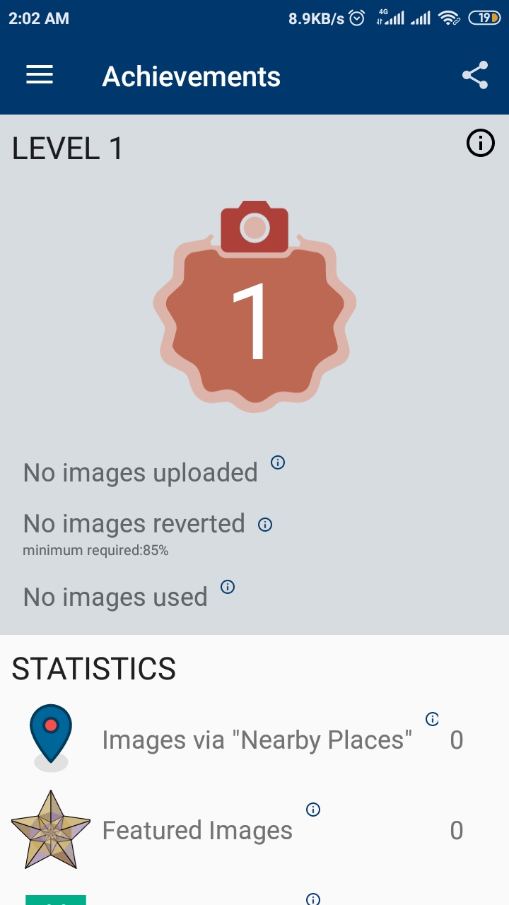
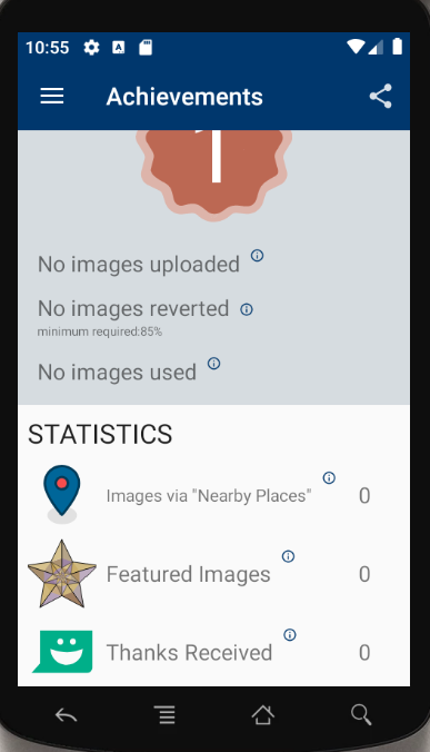
All stats have a help button, except that one.
I guess it is just waiting for someone to add one.
The help text could be:
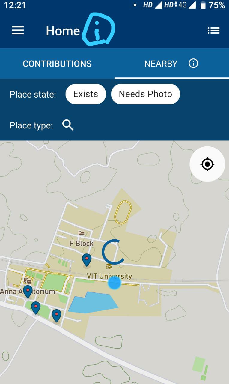
In the app's home, tap the "Nearby" tab to show places around you that need a picture.
 nicolas-raoul
All 53 comments
@nicolas-raoul I would like to give a try . Could you able to assign me this issue?
 TejaswiKarasani
on 25 Feb 2020
TejaswiKarasani
on 25 Feb 2020
Assigned to @TejaswiKarasani
 maskaravivek
on 25 Feb 2020
maskaravivek
on 25 Feb 2020
@maskaravivek I would like to confirm whether the interpretation of the task by myself is correct.
I had sketched the help link in the screenshot. Could you able to verify and let me know whether is that the case?
TejaswiKarasani
on 25 Feb 2020
Nope. The issue is about the achievements screen
maskaravivek
on 25 Feb 2020
Nope. The issue is about the achievements screen
It already had a pop message stating as below. Should I need to just replace the text to "In the app's home, tap the "Nearby" tab to show places around you that need a picture." or add this text to the existing content?
TejaswiKarasani
on 25 Feb 2020
Oh, then I guess it might be getting cut off on smaller devices. Can you test it on smaller devices?
maskaravivek
on 25 Feb 2020
Ok I will test it and revert back!
TejaswiKarasani
on 25 Feb 2020
Rn, I don't have internet connection to download the virtual devices but asked one of my friends who uses a smaller device (Android Version 7)
echnical information --
API level: 25
Android version: 7.1.2
Device manufacturer: Xiaomi
Device model: Redmi 4
Device: santoni
Network type: cellular-4g
App version name: 2.12.3~dc08a5e88
User name: Indianmatrix
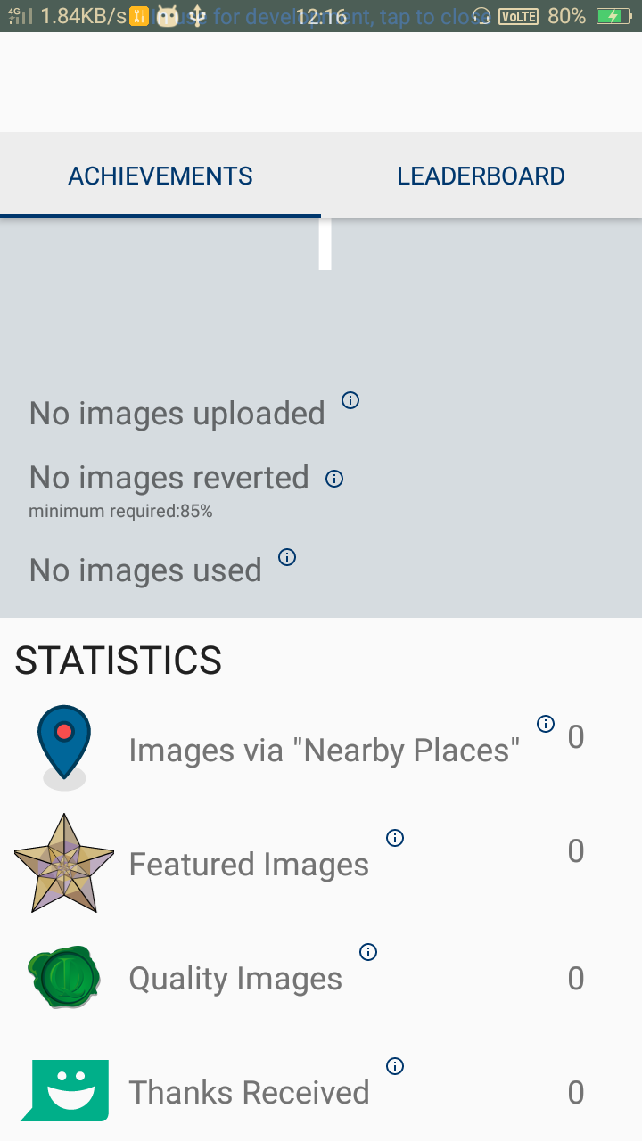
Screenshot from his mobile
TejaswiKarasani
on 25 Feb 2020
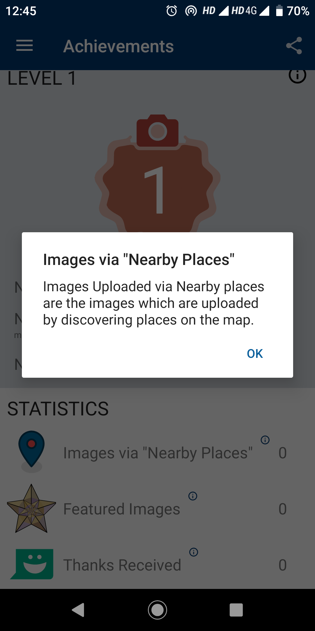
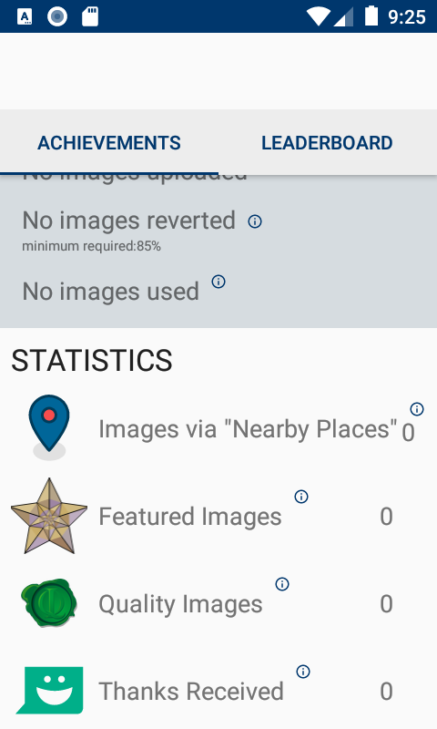
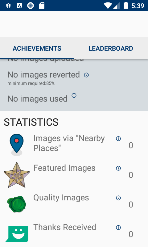
Yup as you can see the (i) icon for "Nearby Places" is slightly cut from the right side. If its a even smaller device, it might be completely cut off.
maskaravivek
on 26 Feb 2020
@maskaravivek so my task is to reduce size so that everything moves a little left , is it so?
TejaswiKarasani
on 26 Feb 2020
Oh, I did not realize that. I guess it is completely cut off on my device.
The goal should be to make it always visible, then :-)
nicolas-raoul
on 26 Feb 2020
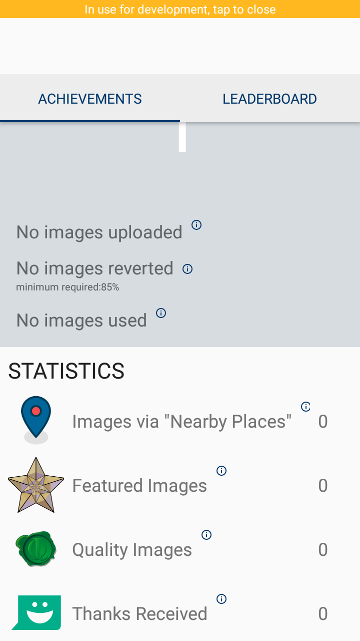
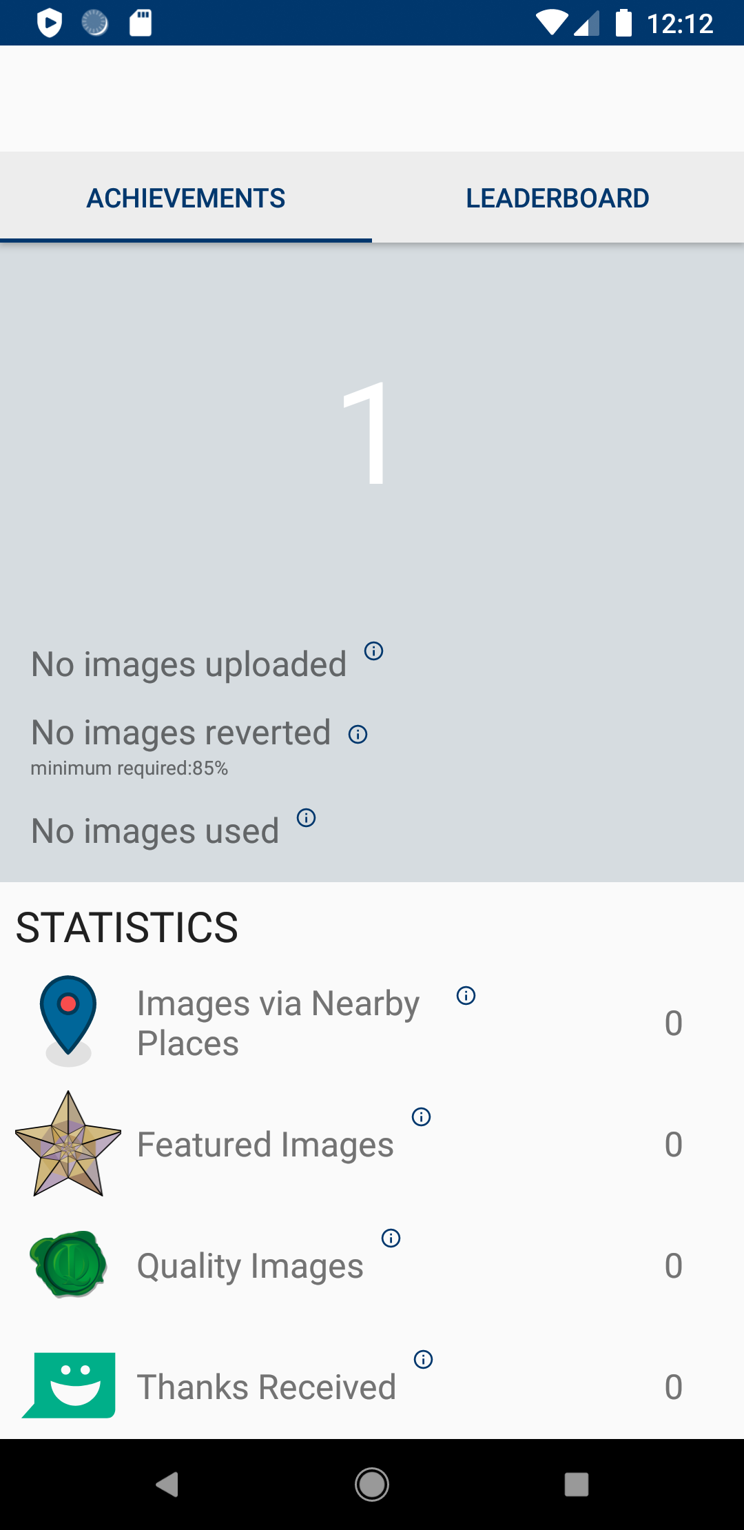
Here is what I see:
https://commons.wikimedia.org/wiki/File:Android_Commons_app-_Achievements_screen.jpg
nicolas-raoul
on 26 Feb 2020
Here is what I see:
https://commons.wikimedia.org/wiki/File:Android_Commons_app-_Achievements_screen.jpg
Ok I will work towards it :)
TejaswiKarasani
on 26 Feb 2020
@maskaravivek @nicolas-raoul does this makes sense or should I reduce the size of other contents under stats as "images via near by places"
Resolution 480 * 800
TejaswiKarasani
on 27 Feb 2020
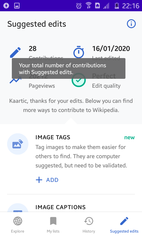
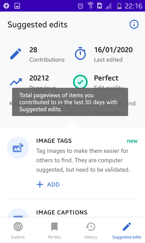
@TejaswiKarasani The reduction of size for that content alone does give an awkward look. My suggestion to fix the issue would be to totally change how the help pop-up is shown. Rather than having a separate "info" icon for each item that would show the help pop-up, we could show the pop-up when a user taps on the text for that item. For example, we could just show the help pop-up when a user taps on the "Feature Images" text. That should totally obviate the issue of info icon getting truncated.
To give an idea, here's the "Suggested edits" screen from the Wikipedia app where they do something similar.
Info overlay shown when tapping on the contribution count
Info overlay shown when tapping on the pageview count
 sivaraam
on 29 Feb 2020
sivaraam
on 29 Feb 2020
@sivaraam I get it. Should I proceed in the same way @maskaravivek ?
TejaswiKarasani
on 29 Feb 2020
@sivaraam Thanks for your feedback. A complete design change could be a separate issue. I have created #3441 to discuss it.
@TejaswiKarasani Lets not use a different text size just for one of the texts.
Please use the following layout.
- Divide the whole thing into 4 columns ie. icon, text, help icon and count
- Use layout weight to assign weights to all of these columns (https://developer.android.com/guide/topics/ui/layout/linear#Weight)
- Now that the linear layout has weights assigned to it, the text and icon will autofit or wrap.
| Icon (20%) | Text (40%) | Help Icon (15%) | Count (25%) |
| ------- | ---------------- | ---------------- | ---------------- |
| ... | ... | ... | ... |
| ... | ... | ... | ... |
PS: Play with the weights to adjust it and use what looks the best.
maskaravivek
on 29 Feb 2020
@sivaraam Thanks for your feedback. A complete design change could be a separate issue. I have created #3441 to discuss it.
@TejaswiKarasani Lets not use a different text size just for one of the texts.
Please use the following layout.
- Divide the whole thing into 4 columns ie. icon, text, help icon and count
- Use layout weight to assign weights to all of these columns (https://developer.android.com/guide/topics/ui/layout/linear#Weight)
- Now that the linear layout has weights assigned to it, the text and icon will autofit or wrap.
Icon (20%) Text (40%) Help Icon (15%) Count (25%)
... ... ... ...
... ... ... ...
PS: Play with the weights to adjust it and use what looks the best.
Will follow👍
TejaswiKarasani
on 29 Feb 2020
A complete design change could be a separate issue. I have created #3441 to discuss it.
Just wanted to clarify one thing as you mentioned "_complete_ design change", I was only proposing to show the help pop-up when tapping on the text rather than showing it via a separate information icon. I'm not sure how that counts as a "_complete_ design change".
I used the screenshots from the Wikipedia app only to illustrate how they were handling a similar help pop-up in their app. I wasn't suggesting to change the complete design of Achievements to make it look similar to the "Suggested edits" screen of the Wikipedia app. Just wanted to get that through. Apologies if that wasn't clear.
sivaraam
on 29 Feb 2020
@sivaraam Apologies for not putting it clearly. I just meant it would be a change in behavior as compared to the current flow.
maskaravivek
on 29 Feb 2020
I was thinking about just making sure that the whole text (including the help button) wrap correctly to the next line when the screen is small. It should work even on very small screens where other items such as "Featured images (?)" are also wider than the screen.
nicolas-raoul
on 1 Mar 2020
I was thinking about just making sure that the whole text (including the help button) wrap correctly to the next line when the screen is small. It should work even on very small screens where other items such as "Featured images (?)" are also wider than the screen.
So @nicolas-raoul do you mean layout-weight doesn't work?
TejaswiKarasani
on 1 Mar 2020
So @nicolas-raoul do you mean layout-weight doesn't work?
I cant speak for him but I suppose, he actually means the opposite 🙂 AFAIK if you get the layout weights right, the issue mentioned here shouldn't happen.
sivaraam
on 1 Mar 2020
So @nicolas-raoul do you mean layout-weight doesn't work?
I cant speak for him but I suppose, he actually means the opposite AFAIK if you get the layout weights right, the issue mentioned here shouldn't happen.
If that's the case then cool :)
TejaswiKarasani
on 1 Mar 2020
My team and I were looking for issues to resolve and this seems like a good starting point. If this issue is unassigned, can it be assigned to us?
 arishta
on 27 Aug 2020
arishta
on 27 Aug 2020
@TejaswiKarasani Are you still working on this? :-)
nicolas-raoul
on 28 Aug 2020
Feel free to unassign it @nicolas-raoul :)
TejaswiKarasani
on 28 Aug 2020
@TejaswiKarasani Thanks :-)
@arishta It is yours, please let us know about your progress every few days at least :-)
nicolas-raoul
on 28 Aug 2020
Hello, I'm new here and I was wondering if I could work on this issue..
 anadi198
on 13 Oct 2020
anadi198
on 13 Oct 2020
@arishta Are you still working on this? Please let us know about your progress :-)
nicolas-raoul
on 14 Oct 2020
@nicolas-raoul My team and I are working on three issues of this app(including this) parallelly as part of our software development lab. We have completed the design phase of all the three issues, and are now proceeding towards the implementation part.
arishta
on 14 Oct 2020
@arishta Wonderful! Would you mind posting the results of the design phase? (on each of the 3 issues)
Thanks!
nicolas-raoul
on 14 Oct 2020
@nicolas-raoul
The first phase was the requirements gathering phase, the output of which is the SRS document attached here.
The next phase was the design and planning phase. Most of the discussion was summed up in forms, but we do have a high level design document that I have attached here.
HLD.docx
SRS.pdf
arishta
on 14 Oct 2020
Hi @arishta, we don't require contributors to write those documents for fixing issues. So, you could get right into fixing the issue (likely called the "implementation" phase in your process) and asking for help in that regard. Thanks!
sivaraam
on 17 Oct 2020
@sivaraam Yes, I understand that. As I have said in the above comment, we have picked these issues as part of our software development lab in the ongoing semester, which requires us to follow all the steps in the given order, beginning from, requirements gathering phase to testing phase, mimicking how software development process actually happens in the real world. I posted the documents after @nicolas-raoul expressed interest in seeing them.
arishta
on 17 Oct 2020
This is the link to the PR from my team - isdl03
link
arishta
on 8 Nov 2020
@sivaraam We have made the requested changes in the PR #4023. Kindly review the same.
arishta
on 9 Jan 2021
Hi, @sivaraam @nicolas-raoul Is the issue still open? I would like to work on this issue.
 Ayan-10
on 31 Mar 2021
Ayan-10
on 31 Mar 2021
@arishta Thanks for working on this! Are you planning to address https://github.com/commons-app/apps-android-commons/pull/4023#pullrequestreview-572388916 within a month? If not, would you mind letting Ayan continue your work? Cheers!
nicolas-raoul
on 1 Apr 2021
Hello, @nicolas-raoul No, we will not be working on this. You can let Ayan continue the work.
arishta
on 1 Apr 2021
Thanks for letting us know @arishta , you can go for it @Ayan-10 :)
 neslihanturan
on 1 Apr 2021
neslihanturan
on 1 Apr 2021
Hey @neslihanturan , Thank you for assigning me.
I was thinking that In fragment_achievements.xml under the statistics section if we wrap each element with Constraint layout instead of Relative Layout and constrain it as needed we can prevent this issue.
I am attaching the original and updated screenshot of the app. Please have a look.
Original
Updated
I just do the modification for the first two elements so It is looking uneven I will fix that later. First, let me know Should I move forward with this idea? I mean Let me know your opinion.
Ayan-10
on 1 Apr 2021
@Ayan-10 For the updated version, could you please post a screenshot on a tiny screen? You can use the Android emulator to simulate any screen size. Thanks!
nicolas-raoul
on 2 Apr 2021
@nicolas-raoul , I test this issue in Nexus One 3.7' 480x800 API 26. This solution is not working help popup is getting overlapped with the count Textview. After that, I also tried in every possible way to solve this issue by organising fragment_ achievements.xml layout but this issue can't be solved.
I think now either we have to reduce the size of each TextView and ImageViews or we have to change the whole Statistics section that the help popup can be shown in small screen. Although I am still trying to solve the issue by maintaining this layout theme.
If you have any other idea or suggestion You can suggest me.
Ayan-10
on 2 Apr 2021
@Ayan-10 Thanks for testing! Unfortunately I am not sure what would work here... I still hope it is possible to achieve without changing the UI drastically, though.
nicolas-raoul
on 3 Apr 2021
Ok @nicolas-raoul, So I have got an idea. The in the layout the help icon is a little upper of the layout. So if we put the count textView a little lower and warp them with constrainlayout, For smaller screen size devices the count textView will come under the help icon instead of overlapping it. For a normal screen device, it will look as it is now ( not actually as it is. The count icon will come a little lower but not that much and We have to give less margin from right ). But in the smaller devices, it will come under the icon.
What is your opinion about this idea?
Ayan-10
on 3 Apr 2021
I am not a Android UI expert unfortunately...
Anyone able to check the strategy described in the post above? @madhurgupta10 maybe?
nicolas-raoul
on 4 Apr 2021
IMO using constraint layout and setting 0dp for the TextView should work just fine for all devices.
 madhurgupta10
on 4 Apr 2021
madhurgupta10
on 4 Apr 2021
@madhurgupta10 I tried that idea before but I think It didn't work for all devices. For small devices, the TextViews were getting overlapped. As you can see in early conversation I tested on Nexus One 3.7' 480x800 API 26. TextViews are getting overlapped as the text is large in size.
Ayan-10
on 4 Apr 2021
@madhurgupta10 @nicolas-raoul Till now I can think of two possible ideas. I am mentioning it below.
1. Placing the count TextView under the help icon and reducing the size of the right margin of count TextView.( As I said earlier )
| Device Size = Normal || Device = Pixel 3a | Device Size = Small || Device = Nexus One |
 |
 |
UI can still be improved
2. The main problem is the text is very long and that's why it's creating problem and getting overlapped. So it we break the line into two parts and give a new line between those two parts. The problem can be solved and it will work for smallest devices I tested it on the smallest emulator 2.7" QVGA 240x320
| Device Size = Normal || Device = Pixel 3a | Device Size = Small || Device = Nexus One |
 |
 |
I think 2nd solution looks better and Hope you like it. Let me know your thought on this.
Ayan-10
on 4 Apr 2021
@madhurgupta10 I tried that idea before but I think It didn't work for all devices. For small devices, the TextViews were getting overlapped. As you can see in early conversation I tested on Nexus One 3.7' 480x800 API 26. TextViews are getting overlapped as the text is large in size.
Could you share the code snippet?
madhurgupta10
on 4 Apr 2021
@madhurgupta10 I tried that idea before but I think It didn't work for all devices. For small devices, the TextViews were getting overlapped. As you can see in early conversation I tested on Nexus One 3.7' 480x800 API 26. TextViews are getting overlapped as the text is large in size.
Could you share the code snippet?
When I was testing, It did not work out so I delete the branch. I will redo it and share the code snippet here ASAP.
Ayan-10
on 4 Apr 2021
Thank you @madhurgupta10 for suggesting.
After the suggestion while redoing it. I realized It can be actually possible to do.
I think the issue was solved. Here I am attaching the images of normal and small device screen.
| Device Size = Normal || Device = Pixel 3a | Device Size = Small || Device = Nexus One |
 |
 |
Ayan-10
on 4 Apr 2021
Related issues
 domdomegg
·
3Comments
domdomegg
·
3Comments
 Opsylac
·
3Comments
nicolas-raoul
·
4Comments
Opsylac
·
3Comments
nicolas-raoul
·
4Comments
 Saral-code
·
3Comments
Saral-code
·
3Comments
 psh
·
3Comments
psh
·
3Comments
Most helpful comment
Thank you @madhurgupta10 for suggesting.
After the suggestion while redoing it. I realized It can be actually possible to do.
I think the issue was solved. Here I am attaching the images of normal and small device screen.