Apps-android-commons: New main screen UI in v3.0
This task was mentioned in our PG proposal and is slated for the end of our grant, but I forgot to create an issue for it. :) Copying over from the proposal:
After the new features have been completed, we would like to tie everything together in a new main screen UI. Since the creation of the app, the focal point of the main screen has been the user's past contributions. However, the app is now very different from what it was at the beginning - we have the Nearby feature, an Achievements screen with a level badge and upload stats, a Notifications screen with user talk messages, an Explore screen that lets users browse other Commons photos, and various other conveniences. At the end of 2018 we will be able to display news about an ongoing campaign. And at the end of this proposed grant, we will have a limited connection mode, the option to pause and resume image uploads, and a "to-do" system.
When the time comes, we will create a few different mockups and seek community feedback on which one they like best, before proceeding with implementation. However, as a rough guide, a possible plan for a new main screen UI is outlined below.
The action bar (the blue bar at the top of the screen) could have:
- Unread notifications as a bell icon
- Limited connection mode toggle
A bottom navigation bar could have:
- Home
- Nearby (nearby places that need pictures)
- Browse (the current "Explore" screen)
- My contributions
Home (which will be the new main screen) could contain:
- "Welcome back, username!" with level badge, upload stats and achievements displayed
- News about ongoing campaigns
- The nearest place that needs pictures
- The picture being uploaded currently (with option to pause/resume) and queue of other pending uploads. Or, if there is no picture being uploaded or in the queue, the most recent picture uploaded
- "To do list" of uploaded pictures with action needed
- Upload button
All of this will culminate in the release of v3.0 of the app at the end of the project.
 misaochan
All 20 comments
I tried to follow this specification for mockups, but here are some problems I faced:
The action bar (the blue bar at the top of the screen) could have:
- Unread notifications as a bell icon
- Limited connection mode toggle
After we have a bottom bar, keeping a global action bar for all screens reduces the area when considering the actions belong to each screen. Ie. Exploring have an search field, which I really like, on toolbar. Adding a global toolbar means shifting search field one row bottom and this means reducing our usable area (Or adding the action to existing global toolbar, I didn't find this solution simple). Thus I am not in favor with having a global toolbar. Both limited connection mode and notifications can be accessed from home bottom bar item. We can indicate notifications with a red dot on upper right corner of home icon. How does that sounds @misaochan ?
 neslihanturan
on 11 Apr 2019
neslihanturan
on 11 Apr 2019
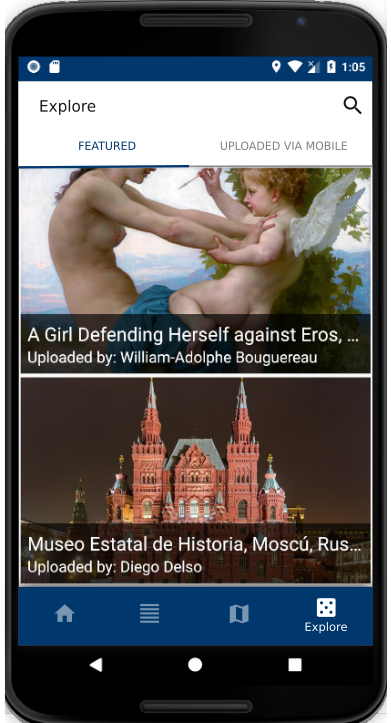
Adding my current Explore screen design for reference to discussion:
neslihanturan
on 11 Apr 2019
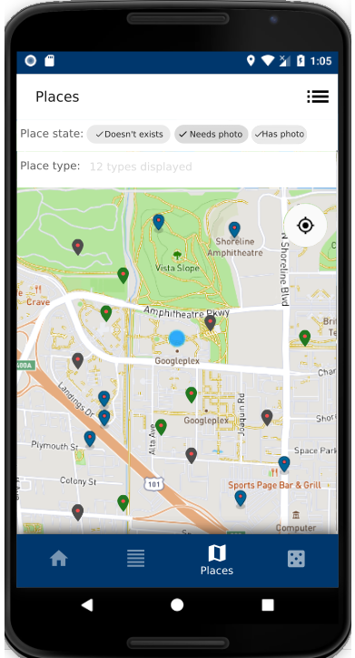
Here is my Nearby suggestion:
neslihanturan
on 12 Apr 2019
Home (which will be the new main screen) could contain:
- "Welcome back, username!" with level badge, upload stats and achievements displayed
- News about ongoing campaigns
- The nearest place that needs pictures
- The picture being uploaded currently (with option to pause/resume) and queue of other pending uploads. Or, if there is no picture being uploaded or in the queue, the most recent picture uploaded
- "To do list" of uploaded pictures with action needed
- "Upload button"
@misaochan I am not sure about moving upload button under home, I think we should keep on contributions page instead. Or we can have it on both home and contributions screens?
neslihanturan
on 12 Apr 2019
@neslihanturan , I made a rough sketch of how I envisioned Home to look like. The bottom bar you made with Nearby and Explore looks great to me, so I just copied it onto my sketch. :)
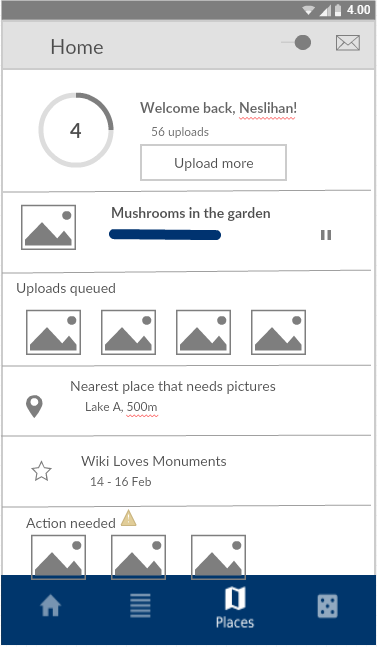
A few points to note:
The inspiration for this was a card-based layout, similar to the home screen of Google Play and Wikipedia. We can add or remove cards based on the state, for instance the "uploads queued" card would only show up if there are queued uploads. Some of the cards (e.g. 'uploads queued' and 'actions needed') could have horizontal scrolling so we won't be limited to the width of the screen
The "mail" icon on the action bar is just a placeholder for the bell icon, there was no bell icon in the software that I used lol. Ditto with the star icon for campaign news
I definitely think we need an upload button under Home, because that is the main function of the app. We can have it on both Home and Contributions if needed.
I am not sure however, what the best form is for the button. The "Upload more" button made sense to me in the context of being displayed under the user's upload stats, and also I'm not sure how a FAB will look above the bottom bar.
Both limited connection mode and notifications can be accessed from home bottom bar item. We can indicate notifications with a red dot on upper right corner of home icon. How does that sounds @misaochan ?
Sounds good to me
misaochan
on 13 Apr 2019
Thanks @misaochan , I think I got what is in your mind.
neslihanturan
on 13 Apr 2019
Hi, we had a discussion about usage of nav drawer together with bottom navigator.
@ashishkumar468 :
But yes, I just found this on material.io "Caution.
Avoid using a navigation drawer with other primary navigation components, such as a bottom navigation bar.
"
https://material.io/design/components/navigation-drawer.html#usage
On the other hand we have several items on our current nav drawer and it can be hard to fit all of them in home screen. Proposed solutions:
- Having a three dots menu on toolbar
- Having a fifth item on bottom navigation (According to guideline we are allowed to use 3 to 5 items, no more)
- Putting about and feedback under settings
What do you say? Do you have other suggestions?
neslihanturan
on 14 Apr 2019
To find the best approach for our new UI, we may need to sort our current and to have features:
Accessible from nav bar:
- Current nav bar items
- Contributions
- Nearby
- Explore
- Bookmarks
- Review
Account related things:
- Settings
- About
- Tutorial
- Feedback
- Logout
Accessible from other screens:
- Notifications
- Achievements
- Campaigns
- Closest nearby
Plans
- TODO list #1870
- Upload later queue
- Limited connection mode toggle
The motivation for using a bottom navigation in our new UI is presenting Explore as one of main features. So our must bottom items, currently 4:
- Home
- Contributions
- Places (means nearby)
- Explore
The limitation for use of bottom navigator is max number of items we can have is 5, according to design guidelines. As I listed above we have several items and it is hard (and not user friendly) to fit all into one screen, home. We can't keep navigation drawer with bottom navigator since this is not recommended. Based on this information we should decide:
1. Use a fifth item on bottom navigator
- Pros: We can put account related items under new bottom item and our features under home bottom item as,
- Home
- Notifications
- Achievements
- Campaigns
- Closest nearby
- TODO list #1870
- Upload later queue
- Limited connection mode toggle
- Contributions
- Explore
- Explore
- Bookmarks (Should we put them together?)
- Peer review (Should we put them together?)
- Nearby
- Account
- Settings
- About
- Tutorial
- Feedback
- Logout
- Home
- Cons: We frequently add new features, ie. our gamification plans. If we use or all 5 items now we will have hard times when we need to insert some new features.
2. Use a menu on toolbar of home fragment
In this option I suggest having 4 bottom items and adding account related tasks under a menu which is accessible from the toolbar of home fragment, ie. a three dots menu.
- Pros: We can add the fifth item if we need to
- Cons: Home is very crowded as:
- Home
- Notifications
- Achievements
- Campaigns
- Closest nearby
- TODO list #1870
- Upload later queue
- Limited connection mode toggle
- A menu:
- Settings
- About
- Tutorial
- Feedback
- Logout
- Contributions
- Explore
- Explore
- Bookmarks (Should we put them together?)
- Peer review (Should we put them together?)
- Nearby
- Home
3. Do we really want to use bottom navigator?
I know bottom navigator is very cool but we may have too many features. We should consider if bottom navigator really fits with our app or not. Please join to the discussion.
neslihanturan
on 15 Apr 2019
Yes, this is a bit of a dilemma. It would be great to get more thoughts on this. @nicolas-raoul ?
I think that that Option 1, the 5-item bottom nav bar, should be reasonably future-proof. We would likely be able to fit most things under those 5 items - for instance if we gamify Nearby, we would just add it to Nearby, not to the main nav bar. But it does pose a restriction somewhat, and also it would be more difficult for users to navigate since it is a huge change compared to my initial proposal (just using the bottom nav bar as a shortcut and keeping the nav drawer). Also I am not sure how it would appear on small screens, 5 items is a lot.
For Question 3, it feels like a step back to go back to pure nav drawer. We currently have tabs that encourage users to focus on Nearby. If we go back to pure nav drawer, we lose the ability to highlight our main features. However, ditching the bottom navigator may indeed be the safest option.
Conclusion: I am undecided and hoping for more input, especially from regular users. :)
misaochan
on 17 Apr 2019
Sorry I haven't got much time to read this thread and the next three weeks will be super-busy too... anyway I am sure you will make good decisions :-)
By the way, I like how the sketch above presents the user with immediate calls to action (upload more, most nearby, TODO list)
 nicolas-raoul
on 22 Apr 2019
nicolas-raoul
on 22 Apr 2019
https://phabricator.wikimedia.org/T223159 has design suggestions by Robin Schoenbaechler, the designer whom we worked with at the hackathon.
The (unstable) WIP PR is #2972
misaochan
on 9 Jun 2019
Thanks for remembering it @misaochan , it looks really helpful.
neslihanturan
on 10 Jun 2019
Copy pasting the design posted by @neslihanturan at https://github.com/commons-app/apps-android-commons/issues/746#issuecomment-651411040 for reference. It looks good to me personally. Opinions appreciated. :)

misaochan
on 30 Jun 2020
Copy pasting the design posted by @neslihanturan at #746 (comment)
That certainly does look nice. Just wondering, is this going to be the how the re-design would look? Or is there more work to it?
 sivaraam
on 30 Jun 2020
sivaraam
on 30 Jun 2020
That is a mockup for how the redesign would look, yes. I imagine we might discover that some tweaks might be necessary when implementation starts.
misaochan
on 30 Jun 2020
Actually, now that I think about it... I love the cloud icon and it should stay, but additionally I think we need a very clear way of telling the user that limited connection mode is on. With this design a user might accidentally turn the mode on, and then they might just not look at the upper right of their screen and wonder why things aren't working the way they are supposed to. Maybe even having text somewhere that says "Limited connection mode ON" (with a tooltip) if the mode is enabled, could be beneficial.
misaochan
on 30 Jun 2020
I know it is only a draft, but if I had a comment to make, it would be to add a bit of space before the next picture, or remove a bit of space above the picture name. Taking the Instagram app as a reference, I can see that the vertical spacing between two posts is double the size of the vertical spacings that can be found within an individual post.
nicolas-raoul
on 30 Jun 2020
Actually, now that I think about it... I love the cloud icon and it should stay, but additionally I think we need a very clear way of telling the user that limited connection mode is on.
Yeah, certainly. This reminds me of the "Offline library" feature that the Wikipedia app had in its alpha but was paused before it went into production. They had a nice design which clearly indicated when the user was browsing offline and online. I guess we could do something like that here. Here's a task related to that design: https://phabricator.wikimedia.org/T163595
sivaraam
on 2 Jul 2020
Yeah, certainly. This reminds me of the "Offline library" feature that the Wikipedia app had in its alpha but was paused before it went into production. They had a nice design which clearly indicated when the user was browsing offline and online. I guess we could do something like that here. Here's a task related to that design: https://phabricator.wikimedia.org/T163595
That looks like a nice design! Thumbs up from me. :)
misaochan
on 3 Jul 2020
phabricator.wikimedia.org/T223159 has design suggestions by Robin Schoenbaechler, the designer whom we worked with at the hackathon.
The Wikipedia app recently pushed a change to its alpha version in which it has a bottom nav bar similar to the one found in the proposed design. Just wanted to mention it in case someone wants to get an idea of how having the "More" menu in the bottom nav bar would feel like in live action :)
sivaraam
on 4 Jul 2020
Related issues
 Saral-code
·
3Comments
Saral-code
·
3Comments
 Opsylac
·
3Comments
nicolas-raoul
·
4Comments
misaochan
·
4Comments
Opsylac
·
3Comments
nicolas-raoul
·
4Comments
misaochan
·
4Comments
 whym
·
3Comments
whym
·
3Comments
Most helpful comment
I know it is only a draft, but if I had a comment to make, it would be to add a bit of space before the next picture, or remove a bit of space above the picture name. Taking the Instagram app as a reference, I can see that the vertical spacing between two posts is double the size of the vertical spacings that can be found within an individual post.