Apps-android-commons: Include previous hackathon work to our master
Summary:
We should include previous hackathon's task which is mostly ready to be merged to master, preferably before next hackathon :)
 neslihanturan
All 23 comments
@neslihanturan Is https://github.com/commons-app/apps-android-commons/tree/wikimedia-hackathon-2018 this the hackathon branch?
The first task would be to bring this branch up to date with the master. Post that, we can identify the pending issues and merge it to master. :)
Let me try rebasing the branch with master. Will update the branch if rebase succeeds.
 maskaravivek
on 1 Jan 2019
maskaravivek
on 1 Jan 2019
Have rebased the branch with master and have made a few minor changes to fix the build.
Great work @neslihanturan @ejegg and @whym for building this during the hackathon.
Peer review functionality works for me but I think it's not ready for production yet.
- The flow didn't feel intuitive for me and I didn't know what would happen on clicking Yes or No.
- I would prefer to skip an image without reviewing. Later, I realized that the refresh button gives me a new image, but it would be nice to have this more prominently.
- IMO, the image should be clickable and should open media details activity.
- It's asking me to review the categories but it doesn't show the currently added categories. It should show the current categories on the same page.
- On clicking Yes, a popup shows with some pre-written text. I didn't realize that it is editable. Maybe we could reuse #1824.
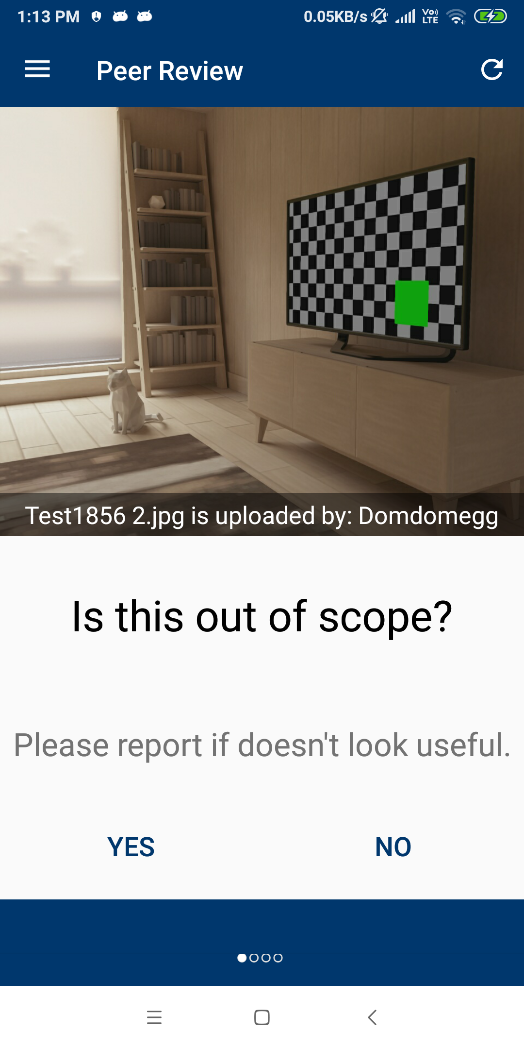
Yet, I feel that it would be okay to merge it to master in its current state and give our alpha users a chance to provide feedback.
cc: @misaochan @nicolas-raoul
maskaravivek
on 1 Jan 2019
I am also in favour of merging even if many things are currently awkward.
It is a feature for power users anyway, and much better than nothing.
On Tue, Jan 1, 2019, 13:53 Vivek Maskara <[email protected] wrote:
Have rebased the branch with master and have made a few minor changes to
fix the build.Great work @neslihanturan https://github.com/neslihanturan @ejegg
https://github.com/ejegg and @whym https://github.com/whym for
building this during the hackathon.Peer review functionality works for me but I think it's not ready for
production yet.
- The flow didn't feel intuitive for me and I didn't know what would
happen on clicking Yes or No.- I would prefer to skip an image without reviewing. Later, I realized
that the refresh button gives me a new image, but it would be nice to have
this more prominently.- IMO, the image should be clickable and should open media details
activity.- It's asking me to review the categories but it doesn't show the
currently added categories. It should show the current categories on the
same page.- On clicking Yes, a popup shows with some pre-written text. I didn't
realize that it is editable. Maybe we could reuse #1824
https://github.com/commons-app/apps-android-commons/pull/1824.[image: device-2019-01-01-131311]
https://user-images.githubusercontent.com/3069373/50571104-0c729680-0dc7-11e9-9d4b-67b66b764c62.pngYet, I feel that it would be okay to merge it to master in its current
state and give our alpha users a chance to provide feedback.cc: @misaochan https://github.com/misaochan @nicolas-raoul
https://github.com/nicolas-raoul—
You are receiving this because you were mentioned.
Reply to this email directly, view it on GitHub
https://github.com/commons-app/apps-android-commons/issues/2253#issuecomment-450715009,
or mute the thread
https://github.com/notifications/unsubscribe-auth/AAGFBhqNT-l5IykqHrDpY9m27j-LweTtks5u-xP6gaJpZM4ZlmyH
.
 nicolas-raoul
on 1 Jan 2019
nicolas-raoul
on 1 Jan 2019
I'm OK with merging it to master, but if it is not in a polished state, maybe we can control access to it. For instance, instead of making it a main nav bar item, we can instead have a link to it in About or such? And when the user accesses the activity, we mention that it is still a work in progress, and mostly only useful for power users.
 misaochan
on 2 Jan 2019
misaochan
on 2 Jan 2019
And when the user accesses the activity, we mention that it is still a work in progress, and mostly only useful for power users.
This is a good point.
A similar idea might be to create a preference item for "Turn on experimental features" so that the user can (and have to) choose to see experimental features like this? If turned off, the link would be disabled or hidden. It can bring more complexity to the implementation, though.
 whym
on 2 Jan 2019
whym
on 2 Jan 2019
A similar idea might be to create a preference item for "Turn on experimental features" so that the user can (and have to) choose to see experimental features like this? If turned off, the link would be disabled or hidden. It can bring more complexity to the implementation, though.
Interesting idea! Instead of a setting (which could indeed increase complexity), what about just having an "Experimental features" activity that would house features like this? Would reduce complexity and keep them all in one place.
misaochan
on 2 Jan 2019
A similar idea might be to create a preference item for "Turn on experimental features" so that the user can (and have to) choose to see experimental features like this? If turned off, the link would be disabled or hidden. It can bring more complexity to the implementation, though.
I like the idea of having something called experimental features in the app. This could indeed be another task in itself. Someone can help in building a simple framework for experimental features and this issue can leverage it.
For now, I like @misaochan's suggestion of having all experimental features accessible from a single activity.
maskaravivek
on 2 Jan 2019
Eventually, we can work on building a simple service/framework for handling experimental features/enabling certain features based on some checks. I have opened a new issue for discussing the framework. #2269.
maskaravivek
on 4 Jan 2019
I am willing to polish this changes and make them ready for production. It may take a week or so, but should I merge #2257 and work top of it on master or should I work on the task branch and then merge all together? I think working on master doesn't seem safe since we plan to have 2.10 soon. On the other hand these changes are not very related with current code base, it is an addition, if it is ok for @maskaravivek I suggest closing #2257 for now and working on that branch, then when it is ready we can merge to master.
neslihanturan
on 4 Jan 2019
Yes, sure. Feel free to close #2257. You can start working on that branch as it's up to date with the master. :)
maskaravivek
on 4 Jan 2019
Yes, please work on a separate branch and only merge it to master later, thanks! :)
misaochan
on 4 Jan 2019
Hello @nicolas-raoul, @maskaravivek, @misaochan
Started woking on this issue.
Shall I make the pull request for above mentioned changes to the hackathon branch (https://github.com/commons-app/apps-android-commons/tree/wikimedia-hackathon-2018)
or I shall update this branch with the master and make pull request to the master branch.
Thank you!
 silkypriya
on 14 Mar 2019
silkypriya
on 14 Mar 2019
Pull request should be made to the master branch :-)
There might be conflicts to solve, good luck!
Then please fix at least the first point raised by https://github.com/commons-app/apps-android-commons/issues/2253#issuecomment-450715009 , for instance by replacing "Yes" with "In scope" and "No" with "Out of scope".
@neslihanturan I realize just now that you might have been working on this? I suggest pushing any commit now so that Silky can try them out :-)
nicolas-raoul
on 14 Mar 2019
Thank you @nicolas-raoul.
I think slight change in UI can fix both first and second point mentioned in #2253 (comment).
Shall I proceed for following changes?
In order to make the flow more intuitive -
Add "Next" button instead of "No" to move to next question.
Currently there is no way to so to previous question, so adding "Previous" button would be useful.
"Previous" button will be missing for the first question and similarly "Next" button will be missing for
the last question.In order to make refreshing and getting new image more prominent -
Currently user get new image by clicking at refresh button at the top right corner or clicking at "No"
button for the last question. Instead of this, having one large button for getting new image for
reviewing would be nice.
Screenshot of layout close to the actual result :-)

silkypriya
on 14 Mar 2019
Hi @silkypriya , thanks for your interest.
I think this issue needs some discussion before starting:)
Firstly, this feature is implemented during the hackathon by 3 people, so needs some more work.
- The functionality works just fine
- One of the main problem is it requires to have a new item on nav drawer, we need to discuss are we willing to implement it in that way or not.
- The second problem is the UI should be pretty buggy, and redesign would be nice.
When we implemented peer review on hackathon, there wasn't such thing as explore in the app. Thus, we had a randomizer which randomly displays some images to review. But I think the ability to choose the image before review is better from user's point of view. Now we have the explore feature, so user can use explore, go to media details of the image that she wants to explore and review it too.
For simplicity my suggestion is let's merge this task with #2016 . I mean:
- Let's do not add a new item to nav bar
- Do not randomize images instead use the images from explore
Current UI and work flow is as:
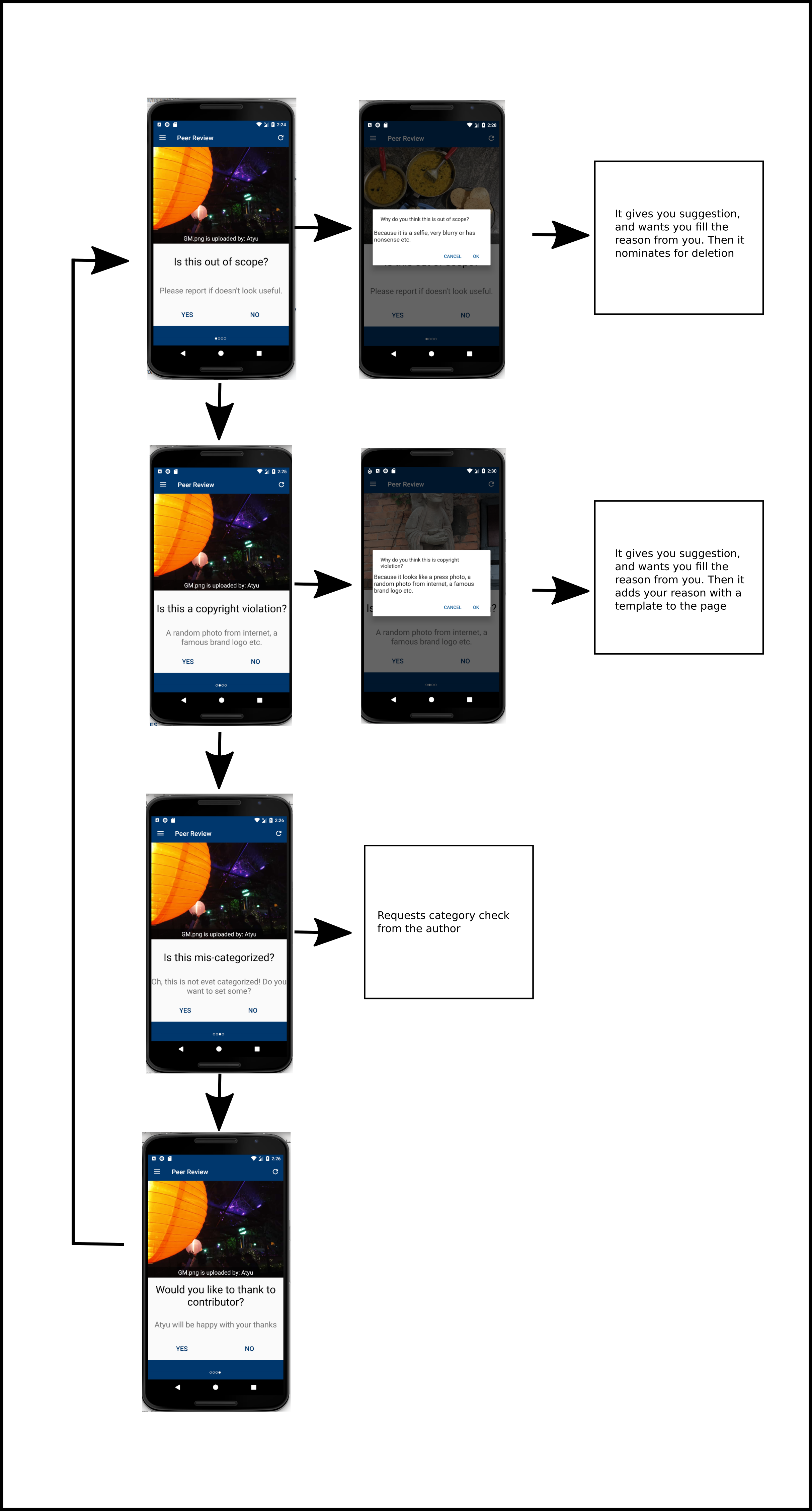
Yes: horizontal arrows, No: vertical arrows
My suggestion for a new and simple UI is:
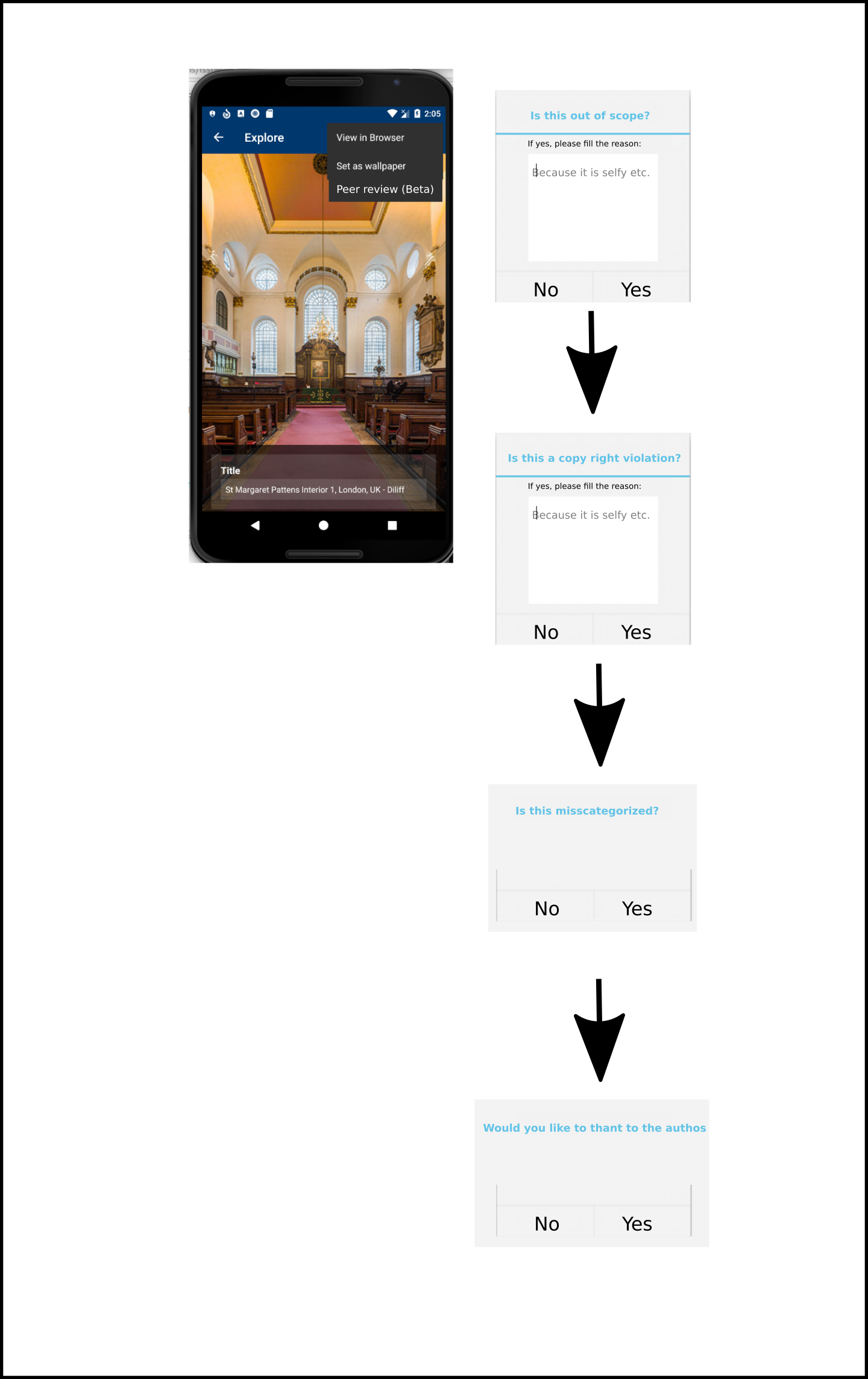
Yes/No: vertical arrows
Clicking outside cancels the flow.
What do you think?
neslihanturan
on 14 Mar 2019
There are so many mobile uploads each day, we need the review option to be
more visible, I would say.
I would argue in favor of an item in the navigation bar, that starts
reviews (potentially many) in the mobile uploads category only, by
last-uploaded order (or randomly if it is easier but only recent uploads).
I don't think we need a "Review other image" button, the "Next" button
should do that.
On Thu, Mar 14, 2019, 21:06 neslihanturan notifications@github.com wrote:
Hi @silkypriya https://github.com/silkypriya , thanks for your interest.
I think this issue needs some discussion before starting:)
Firstly, this feature is implemented during the hackathon by 3 people, so
needs some more work.
- The functionality works just fine
- One of the main problem is it requires to have a new item on nav
drawer, we need to discuss are we willing to implement it in that way or
not.- The second problem is the UI should be pretty buggy, and redesign
would be nice.When we implemented peer review on hackathon, there wasn't such thing as
explore in the app. Thus, we had a randomizer which randomly displays some
images to review. But I think the ability to choose the image before review
is better from user's point of view. Now we have the explore feature, so
user can use explore, go to media details of the image that she wants to
explore and review it too.For simplicity my suggestion is let's merge this task with #2016
https://github.com/commons-app/apps-android-commons/issues/2016 . I
mean:
- Let's do not add a new item to nav bar
- Do not randomize images instead use the images from explore
Current UI and work flow is as:
[image: review1]
https://user-images.githubusercontent.com/3127881/54354246-323dd680-4667-11e9-88c9-64b85a7d8617.pngYes: horizontal arrows, No: vertical arrows
My suggestion for a new and simple UI is:
[image: review2]
https://user-images.githubusercontent.com/3127881/54355636-a5951780-466a-11e9-862a-77cce098efee.pngYes/No: vertical arrows
Clicking outside cancels the flow.What do you think?
—
You are receiving this because you were mentioned.
Reply to this email directly, view it on GitHub
https://github.com/commons-app/apps-android-commons/issues/2253#issuecomment-472825027,
or mute the thread
https://github.com/notifications/unsubscribe-auth/AAGFBlXBNopeIBluGHCG1Yeit3mXmtMWks5vWjtMgaJpZM4ZlmyH
.
nicolas-raoul
on 14 Mar 2019
Actually, a complete review has 4 steps, user may want to review other image before completing all independent 4 steps too.
If we will keep it as separate item on nav bar, then we can redirect user from explore to review activity when they wanted to review an image in explore page. So that we ca both use randomization and explore+review thing.
neslihanturan
on 14 Mar 2019
If we decide to use it as a new item on nav bar, then I think current UI is quite material design friendly. Some problems are:
- When we switch to next one, whole page switches. Instead just question supposed to switch.
Possible problems on newly shared UI:
- I think only having "yes" feels weird.
- Previous design looks more material design friendly, let's keep the design more minimal (do not use colored buttons, just texts are fine.)
My design suggestion based on @maskaravivek 's comments:
- By adding some explanation we can emphasize what will happen if I click to Yes
- Yes and no are more clear now
- Next and prev buttons are for moving on questions, not images. You can use the button on the top to have a new image.
- We can include a long explanation along with review another image question mark
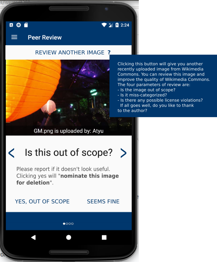
IMO, the image should be clickable and should open media details activity.
This can be a future enhancement, I think.
It's asking me to review the categories but it doesn't show the currently added categories. It should show the current categories on the same page.
Agreed, should be added to the transparent grey field as a new line.
On clicking Yes, a popup shows with some pre-written text. I didn't realize that it is editable. Maybe we could reuse #1824.
Strongly agreed.
Lastly, I think the title should be "Peer review (beta feature)"
neslihanturan
on 14 Mar 2019
How about renaming "Review another image?" to "Skip this image?"
I suggest showing the "Yes, out of scope" button in red and the "Seems fine" button in green, because it seems easy to get distracted and click "Yes" thinking "Yes it is on-topic"
I am not sure previous/next are really needed but if they are implemented already let's try with them.
nicolas-raoul
on 15 Mar 2019
Hello @nicolas-raoul , @neslihanturan, @maskaravivek
Made pull request implementing changes discussed above.
Please review. Would love your suggestions for improvement.
Thank you!
silkypriya
on 15 Mar 2019
The latest mockup looks fantastic IMO! :)
misaochan
on 19 Mar 2019
Isn't it @misaochan ! I am on it for testing now, thanks for fast responses @silkypriya
neslihanturan
on 19 Mar 2019
Thank you! @neslihanturan @misaochan
silkypriya
on 19 Mar 2019
Related issues
nicolas-raoul
·
4Comments
 jidanni
·
3Comments
jidanni
·
3Comments
 Opsylac
·
3Comments
neslihanturan
·
3Comments
Opsylac
·
3Comments
neslihanturan
·
3Comments
 psh
·
3Comments
psh
·
3Comments
Most helpful comment
This is a good point.
A similar idea might be to create a preference item for "Turn on experimental features" so that the user can (and have to) choose to see experimental features like this? If turned off, the link would be disabled or hidden. It can bring more complexity to the implementation, though.