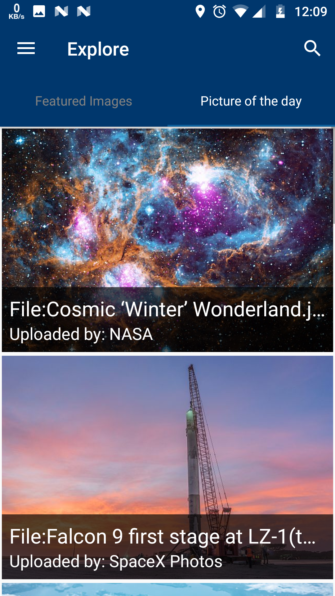
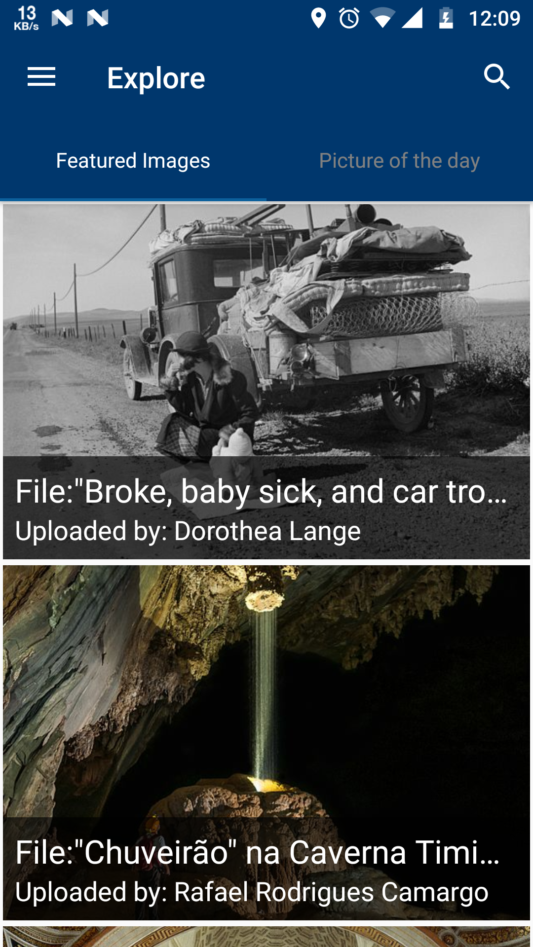
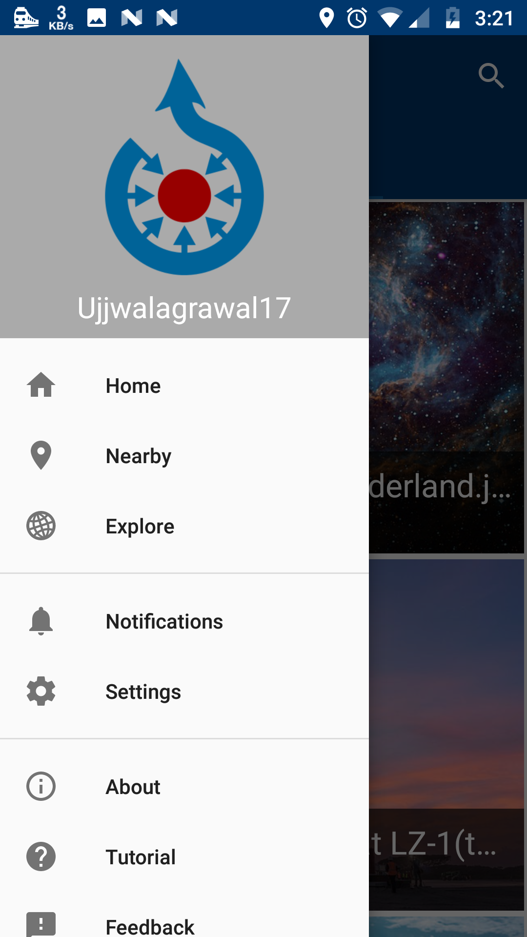
Apps-android-commons: Explore option (for Browsing)
Summary:
Apart from "featured Images" that are already in the app there should be a option for people to view all "picture of the day". We can put a common option in navigation drawer named "Explore " and place both categories inside them along with a search icon. We can, later on, customize explore activity more for browsing feature.
Commons app version:
2.7.1-debug-explore_activity
Screen-shots:
|  |  |
Would you like to work on the issue?
Yes, I have already worked on this issue.
All 7 comments
Some of the discussion on this feature is already done in #1521
I am attaching the some discussion here-
@ujjwalagrawal17
If we look at Commons Website main page
I found that except Featured Image - Quality Images, Valued Images, and Picture of the day can also be shown in explore page.
Links of the categories -
- [Picture of the day] https://commons.wikimedia.org/wiki/Category:Commons:Potd_(en)
- [Valued Images] https://commons.wikimedia.org/wiki/Category:Valued_images
- [Quality Images] https://commons.wikimedia.org/wiki/Category:Quality_images
- [Featured] https://commons.wikimedia.org/wiki/Category:Featured_pictures_on_Wikimedia_Commons
I have designed an UI for explore page -
On click of each we will open the already existing CategoryImageActivity by passing category name which will not contain search icon.(We don't need to write API calls for each page as @maskaravivek has made a common method for it).
Also we can put some icons along with the names if this UI looks simple.@nicolas-raoul
Most Commons users do not know what is the difference between quality and valued images, and don;t really need to know.
They just want to see nice images.
So, how about hiding these technicalities, and just showing pictures in this order:The picture of the day
All of the pictures for the first page (page in the meaning of query paging) of featured images
All of the pictures for the first page (page in the meaning of query paging) of quality images
All of the pictures for the first page (page in the meaning of query paging) of valued images
All of the pictures for the second page (page in the meaning of query paging) of featured images
All of the pictures for the second page (page in the meaning of query paging) of quality images
All of the pictures for the second page (page in the meaning of query paging) of valued images
etc
Advantages over showing a featured/potd/quality/valued menu:Content is shown as soon as you touch "Explore", which is more entertaining
More user-friendly
We can maybe put a heterogeneous recyclerview with different kind of cards that are shown according to date like
1.Today's Picture of the day
- Recently Featured Images
- Recent Valued Images
- Recent Quality Images
- Some Random Images
..Old images of each kind ...
Every card should have a different design so that user can enjoy using app.
I like @ujjwalagrawal17's idea of using a heterogeneous recycler view with different kind of cards. The wikipedia homepage also uses cards very pleasantly. Attaching screenshots of how it looks.
| 1 | 2 | 3 | 4 |
| ------------- | ------------- | ------------- | ------------- |
| |
|
|
|
Similarly we could have cards for featured images, picture of the day, random images, valued images etc. The card could show the first image there itself and have a button to see more images. Clicking the button could open that category.
Morover, with more and more browsing features coming in the app, I feel that it should have a more prominent placement in the app. With the card views, we can have cards for each of these things and user's contribution could be just another card(Personally I don't think theres much value in seeing own contributions when the app opens).
I think cards are quite cool but, I also agree to @nicolas-raoul about hiding technical details. Since currently we add several new things to app, we should protect simplicity.
The cards look great to me personally, especially in the way that the Wikipedia app designed them. However, I have also had issues with the Wikipedia app where the main screen was just too complex - I couldn't keep track of which cards I had viewed and why there were so many of them. If we did use cards, I would actually put "Picture of the day" as the first card, "Valued/Quality/Featured" all under ONE card view, and then "All" under another card.
With the card views, we can have cards for each of these things and user's contribution could be just another card(Personally I don't think theres much value in seeing own contributions when the app opens).
I am hesitant to do this until we establish a better system for notifying the user of successful or failed uploads (with the option of retrying the upload if it fails). While viewing my old contributions isn't particularly useful, I always glance at the last few photos uploaded to check if the upload succeeded or not.
Also #1502 would work better if our own contributions are more prominent.
The option for exploring images is available now in app. Can we add a option to explore categories too ?? In tab 2 ?? Commons website main page has this too.
Please share your opinions @nicolas-raoul
@misaochan @maskaravivek @neslihanturan
We have already implemented the task written here.


Most helpful comment
We can maybe put a heterogeneous recyclerview with different kind of cards that are shown according to date like
1.Today's Picture of the day
..Old images of each kind ...
Every card should have a different design so that user can enjoy using app.