Apexcharts.js: Enabling multiple time ranges on timeline bar charts
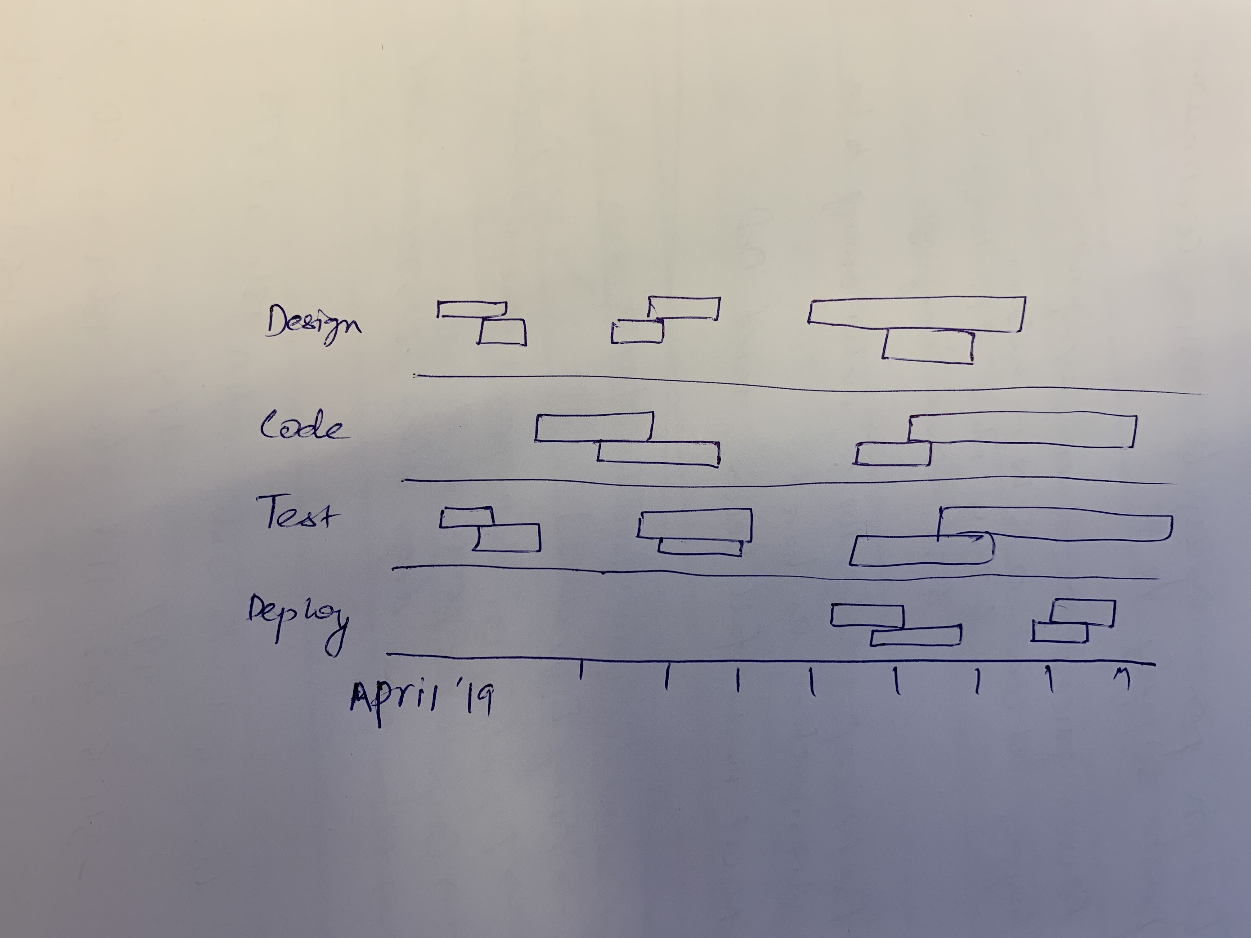
Requesting an enhancement on the current timeline bar charts (https://apexcharts.com/vue-chart-demos/bar-charts/timeline-chart/) so that multiple time ranges can be displayed. Attached sketch for reference.
 stalnikar
All 13 comments
I'd also be interested in this being added. There are currently no vue integrated charting plugins which have this functionality.
 rtybanana
on 26 Aug 2019
rtybanana
on 26 Aug 2019
I'm working with a small team on a project that would greatly benefit from multiple time bars in the same horizontal slot. It's also using Vue.JS
 cjakeman
on 27 Aug 2019
cjakeman
on 27 Aug 2019
Hi. Is it possible to make something like this by using existing version?
 Shkiperon
on 19 Sep 2019
Shkiperon
on 19 Sep 2019
Without this function, this view loses relevance in most cases. Someone was able to solve the standard functions?
 bars949
on 24 Sep 2019
bars949
on 24 Sep 2019
I also would find this feature rather useful. This project is great, and this capability would further separate it from other timelines.
 jakeflorentine
on 5 Nov 2019
jakeflorentine
on 5 Nov 2019
The use case-described in OP is the sole motivation for me to try this library. Disappointing that it can't be implemented currently. I'd like to see functionality such as this: https://github.com/vasturiano/timelines-chart
 dylanmartin
on 12 Nov 2019
dylanmartin
on 12 Nov 2019
I have finished working on this and the functionality will be released in v3.11.0
I will also create demos for it on the website soon.
Thank you for your patience!
 junedchhipa
on 14 Dec 2019
junedchhipa
on 14 Dec 2019
Juned,
I’m grateful for this addition!
Thanks,
Jake Florentine
On Dec 14, 2019, at 2:53 AM, Juned Chhipa notifications@github.com wrote:
I have finished working on this and the functionality will be released in v3.11.0
I will also create demos for it on the website soon.Thank you for your patience!
—
You are receiving this because you commented.
Reply to this email directly, view it on GitHub, or unsubscribe.
jakeflorentine
on 14 Dec 2019
Here are the demos - https://apexcharts.com/javascript-chart-demos/timeline-charts/
junedchhipa
on 14 Dec 2019
@junedchhipa thanks for the feature. I added another Test row
        {
          x: 'Test',
          y: [
            new Date('2019-03-08').getTime(),
            new Date('2019-03-12').getTime()
          ]
        },
Just in between two ranges. As you can see in the picture it looks like they are merged. This is not a wanted behaviour.

 thellimist
on 15 Dec 2019
thellimist
on 15 Dec 2019
@junedchhipa another bug which I'm not sure if related with your changes but I'll add it to this issue. The colors in the labels are broken for custom colors

thellimist
on 15 Dec 2019
The colors in the legend are broken for custom colors
The colors of the legend don't correlate with each data item. It correlates with each series index.
You can override those colors with
legend: {
  markers: {
    fillColors: ['purple', 'blue']
  }
}
You can override those colors with
The issue is I have a dynamic rangeBar chart. The order of the items might change. It can be hacked inserting random data to a time where the chart doesn't show to ensure its order, however, the library should automatically handle this case in my opinion. That's what makes Apex Charts better than other alternatives. It is easy
thellimist
on 15 Dec 2019
Related issues
 Vvelghe
·
15Comments
Vvelghe
·
15Comments
 jsinhSolanki
·
23Comments
jsinhSolanki
·
23Comments
 taheri24
·
19Comments
taheri24
·
19Comments
 GalacticSun
·
29Comments
GalacticSun
·
29Comments
 CheyenneForbes
·
17Comments
CheyenneForbes
·
17Comments
Most helpful comment
I have finished working on this and the functionality will be released in v3.11.0
I will also create demos for it on the website soon.
Thank you for your patience!