Anysoftkeyboard: [Feature Request] New UI/UX
Hi, I want to suggest some UI/UX improvements
Welcome screen
Remove color from app bar
- "Welcome to AnySoftKeyboard" is too big, so I shortened it
- Replaced all links to the buttons
- Removed the keyboard as it is already on the UI page
- I deleted the shadows, they are useless and don't give the user any information.
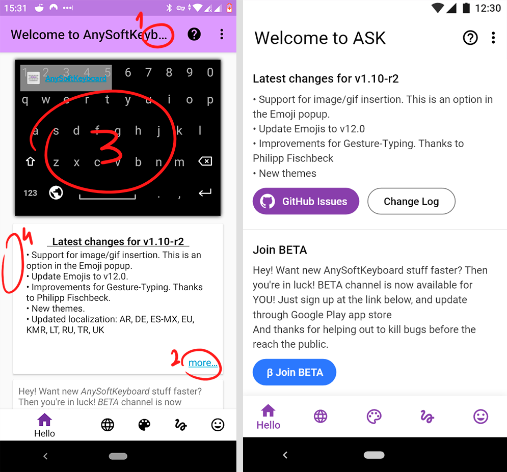
New alert message

Language screen
The only problem with this screen was the icons, I made them the same size and aligned them to the grid, and added color for the user's convenience
Remove all dots, they're not needed here

User Interface
- Too much empty space. So I changed the "UI" to "User Interface"
- Made the shadow much more transparent, as I have already written above the shadow only prevent perception
- There are too many tabs with the same name "tweaks". I changed the name and icon a little bit so that users don't get confused

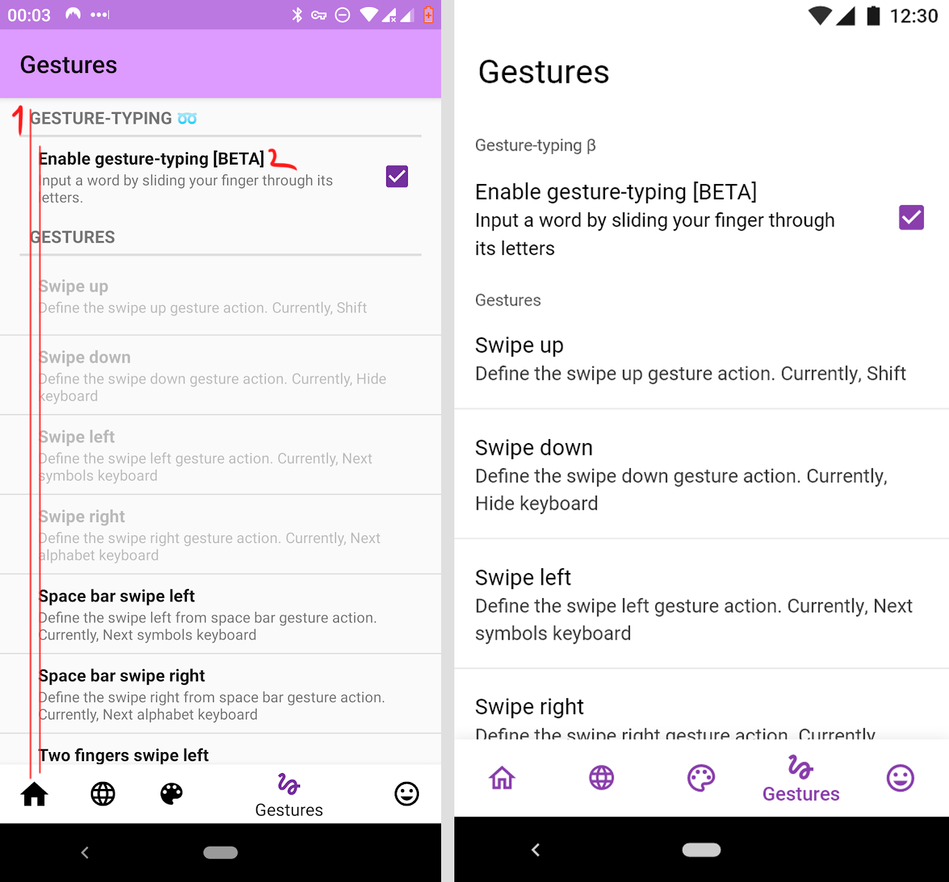
Gestures
- Aligned everything on the left side, it looks better and fits the material design guidelines
- Removed bold font
- Increased the size of the font on the guidelines, but it's purely optional
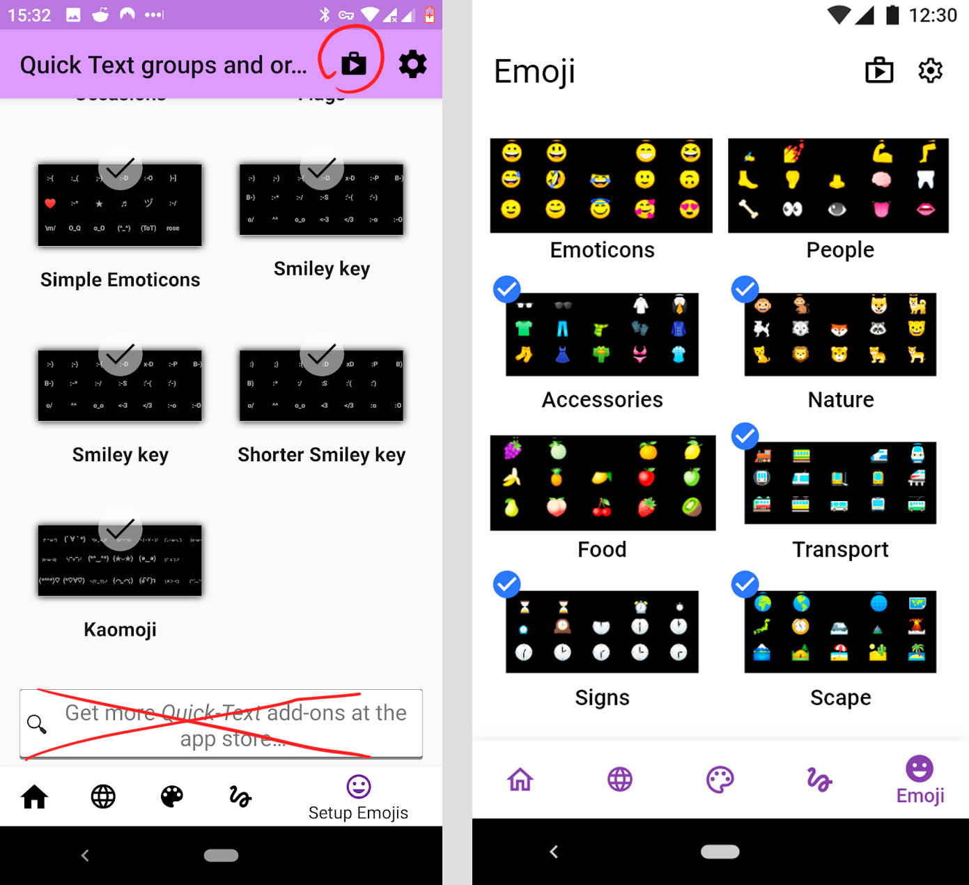
Emoji
- As well as on the welcome screen, the title does not fit so I shortened it
- Delete search box because it's duplicated with the Play Market button
- Changed the distance between the objects, it was too big
- Optional: I've changed "check" icon, I think it's better. Also, the selected objects become a bit smaller.
Icons and bottom bar
- In app, the filled and outline icons are used together - this is an mistake. I have replaced all the normal (inactive) icon buttons to Outline icons, and the active buttons to Filled icons
- Changed the distance between the buttons in the bottom bar
- Made them the same color
- Made bottom bar a bit wider

New dark theme

New app icon
Spacing
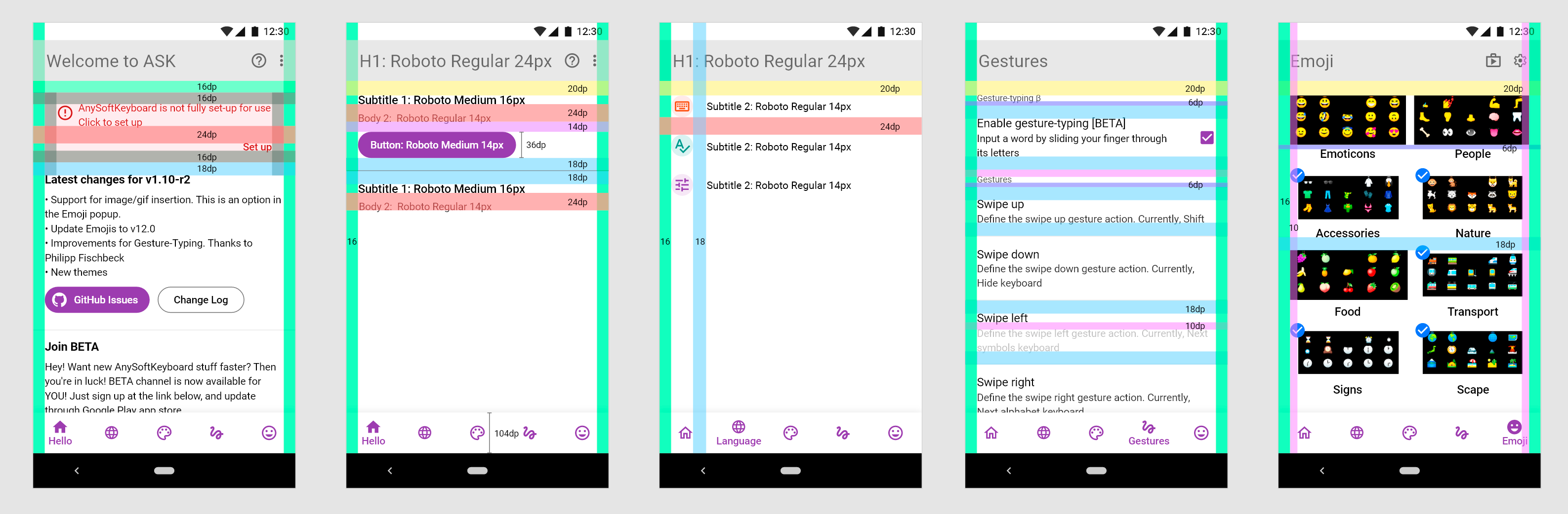
Type Scale
H1: Roboto Regular 24px
Subtitle 1: Roboto Medium 16px
Subtitle 2: Roboto Regular 14px
Button: Roboto Medium 14px
Body 1: Roboto Regular 16px
Body 2: Roboto Regular 14px
Caption: Roboto Regular 12px
Bottom Navigation: Roboto Medium 14px
Colors:
Light theme:
Magenta: #893EAC
Blue: #2B78FE
Caption font color: #525252
Alert message background: #FFEBEE
Alert message font color: #B71C1C
Body 2 font color: #323232
Dark theme:
Caption font color: #BF7FFF
Alert message background: #5B2B2A
Alert message font color: #FFFFFF
Body 2 font color: #A1A1A1
.png and .svg icons
 BurlyMynah
All 4 comments
Wow, these are very good suggestions @burlymynah. I will have a look at these and maybe iterate on them. I've left the project kinda behind and want to go back in.
 AnXh3L0
on 26 Nov 2019
AnXh3L0
on 26 Nov 2019
These are fantastic ideas indeed :)
 papb
on 26 Nov 2019
papb
on 26 Nov 2019
Looks very good!
 kojid0
on 13 Dec 2019
kojid0
on 13 Dec 2019
This looks great. One improvement that I think would improve user experience would be to separate out the keyboards for languages into categories per-language; e.g., Language > Enable keyboards and languages. > $LANGUAGE (would be a good place to use the flag svgs) > [All the keyboards for that language]. Of course, you would still be able to select as many keyboards from as many languages as you wanted.
 martholomew
on 14 Dec 2019
martholomew
on 14 Dec 2019
Related issues
 ezzarghili
·
4Comments
ezzarghili
·
4Comments
 ntninja
·
7Comments
ntninja
·
7Comments
 Rising-Soul
·
7Comments
Rising-Soul
·
7Comments
 ghost
·
5Comments
ghost
·
5Comments
 dbolton
·
6Comments
dbolton
·
6Comments
Most helpful comment
Wow, these are very good suggestions @burlymynah. I will have a look at these and maybe iterate on them. I've left the project kinda behind and want to go back in.