Antennapod: Make update time setting easier to use
Checklist
- [x] I have used the search function to see if someone else has already submitted the same feature request.
- [x] I will only create one feature request per issue.
- [x] I will describe the problem with as much detail as possible.
System info
App version: 2.0.0
Feature description
Problem you may be having, or feature you want:
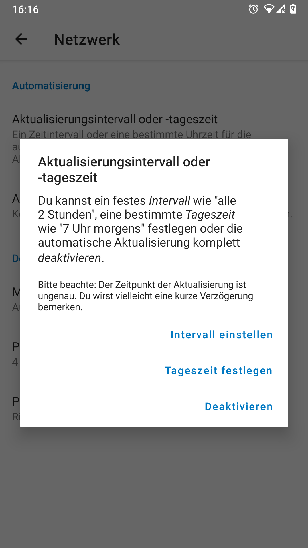
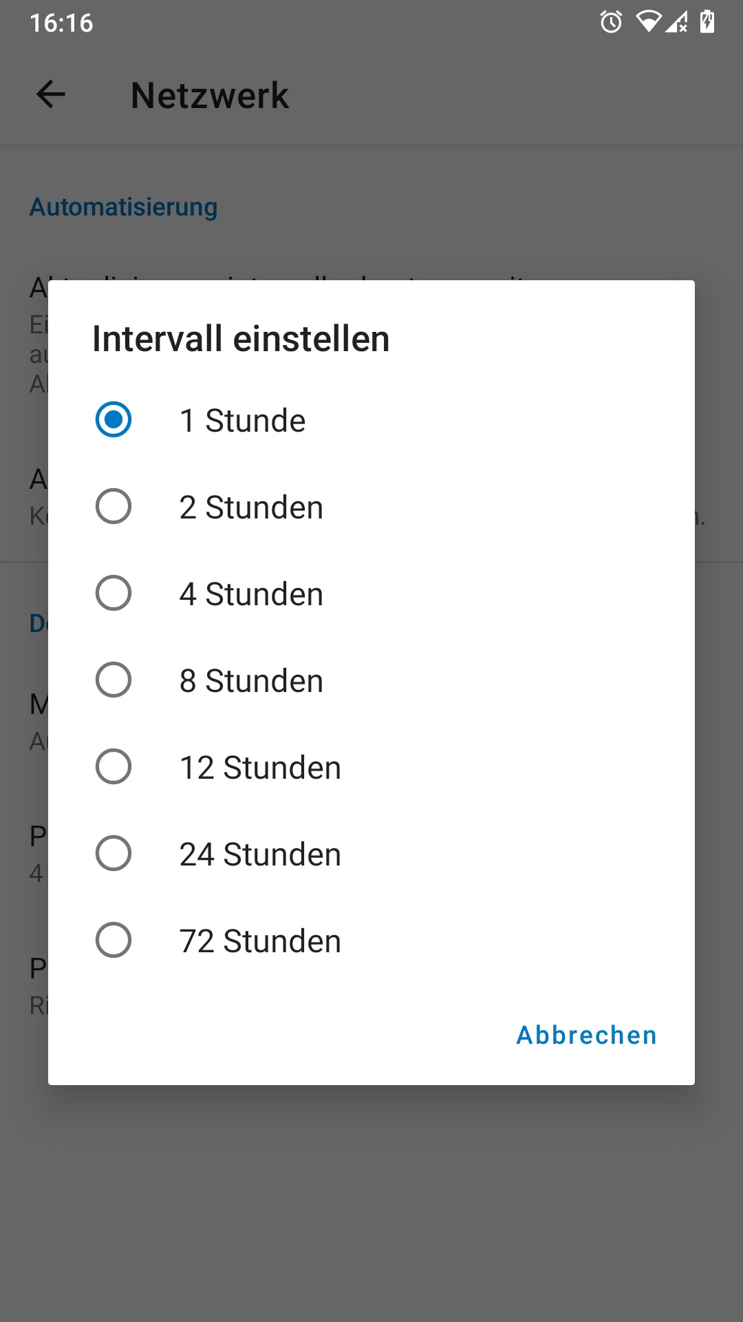
Settings » Network » Update time is a bit strange to use. It shows different popups when clicking, contains too much text and does not show the current state directly. All in all, it does not "feel" nice to me - dialogs change completely, no consistency.
Suggested solution:
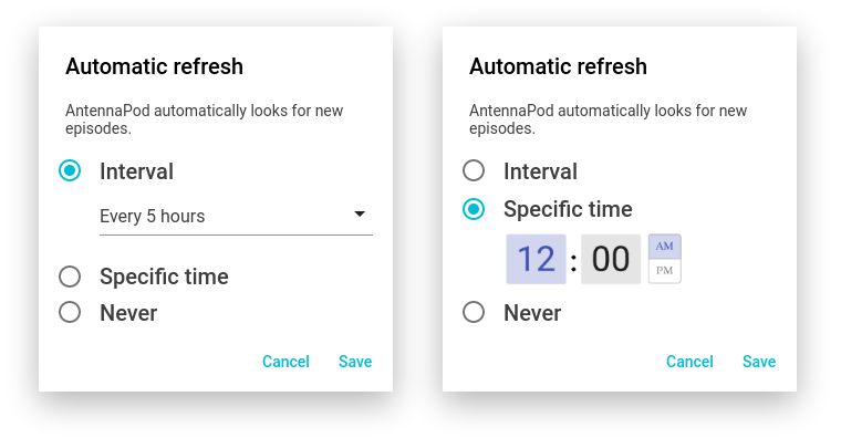
Rename to "Look for new episodes" or "Automatic refresh". Change the layout:
 ByteHamster
All 5 comments
I am interested in working on this issue
:D
 FivelMttz
on 1 Dec 2020
FivelMttz
on 1 Dec 2020
Thanks for suggesting this - nice improvement!
The title is tricky. First I thought of 'Automatic feed updates' (I find 'Refresh' a bit unclear). But I think "Look for new episodes" is better, as it clearly indicates what it does without using technical or vague terms like feed or refresh. It doesn't mention that it's about the time, but this will be apparent from the description.
As for the mock-ups, one comment: please, PLEASE no AM/PM system. It's the most confusing time annotation ever. If implemented, it should only be shown of it is the device default.
 keunes
on 2 Dec 2020
keunes
on 2 Dec 2020
@FivelMttz Should we assign to you?
keunes
on 2 Dec 2020
Yes, please 😁
FivelMttz
on 2 Dec 2020
(Will do tomorrow as it's not possible from the mobile app, but feel free to start already if you want ;) )
keunes
on 2 Dec 2020
Related issues
 reverse-unina
·
5Comments
reverse-unina
·
5Comments
 matthiasroos
·
3Comments
matthiasroos
·
3Comments
 yosefmizrahi
·
3Comments
yosefmizrahi
·
3Comments
 thom-github
·
3Comments
thom-github
·
3Comments
 fabolhak
·
3Comments
fabolhak
·
3Comments
Most helpful comment
I am interested in working on this issue
:D