Antennapod: Playback speed selection dialog looks too long and cluttered
App version: develop
Problem you are having:
User study result: User opened the dialog, yelled "WTF" and closed it as quickly as possible.
Suggested solution:
Redesign the dialog.
Mock-Up:
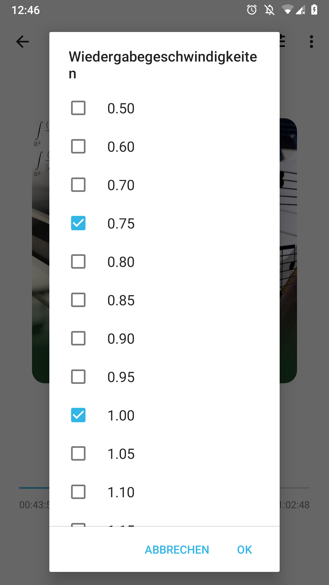
Old dialog, for reference:
 ByteHamster
All 23 comments
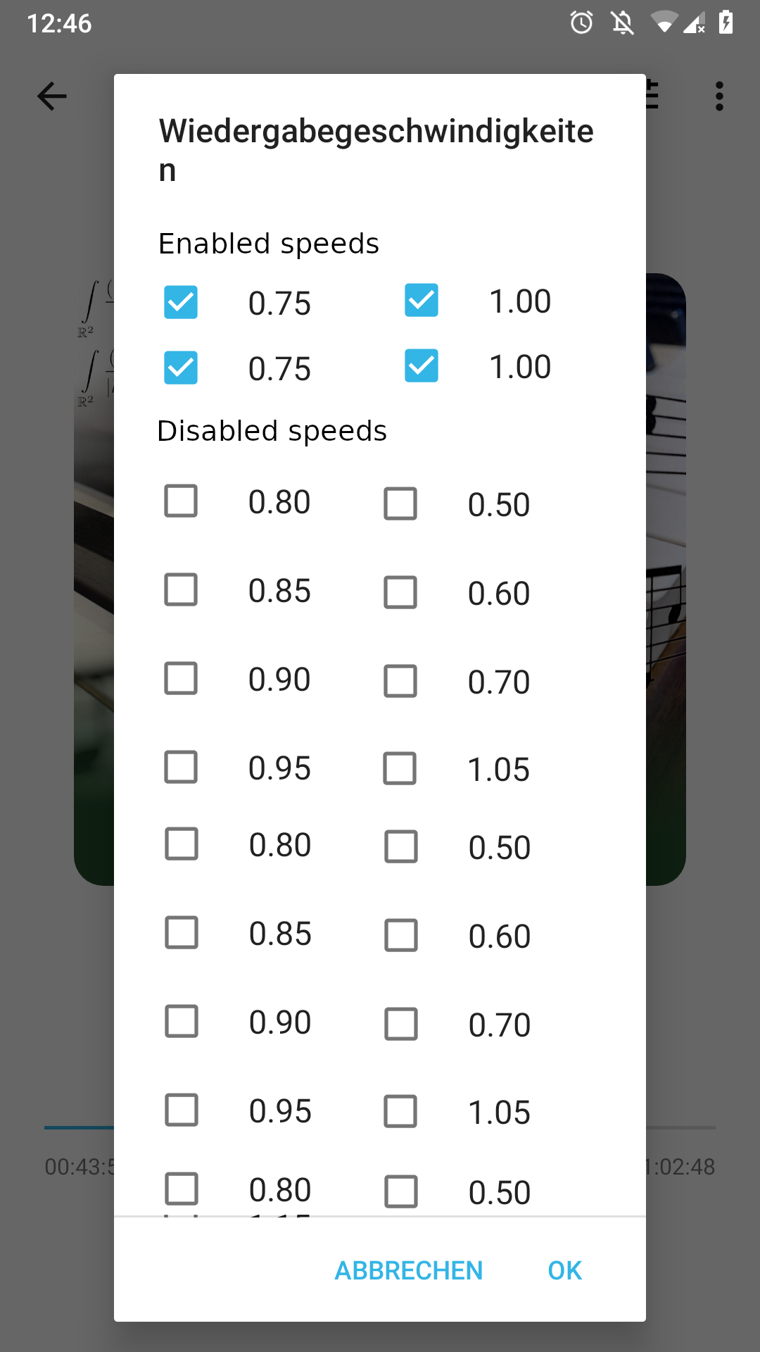
One suggestion is to show the options that are checked in the top area, separated from the potential values. Maybe a left and right area. Left area is what the users picked. Kinda of like this.
like this https://i.stack.imgur.com/Sict6.png
Or another option is to use 3 columns of values
 tonytamsf
on 6 Apr 2020
tonytamsf
on 6 Apr 2020
Another possibility would be to remove this setting completely.
If you want to change the playback speed, a seekbar will be displayed (like Voice does it). This way you can change the speed quickly without predefined values.
There are many ways to do this, here is some inspiration.
 egvimo
on 6 Apr 2020
egvimo
on 6 Apr 2020
Or another option is to use 3 columns of values
On my phone, the dialog fills more than 4 pages of the screen. So this alone is not enough, I think. Maybe two columns (so it is more clear which checkbox belongs to which button) combined with your other suggestion
One suggestion is to show the options that are checked in the top area, separated from the potential values.
This sounds like a good idea that we could try out. Maybe even using a RecyclerView that animates options to the new location :)
If you want to change the playback speed, a seekbar will be displayed (like Voice does it).
AntennaPod already has a seek bar on the "Playback controls" screen. I think that in a car, this button cycling through options is easier to use than a seek bar, where you need to look closely to set the right speed. Obviously, the setup screen that this issue is about should not be used when driving
ByteHamster
on 6 Apr 2020
AntennaPod already has a seek bar on the "Playback controls" screen. I think that in a car, this button cycling through options is easier to use than a seek bar, where you need to look closely to set the right speed. Obviously, the setup screen that this issue is about should not be used when driving
That's true, but how often is the speed actually changed in a car? I think it is set once and rarely changed.
egvimo
on 6 Apr 2020
I think that in a car, this button cycling through options is easier to use than a seek bar, where you need to look closely to set the right speed.
Or anywhere, if you ask me. I already imagine getting annoyed as I accidentally swiped up the speed to four times, making me miss a large part of the podcast ^^
To be frank this dialog always felt out of place. A long-press in the player doesn't feel like the right space for an app setting, for preferences that don't change daily. Instead, I would expect a short press to cycle through my preselected speeds as current, with a long press allowing me to:
- pick any from my preselected speeds
- optionally, additionally allow me to pick any speed I want (using seekbar or number field)
- give me a quick pass to a dialog where I can change my app preference (the preselected speeds)
 keunes
on 6 Apr 2020
keunes
on 6 Apr 2020
Instead, I would expect a short press to cycle through my preselected speeds as current, with a long press allowing me to
This sounds like a request for new features. I actually think it is okay to have the setting there. It is also buried somewhere on the settings screen but that is harder to find than long-pressing.
ByteHamster
on 6 Apr 2020
One suggestion is to show the options that are checked in the top area, separated from the potential values.
I think this looks like a pretty good idea. Already a lot better than the current dialog.
With a RecyclerView and GridLayoutManager, this should even animate nicely when clicking an option :)
ByteHamster
on 7 Apr 2020
Yup, nice
tonytamsf
on 7 Apr 2020
How about the following idea. Starting from the dialog above there would be a section where already enabled speeds would be displayed. But to select new speeds, there is a seekbar instead of all these predefined options. This seekbar could be used to choose desired value and then the value would be added to the existing ones. This way you would still have the predefined speeds that can be selected by tapping during the playback, but with a cleaner settings menu.
egvimo
on 7 Apr 2020
This sounds like a request for new features.
It may technically be 'new' to present a list of preselected speeds, but the list already exists. The only 'new' thing would be to present them as an actionable list. Splitting an app setting from speed selection for the player doesn't sound out-of-scope to me, here.
(Note: the slider/number input could be nice additions, but I don't see the strict need and included them from what was mentioned before, for completeness.)
I actually think it is okay to have the setting there. It is also buried somewhere on the settings screen but that is harder to find than long-pressing.
For me the main reason to propose this, is because I have 7 preselected speeds to cycle through. Going through long-press and selecting the speed is faster than tapping six times.
This is how I envision it: one extra screen, with quick option to go to selector.
 -->
-->
keunes
on 7 Apr 2020
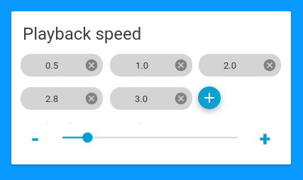
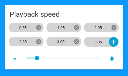
Combining both of your suggestions, what do you think about this? Clicking the options and moving the slider would directly set the speed. Pressing the + button adds the currently selected speed to the list.
ByteHamster
on 7 Apr 2020
Looks like we found a good layout. This is a pretty self-contained change, so I will mark this as "Good first issue". For anyone wanting to implement this: you can borrow some code from PlaybackControlsDialog.java as a starting point.
ByteHamster
on 8 Apr 2020
Pressing the + button adds the currently selected speed to the list.
One note: if done like that, you don't know what you're adding until you hit the + button. Either there should be some text field, or the current value of the bar should be displayed somehow.
keunes
on 9 Apr 2020
One note: if done like that, you don't know what you're adding until you hit the
+button. Either there should be some text field, or the current value of the bar should be displayed somehow.
You could display the current value directly beside the + button.
And please use two decimal places like it is now (the "jumps" could be rounded to 0.05).
Something like:
egvimo
on 9 Apr 2020
I don't even think a set of presets is necessary. I think just up and down buttons cycling through in 0.05x increments would be enough IMO. It could just be 2 buttons in the playback view.
 stevenroose
on 23 May 2020
stevenroose
on 23 May 2020
You could display the current value directly beside the + button. [@egvimo]
I like it & gave it a thumbs-up, but have one comment: it should visually be distinct from existing values. So e.g. give it a border instead of full background fill.
I don't even think a set of presets is necessary [@stevenroose]
I wouldn't personally need them necessarily. But some users indicated they listen some podcasts up to four (4!) times the normal speed. Imagine reaching that number with 0.05 increments ;)
keunes
on 24 May 2020
I wouldn't personally need them necessarily. But some users indicated they listen some podcasts up to four (4!) times the normal speed. Imagine reaching that number with 0.05 increments ;)
What about like you said making + button not filled and making it directly editable ? To make it obvious it is editable, five seconds after having moved slider, there could be a cursor caret blinking inside.
If so I would suggest for the slider to have .25 increment. Advanced user who want to fine tune speed could still edit it to whatever they want.
 Matth7878
on 24 May 2020
Matth7878
on 24 May 2020
What about like you said making + button not filled and making it directly editable ? To make it obvious it is editable, five seconds after having moved slider, there could be a cursor caret blinking inside.
If so I would suggest for the slider to have .25 increment. Advanced user who want to fine tune speed could still edit it to whatever they want.
- I don't see the benefit of making the '+ button' directly editable, compared to using the slider or + and - signs. If the numbers immediately update on slider action, just having the slider as input method would be enough.
- Also, such directly editable (number input) setting will not be a suitable alternative for those listening at 1 _and_ at 4 times the speed, given the number of taps required: 1) select the speed button in the player 2) select the field 3) type '4' or '1' respectively 4) press 'ok'
keunes
on 24 May 2020
I overlooked the fact that you can slide directly to the speed you want instead of using -/+ button. It's why I proposed that.
So you are right no need to be able to edit it.
Matth7878
on 24 May 2020
I overlooked the fact that you can slide directly to the speed you want instead of using -/+ button.
I mean, I'm not sure, as I'm not coding the thing and can't code so can't check developments. But that's how I interpreted the 'knob' in the middle of the slider :)
keunes
on 24 May 2020
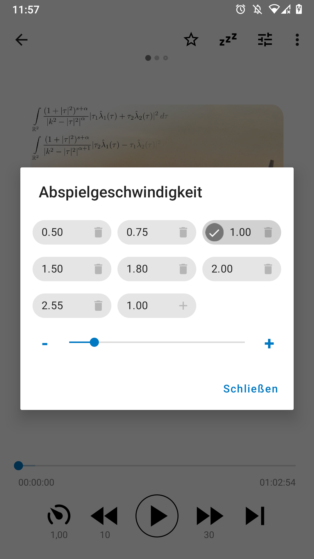
I created a first draft for this feature. It looks better but I do not think that it "feels" right. Especially adding new items is a bit strange, I think. I would be happy about feedback. You can download a test version (that installs alongside your existing app) here: https://drive.google.com/file/d/1TFqnCKJBwWOt0my8wtjPf0FR8S73iFBS/view?usp=sharing
ByteHamster
on 28 May 2020
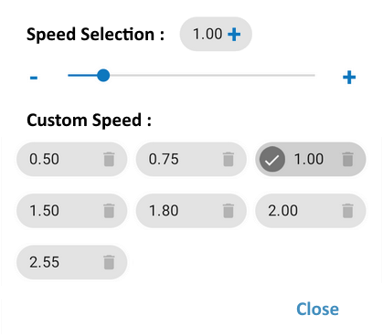
I think it would be better to have slider above since a user could have a lot of custom speed and so slider will not be visible.
Besides speed should be shown next to slider to display which speed is selected even if it is not a custom speed. And It shouldn't be displayed in custom speed if it was not added.
I tried to make a mockup so it is more understandable :
Matth7878
on 28 May 2020
Good idea, thanks! Current state:
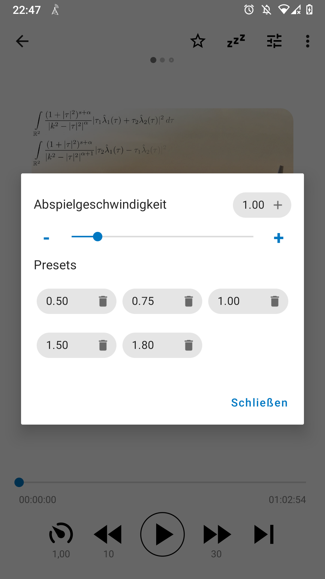
- Making the plus icon blue does not work. The chips tint the icons automatically
- I removed the checkbox highlighting the current speed. The checkboxes looked pretty strange while moving the slider (just flashing shortly).
ByteHamster
on 28 May 2020
Related issues
 mamehacker
·
3Comments
mamehacker
·
3Comments
 fabolhak
·
3Comments
fabolhak
·
3Comments
 thom-github
·
3Comments
thom-github
·
3Comments
 chaulo
·
4Comments
chaulo
·
4Comments
 gappleto97
·
3Comments
gappleto97
·
3Comments
Most helpful comment
Combining both of your suggestions, what do you think about this? Clicking the options and moving the slider would directly set the speed. Pressing the
+button adds the currently selected speed to the list.