Antennapod: Feature: sorting options in podcast view
App version: 1.6.4.1 (from F-Droid)
Android version: 7.1.2 (lineageOS)
Device model: Fairphone 2
I have a lot of old unlistened episodes across many podcasts. In addition to being able to only see the unlistened episodes in some view (#2120), it would be most useful to have a way to sort the episodes in the podcast view (when choosing a particular podcast). Ideally, one would have the same sorting options than the ones available in the three gears menu.
 brabalan
All 16 comments
Rather than 'sorting', would 'filtering' not better suit your goal of finding unlistened episodes of a specific podcast? Filtering already is available in the podcast view ![]()
If it's really sorting you're after, can you describe your use case? Why do you want to sort, and on what characteristics?
(Sorry to be asking these questions, but your issues was kinda two-in-one, which makes it more difficult to deal with)
 keunes
on 10 Jan 2018
keunes
on 10 Jan 2018
I already use filtering to only show episodes that I have not listened to and that are not in the queue.
My use case: I have podcasts with 100 episodes to listen. Each time I want to add one to the queue, I need to scroll all the way down to get the oldest one. If I could sort them from oldest to newest, I would not need to scroll down and simply pick the first one.
brabalan
on 11 Jan 2018
I'd be also interested in this. In my case it would be great for a podcast of several pen-and-paper games running in parallel. Sorting by alphabetical order would be great for finding certain game sessions.
 Moredread
on 24 Apr 2018
Moredread
on 24 Apr 2018
@brabalan For (individual) podcast screen, there is a workaround that might be a tad easier than scrolling all the way down in some cases.
- On podcast screen, click multiple selection button (the one next to filter)
- Over there, you can then specify sorting with the oldest first, and use multiple select
 to select all unplayed episode.
 - You can then scroll down until you reach the first selected episode, i.e., the first unplayed episode, say, episode A
- You then un-select all, and re-select episode A, click download.
 orionlee
on 9 Jun 2018
orionlee
on 9 Jun 2018
I would really like this as well. It takes some effort to scroll down, in a podcast with several hundred episodes. Having a sort button in podcast view would be ideal.
 BlueGreenMagick
on 30 Sep 2019
BlueGreenMagick
on 30 Sep 2019
The following is the proposed UX changes.
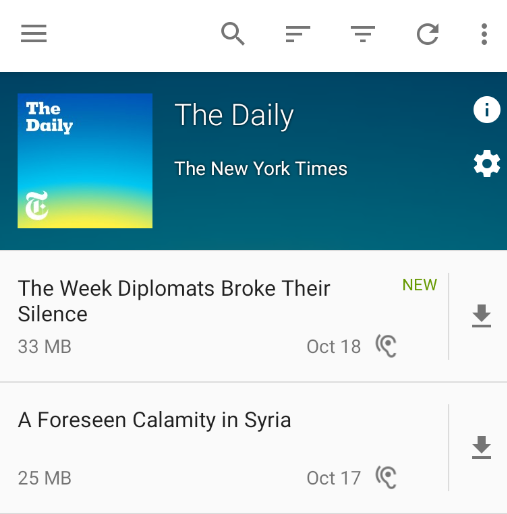
A new sort item in action bar menu:
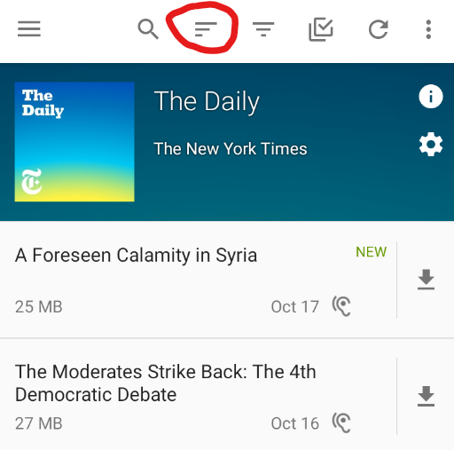
Tapping it will bring up a dialog for sort options (the same as the ones in batch edit screen)
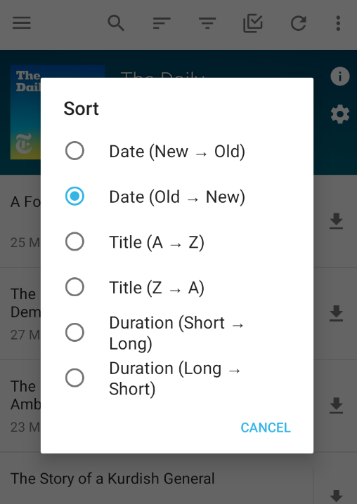
The specified sort option is remembered: it is applied whenever the user goes back to the specific podcast.
orionlee
on 17 Oct 2019
A new sort item in action bar menu
I am not too happy with this. We already have a ton of icons. Maybe we can move sorting or batch editing to the overflow menu instead. I think sorting is used less frequently and it does not break muscle memory if it is added in the overflow menu.
 ByteHamster
on 17 Oct 2019
ByteHamster
on 17 Oct 2019
I'm a tad uneasy with the amount of icons too.
On the flip side, I put it next to filter because when an app has both filter and sort (e.g., file managers), they are usually next to one another. So putting sort to overflow menu arguably breaks some unspoken convention / muscle memory.
orionlee
on 18 Oct 2019
This is a cool feature, since the current sorting of the episode list doesn't work well with Podcasts I want to follow up from the start on, i.e. back to front. Always scrolling down to the first unlistened episode is cumbersome. Sorting them from old to more recent is something I miss often.
 maxbechtold
on 18 Oct 2019
maxbechtold
on 18 Oct 2019
On the flip side, I put it next to filter because when an app has both filter and sort (e.g., file managers), they are usually next to one another.
Okay, so let's move batch editing to the overflow menu and hope that users don't complain
ByteHamster
on 18 Oct 2019
The revised UI, with batch edit moved to the overflow menu.
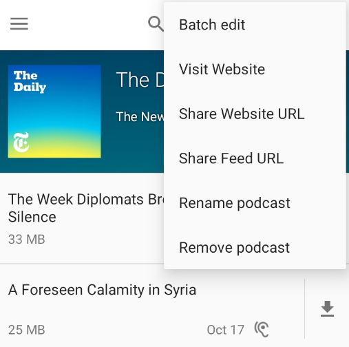
Given that we don't really put title on action bar in podcast screen, I feel leaving batch edit on action bar is okay too, if a tad too busy visually.
orionlee
on 18 Oct 2019
I would suggest that you change either the sort or the filter symbol in order to have a bigger differentiation. Examples:
 mruessler
on 21 Oct 2019
mruessler
on 21 Oct 2019
I felt the same, even though I know that those are the official Android sort/filter icons. I would prefer the first icon you posted but taking it from https://materialdesignicons.com/ (because we already reference their license on the about screen).
ByteHamster
on 21 Oct 2019
I've seen the solid filter icon in a few other apps as well.
One potential downside is the existing icon is quite prominent: users see it whenever they go to podcast screens (both sort and filter icons are on bulk edits too, but it's much less frequently accessed). Changing it now might be an unpleasant surprise.
Another possible design it to move sort (might be filter too) into a little bar above the list, and have them spelled out.
Google Drive does something similar:
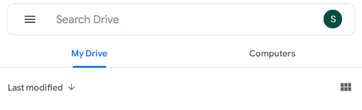
We already have a mini bar when filter is enabled, which could possibly be generalized to support sort / filter there.
orionlee
on 22 Oct 2019
Changing it now might be an unpleasant surprise.
Why? I hope users can live with a different icon.
Another possible design it to move sort (might be filter too) into a little bar above the list, and have them spelled out.
I don't like this too much. It would permanently take away screen space for a feature that beginner users don't need.
ByteHamster
on 22 Oct 2019
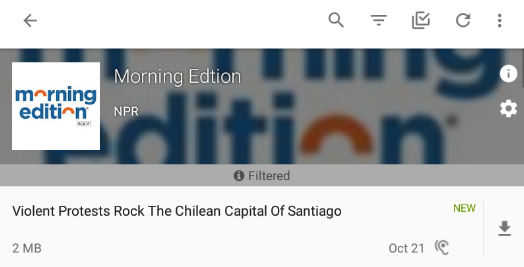
The latest commit uses an outlined funnel for filter:

orionlee
on 23 Oct 2019
Related issues
 reverse-unina
·
5Comments
reverse-unina
·
5Comments
 benediktg
·
4Comments
benediktg
·
4Comments
 yosefmizrahi
·
3Comments
yosefmizrahi
·
3Comments
 AAM1119
·
3Comments
AAM1119
·
3Comments
 gappleto97
·
3Comments
gappleto97
·
3Comments
Most helpful comment
I already use filtering to only show episodes that I have not listened to and that are not in the queue.
My use case: I have podcasts with 100 episodes to listen. Each time I want to add one to the queue, I need to scroll all the way down to get the oldest one. If I could sort them from oldest to newest, I would not need to scroll down and simply pick the first one.