Ant-design-mobile: Custom style with V 2.0.0-alpha.4 doesn't work
What problem does this feature solve?
I tried custom badge style like #1629,but it doesn't work.
Here's my test code.
custom.js
It says Import badge module has no default module.
import badgeStyle from 'antd-mobile/lib/badge/style/index'

export default {
    ...badgeStyle,
    primaryHighlight: {
        padding: 0,
        backgroundColor: '#fff',
        color: '#f19736',
        // borderStyle: 'solid',
        // borderWidth: 1,
        // borderColor: '#f19736',
    }

}
use space
import React, {Component} from 'react'
import {StyleSheet, View, Button,Text} from 'react-native'
import {List, Flex, Badge} from 'antd-mobile'
import {connect} from 'dva'

import {NavigationActions} from '../utils'
import {customBadge} from '../styles/customBadge'

const Item = List.Item

@connect()
class Account extends Component {

    gotoLogin = () => {
        this.props.dispatch(NavigationActions.navigate({routeName: 'Login'}))
    }

    render() {
        return (

            <View style={styles.container}>
                <List>
                    <Item style={{alignItems: 'center'}} arrow="empty">
                        <Flex justify="center">
                            <Flex>
                                <Badge style={customBadge} text={'陈jie'}/>
                            </Flex>
                        </Flex>
                    </Item>
                </List>
                <Button title="Goto Login" onPress={this.gotoLogin}/>
            </View>
        )
    }
}
package
"antd-mobile": "^2.0.0-alpha.4",
"dva": "^1.3.0-beta.4",
"expo": "^19.0.1",
"react": "16.0.0-alpha.12",
What does the proposed API look like?
ref #1629
 AlberZ1989
All 19 comments
@AlberZ1989
import customBadge from '../styles/customBadge'
 silentcloud
on 3 Aug 2017
silentcloud
on 3 Aug 2017
@silentcloud
It doesn't work .
Warning: Failed prop type: Invaild props.style key 'primaryHighlight' supplied to 'View'.
AlberZ1989
on 3 Aug 2017
@AlberZ1989 Hope you can read #1629 doc carefully...
styles , not style
<Badge styles={customBadge} text={'陈jie'}/>
@silentcloud 为什么我这样写没用呢。。。
import inputItemStyle from 'antd-mobile/lib/input-item/style/index';
export default {
    ...inputItemStyle,
    primaryHighlight: {
        fontSize:12,
        backgroundColor:'red'
    },
}
import inputStyle from '../../custom/input-item';

 ... styles={inputStyle}
 cielu
on 8 Aug 2017
cielu
on 8 Aug 2017
@cielu 你用的 2.0?
组件有没有传 styles?
<InputItem styles={inputStyle} ... />
silentcloud
on 8 Aug 2017
@silentcloud 对啊,本来用1.6的,发现改样式太麻烦了,就用到2.0了,然后结果没反应。。。
传了哦
cielu
on 8 Aug 2017
@silentcloud 啊,希望对这种组件的API多一点。。
不能定义字体大小,能改item的每个高度都行啊。。。都被固定死了。。。
之前好多地方想用它,可是都望而却步了。。
改不动样式。。。然后很无奈
cielu
on 8 Aug 2017
@silentcloud 回归到 Toast ,Toast 如果能自定义出现的位置就好了,,,比如上,中,下。。
可是也被固定在中间了。。。啊 啊啊 啊 ,,强迫症好纠结
cielu
on 8 Aug 2017
@cielu 我等会看一下,传个例子
silentcloud
on 8 Aug 2017
@silentcloud 你直接用 InputItem ,然后引入一个自定义的 styels , 试试看。。。我用了,无任何反应。。
后面说的toast位置,意思就是toast展示的位置,很多时候我们的通知都是toast在底部的,中间一般是网络加载之内的。。。
cielu
on 8 Aug 2017
 inputItemStyle from 'antd-mobile/lib/input-item/style/index';
export default {
    ...inputItemStyle,
    primaryHighlight: {
        fontSize:12,
        backgroundColor:'red'
    },
}
cielu
on 8 Aug 2017
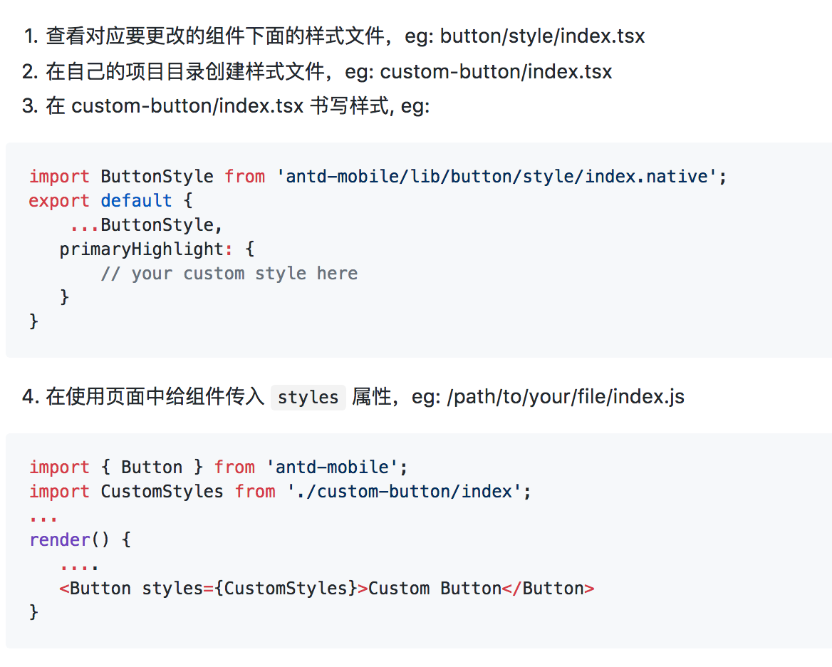
@cielu 我试了,没问题的哈, demo 例子 https://github.com/ant-design/antd-mobile-samples/tree/master/rn-custom-ui, 要注意,2.0.0-alpha.4 现在 rn 的组件改了后缀了,所以是 style/index.native
silentcloud
on 8 Aug 2017
@silentcloud 改了后缀也没反应。。。难道是还有其他步骤要做??
我没引入到主题里,跟这个修改方式一样,你看看
cielu
on 8 Aug 2017
@cielu 你把你的代码打包上传上来吧,不然我也不知道你哪里问题
silentcloud
on 8 Aug 2017
@silentcloud react-native-cli 应该会自己优先尝试加载 .native, 所以用户代码可以不用指定才对
 paranoidjk
on 8 Aug 2017
paranoidjk
on 8 Aug 2017
主代码.zip
@silentcloud
cielu
on 9 Aug 2017
@paranoidjk 嗯,一时忽略了
@cielu 额,InputItem 哪里有 primaryHighlight 的样式?
只有 container, text, input, extra, errorIcon
primaryHighlight 这个只是我举例的 button 里的,你不能直接照抄例子吧
silentcloud
on 10 Aug 2017
@silentcloud 第一次用,不知道这玩意的用法,没注明啊。。。
cielu
on 12 Aug 2017
把styles看成了style然后顺着google找到了这个issue....看的还不够仔细啊
 jianggaocheng
on 22 Jun 2018
jianggaocheng
on 22 Jun 2018
Related issues
paranoidjk
·
4Comments
 tolg
·
4Comments
tolg
·
4Comments
 Calinas
·
4Comments
Calinas
·
4Comments
 zhangshuaidan
·
3Comments
zhangshuaidan
·
3Comments
 dongchuanlei
·
4Comments
dongchuanlei
·
4Comments
Most helpful comment
@AlberZ1989