Angular-gridster2: is it auto resize possible?
Hi, first off all tnx for creating this, it is really awesome.
Everything is working fine ( frontend and backend side), I just have one question. My grid is of type: 'fixed', (125x125 is size of fixedColWidth and fixedRowHeight, basically square shapes with some elements inside of them). Is it possible for entire grid to be responsive ( aka each time when we resize browser and change screen size entire grid to automatically change size and fit to screen with colSize and rowSize proportionally scaled)?
Tnx in advance
 Vojislav-Vukovic
All 6 comments
what you describe sounds much like grid-type: "fit to screen".
what's the difference?
 tmtron
on 20 Apr 2019
tmtron
on 20 Apr 2019
@tmtron Difference is that scaling in 'fit to screen' is not consistent for my use case - check it out on demo page and resize window. In my case I have some circles and squares inside grid so when scaling in this mode they are becoming deteriorated (because width is changing, height is not). That is why I asked for proportionally scaling (if we resize width, height of grid is auto-reduced together with it). I will try out some solutions.
Vojislav-Vukovic
on 20 Apr 2019
Hi @Vojislav-Vukovic ,
You want something to keep the same ratio and since you have square widgets configured maybe try scrollVertical since in that grid type the height of the row will be equal to width of the column.
 tiberiuzuld
on 12 May 2019
tiberiuzuld
on 12 May 2019
Thank you very much @tiberiuzuld . I will try it out just from curiosity because eventually I've changed it to 'fit to screen' and refactored CSS for my objects inside of grid items. Lot of work, but it's all good now :) Tnx again for your help
Vojislav-Vukovic
on 22 May 2019
@Vojislav-Vukovic how did you get it? because in my case, I have 6 col grid and X rows , But, when I refresh the browser, it does not resize correctly. After I drag an item, it resizes correctly. I add two pictures so you can see the difference.
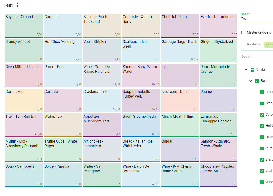
This is when I first get into the grid view
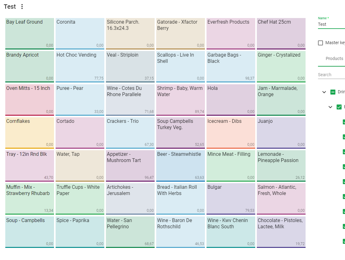
This is how it looks like after dragging an item. You can see the first image the last item gets 'cut'. Can u help me?
 Estevete
on 4 Jul 2019
Estevete
on 4 Jul 2019
Hi @Vojislav-Vukovic ,
You want something to keep the same ratio and since you have square widgets configured maybe tryscrollVerticalsince in that grid type the height of the row will be equal to width of the column.
Hi, can we achieve the same behavior, but with any scrolling on gridster element, like gridster can use any available width and height of parent but with maintaining aspect ratio of gridster-item?
 mujahid-akbar
on 7 Jan 2021
mujahid-akbar
on 7 Jan 2021
Related issues
Vojislav-Vukovic
·
4Comments
 jayoma
·
3Comments
jayoma
·
3Comments
 Abdullah-96
·
5Comments
tiberiuzuld
·
3Comments
Abdullah-96
·
5Comments
tiberiuzuld
·
3Comments
 MaiGhoneem
·
4Comments
MaiGhoneem
·
4Comments
Most helpful comment
Hi @Vojislav-Vukovic ,
You want something to keep the same ratio and since you have square widgets configured maybe try
scrollVerticalsince in that grid type the height of the row will be equal to width of the column.