@jancborchardt and me went over dark mode and found some things to do
- [x] #5739 heading, blue background: text should stay white
- [x] #5739 triangle in drawer -> white
- [x] #5739 share icons: more users -> white
- [x] #5739 file detail sharing: above act/sharing -> white line should be same like receive external files line
- [x] activity/notifications:
- [x] invert all except "file_created" and "file_deleted"
- [x] remove background circle
- [x] remove white border from shared_via_link
- [x] #5739 notifications: button:
- [x] #5739 light: background (light gray), no border
- [x] #5739 dark: background: ligth gray, no border
- [x] #5739 + button: white color
- [x] long press:
- [x] weird header, status bar same dark gray
- [x] on selected item: subline lighter
- [x] highlight: darker
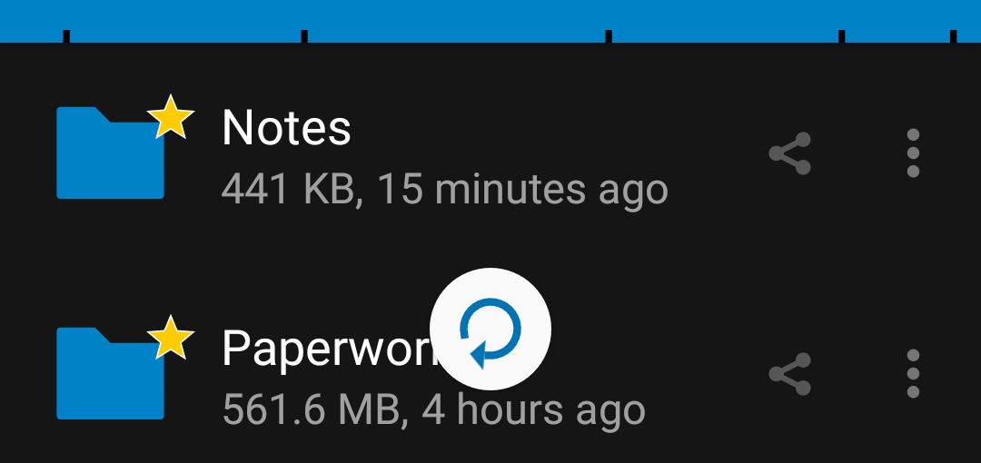
- [x] #5739 In the file list, the favorite icon needs a dark outline instead of white. Also the "Person" icon on the right should be light (very barely visible now):

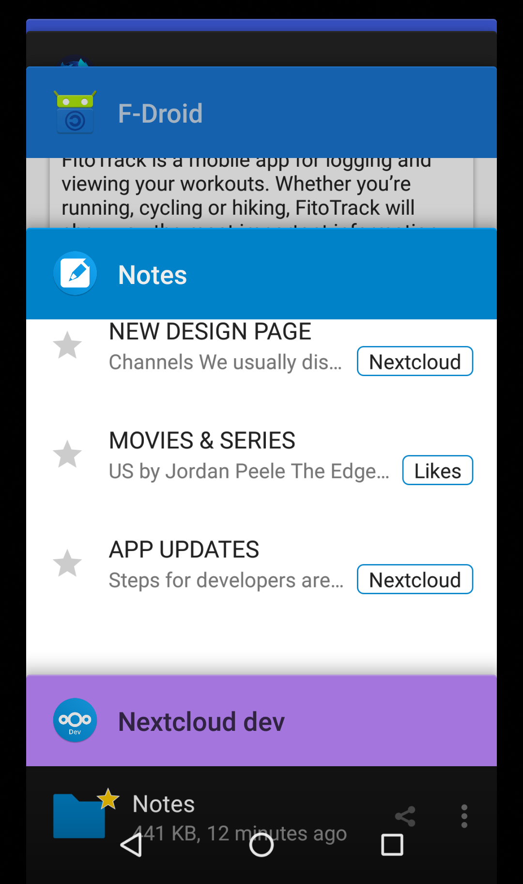
- [x] #5739 The triangle for account switching in the sidebar should be light:

- [x] #5739 The lines in the "Add" menu should be dark as well:

- [x] #5739 The refresh spinner could be dark as well?
- [x]
Toasts could be dark as well:

- [x] The header color in the app switcher looks off – this is not themed:
@AndyScherzinger @dan0xii maybe you have time and want to help out? :heart:
 tobiasKaminsky
All 22 comments
remove background circle
So how do we "re-colorize" the icons? We added the circle so the icons would just get visible again for dark them (is that the invert task?)
 AndyScherzinger
on 31 Jan 2020
AndyScherzinger
on 31 Jan 2020
Yes.
All icons are black, so we invert them on dark mode.
File_created (green +) and file_deleted (red x) can remain the same.
tobiasKaminsky
on 31 Jan 2020
This request did not receive an update in the last 4 weeks. Please take a look again and update the issue with new details, otherwise the issue will be automatically closed in 2 weeks. Thank you!
![stale[bot] picture](https://avatars3.githubusercontent.com/in/1724?v=4&s=40) stale[bot]
on 28 Feb 2020
stale[bot]
on 28 Feb 2020
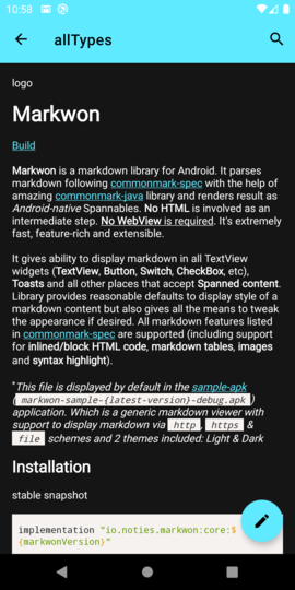
Hi, should the markdown editor also get a dark theme? (or should that be reported in another GitHub project?)
With Nexcloud for Android Beta 3.11.0 RC3, the editor defaults to black text on white background, when e.g. editing the Readme.md file in a directory.
 moviuro
on 23 Mar 2020
moviuro
on 23 Mar 2020
Hi, should the markdown editor also get a dark theme?
Yes, it should :-)
or should that be reported in another GitHub project?)
Depends: when viewing the readme / folder info, then it is within this repo.
When editing a text file, then it is https://github.com/nextcloud/text/
tobiasKaminsky
on 24 Mar 2020
Depends: when viewing the readme / folder info, then it is within this repo.
When editing a text file, then it is https://github.com/nextcloud/text/
Specifically when I edit a Readme.md file in the Android app, the text zone is black on white. See https://sco.popho.be/s/Z2ANg6m22jTaRfX
moviuro
on 24 Mar 2020
Which version do you use?
Can you try 3.11RC4 which is available via Fdroid/play store beta program?
For me it looks good:
tobiasKaminsky
on 24 Mar 2020
I have the 3.11.0RC4 too. I was editing the mardown file, not just viewing it. What happens when you tap the pencil icon at the bottom right?
moviuro
on 24 Mar 2020
Then the text editor is launched, which is then an issue of the above repo :-)
tobiasKaminsky
on 24 Mar 2020
Here are some screenshots of the specific points to illustrate what is left to do:
EDIT: moved to the main description
 jancborchardt
on 24 Mar 2020
jancborchardt
on 24 Mar 2020
I've made a start on these issues in #5353-dm. https://github.com/nextcloud/android/commit/f868b5a3c3871794f03cea25fd4892da88466a1c fixes three from Jan's post at least and I'm working on the rest.
 dan0xii
on 25 Mar 2020
dan0xii
on 25 Mar 2020
The lines in the "Add" menu should be dark as well:
@jancborchardt why? In the light theme they are dark (=text color), so either
- they stay light (for the dark) theme or
- get removed completely
The dividers are there to divide the menu item groups. Other than that they should be rather
- light grey (for dark and light theme)
- have a padding on the left and start with the text, see GDrive for example
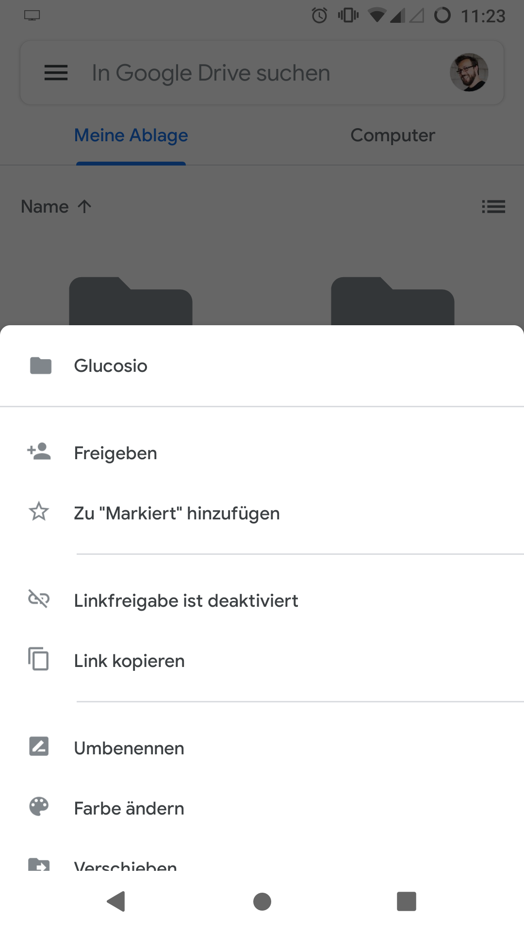
So other than that I'd also propose to:
- not tint the icons anymore in this bottom menu(s) but rather use the grey version (except for the doc-types (like we do now for collabora/OO
AndyScherzinger
on 25 Mar 2020
or we raise the margin between the menu item groups (like in the drawer menu, for consistency)
AndyScherzinger
on 25 Mar 2020
@AndyScherzinger the lines should just not be so bright, but more like the color of the subline in the file list, or the 3-dot icon. :) They are only dividers, not to call attention to themselves.
jancborchardt
on 26 Mar 2020
@jancborchardt
the lines should just not be so bright, but more like the color of the subline in the file list, or the 3-dot icon. :) They are only dividers, not to call attention to themselves.
DONE 👍
Toasts could be dark as well:
Let's discuss this one because Android does it "the other way around", so on light theme toasts are dark and on dark themes toast are light. This is done by Android OS, so I'd keep it this way (since that is standard Android behavior/coloring)
AndyScherzinger
on 27 Mar 2020
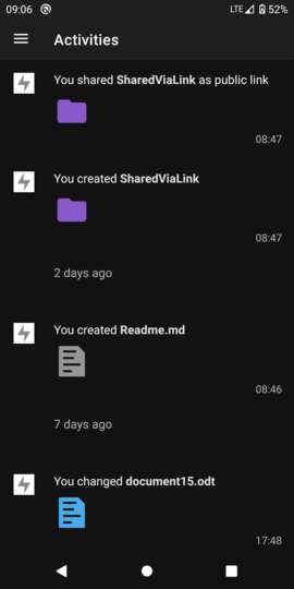
activity/notifications:
invert all except "file_created" and "file_deleted"
I don't understand what's meant here.
remove background circle
Done.
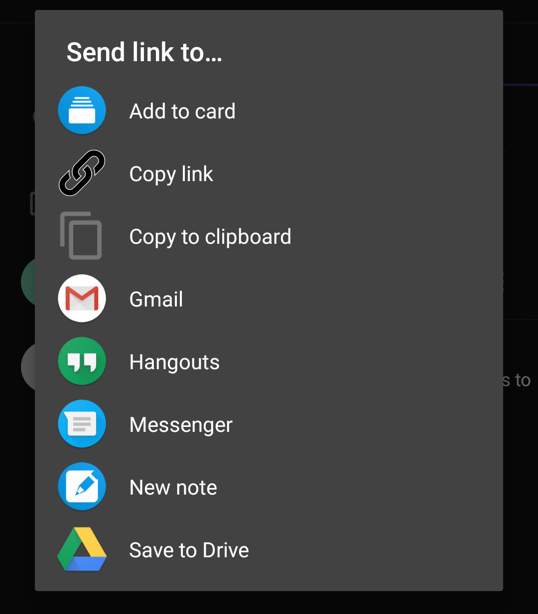
remove white border from shared_via_link
Is "Copy link" below the icon you're referring to?
dan0xii
on 4 Apr 2020
@dan0xii you need to add a new, second link icon, the one used so far has the stroke color on purpose since it is also used as an overlay on images.
AndyScherzinger
on 4 Apr 2020
invert all except "file_created" and "file_deleted"
@dan0xii all icons except the ones for the two activities mentioned above are black and thus need to be inverted before display. The icons are fetched from the server for each activity.
AndyScherzinger
on 4 Apr 2020
@tobiasKaminsky
invert all except "file_created" and "file_deleted"
Any idea how to do this? I found examples for Glide 4, but we are still stuck on Glide 3 due to the large efforts needed to migrate to 4. Any ideas how to solve this for our case?
AndyScherzinger
on 20 Apr 2020
Should be something like
myImageView.setColorFilter(Color.WHITE, PorterDuff.Mode.XOR);
tobiasKaminsky
on 21 Apr 2020
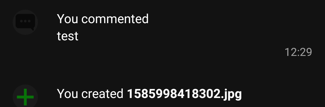
activity/notifications:
invert all except "file_created" and "file_deleted"I don't understand what's meant here.
@dan0xii if you look at the screenshot you took, on the left next to "You commented test" there is a very faintly visible black "comment" icon. :) In dark mode, that should be inverted to be light.
In fact all others of this Activity timeline need to be inverted as they are black, except file_created and file_deleted since they are green and red respectively and should keep their color even in dark mode.
jancborchardt
on 21 Apr 2020
EDIT: found a way, PR will come soon
@jancborchardt as we get these images as svg from server, do you have an idea how to invert them?
My idea, to invert the entire image did not worked out:
tobiasKaminsky
on 5 Jun 2020
Related issues
 ikke-t
·
3Comments
AndyScherzinger
·
3Comments
ikke-t
·
3Comments
AndyScherzinger
·
3Comments
 daywalk3r666
·
3Comments
daywalk3r666
·
3Comments
 markbryanduncan
·
3Comments
markbryanduncan
·
3Comments
 JSoko
·
3Comments
JSoko
·
3Comments