Android: The restore button is too small
Hi,
It's not really a "bug" (nor a feature). And it's pixel perfection.
But the button to restore file in trash is so small and not easy to click/touch.
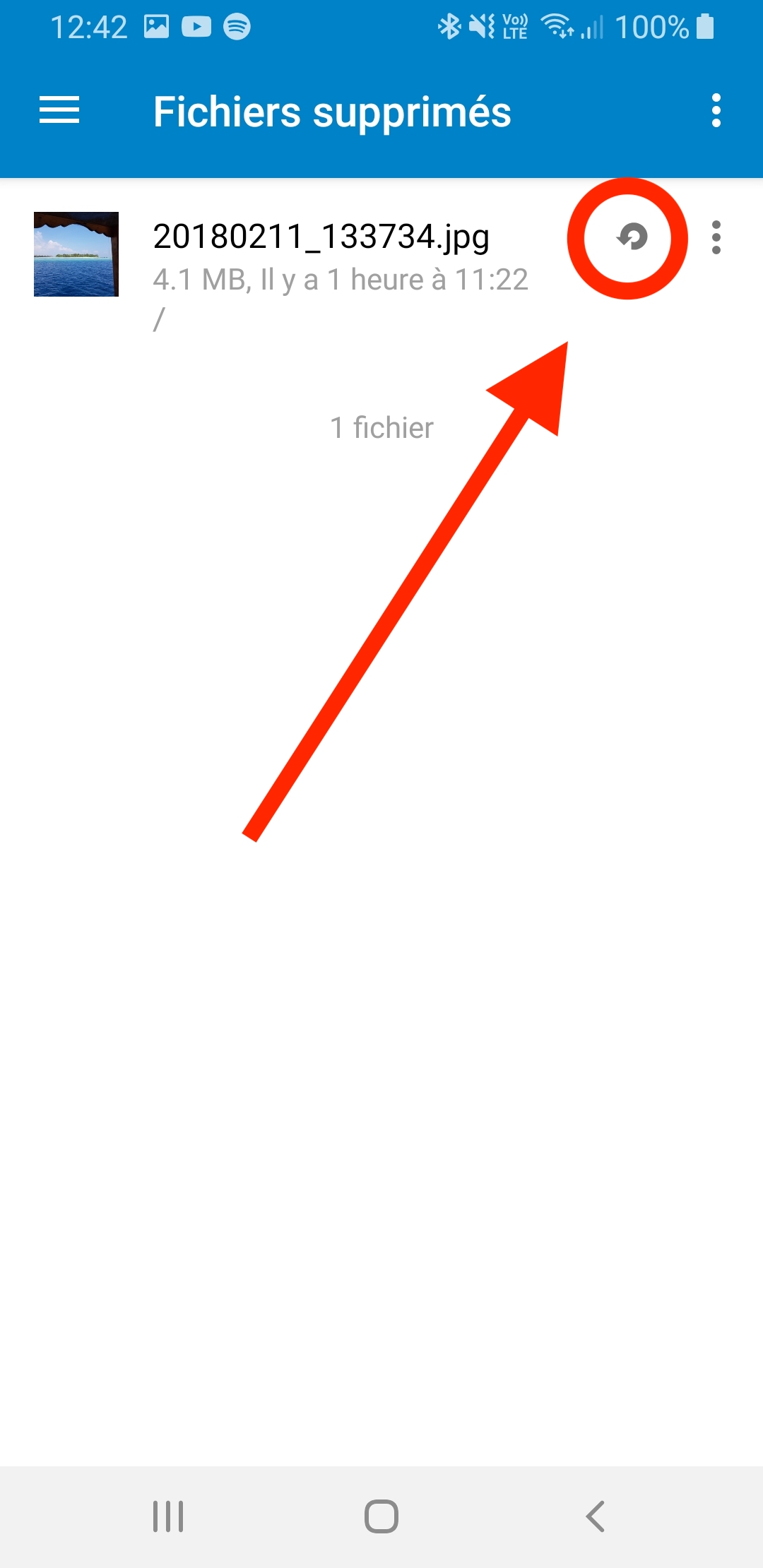
I suggest we replace it by a bigger.
App version : 3.9.0
 Shagequi
All 10 comments
cc @nextcloud/designers I agreed with @Shagequi that the icon should be enlarged (as in fit the size of the other 24dp icons). Issue is likely the padding/margin of the icon itself
 AndyScherzinger
on 18 Nov 2019
AndyScherzinger
on 18 Nov 2019
Let us call it a bug, as it prevents user from using the app without problems :-)
 tobiasKaminsky
on 19 Nov 2019
tobiasKaminsky
on 19 Nov 2019
Yup yup, should have proper clickable size (48*48pt on Android, right?). For these actions in rows, the tappable area of the icon should also extend to the very top and bottom of the row for ideal clickability.
 jancborchardt
on 19 Nov 2019
jancborchardt
on 19 Nov 2019
Size would be 24dp afaik, but the issue is rather the margin within the icon itself
AndyScherzinger
on 19 Nov 2019
Yes, sorry, when I said "clickable size" I mean the padding of the icon. (Margin in CSS at least means _outside_ whitespace, that is non-tappable.)
jancborchardt
on 20 Nov 2019
Added a new icon from our fork directly
Shagequi
on 20 Nov 2019
@jancborchardt Is there any specific reason why we do not adopt Material Design list components?
- Those designs have this aspect covered pretty well
- Users are familiar with this concept as it is used in all Android applications
I can understand that we did this in 4.x as there was no MD back then, but now... hm.
 ezaquarii
on 22 Nov 2019
ezaquarii
on 22 Nov 2019
Is there any specific reason why we do not adopt Material Design list components?
@ezaquarii no reason, I assumed we follow Material Design here. :) Definitely something to adopt for this list.
jancborchardt
on 24 Nov 2019
@jancborchardt I see... well, we're "material-inspired", while a lot of specification aspects are not used (mostly nitty-gritty details). This might be an accident or deliberate choice, as not everybody likes MD.
https://material.io/components/lists/
Anyway, if we're open to use MD specification, then I'll be mindful of that fact when touching layouts.
ezaquarii
on 24 Nov 2019
tobiasKaminsky
on 6 Dec 2019
Related issues
 JSoko
·
3Comments
JSoko
·
3Comments
 Tie-fighter
·
3Comments
tobiasKaminsky
·
3Comments
Tie-fighter
·
3Comments
tobiasKaminsky
·
3Comments
 Bugsbane
·
3Comments
ezaquarii
·
3Comments
Bugsbane
·
3Comments
ezaquarii
·
3Comments