Android: Activity stream design enhancements on file detail
From https://github.com/nextcloud/android/pull/2690#issuecomment-397328377.
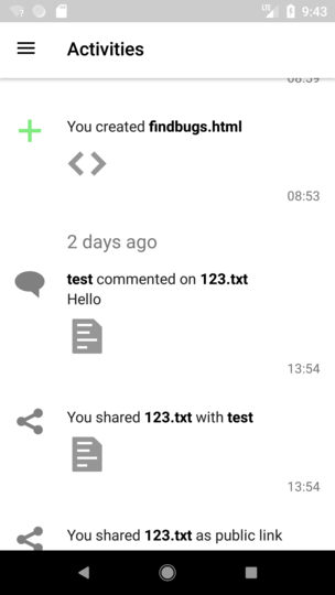
We are re-using the activity stream, which can be accessed via drawer -> activities, so each change will also affect the other stream:
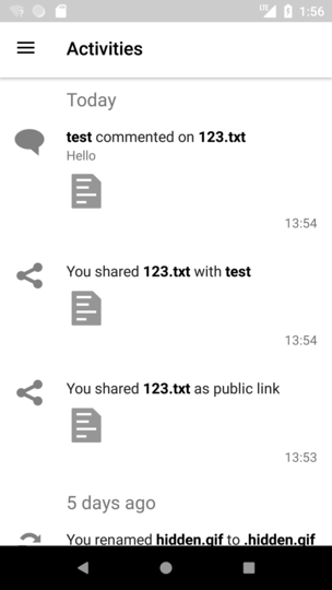
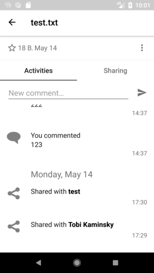
- The first line of the comment »Commented by you« is not really useful. It should simply say »You« instead
Needs to be done on activity app
- Similar for the icon: Instead of the generic comment icon, it should show your avatar
Wouldn't it be better to have the big icon as "action icon" and just before "test" (user) we show the avatar?
- And the comment text below should have the same text size as the normal text. We shouldn’t have too many different text sizes as that looks strange.
Currently we have 3 font sizes:
- Date (today, yesterday, monday, May 28)
- "action" (new version was created, you changed file, you commented)
- "value" (file size, comment text)

--> action and value both in size of "action"?
- We can remove the »Today« header – it’s not necessary to show that one. Should only start with »Yesterday«.
This will then also be in activity stream. Is this ok for you?
What about the bold text? Personally I do not like them at all.
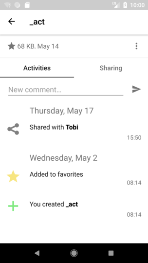
(there is no thumbnail because the files are already deleted)
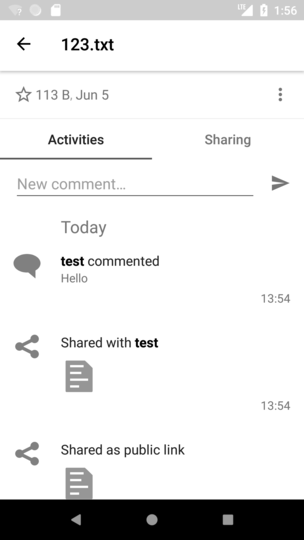
File details only:
do we want to hide the thumbnails, as the user knows which file he is viewing?
@jancborchardt
 tobiasKaminsky
All 8 comments
Wouldn't it be better to have the big icon as "action icon" and just before "test" (user) we show the avatar?
It looks way nicer if the avatar is the big icon. :) Especially for comments, the comment icon itself is not really needed as for chat messages usually always the avatar is shown.
action and value both in size of "action"?
Yes. :) However, we need to differentiate a bit with opacity, and ideally it would be:
- Full opacity for things like the action text, and for "value" which is actual content, like a comment text.
- Less opacity for main date header, time on right, and for "value" which is metadata, like file size. _And_ that less opacity should be a bit less than the current one. Let me know what the current one is and I’ll tell you what it should be. :) (If it’s more than 50%, make it that for a start)
We can remove the »Today« header – it’s not necessary to show that one. Should only start with »Yesterday«.
This will then also be in activity stream. Is this ok for you?
Yup! :)
What about the bold text? Personally I do not like them at all.
Let’s keep this for now. It’s good to immediately show the focus of the activity. But yes, this is something we could rethink.
File details only:
do we want to hide the thumbnails, as the user knows which file they are viewing?
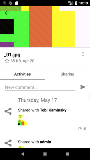
Good point. Yes, let’s hide it but only for when you view a file, and only when it’s a filetype icon. When it’s an actual preview (like for pictures) we should keep it, so you can directly see what changed (even though it’s small, the preview is useful) :)
 jancborchardt
on 20 Jun 2018
jancborchardt
on 20 Jun 2018
It looks way nicer if the avatar is the big icon. :) Especially for comments, the comment icon itself is not really needed as for chat messages usually always the avatar is shown.
Have you reported this to activity app as we only take their stream :)
Full opacity for things like the action text, and for "value" which is actual content, like a comment text.
Less opacity for main date header, time on right, and for "value" which is metadata, like file size. And that less opacity should be a bit less than the current one. Let me know what the current one is and I’ll tell you what it should be. :) (If it’s more than 50%, make it that for a start)
We have no real way to determinate the "type" of an activity. We would have to hardcode this somehow in it and this is something I do not want to do.
--> all "values" need to have the same opacity
main date header, time on right: currently there is no opacity, but just a grey text color: #757575
tobiasKaminsky
on 22 Jun 2018
Good point. Yes, let’s hide it but only for when you view a file, and only when it’s a filetype icon. When it’s an actual preview (like for pictures) we should keep it, so you can directly see what changed (even though it’s small, the preview is useful) :)
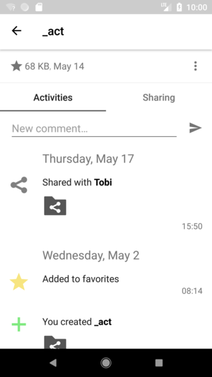
Folder:
 ->
-> 
File without preview:
File with preview:
tobiasKaminsky
on 22 Jun 2018
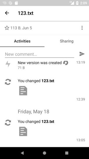
Same size of text:
tobiasKaminsky
on 22 Jun 2018
Good stuff! Only one thing: Of course when viewing the activities of a single folder (just like single file) we also don’t need the icon. (I meant to say »when viewing a single file« (also including folders), not »only for _files_«. :)
jancborchardt
on 23 Jun 2018
Well, it is, or?
(in previous post I showed the old one on the left and the new on the right)
tobiasKaminsky
on 25 Jun 2018
(in previous post I showed the old one on the left and the new on the right)
Aaah ok – then nevermind. :D All good :+1: :taco:
jancborchardt
on 25 Jun 2018
Thanks for your feedback, will be auto-closed with pr #2751
tobiasKaminsky
on 26 Jun 2018
Related issues
 ezaquarii
·
3Comments
ezaquarii
·
3Comments
 JSoko
·
3Comments
JSoko
·
3Comments
 AndyScherzinger
·
3Comments
tobiasKaminsky
·
3Comments
tobiasKaminsky
·
3Comments
AndyScherzinger
·
3Comments
tobiasKaminsky
·
3Comments
tobiasKaminsky
·
3Comments