

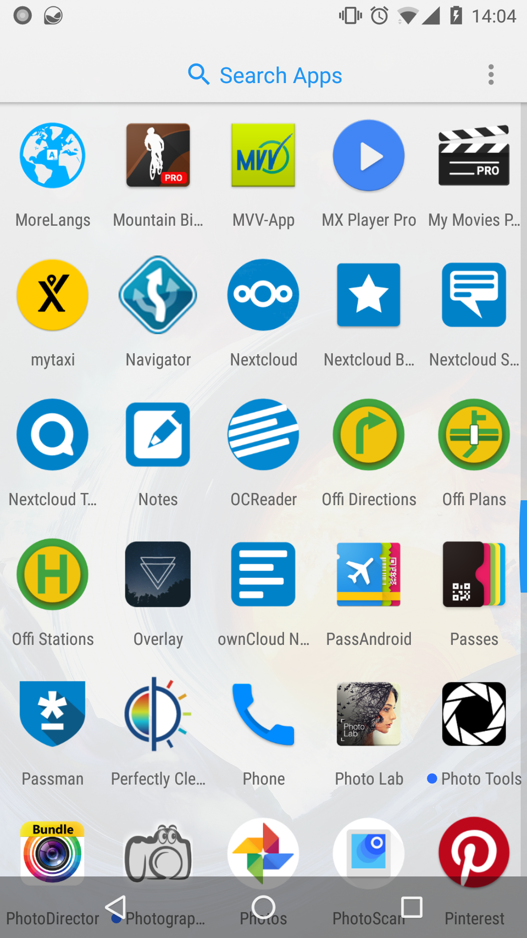
As you can see our icon is now very small within the circle.
I would like to make it bigger and fill the circle just like the phone app next to our app.
EDIT: as you can see on the right screenshot it seems to be possible to still have a regular icon, like Fdroid.
What do you prefer?
@nextcloud/designers?
 tobiasKaminsky
All 29 comments
Round icon for sure!
 enoch85
on 21 Dec 2017
enoch85
on 21 Dec 2017
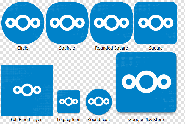
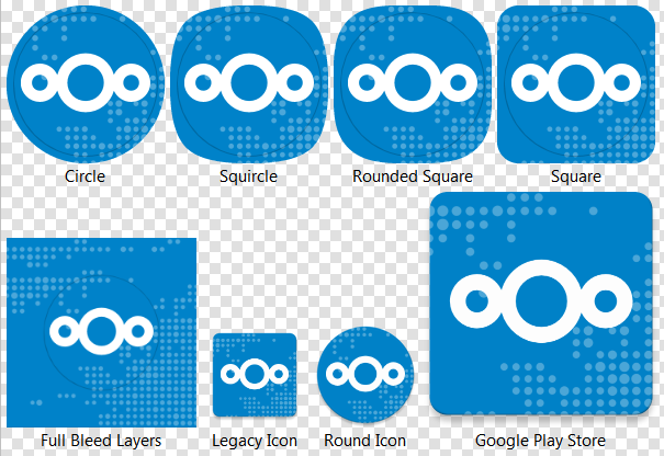
I can take care of this, will do the round icon as an alternative (is Nougat and up) and the adaptive icon (Oreo and up) which changes the outer form factor depending on the user's device settings due to the fact that in Oreo you can choose the icon form, round, square, etc. :)
 AndyScherzinger
on 21 Dec 2017
AndyScherzinger
on 21 Dec 2017
As for Oreo we might have to check since we likely have to bump the target version which might deactivate compatibility switches within Android OS itself for running the app so there could be side effects for auto upload, notifications or else. Will check.
AndyScherzinger
on 21 Dec 2017
I'd say we should definitely use the round icon. Even for earlier versions where it's choosable. It fits way better with the logo. :)
(Same for the Talk app logo.)
 jancborchardt
on 21 Dec 2017
jancborchardt
on 21 Dec 2017
Also as commented at https://github.com/nextcloud/talk-android/issues/15#issuecomment-346844222, find the files there. :)
jancborchardt
on 21 Dec 2017
Will use your referenced files @jancborchardt with my change will will basically support anything (literally!). Si we will ship, round square, round, and "whatever" (which is a 2 layer icon where the OS (based on the users design settings decides on the form) 🎉
AndyScherzinger
on 21 Dec 2017
@jancborchardt @tobiasKaminsky @enoch85 here are screenshots of the round icon (the dots are there but that's how desktop designs work on high resolution devices....):

Beware that the icons are "adaptive" on Android Oreo so they _will_ change forms based on OEM implementations, see:
AndyScherzinger
on 21 Dec 2017
I'm not sure how much sense there is in that background - it's almost invisible...
 pixelipo
on 21 Dec 2017
pixelipo
on 21 Dec 2017
As discussed in #1869 I think the dots need to be bigger...
Otherwise really great @AndyScherzinger!
tobiasKaminsky
on 21 Dec 2017
Thanks @tobiasKaminsky
Well as for the dots in the launcher icon I's say drop them.
AndyScherzinger
on 21 Dec 2017
Having only a solid background is "boring" in my opinion.
tobiasKaminsky
on 21 Dec 2017
The dots are IHMO useless in general on the mobile.
 mario
on 21 Dec 2017
mario
on 21 Dec 2017
@jancborchardt your feedback please :-)
tobiasKaminsky
on 21 Dec 2017
We just need to make the dots bigger. I agree with @tobiasKaminsky that only a solid background is a bit bland.
Here’s two variants:
![]()
Source: https://github.com/nextcloud/promo/blob/master/Specific%20designs/icon-background.svg
![]()
Source: https://github.com/nextcloud/promo/blob/master/Specific%20designs/icon-background-big.svg
I guess the second one with the even bigger dots works better? Also increased the opacity to 20%.
jancborchardt
on 21 Dec 2017
@jancborchardt And again you _desktoping_.... this is and will stay a dpi issue... because even with your latest change it'll look like this:
So even when looking at this full-HD display screenshot you need to look at it on a phone!
AndyScherzinger
on 21 Dec 2017
Ok, so is this more proper? Otherwise I don’t get what you mean by it being a dpi issue:
Source: https://github.com/nextcloud/promo/blob/master/Specific%20designs/icon-background.svg
jancborchardt
on 21 Dec 2017
@jancborchardt that seems better, and I'll try that one. What I mean by dpi is that a phone has very high resolution while (at least most) pc screens do not so the image is way larger on a desktop/laptop (in cm) and way smaller on a phone so the dots even though they might look nice on a large pc screen (with a low dpi number) will vanish on a high dpi, phone display. I hope I could explain what I meant, but let's see
AndyScherzinger
on 21 Dec 2017
Still something I very much dislike :/
On Thu, 21 Dec 2017 at 16:40, Jan-Christoph Borchardt <
[email protected]> wrote:
Ok, so is this more proper? Otherwise I don’t get what you mean by it
being a dpi issue:
[image: 34257128-cfff5ab2-e658-11e7-9bb6-2775f79656a7]
https://user-images.githubusercontent.com/925062/34262779-9d5f7b86-e66d-11e7-9dc0-fd2066cf2068.jpgSource:
https://github.com/nextcloud/promo/blob/master/Specific%20designs/icon-background.svg—
You are receiving this because you commented.Reply to this email directly, view it on GitHub
https://github.com/nextcloud/android/issues/1886#issuecomment-353382365,
or mute the thread
https://github.com/notifications/unsubscribe-auth/AAAWsox0ypqbE2BB6bFaihENqU52I5-Lks5tCnv3gaJpZM4RJb0W
.
mario
on 21 Dec 2017
I am also not a big fan but won't have much time in the upcoming days/weeks so I do whatever it takes to get it done while I still have time...
AndyScherzinger
on 21 Dec 2017
So here is the latest version from the oreo branch:
cc @jancborchardt
AndyScherzinger
on 21 Dec 2017
Overall-all-icon-format-oem-os-possible screenshot:
AndyScherzinger
on 21 Dec 2017
@AndyScherzinger Your icons have the logo at-least one pixel too high, could be two.

Some smoothing and a bigger opening makes it seem more fluid and liquid.
(still not centered)
 comradekingu
on 21 Dec 2017
comradekingu
on 21 Dec 2017
Kudos @comradekingu! You are indeed right and in the svg file it has been several pixels actually... eagle eyes! 💯
Here is the fixed version screenshot

and updated home screen:

cc @tobiasKaminsky @jancborchardt @mario
AndyScherzinger
on 21 Dec 2017
The middle circle also looks slightly smaller. Only happens if you see them together.
comradekingu
on 21 Dec 2017
Anyone interested what the adaptive icons for Android O+ will do: https://developer.android.com/guide/practices/ui_guidelines/icon_design_adaptive.html
The middle circle also looks slightly smaller. Only happens if you see them together.
@comradekingu that is always the case as far as I can see (looks to me like the same on nextcloud.com too). If this needs to be changed than we need a reworked SVG file from @jancborchardt or anyone from the designers.
AndyScherzinger
on 21 Dec 2017
How about some opposite direction "dropshadows" in a lighter colour?
It would make it seem as they are light-rays going into the water.
comradekingu
on 21 Dec 2017
How about some opposite direction "dropshadows" in a lighter colour?
It would make it seem as they are light-rays going into the water.
Your call @jancborchardt @nextcloud/designers :)
While looking at https://developer.android.com/guide/practices/ui_guidelines/icon_design_adaptive.html and OEM animations we might best leave it as-is!
AndyScherzinger
on 21 Dec 2017
No dropshadow in a lighter color please - that is not a shadow and will look tacky. :)
The slight upward position of the logo was intentional btw because otherwise it visually seems hanging down.
jancborchardt
on 21 Dec 2017
I like the logo with the background 👍
tobiasKaminsky
on 23 Dec 2017
Related issues
 Tie-fighter
·
3Comments
Tie-fighter
·
3Comments
 JSoko
·
3Comments
JSoko
·
3Comments
 ikke-t
·
3Comments
JSoko
·
3Comments
JSoko
·
3Comments
ikke-t
·
3Comments
JSoko
·
3Comments
JSoko
·
3Comments
Most helpful comment
Will use your referenced files @jancborchardt with my change will will basically support anything (literally!). Si we will ship, round square, round, and "whatever" (which is a 2 layer icon where the OS (based on the users design settings decides on the form) 🎉