Android: Computed accent color too bright
Currently this is our algo:
if lightness <= 0.55
lightness + 0.1
else
lightness - 0.1
This seems not the best idea ;-)
@jancborchardt @juliushaertl
All 10 comments
I think the "correct" method would include asymmetric colour matching.
https://pdfs.semanticscholar.org/dfc9/7e419d66eb92c4ea968c9bc8f0667575f8cd.pdf
The colour will otherwise appear different based on what background it is on.
What we could do:
- Ensure the lightness of the text is not above a certain value, and if it is:
- Make it darker to fit the value
- Simply use a defined black or grey text
- Add a _very_ slight text shadow, if that’s possible or at all Android-like
Other ideas @juliushaertl?
I would go for idea 1 with a sane threshold. Text shadow is uncommon for me.
Can you do an example of how that green (or a similar bright color like yellow) looks with 20%, 30%, 40%, 50% lightness? Then we could decide on a threshold.
Current situation:
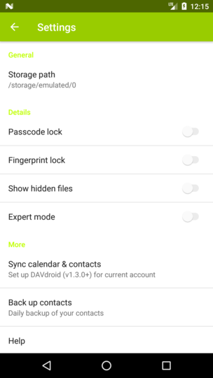
10:
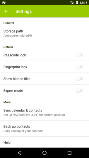
20:
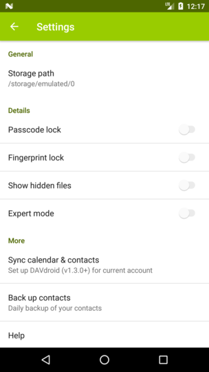
30:
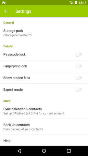
40:
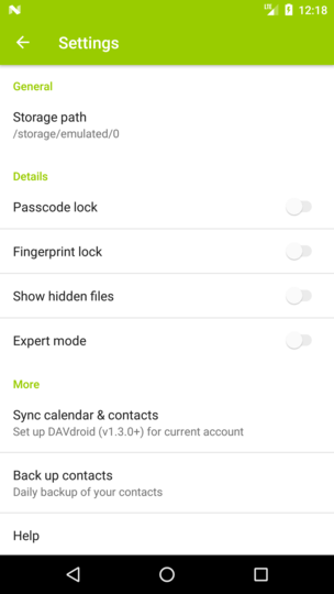
50:
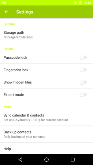
60:
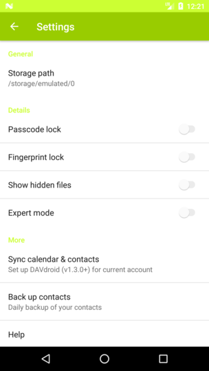
70:
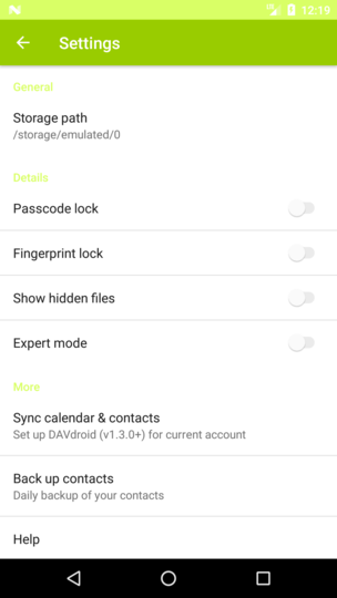
For primaryDarkColor we compute it with -20% lightness, so this might also need an adjustment.
Thanks! The one at 40 seems best, what do you think? cc @juliushaertl
Nice, I'd say 30 since then you still have a slight contrast between the two colors whereas with 40 primary and primary dark are about the same and can't be distinguished.
I only now saw that the top status bar is affected too btw, my comment was only about the text color. :)
30 seems a tad dark for the text. Is it possible to do the top bar separately? Or maybe 35? (I'm also fine with the top bar and status bar being the same color, looks simple. ;)
But really, details which only occur on theming, so I'm fine with 30 too I guess. ;)
No, the top status bar is always primaryDark. This was a fault due to hacking the values (20%, 30%, ...) hardcoded into it.
So this is only about the text color.
I will add a threshold of max 35% and test it with some random colors.
Most helpful comment
No, the top status bar is always primaryDark. This was a fault due to hacking the values (20%, 30%, ...) hardcoded into it.
So this is only about the text color.
I will add a threshold of max 35% and test it with some random colors.