Android: Improvment for settings: add clear difference between Title and Entries
Actual behaviour
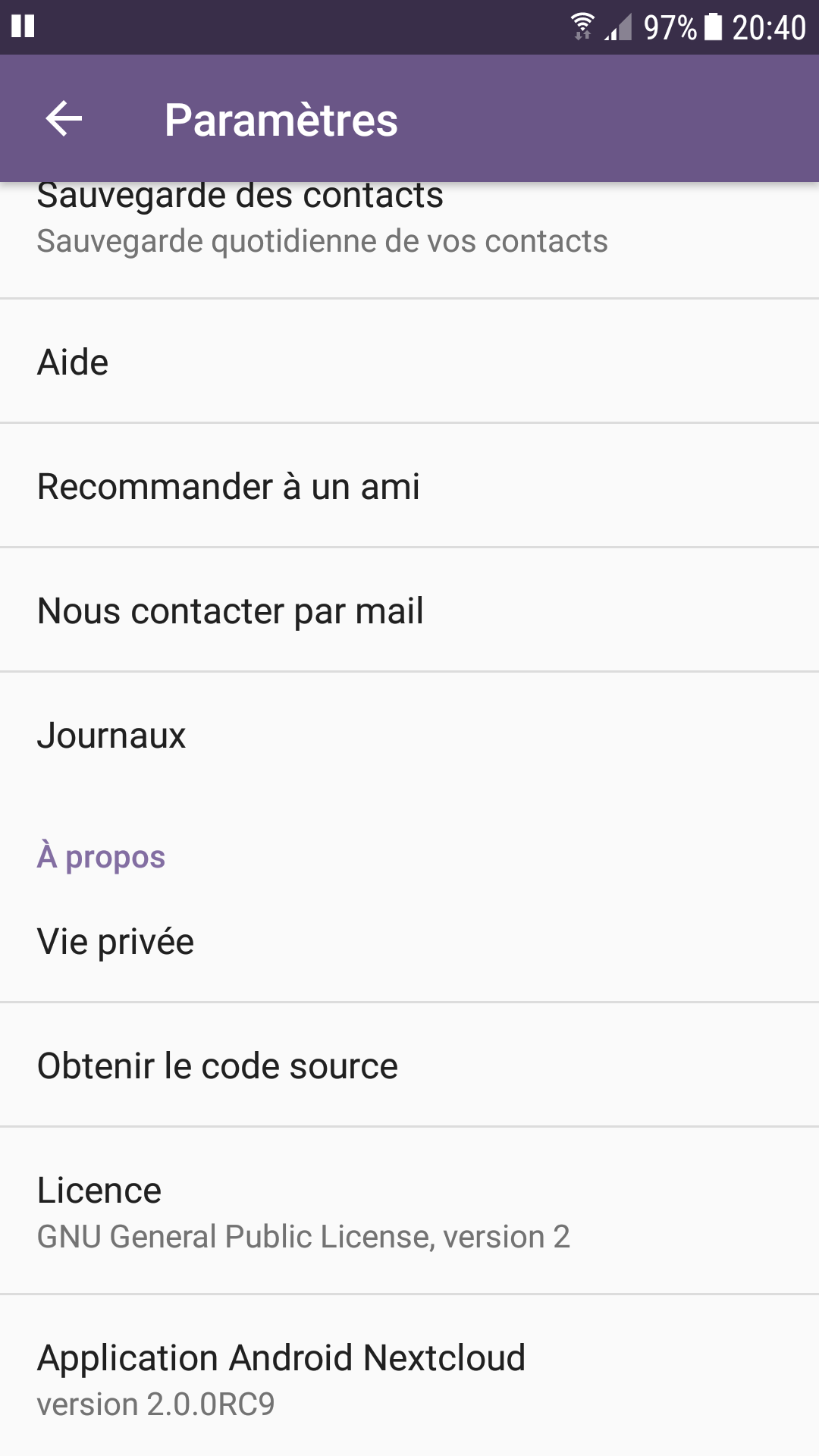
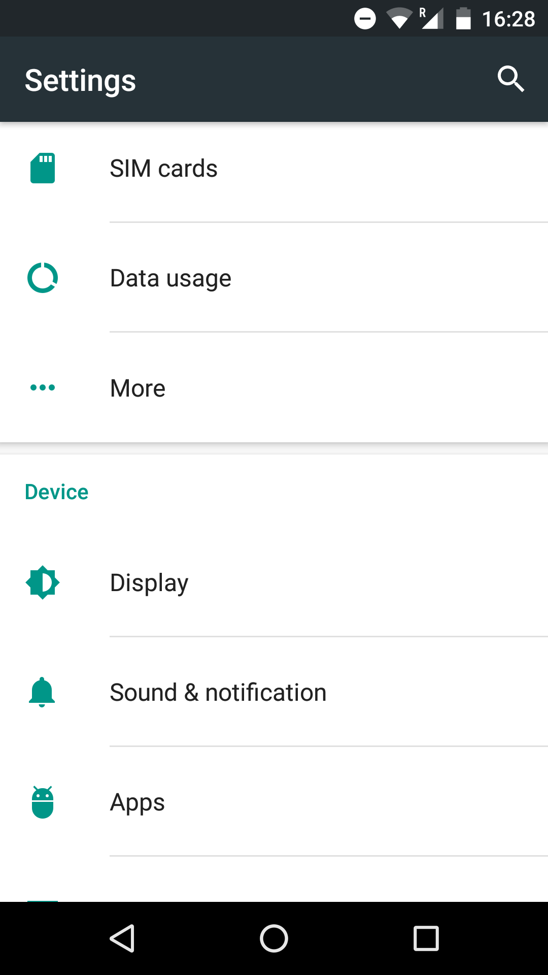
It's hard for users to "read / guess" what is the section title and what are the entries ;-), see the "list" bellow where titles are purple:
Expected behaviour
Do a clear difference between title and entries for instance BIG / CAPITALIZED TITLE and Lower font size for entries or change the position of entries (little right indent).
Environment data
Nextcloud app version: 2.0.0RC9 has shown above.
 ldmpub
All 16 comments
Thanks for the report @ldmpub
@jancborchardt @nextcloud/designers what do you think? I'd say we keep it as is since this is the standard Android/Material Design layout/design so all "native" application's settings screens look like this.
 AndyScherzinger
on 19 Oct 2017
AndyScherzinger
on 19 Oct 2017
We definitely do not and should not use "ALL CAPS" anywhere. ;)
@AndyScherzinger agree. However in the Android Settings for example there seems to be more whitespce, or rather a "card separation" between the different sections. That makes it more clear it's separate.
 jancborchardt
on 19 Oct 2017
jancborchardt
on 19 Oct 2017
Other suggestion: separations should be at section level (at end of previous section to group entries) and yet it is at item level (see screenshot above) ... it's confusing.
ldmpub
on 19 Oct 2017
@ldmpub like I implied this is Android's standard design/layout we do haven't changed anything here.
AndyScherzinger
on 19 Oct 2017
@AndyScherzinger I respect your hard work but this kind of answer make me laught because you may know as I do that even if there is a standard you may use it baddly (it's true from API SDK to Design).
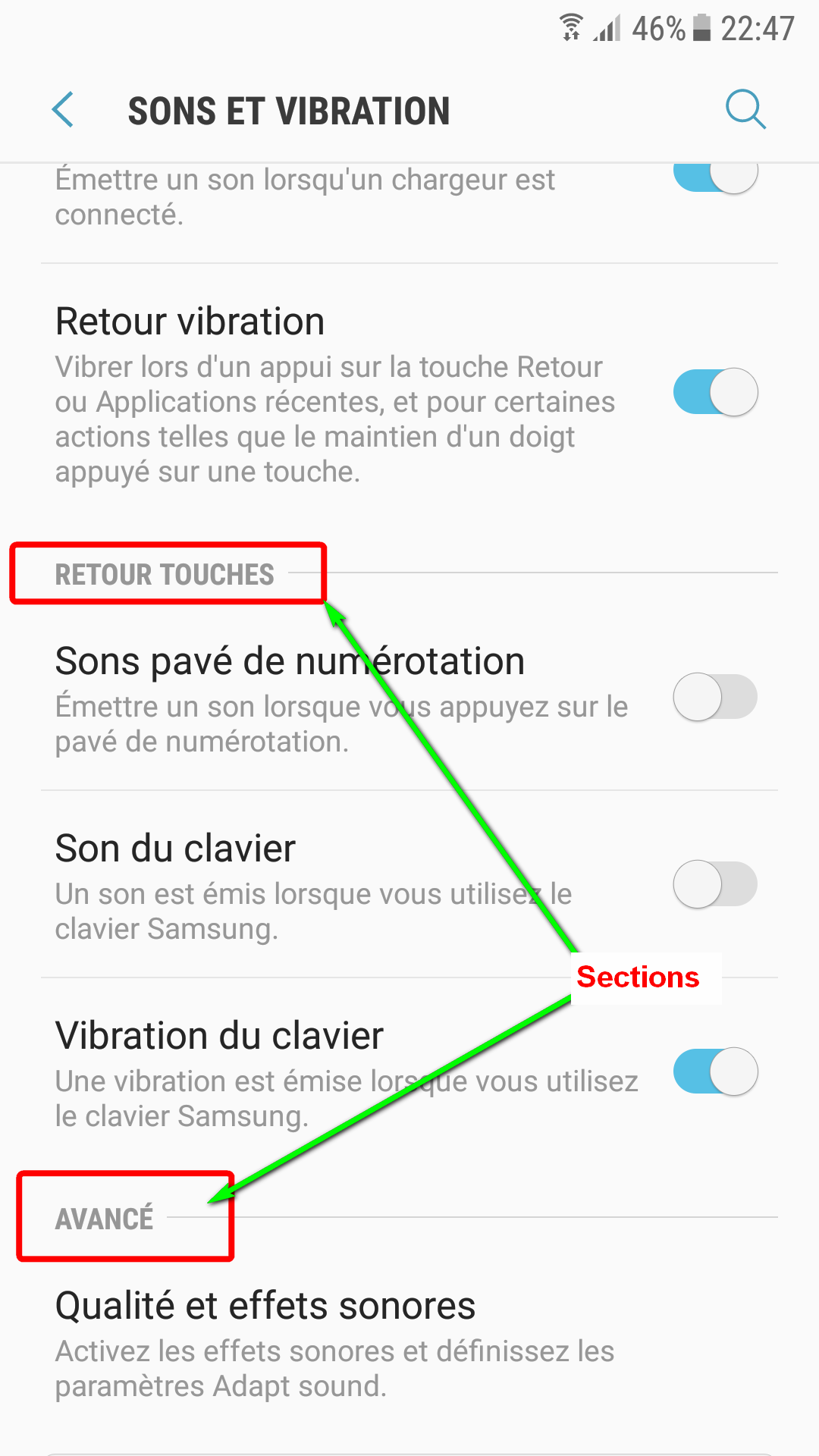
Attached a standard Android settings screen (sorry it's in french) where you will see how the same material design can be used wisely...
ldmpub
on 19 Oct 2017
@ldmpub Erm, your screenshot is not fully material simply _because_ of your headline design in the screenshot... looking at any material styled app... they look exactly the same as Nextcloud's. Choose _any_ of Google's apps or Dropbox or if you prefer OSS take a look at SeriesGuide which even got nominated in the Material Design app category by Google at a Google I/O.
You got it right I do spend a lot of blood sweat and tear into this app and I also read through Material Design documentation and take the time to get it right. That is why it I do feel offended (while I probably shouldn't) and leave this issue to anyone else who might want to further elaborate: @jancborchardt @mario @tobiasKaminsky etc.
I'm out.
AndyScherzinger
on 19 Oct 2017
I'm gonna close this issue. If I remember right we use the preferences magic by Google where they decide on the actual layout.
That is good enough for now.
 mario
on 20 Oct 2017
mario
on 20 Oct 2017
@ldmpub please, a bit more civility when communicating with people whose work you can enjoy free & open source.
As Andy already said, the screenshot you said is not standard Material Design. Consult the Material guidelines yourself to see some examples. All-caps in top bar and section headings are not used for example.
jancborchardt
on 20 Oct 2017
Hi, sorry to have offend any one here ... it was not my purpose at all! I'm also working to make this app a good piece of free software (at my little level: testing, reporting issues, translating it to french, suggesting improvements...).
I'm very glad to have confirmation that Nextcloud uses standard (ie Google material design in this particular screen).
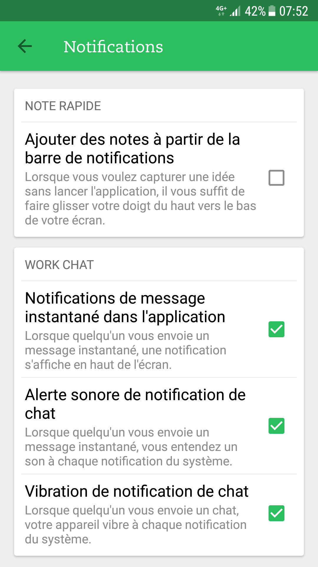
I have looked around and discovered that a lot of apps are using other custom (?) layouts for settings screen even Google itself sometimes (see my 2d screen shot above) or Evernotes (see just below ... it's far from Google material design !!! but it's very handy to use ;-) ).
Does it mean we need to report improvement request to Google in this field? Does any one in this team as the power to be heard by Google design gurus ?
Here is Evernotes exotic preferences screen:
ldmpub
on 21 Oct 2017
Hi, sorry to have offend any one here ... it was not my purpose at all! I'm also working to make this app a good piece of free software (at my little level: testing, reporting issues, translating it to french, suggesting improvements...).
Thanks @ldmpub This means a lot to me!
I have looked around and discovered that a lot of apps are using other custom (?) layouts for settings screen even Google itself sometimes (see my 2d screen shot above) or Evernotes (see just below ... it's far from Google material design !!! but it's very handy to use ;-) ).
Oh this is really tricky to answer, but I try my best to explain as good as I can.
- Evernote seems like a completely custom implementation (kind of like the auto upload configuration dialog which also mimics a preference screen)
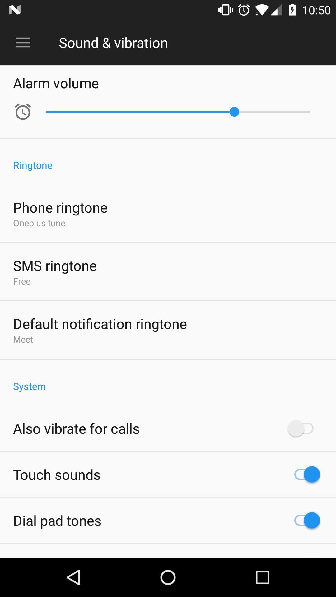
- The sounds&vibration screen you posted is a settings screen within the OS. Mine looks totally different, see screenshot below. The reason for this is that these screens are written using the "native/standard" implementation within Androids APIs, are part of the OS (Samsung in your case) so they adapt to theming (in your case Samsungs skinning , in my case OnePlus' skinning )
- Nextclouds settings screen looks slightly different due to the fact that we use Google's AppCompat library to have material design throughout all Android versions (4+) so the setting screen looks like that on all devices and also anything else looks like that (action bar, buttons, check boxes, toggles, etc.). This kills all OEM specific skinning (which is necessary to support themeing since else we can't predict what will happen on the huge variety of devices and their OEM customization (could render UI elements unusable...).
Does it mean we need to report improvement request to Google in this field? Does any one in this team as the power to be heard by Google design gurus ?
It is basically due to Google's AppCompat library shipped theming/styling definitions that it looks this way so yes it would then have to be reported there. I am not aware that anyone on the Nc team has a direct link to the Google design team. Also I am sure they will argue against it. Usually the "headlines" for the setting sections are to be colored with the material accent color which is usually a color that has a high contrast to the primary color (in your case violet in Nc case blue). Since the client gets the colors from the server we only have blue (primary color) and calculate a slightly lighter variant of it for the accent color (this is due to the fact that the server isn't themed with material primary/accent). So theoretically we could change the algorithm that calculates the accent color variant but that might destroy the Nc/server-theming branding... :(
Advantage though on the other hand is that whenever Google decides to change the design and we update to the latest version of ther support libraries that the app will automatically pickup the new design changes by itself, no changes needed from our side :)
AndyScherzinger
on 21 Oct 2017
Here's how it looks in my Fairphone OS which I think uses unthemed Android. It's version 6 still but assume it's similar in newer versions?
There's some separations between the sections, and that might be useful?
jancborchardt
on 21 Oct 2017
I can check if and how we can influence the theming to have a better separation between preference sections.
AndyScherzinger
on 22 Oct 2017
Colour/luminocity, size and pictograms are preferable to caps.
Just having
"Pictogram [ option] [option ] [option]"
Would be preferable to expanding or going in and out of things
 comradekingu
on 22 Oct 2017
comradekingu
on 22 Oct 2017
@comradekingu we're not talking about the structure, only about the separation between sections. The little shadow above the section header "Device" in my screenshot. We aim to use Material Design standards.
jancborchardt
on 22 Oct 2017
@AndyScherzinger thanks for your long and clear explanations. It took me 3 days to understand them all ... no I'm joking: I was on vacations ;-).
I confirm what you say: text color of sections is aligned with the server theme, I was not aware of that advanced capability at all.
ldmpub
on 24 Oct 2017
@ldmpub vacation sounds awesome 👍 I am still having it on my agenda to look if/how we can improve on the separation of the settings categories 😃 ...but can't exactly say when I'll find the tie to get to it since there are around 10 other PRs I need to keep up to date until they get merged but hopefully most of them will make it to master in the next days...
Will comment here again as soon as I have new findings or screens to share. Hope it doesn't take to long (mayybe mid of November I'll be less busy at work)
AndyScherzinger
on 24 Oct 2017
Related issues
 markbryanduncan
·
3Comments
markbryanduncan
·
3Comments
 tobiasKaminsky
·
3Comments
tobiasKaminsky
·
3Comments
 JSoko
·
3Comments
JSoko
·
3Comments
 ikke-t
·
3Comments
ikke-t
·
3Comments
 ezaquarii
·
3Comments
ezaquarii
·
3Comments
Most helpful comment
I can check if and how we can influence the theming to have a better separation between preference sections.