Android: DEV-20170817: add an indicator to the app menu if not all menu entries are displayed
Actual behavior
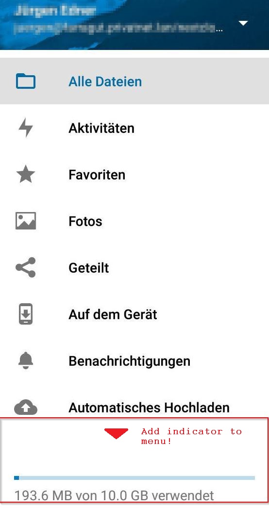
If not all menu entries of the app can be displayed, this is not visible to the user. Additionally the distance between the last displayed menu entry and the usage bar might be leading to the assumption that there are no additional entries.
Expected behavior
And indicate should be shown at the bottom of the displayed menu if not all menu entries are displayed.
Steps to reproduce
- Open the Nextcloud app.
- Open the menu.
- Check how the entries are displayed.
Environment data
Android version: 7.1.1
Device model: Jiayu S3 Adv.
Stock or customized system: MadOS ROM
Nextcloud app version: v1.4.3 20170817-dev
Nextcloud server version: 12.0.2
Logs
Web server error log
Nothing special has been logged related to this problem.
 j-ed
j-ed
All 9 comments
Thank you for this suggestion. Indeed there is something needed, but do you have an idea how? Maybe a screenshot of another app?
A scrollbar could be possible, but this is kind of ugly, or?

cc @nextcloud/designers
 tobiasKaminsky
on 18 Aug 2017
tobiasKaminsky
on 18 Aug 2017
@tobiasKaminsky You're right, that's the way how Google apps etc. are handling such kind of menus.
j-ed
on 21 Aug 2017
First off, that big amount of vertical whitespace above the quota bar should be reduced. Then it probably is already better. :) A permanent scrollbar is not that nice.
 jancborchardt
on 21 Aug 2017
jancborchardt
on 21 Aug 2017
We do show a scrollbar while opening the menu and it disappears after ~2 seconds (same behavior as the Google apps) which indicates more content on scroll.
 AndyScherzinger
on 21 Aug 2017
AndyScherzinger
on 21 Aug 2017
You're right. I've never realized that scroll-bar, maybe because it is so slim and vanishes after that time.
j-ed
on 21 Aug 2017
@AndyScherzinger ah yes. Can we additionally cut a bit off of the vertical whitespace on top of the quota bar? Or what is that for?
jancborchardt
on 22 Aug 2017
@jancborchardt how much do you want to cut? I think the space is fine as otherwise the items are two narrow.
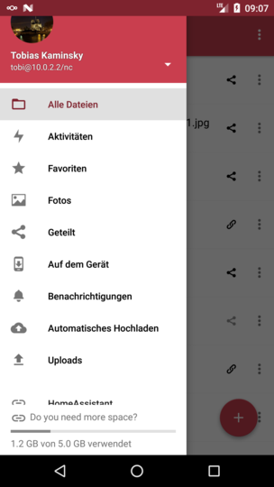
On the initial screen is a larger gap
But this is because of the "separation" of regular items and external links/items/apps:

tobiasKaminsky
on 30 Oct 2017
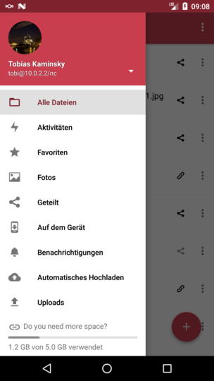
@tobiasKaminsky there it seems fine. However in the normal app there is no "do you want more space" text above the quota bar. Could we reduce the height accordingly when that text is not present?
jancborchardt
on 30 Oct 2017
Now I got it.
tobiasKaminsky
on 30 Oct 2017
Related issues
 ikke-t
·
3Comments
tobiasKaminsky
·
3Comments
ikke-t
·
3Comments
tobiasKaminsky
·
3Comments
 eppfel
·
3Comments
eppfel
·
3Comments
 toobie83
·
3Comments
toobie83
·
3Comments
 JSoko
·
3Comments
JSoko
·
3Comments