Android: Nextcloud Dev 20170705: "Settings" page for Passlock and "Show hidden files" confusion.
Actual behaviour
-Tell us what happens
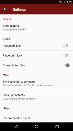
This new release of Nextcloud Dev seems to have a few graphical element being reworked.
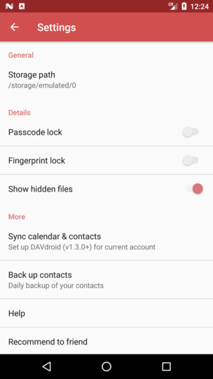
One that is confusing is the "Passcode lock" and "Show hidden files" switch graphical representation.
I just can't make sense of the meaning of the gey'ish and darker grey color of the switch.
Which color correspond to the enabled vs disabled?
I am confused.
Expected behaviour
-Tell us what should happen
A better, more meaningfull color coding stile should be used as not to misinterpret the status of the controls.
Steps to reproduce
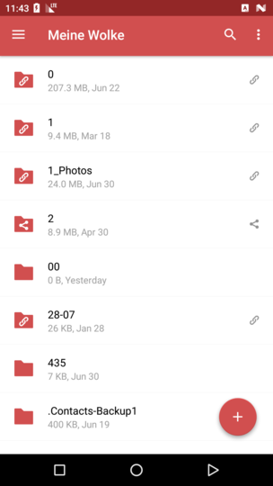
- Go into "Settings"
- Go to Details section and toggle the switches. 3.
Environment data
Android version:
6.0
Device model:
LG-D852
Stock or customized system:
Stock
Nextcloud app version:
Nextcloud Dev 20170705
Nextcloud server version:
NC 12
Logs
Web server error log
Insert your webserver log here
Nextcloud log (data/nextcloud.log)
Insert your Nextcloud log here
NOTE: Be super sure to remove sensitive data like passwords, note that everybody can look here! You can use the Issue Template application to prefill some of the required information: https://apps.nextcloud.com/apps/issuetemplate
 OlivierS1
All 22 comments
@tobiasKaminsky this one is for you ;)
 AndyScherzinger
on 5 Jul 2017
AndyScherzinger
on 5 Jul 2017
The problem is that we cannot theme the preference toggle buttons with any arbitrary color as we can do with the rest. So we are using grey as a fallback for the toggle buttons in preference, and only there ;-)
As we do not change the overall UI/UX I thought it will still be clear what is "on" and what is "off"...
@jancborchardt @juliushaertl do you have any additional design ideas?
 tobiasKaminsky
on 5 Jul 2017
tobiasKaminsky
on 5 Jul 2017
@tobiasKaminsky can we use this?
 mario
on 5 Jul 2017
mario
on 5 Jul 2017
No, we need to use a SwitchPreference <- TwoStatePreference <- Preference :-/
tobiasKaminsky
on 5 Jul 2017
@tobiasKaminsky this might work https://stackoverflow.com/questions/26466577/apply-tint-to-preferenceactivity-widgets-with-appcompat-v21
AndyScherzinger
on 5 Jul 2017
Can you give me a more detailled hint which I shall try? ;-)
tobiasKaminsky
on 5 Jul 2017
If it’s not possible to theme, maybe we should go even darker, maybe full black (or whatever is used for text color) for the toggle?
 jancborchardt
on 5 Jul 2017
jancborchardt
on 5 Jul 2017
We can try it, but I think that the more important visual hint is if the round button is left (off) or right (on)...
tobiasKaminsky
on 5 Jul 2017
the more important visual hint is if the round button is left (off) or right (on)...
not for users from the r-t-l space ;)
AndyScherzinger
on 5 Jul 2017
Yeah, that is actually the case for anyone: You don't necessarily know which direction is on and which is off, that's why it has to be unmistakably clear. :)
Let's try going darker or full black - or in the best case color it like @mario referenced above (if possible). :)
jancborchardt
on 6 Jul 2017
Full black wouldn't be a good idea I think.
I have played with the new color scheme and the text were "Nextcloud Dev" used to appear on the top menu and now being replaced with the slogan did show in black when I used my own string. It was disconcerting. Maybe that was expected due to some settings, but it seemed to me more like of having a bug where font is missing. Didn't like it at all.
OlivierS1
on 6 Jul 2017
The color of the slogan should change depending on the background color:
if it is a lighter color -> black
if it is a darker color -> white
Please note that the discussion of the color is just only for the preferences screen, not for the entire/rest of the app.
tobiasKaminsky
on 7 Jul 2017
@tobiasKaminsky @jancborchardt shouldn't we rather use the server name?! Our stable app also says Nextcloud and not "your data, your rules" or whatever. In my opinion this should be the server name branding wise... :)
AndyScherzinger
on 7 Jul 2017
Indeed
On Fri, Jul 7, 2017 at 9:57 AM, Andy Scherzinger notifications@github.com
wrote:
@tobiasKaminsky https://github.com/tobiaskaminsky @jancborchardt
https://github.com/jancborchardt shouldn't we rather use the server
name?! Our stable app also says Nextcloud and not "your data, your rules"
or whatever. In my opinion this should be the server name branding wise...
:)—
You are receiving this because you were mentioned.
Reply to this email directly, view it on GitHub
https://github.com/nextcloud/android/issues/1163#issuecomment-313614294,
or mute the thread
https://github.com/notifications/unsubscribe-auth/AAAWsqOPYYRXIgdnzIHUFEe9P8fstW1hks5sLeTagaJpZM4ON5RC
.
mario
on 7 Jul 2017
Absolutely, header should use the name, not slogan. The slogan is only used in the web interface really. :)
jancborchardt
on 7 Jul 2017
shouldn't we rather use the server name?!
I have changed this.
tobiasKaminsky
on 10 Jul 2017
It seems that we currently do not support r-t-l at all:
Forced rtl on emulator, left settings, right our app:
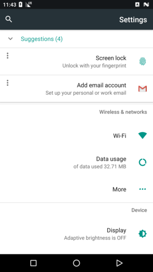
I will open up an issue for this.
This is the toggle button with a slightly darker color.
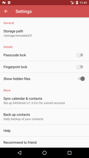
I will give the theming of this toggle button one last chance, otherwise we have to stay with this color.
tobiasKaminsky
on 11 Jul 2017
Well, one way to "fix" it would be to revert back to checkboxes in the settings view. @mario changed it to use switches for material design alignment (thanks for also having an eye on material design 👍). So Pinging you both @tobiasKaminsky
cc: @jancborchardt
AndyScherzinger
on 11 Jul 2017
further remark: even GMail uses checkboxes... So I guess it would be still fine to go back to checkboxes and they would have a clear visual state then 💃
AndyScherzinger
on 11 Jul 2017
I finally managed it :tada:
Please confirm and then we can close this
tobiasKaminsky
on 11 Jul 2017
Nice work! :)
jancborchardt
on 13 Jul 2017
Thanks, closing as the PR (#1031) is also merged :tada:
tobiasKaminsky
on 14 Jul 2017
Related issues
 rainer042
·
3Comments
tobiasKaminsky
·
3Comments
rainer042
·
3Comments
tobiasKaminsky
·
3Comments
 markbryanduncan
·
3Comments
markbryanduncan
·
3Comments
 daywalk3r666
·
3Comments
daywalk3r666
·
3Comments
 Tie-fighter
·
3Comments
Tie-fighter
·
3Comments
Most helpful comment
I finally managed it :tada:
Please confirm and then we can close this