Anatole: Could there be a limit for the content width? Thinking of ultrawide screens and so.
 ivnvitx
All 8 comments
@ivnvitx Would you mind providing a screenshot or more detailed description of the issue you are having? I assume it has to do with the fact, that the columns are stretched over the whole width of the screen.
 lxndrblz
on 22 Sep 2020
lxndrblz
on 22 Sep 2020
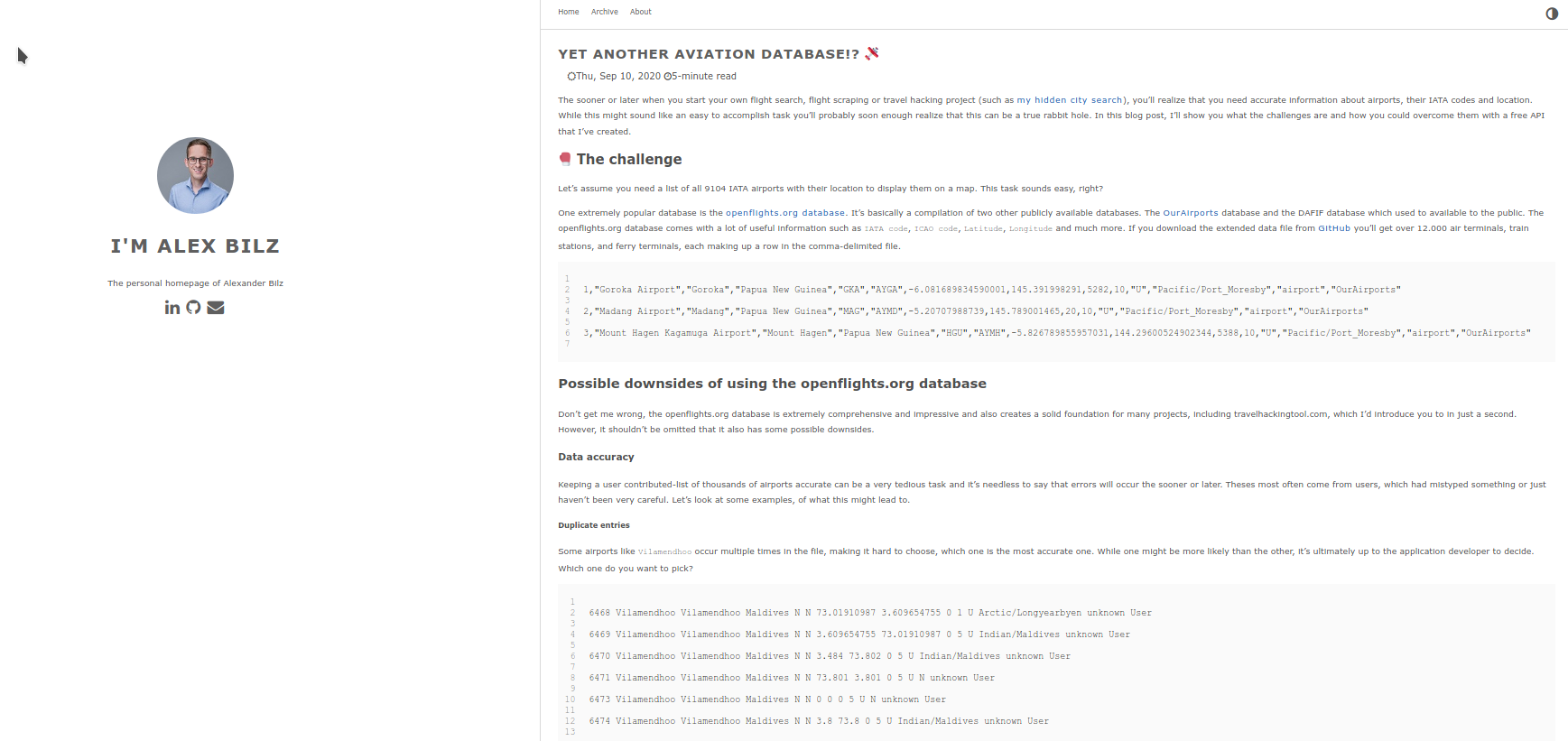
Yes, basically this is what would happen with wider screens and so. I was thinking if maybe there could be a limit on how much the website stretches horizontally. Many other websites do this very thing, so that the content does not stretch to far and your eyes get tired of moving so much.
ivnvitx
on 24 Sep 2020
@ivnvitx Gotcha, what we could do is to add a percentual margin for the content for high resolutions. This would look like the following:
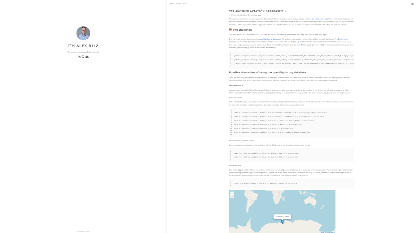
I'll add it on to the road map. As you might have noticed the sidebar gets very obvious on large screens. It might be worth reducing it's size too.
lxndrblz
on 24 Sep 2020
Yes, thank you for your work.
The picture you showed is definitely better but at the same time, it would be better if no space was generated between the sidebar and the content.
I feel like maybe the best approach would be to somehow keep both sides kinda together in the center, leaving blank space on the sides, or pushing everything to the left and leave a blank space on the right. I wish I (noob) could help out on this. I'll try when I get a bit of time.
ivnvitx
on 30 Sep 2020
@ivnvitx I got an ultrawide screen the other day- so I'll be able to do some easy testing. I'm totally with you that centring the whole page would be the best approach. From what I've seen that's also the approach most other websites take.
lxndrblz
on 5 Oct 2020
The sidebar does look too big in most desktop screens.
 LITUATUI
on 16 Oct 2020
LITUATUI
on 16 Oct 2020
@LITUATUI Thanks for the feedback. I am working on the ultra-widescreen topic. For the time being you can also use a custom CSS file to shrink the column width.
lxndrblz
on 16 Oct 2020
Thanks @lxndrblz. Just did what you suggested to shrink the sidebar from 40 to 25 %, looks much better now.
LITUATUI
on 17 Oct 2020
Related issues
 SamEdwardes
·
6Comments
SamEdwardes
·
6Comments
 GhostBasenji
·
5Comments
GhostBasenji
·
5Comments
 shariq1989
·
3Comments
shariq1989
·
3Comments
 karasun0
·
3Comments
karasun0
·
3Comments
 Sptandi
·
4Comments
Sptandi
·
4Comments