Amphtml: Story education and viewport warning layer don't overlap well
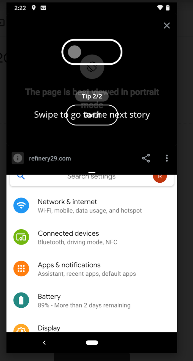
Story education and viewport warning layer don't overlap well. This can be seen on mobile when using the "split screen" feature:

Suggested fix: playing with the z-index so the viewport warning layer covers all the content. Once the user has resized their viewport, they will see the education and/or the story content.
cc @ampproject/wg-stories
All 4 comments
My preferred fix is to deprecate the viewport warning layer 😀
Haha yep. This one is the "best viewed in portrait mode" though, but I 100% agree for the "screen too narrow/short" one
This could be fixed by deprecating desktop panels mode :)
I agree with the suggestion to adjust the z-index.
Maybe a fix for now would be to have the viewport warning on top of the education layer.
The description of #28410 has instructions on how to force the education overlay to display.
From there we might be able to debug the z-index value.