Amphtml: Amp stories pages' background image was blocked by browser toolbar in iPhone 6&7
Please only file reports about bugs in AMP here.
What's the issue?
Hi, I got a problem about full screen amp-img in iPhone 7 and other small Apple devices. There are toolbar and address bar in iOS Safari which block the image. I try to use custom JS to fix it, but it seems be not allowed in amp stories, any idea?
How do we reproduce the issue?
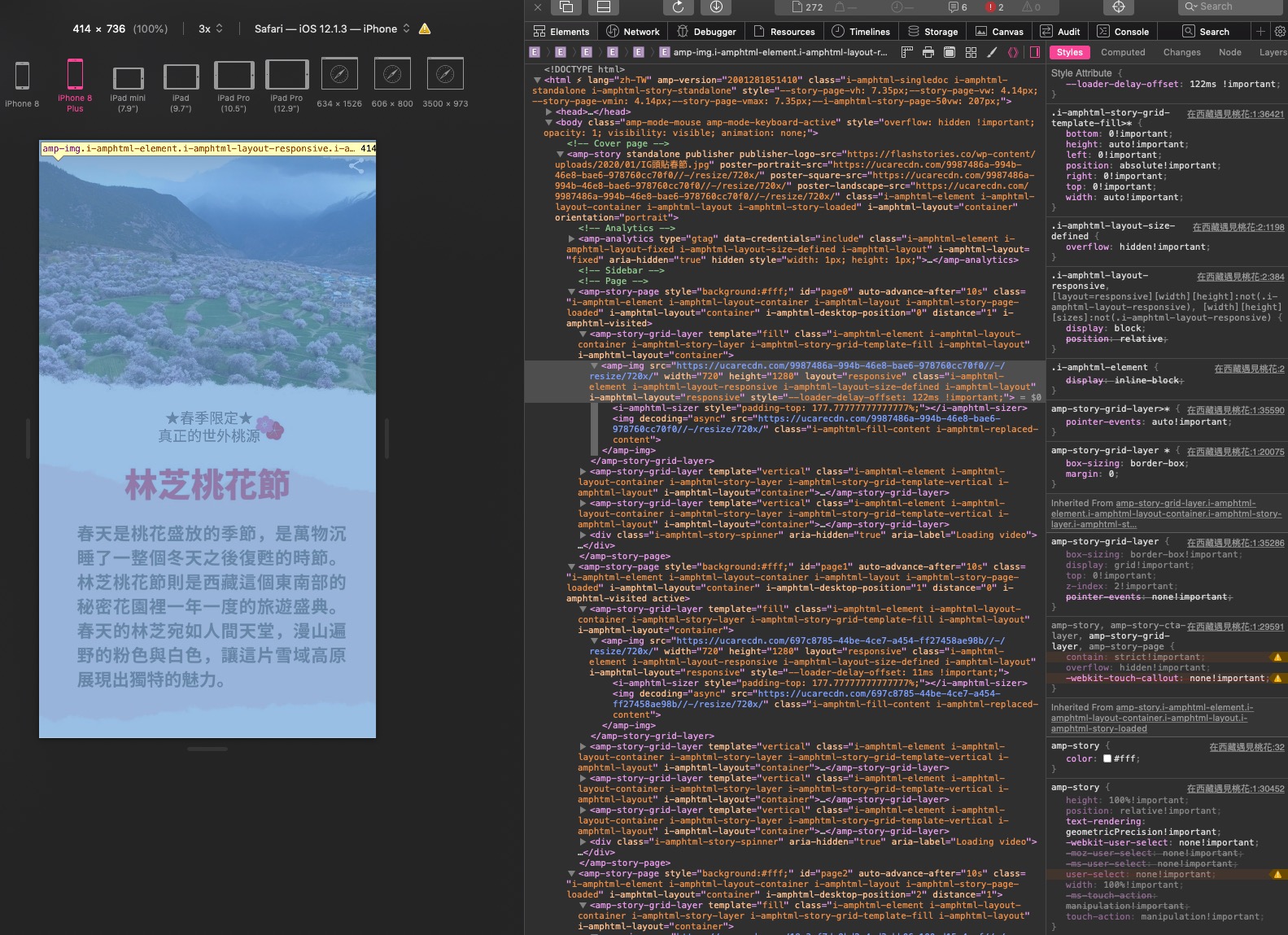
Visit this link with Mobile Safari in iPhone 6&7, and the top and bottom areas were blocked by toolbar.
https://flashstories.co/在西藏遇見桃花/
What browsers are affected?
Mobile Safari in iPhone 6&7
Which AMP version is affected?
Powered by AMP ⚡ HTML – Version 2001281851410 –
 oberonlai
All 10 comments
Thanks for the feedback!
If I understand correctly, the image is just being cropped? How would you like for the image to be displayed? You will either have to crop some of the image, or letterbox the image which leaves black bars on the sides. These can both be achieved with just CSS, so you shouldn't need custom JS to fix this.
 newmuis
on 10 Feb 2020
newmuis
on 10 Feb 2020
Thanks for your reply.
I hope the image can be displayed completely without cropped. I think that the tag
oberonlai
on 11 Feb 2020
The size of the container should be correct, but the image's object-fit defaults to cover. Can you try adding object-fit="contain" on your <amp-img> tag and see if this produces the desired result?
newmuis
on 11 Feb 2020
I didn't see the property of object-fit on <amg-img>.
oberonlai
on 12 Feb 2020
Sorry, I mean to set it as an HTML attribute. For example:
<amp-img src="https://ucarecdn.com/9987486a-994b-46e8-bae6-978760cc70f0//-/resize/720x/"
    width="720"
    height="1280"
    layout="responsive"
    object-fit="contain">
</amp-img>
Thanks for your tutorial.
There is the completed image in the screen, but I don't want to the margin on both side. Is it possible that the image is full of screen without cropping? I have tested the css value of cover and contain for serval days, and I realized that the <amp-story> container height should be resized to fit the viewport height of iPhone Safari, like what I said before. What do you think?

oberonlai
on 13 Feb 2020
This is something that's just not possible even theoretically. This isn't really a question of execution; your image and your device have different aspect ratios and so you have to figure out how you'd like to allocate the extra space. You have to choose between:
- Use all the space. The image will be full bleed, but since the image is a different aspect ratio, some of it will be cropped (what you had initially,
object-fit="cover") - Make sure the entire image is displayed. Again, since the device is a different aspect ratio, you'll have to letterbox the image, leaving extra space either on the left/right as shown above, or on the top/bottom if your device is taller than the image (
object-fit="contain") - In order to neither crop nor letterbox, you will have to force the image to be the same aspect ratio as the viewport. This results in stretching the image (which you wouldn't want, but if you want to verify that yourself, you can use
object-fit="fill")
Again this is not really about JavaScript or !important, but just about how to position two boxes (the image and the viewport) that are different shapes relative to one another.
Here's an example of all the possibilities, from a Medium post about object-fit:

It's also very important to remember that testing on an iPhone in developer tools and testing on a real iPhone is not the same. Real devices have the OS status bar, the browser bar, and navigational controls that make the viewport substantially shorter than fullscreen; none of these are shown in developer tools by default.
Now, if you would like the image to be full-bleed and cropped, but would just like to have better control of the crop, that's a different story. You can use the object-position attribute on <amp-img> to set a focal point, to attempt not to crop that portion of the image. For example, your image has text at the bottom; by default this will be cropped on some devices. The default is to crop to the center of the image, so the top and bottom will be cropped equally. I would say that you should crop the top of this image only, and not the bottom.
To do this, you can set object-position="center bottom", which indicates that the content at bottom of the image (in the center, horizontally) is the focal point of the image. This will allow you to crop out the blue sky instead of the words in the image.
Lastly, it would also work well to split this into multiple layers. The text would ideally not be part of the image so that you don't need to worry about aspect ratio, it will just wrap accordingly. But even if you make the text an image, is possible you'll want to make it a separate image from the background image, so that you can crop them differently. The text should never be cropped, ideally, so you could have that on a foreground layer with layout="responsive" and have a separate background layer with layout="fill". This part is likely much more work for you at this point, so I'd say it's optional, but it would quite possibly have a better output.
newmuis
on 13 Feb 2020
Appreciate your detail explanation!
My biggest problem is I am developing the AMP Stories Builder for normal users who don't know anything about coding. It is not possible asking everyone to build the content in our way. The truth is that they usually upload the image which they have already designed in Photoshop or Illustrator for another platform, like Instagram Stories. They don't want to make another design for AMP Stories.
In my opinion, I think the html or body height shouldn't be 100%!important, the better way I found in this article ---> https://css-tricks.com/the-trick-to-viewport-units-on-mobile/.
It uses the Javascript to get the window.innerHeight to set the CSS --var property in height calc. I wanna try this way but I can't add js in amp stories. Is it possible adding this function to the AMP stories source code?
oberonlai
on 14 Feb 2020
You are definitely free to try it; you can even use !important for local testing as there are no restrictions around that. My point was just that this will not fix the issue, it's not a matter of code but a matter of the theory here. In fact, the element is already correctly sized (which is why your image fits the height perfectly with object-fit="contain"), it's just that the default value we use for object-fit is cover, which causes the image to get cropped. But, the height of the container is correct.
The problem isn't the styling of the page, but rather the fact that it's viewed in a window that is a different aspect ratio than the image content. Instagram uses 9:16 content, and has the ability to control how the content is rendered. Technically, they solve this problem by letterboxing. On shorter phones, they show the content fullscreen:
Notice how the UI widgets like the progress bar at the top and the comment box on the bottom are overlaid on top of the content. On taller phones, they cap the story at 9:16:
Notice how the comment box at the bottom is below the bottom of the story.
Since most modern phones are taller than 9:16 AND since they have the ability to utilize the full screen if they like, this works perfectly for them, because they know there will always at least be space for 9:16 content.
However, this is not true in the web context. Although the device that you used (iPhone 7) is 9:16, the browser bars and OS bars take up about 93px of vertical space, leaving you with a much shorter aspect ratio (closer to 9:13). If we could utilize the full screen, that would work as well, but fullscreen support is very spotty (not supported on iPhones at all), and even where it is implemented, it requires a user to click e.g. a button first. So, the user will always have a chance to see your content the same problematic way as posted above.
So, you'll always have to choose between cropping, stretching, and letterboxing content; you can't have something be full-bleed and also not cropped unless your image is exactly the same aspect ratio as the viewport. Instagram chose to solve this problem by letterboxing at a fixed aspect ratio of 9:16; you could do the same, but you'll want to target a much shorter aspect ratio for web, since you can pretty much always expect to lose a substantial portion of the viewport to OS and browser UI chrome. To do the letterboxing with a single image like you have, you just need the object-fit="contains" from above, but again you'll likely want to encourage folks to produce image content at a shorter aspect ratio for now.
newmuis
on 14 Feb 2020
I got your point. I'll take your advice to keep the fixed aspect ratio of 9:16 to solve this problem. Thank you for being patient to answer my question!
oberonlai
on 14 Feb 2020
Related issues
 gmajoulet
·
3Comments
gmajoulet
·
3Comments
 westonruter
·
3Comments
westonruter
·
3Comments
 samanthamorco
·
3Comments
samanthamorco
·
3Comments
 mkhatib
·
3Comments
mkhatib
·
3Comments
 edhollinghurst
·
3Comments
edhollinghurst
·
3Comments
Most helpful comment
You are definitely free to try it; you can even use
!importantfor local testing as there are no restrictions around that. My point was just that this will not fix the issue, it's not a matter of code but a matter of the theory here. In fact, the element is already correctly sized (which is why your image fits the height perfectly withobject-fit="contain"), it's just that the default value we use forobject-fitiscover, which causes the image to get cropped. But, the height of the container is correct.The problem isn't the styling of the page, but rather the fact that it's viewed in a window that is a different aspect ratio than the image content. Instagram uses 9:16 content, and has the ability to control how the content is rendered. Technically, they solve this problem by letterboxing. On shorter phones, they show the content fullscreen:
Notice how the UI widgets like the progress bar at the top and the comment box on the bottom are overlaid on top of the content. On taller phones, they cap the story at 9:16:
Notice how the comment box at the bottom is below the bottom of the story.
Since most modern phones are taller than 9:16 AND since they have the ability to utilize the full screen if they like, this works perfectly for them, because they know there will always at least be space for 9:16 content.
However, this is not true in the web context. Although the device that you used (iPhone 7) is 9:16, the browser bars and OS bars take up about 93px of vertical space, leaving you with a much shorter aspect ratio (closer to 9:13). If we could utilize the full screen, that would work as well, but fullscreen support is very spotty (not supported on iPhones at all), and even where it is implemented, it requires a user to click e.g. a button first. So, the user will always have a chance to see your content the same problematic way as posted above.
So, you'll always have to choose between cropping, stretching, and letterboxing content; you can't have something be full-bleed and also not cropped unless your image is exactly the same aspect ratio as the viewport. Instagram chose to solve this problem by letterboxing at a fixed aspect ratio of 9:16; you could do the same, but you'll want to target a much shorter aspect ratio for web, since you can pretty much always expect to lose a substantial portion of the viewport to OS and browser UI chrome. To do the letterboxing with a single image like you have, you just need the
object-fit="contains"from above, but again you'll likely want to encourage folks to produce image content at a shorter aspect ratio for now.