Amphtml: <amp-img> sizes attribute behavior seems different from non-AMP <img>
What's the issue?
This might be the expected behavior. But it looks like the <amp-img> sizes attribute causes inline styling to be added to the <amp-img>, which can distort it.
And this seems to be different from the non-AMP behavior of a sizes attribute in an <img>.
How do we reproduce the issue?
- Add an
<amp-img>to an AMP document, like in this bin: https://ampb.in/#-LICaUs4O7ob4r45bpO3 - Set a
sizesvalue of100vw. - Set the
srcto an image that isn't big enough to fill the entirevw, like150px x 150px. For example: https://paired-ampconfdemo.pantheonsite.io/wp-content/uploads/2018/07/image-alignment-150x150.jpg - Expected: The image appears at its natural size:
https://paired-ampconfdemo.pantheonsite.io/image-alignment-150x150/

- Actual: The image is distorted:
https://paired-ampconfdemo.pantheonsite.io/image-alignment-150x150/?amp

It looks like the AMP runtime adds an inline style to the <amp-img> that's the same as the sizes attribute:
<amp-img ... sizes="100vw" layout="intrinsic" style="width: 100vw;">
This looks different from the AMP documentation for <amp-img>:
sizes
Same as sizes attribute on the img tag.
Still, this Responsive images document suggests that this might be expected.
What browsers are affected?
Chrome Version 67.0.3396.99 (Official Build) (64-bit)
Firefox 60.0.2 (64-bit)
Safari Version 11.1 (13605.1.33.1.2)
All on MacOS 10.13.4 (17E199)
Which AMP version is affected?
1531800879103
We noticed this on July 2, 2018 on amp-wp/1237.
 kienstra
All 26 comments
/cc @cathyxz
 aghassemi
on 25 Jul 2018
aghassemi
on 25 Jul 2018
We propagated srcset and sizes to <amp-img> in https://github.com/ampproject/amphtml/pull/14975. It looks like we need to remove some custom logic that is done for sizes in https://github.com/ampproject/amphtml/blob/2dcc8c25b433394d0ba72927fa91cb67e055ecfd/src/custom-element.js#L648-L655.
Probably the easiest way to do this for <amp-img> without killing anything else is to override the applySizesAndMediaQuery for <amp-img> and have it do nothing. If applySizesAndMediaQuery can be overridden, that is.
 cathyxz
on 25 Jul 2018
cathyxz
on 25 Jul 2018
We would still want sizes to be applied to amp-img I think one issue is that in AMP, sizes takes precedence over width and height but in img, width and height take precedence over sizes. There may also be other inconsistencies.Essentially we need need to make sure amp-img is sized exactly as img is sized when it comes to sizes attribute ( but both need to get sized regardless )
aghassemi
on 25 Jul 2018
@kienstra In this particular example, you are using layout=intrinsic which works similar tolayout =responsive and width and height are used to calculate the aspect ratio and work as min-width/height too but the final layout can definitely be bigger than the given width and height.
In short, that is not equivalent to <img width="150" height="150" src="https://url">. The equivalent to that would be <amp-img layout=fixed width=150 height=150> (regardless this bug exists with layout=fixed as well).
<amp-img layout=intrinsic width=150 height=150> would be roughly equivalent to <img style="width:100%; min-width: 150px; padding-top: 100%; min-height: 150px">
aghassemi
on 25 Jul 2018
Thanks!
Hi @aghassemi,
Thanks a lot for looking at this. And good point that the <img> in the example would be more like <amp-img layout=fixed width=150 height=150>
kienstra
on 25 Jul 2018
Here I see that when amp-img is used with srcset and sizes attribute then the meaning of sizes attribute is different than how other amp element uses sizes attribute. It looks like there is a conflict. Maybe introducing one new attribute specific to the amp-img element for sizes ( map that new attribute with actual image sizes attribute and let allow the browser to handle srcset and sizes calculation? ) can be one of the fixes. Share your thoughts.
/cc @cathyxz @aghassemi
 sagarkbhatt
on 3 Nov 2018
sagarkbhatt
on 3 Nov 2018
Context: The AMP runtime defines sizes behavior for all components.
I think this would be a reasonable thing to do:
- If
sizesis set on an<amp-img>, then it behaves exactly the same as a normal<img>tag. We should keep API consistency with html. - For all other components, we'd like the
sizesattribute to behave as currently defined.
Maybe this is just a case of special-casing sizes for <amp-img> and not doing anything in applySizesAndMediaQuery if the element is an <amp-img>, since sizes is already propagated to the <img> tag in the amp-img implementation.
What do you think @aghassemi ?
cathyxz
on 6 Nov 2018
@cathyxz
But we still require sizes for amp-img right?
sagarkbhatt
on 6 Nov 2018
sizes is an optional attribute for <amp-img>.
We were thinking of auto-populating it if undefined for components like <amp-lightbox-gallery> as a future feature request, but that shouldn't impact what we want to do here.
cathyxz
on 6 Nov 2018
This issue hasn't been updated in awhile. @cathyxz Do you have any updates?
 ampprojectbot
on 13 Feb 2019
ampprojectbot
on 13 Feb 2019
Here's another report of this issue: https://wordpress.org/support/topic/amp-conflicting-with-align-center-gb-image/
👉 This is important because it involves styles that are now included in WordPress core and should be present on every install.
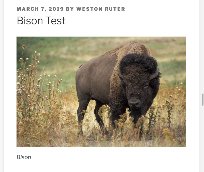
Given this non-AMP HTML:
<div class="wp-block-image">
<figure class="aligncenter">
<img src="https://i0.wp.com/weston.ruter.net/wp-content/uploads/2019/03/American_bison_k5680-1.jpg?resize=525%2C343&ssl=1" alt="" class="wp-image-9064" srcset="https://i0.wp.com/weston.ruter.net/wp-content/uploads/2019/03/American_bison_k5680-1.jpg?resize=700%2C457&ssl=1 700w, https://i0.wp.com/weston.ruter.net/wp-content/uploads/2019/03/American_bison_k5680-1.jpg?resize=300%2C196&ssl=1 300w, https://i0.wp.com/weston.ruter.net/wp-content/uploads/2019/03/American_bison_k5680-1.jpg?resize=768%2C501&ssl=1 768w, https://i0.wp.com/weston.ruter.net/wp-content/uploads/2019/03/American_bison_k5680-1.jpg?w=1050&ssl=1 1050w, https://i0.wp.com/weston.ruter.net/wp-content/uploads/2019/03/American_bison_k5680-1.jpg?w=1575&ssl=1 1575w" sizes="(max-width: 525px) 100vw, 525px" data-recalc-dims="1"/>
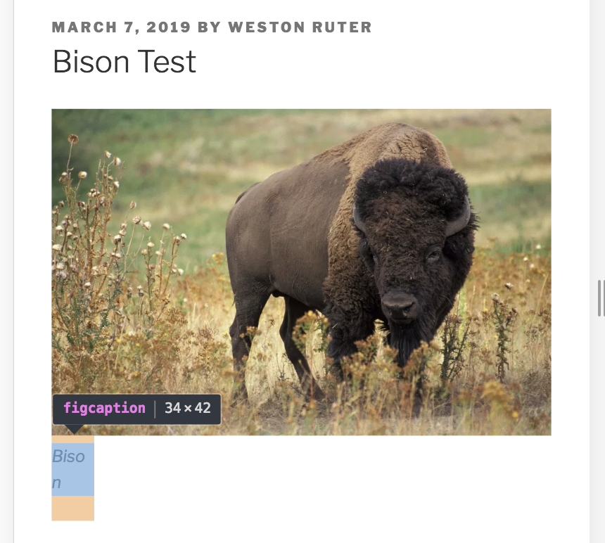
<figcaption>Bison</figcaption>
</figure>
</div>
Which renders as:
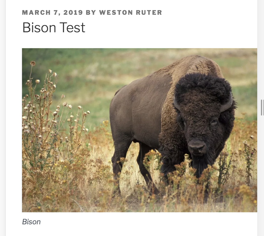
And this AMP generated from the HTML (via the AMP WordPress plugin):
<div class="wp-block-image">
<figure class="aligncenter">
<amp-img src="https://i0.wp.com/weston.ruter.net/wp-content/uploads/2019/03/American_bison_k5680-1.jpg?resize=525%2C343&ssl=1" alt="" class="wp-image-9064 amp-wp-enforced-sizes" srcset="https://i0.wp.com/weston.ruter.net/wp-content/uploads/2019/03/American_bison_k5680-1.jpg?resize=700%2C457&ssl=1 700w, https://i0.wp.com/weston.ruter.net/wp-content/uploads/2019/03/American_bison_k5680-1.jpg?resize=300%2C196&ssl=1 300w, https://i0.wp.com/weston.ruter.net/wp-content/uploads/2019/03/American_bison_k5680-1.jpg?resize=768%2C501&ssl=1 768w, https://i0.wp.com/weston.ruter.net/wp-content/uploads/2019/03/American_bison_k5680-1.jpg?w=1050&ssl=1 1050w, https://i0.wp.com/weston.ruter.net/wp-content/uploads/2019/03/American_bison_k5680-1.jpg?w=1575&ssl=1 1575w" sizes="(max-width: 525px) 100vw, 525px" data-recalc-dims="1" width="525" height="343" layout="intrinsic"></amp-img>
<figcaption>Bison</figcaption>
</figure>
</div>
Which renders incorrectly as (with the image width overflowing the right margin):
The DOM with the AMP runtime:
<div class="wp-block-image">
<figure class="aligncenter">
<amp-img src="https://i0.wp.com/weston.ruter.net/wp-content/uploads/2019/03/American_bison_k5680-1.jpg?resize=525%2C343&ssl=1" alt="" class="wp-image-9064 amp-wp-enforced-sizes i-amphtml-element i-amphtml-layout-intrinsic i-amphtml-layout-size-defined i-amphtml-layout" srcset="https://i0.wp.com/weston.ruter.net/wp-content/uploads/2019/03/American_bison_k5680-1.jpg?resize=700%2C457&ssl=1 700w, https://i0.wp.com/weston.ruter.net/wp-content/uploads/2019/03/American_bison_k5680-1.jpg?resize=300%2C196&ssl=1 300w, https://i0.wp.com/weston.ruter.net/wp-content/uploads/2019/03/American_bison_k5680-1.jpg?resize=768%2C501&ssl=1 768w, https://i0.wp.com/weston.ruter.net/wp-content/uploads/2019/03/American_bison_k5680-1.jpg?w=1050&ssl=1 1050w, https://i0.wp.com/weston.ruter.net/wp-content/uploads/2019/03/American_bison_k5680-1.jpg?w=1575&ssl=1 1575w" sizes="(max-width: 525px) 100vw, 525px" data-recalc-dims="1" width="525" height="343" layout="intrinsic" i-amphtml-layout="intrinsic" style="width: 100vw;">
<i-amphtml-sizer class="i-amphtml-sizer">
<img alt="" role="presentation" aria-hidden="true" class="i-amphtml-intrinsic-sizer" src="data:image/svg+xml;charset=utf-8,<svg height="343px" width="525px" xmlns="http://www.w3.org/2000/svg" version="1.1"/>">
</i-amphtml-sizer>
<img decoding="async" alt="" srcset="https://i0.wp.com/weston.ruter.net/wp-content/uploads/2019/03/American_bison_k5680-1.jpg?resize=700%2C457&ssl=1 700w, https://i0.wp.com/weston.ruter.net/wp-content/uploads/2019/03/American_bison_k5680-1.jpg?resize=300%2C196&ssl=1 300w, https://i0.wp.com/weston.ruter.net/wp-content/uploads/2019/03/American_bison_k5680-1.jpg?resize=768%2C501&ssl=1 768w, https://i0.wp.com/weston.ruter.net/wp-content/uploads/2019/03/American_bison_k5680-1.jpg?w=1050&ssl=1 1050w, https://i0.wp.com/weston.ruter.net/wp-content/uploads/2019/03/American_bison_k5680-1.jpg?w=1575&ssl=1 1575w" src="https://i0.wp.com/weston.ruter.net/wp-content/uploads/2019/03/American_bison_k5680-1.jpg?resize=525%2C343&ssl=1" sizes="(max-width: 525px) 100vw, 525px" class="i-amphtml-fill-content i-amphtml-replaced-content">
</amp-img>
<figcaption>Bison</figcaption>
</figure>
</div>
Notice again that the amp-img has the style="width: 100vw;".
Two other things to point out:
This style rule _does_ exist as originating from WordPress:
.wp-block-image amp-img {
    max-width: 100%;
}
In spite of this, the image still overflows. And this seems to be due to another WordPress style:
.wp-block-image .aligncenter {
    display: table;
}
If I hack DevTools to make this display: block then the amp-img properly no longer overflows the container. However, this then breaks the figcaption which has a display:table-caption style:
Here is the full AMP HTML document which you can use for debugging: https://gist.github.com/westonruter/3cb2eddb970d5500b785dced91be655c
@cathyxz Should this be fixed by #20968?
 westonruter
on 7 Mar 2019
westonruter
on 7 Mar 2019
Hi @westonruter! So the intended result of #20968 is that you should no longer need to add a sizes attribute to <amp-img> and the AMP runtime will automatically generate a correct sizes attribute for you. We won't be "fixing" this bug in the sense of making sizes on <amp-img> behave consistently with sizes on img because sizes on AMP in general has a different meaning and changing that could break a lot of websites that depend on that behavior. However, on your end, you should be able to remove the sizes attribute and expect sizes to be automatically generated on the <img> inside each <amp-img>.
*Note that this PR is currently still in canary-only and will ramp up to 100% of production over 4 weeks (you can test it by enabling the experiment or using dev channel though).
To clarify in context of this thread, what I proposed in https://github.com/ampproject/amphtml/issues/17053#issuecomment-436398050 doesn't work due to backward compat issues mentioned above, and if you remove sizes from <amp-img> you should get correct <img> sizes from #20968, autogenerated.
cathyxz
on 7 Mar 2019
@cathyxz Thank you. It's the amp-img-auto-sizes experiment? I don't see it listed: https://cdn.ampproject.org/experiments.html
westonruter
on 7 Mar 2019
Yup. It should be in the next release--sorry our current release is a little bit behind schedule. /cc @erwinmombay to attach the next release issue when canary is cut.
cathyxz
on 7 Mar 2019
So to confirm, if I include the meta tag:
<meta name="amp-experiments-opt-in" content="amp-img-auto-sizes">
It won't have any effect yet either, correct?
westonruter
on 7 Mar 2019
Nope, not until the next canary release goes out.
cathyxz
on 7 Mar 2019
Sorry @westonruter I need to make a correction. ~We did not launch this experiment as doc-level opt-in (we actually no longer do doc-level opt-in), so the meta tag syntax you referenced above will not work (even after the experiment reaches canary). You can test this experiment locally by opting in a browser via the JS console or clicking the button on the experiments page, but we don't currently have a way for pages to test this as valid AMP.~ #21320 should make canary cut today.
cathyxz
on 8 Mar 2019
@cathyxz Should I be seeing a sizes attribute added in the amp-img > img now?

westonruter
on 8 Mar 2019
Hi @westonruter ! I think it's because the amp-img-auto-sizes experiment hasn't made it to production yet (only canary). I've copied your code above into a minimal repro here: https://codepen.io/cathyxz/full/MxowZK
Note that if amp-img-auto-sizes is on, but dev-channel is off, it doesn't generate a sizes attribute. But if you turn both amp-img-auto-sizes and dev-channel on, it does.
I guess that's why our experiments page doesn't have the amp-img-auto-sizes experiment as an option to turn on yet.
(This is with dev-channel and amp-img-auto-sizes on.)

cathyxz
on 8 Mar 2019
@cathyxz Thank you. I was missing the turning on of the dev-channel:

I have something else for you to look at which may be unintended side effect of removing the sizes: doing so seems to cause the width to no longer be set. Look at this Pen which has the same image with and without sizes defined in the source HTML. Regardless of the experiment running, the second one appears stretched: https://codepen.io/westonruter/pen/jJwbqq?editors=1000
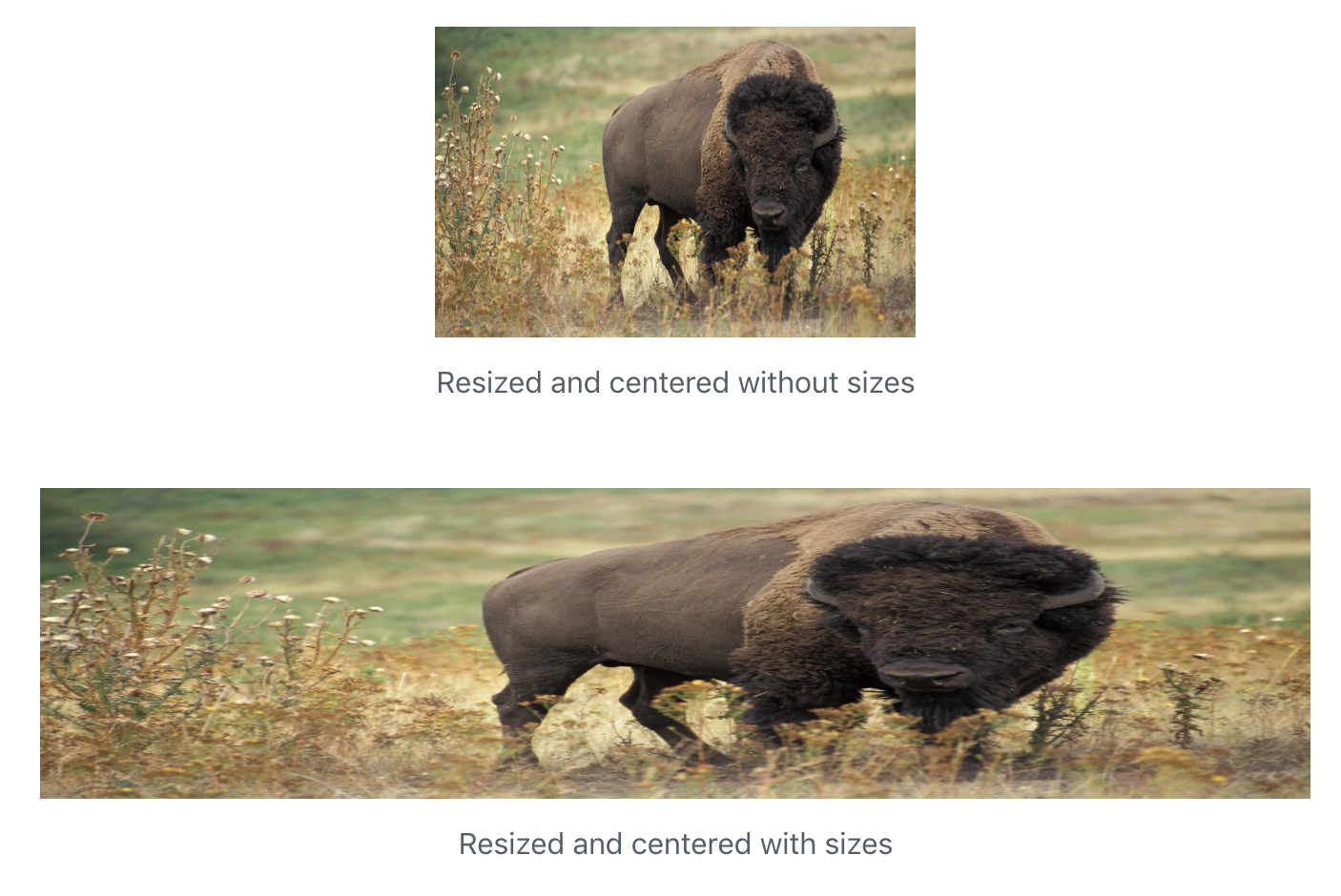
In the first amp-img there is a style="width: 252px;" added whereas in the second there is none. If the recommendation is that the sizes is no longer necessary, then shouldn't the width be added just the same?
westonruter
on 9 Mar 2019
Hi @westonruter !
Thanks a lot for the feedback. I'm going to have to look at this a little bit more closely, but here are a few quick comments and observations:
- We decided to keep
sizesonamp-imgconsistent with the waysizesoperates on general AMP components, which is it's used to infer layout and setwidthbased on media query given a particular matched natural size. - For those who use
sizesin this way, we propagate thesizesattribute to the underlying<img>tag, because people usingsizesin this heuristic will end up with reasonable values for the<img>sizes attributes as well. So if you want to applysizesto<amp-img>, you will set inferred layout, setstyle="width...", and propagatesizesto the underlying<img>tag. - We plan to introduce automatically generated sizes as an option for people who don't want to use
sizesfor inferred layout, and don't want to usesizesto setwidth, because this is inconsistent with how<img>sizes behaves and somewhat confusing. The proposal here is just don't worry about<img>sizes, we will autocalculate and set it for you. It's by no means perfect, but this is the proposed solution for this issue because the original problem statement here was that people didn't like addingsizes(with the intention of making use of browser responsiveness optimizations) having the side effect of settingstyle="width...".
On your particular example:
You're using Layout=INTRINSIC, and without the style="width..." side effect now, it doesn't look like Layout=INTRINSIC. The CSS styling on your page interfering with layout=INTRINSIC here is the display: block style on amp-img which overrides the display: inline-block on layout=INTRINSIC. If you remove that CSS property (as per my screen shot below), I think Layout=INTRINSIC will now behave as intended (but I'm not 100% sure what your intended result is).

We can but I'm not sure if we should do display: inline-block !important on Layout=INTRINSIC to prevent this. Is it possible to get your intended result here by either removing the display: block on <amp-img> to let Layout=INTRINSIC do its thing, or consider using Layout=RESPONSIVE or a different layout instead?
Referencing your attached issue https://wordpress.org/support/topic/amp-conflicting-with-align-center-gb-image/, I think without the manually set style="width", you can now override the width with external CSS without issue.
EDITED for clarity and typos.
cathyxz
on 9 Mar 2019
Thank you. I'll have to take some time to digest this 🙂
I'm not 100% sure what your intended result is)
The intended result is for the image to not be stretched 😄 So it should be a 252x163 image that is centered via auto margins:

westonruter
on 9 Mar 2019
Ah gotcha. In that case, I think removing the display: block on amp-img, for <amp-img> tags with Layout=INTRINSIC or otherwise allowing <amp-img> with Layout=INTRINSIC to be display: inline-block should suffice.
.entry .entry-content .wp-block-image amp-img {
    display: block;
}
In particular, I'm referring to this style block ^^ from your codepen.
But yeah, this feature is new, experimental, and somewhat risky, so thank you so much for trying this out and giving us feedback!
cathyxz
on 9 Mar 2019
Ah gotcha. In that case, I think removing the
display: blockonamp-img
I see. That becomes a challenge then because this CSS is coming from the WordPress theme itself (the AMP plugin converts the img to amp-img):
So at the moment I have in https://github.com/ampproject/amp-wp/pull/1939 a workaround:
/**
 * Prevent display:block in a theme's stylesheet from breaking the width of an image that has an intrinsic layout.
 * See <https://github.com/ampproject/amphtml/issues/17053#issuecomment-471127486>.
 */
.wp-block-image:not(#_) > figure > amp-img {
    display: inline-block;
    vertical-align: middle;
}
This isn't ideal, naturally. Ideally the underlying CSS coming from the WordPress theme or core would be using the right display as required by AMP here, but that's challenging to automate when we process the stylesheet rules. (The :not(#_) here is a hack to increase the selector specificity.) I worry about having to manually discover such rules in every theme to find overrides.
westonruter
on 9 Mar 2019
Yup, this is an issue with how layout="intrinsic" behaves when the <amp-img> is set to display: block. I filed https://github.com/ampproject/amphtml/issues/21371 to track.
cathyxz
on 12 Mar 2019
Closing this as main part is handled by auto img sizes launch and parts of this can not be fixed due to backward compatibility (e.g. sizes meaning different things in AMP vs native)
aghassemi
on 19 Jun 2019
Related issues
 samanthamorco
·
3Comments
samanthamorco
·
3Comments
 choumx
·
3Comments
choumx
·
3Comments
 jpettitt
·
3Comments
jpettitt
·
3Comments
 mrjoro
·
3Comments
mrjoro
·
3Comments
 sryze
·
3Comments
sryze
·
3Comments
Most helpful comment
We would still want
sizesto be applied toamp-imgI think one issue is that in AMP, sizes takes precedence overwidthandheightbut inimg,widthandheighttake precedence oversizes. There may also be other inconsistencies.Essentially we need need to make sureamp-imgis sized exactly asimgis sized when it comes tosizesattribute ( but both need to get sized regardless )