Amphtml: Component request: accessible navigation
What's the issue?
I'm trying to create an AMP-compatible (i.e. non-JavaScript) desktop navigation with submenus which open on hover and on focus (for keyboard accessibility).
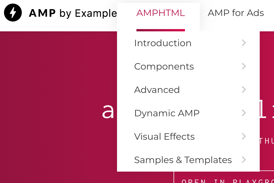
When I struggled to build this, I looked at the https://ampbyexample.com site to see how they solved it - and it turns out their desktop navigation isn't accessible either!
Could we extend the amp-sidebar component so that it can be used on desktop without toggle? Or else, build a desktop-menu component?
How do we reproduce the issue?
This is the navigation on hover (as expected):
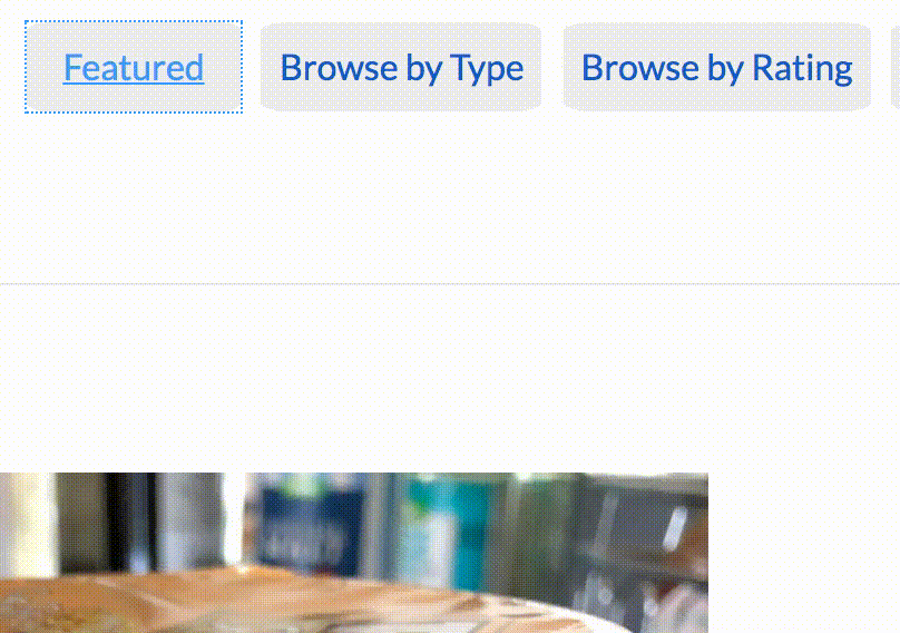
And this is the navigation when I try to access the submenu via keyboard tabbing:

In other words, I cannot navigate the site on a desktop if I am a keyboard-only user.
What browsers are affected?
N/A
Which AMP version is affected?
N/A
 ChrisBAshton
All 9 comments
/to @aghassemi
 choumx
on 2 Jan 2018
choumx
on 2 Jan 2018
/cc @sebastianbenz
 ericlindley-g
on 5 Jan 2018
ericlindley-g
on 5 Jan 2018
Would be great to have a solution for this. This applies to ampproject.org as well (cc @pbakaus, @bpaduch).
 sebastianbenz
on 8 Jan 2018
sebastianbenz
on 8 Jan 2018
I believe this is possible already. If we add tabindex and make :focus do whatever :hover is doing, then it would be accessible with tabs. For arrow key support amp-selector can be used and configured so that arrow-keys focus the item and the rest would be the same as above.
@sebastianbenz @ChrisBAshton anyone likes to give it a try?
This is still a good feature request to have a high-level navigation menu component in AMP, so I will keep it open.
 aghassemi
on 16 Jan 2018
aghassemi
on 16 Jan 2018
Hi @aghassemi - I've just tried the above and struggled to get it working:
header .dropdown li a:focus + .sub-menu {
    display: block;
}
This has the effect of:
- Opening the sub-menu when the parent element is focused
- When you tab to the first link in the sub-menu, the parent element loses focus, so the sub-menu is invisible and we can no longer see where the focus is
- When you tab again, focus moves to the next focusable _parent_ element.
Worth noting I'm working with the default HTML output of WordPress' wp_nav_menu() function:
<ul class="dropdown">
    <li><a href="/featured">Featured</a></li>
    <li class="menu-item-has-children"><a href="/reviews">Browse by Type</a>
        <ul class="sub-menu">
            <li><a href="/reviews/frozen-food">Frozen food</a></li>
            <li><a href="/reviews/chilled-food/">Chilled food</a></li>
            <li><a href="/reviews/food-cupboard/">Food cupboard</a></li>
        </ul>
    </li>
    <li><a href="/etc">Another parent element</a></li>
</ul>
The effect can be seen here:
ChrisBAshton
on 7 May 2018
I've just had another go and managed to get it working using the :focus-within CSS property: https://www.scottohara.me/blog/2017/05/14/focus-within.html
I had to modify my code to use opacity: 0; height: 0; overflow: hidden instead of display: none, and then opacity: 1; height: auto to show the menus.
It seems :focus-within is incompatible with display: none logic - at least in Chrome. The browser knows that tabbing to the next element would lose focus and would trigger display: none, so takes it out of the tab order.
You can see my implementation at https://studentmunch.com/.
ChrisBAshton
on 19 Jun 2018
Some related feedback from @Jessman5
I personally am not happy with how you have to build a main-navigation with AMP when the amp-sidebar is not what you want. I'm currently working for http://chefkoch.de and we've built the main navigation just with
<button>'s and<nav>'s and basically (sorry:) fucked around with amp states. (see here: https://www.chefkoch.de/rs/s0/bacon/Rezepte.html …) The result is everything but not accessible, sadly. If you have to use the keyboard to navigate through the site, you're lost because our navigation is huge.. this yould be easy with plain js but since it's not allowed thats the best we could code till now. If you have another IDea for this, it is very much appreciated. Otherwise we're excited to see a new module for a horizontal navigation that can be responsive for mobile views.
aghassemi
on 20 Jun 2019
I was reading up on UX research on menus recently. There was advice like "hover should not reveal menu immediately to stop page flicker when mouse moves across screen - there should be a delay", but there was an interesting discussion on submenus. I am sure you have all experienced a submenu where you hover, the submenu appears, and you have to move your mouse exactly horizontally sideways to get onto the submenu, then vertically to make your selection. If you go on a diagonal the submenu disappears. It appears the better solutions are once the submenu appears draw diagonal lines from the current menu item bounding box up to the bounding box of the submenu and if the mouse stays in that region, keep the submenu open. Then the mouse can move in a straight line from the current point on a menu item to the submenu item without it disappearing, no matter what it goes over.
There is another pattern which is menus are on every page, can be large (for good UX reasons) and so the weight of the markup matters. So you want to be able to express a mega-menu with fairly lightweight HTML markup (needs to be crawlable by search engines for SEO reasons).
This advanced sort of functionality combined with accessibility and trying to keep the markup as lightweight HTML seems potentially worthy of an AMP component?
 alankent
on 3 Jul 2019
alankent
on 3 Jul 2019
This issue has been automatically marked as stale because it has not had recent activity. It will be closed in 7 days if no further activity occurs. Thank you for your contributions.
![stale[bot] picture](https://avatars.githubusercontent.com/in/1724?v=4&s=40) stale[bot]
on 30 Jan 2021
stale[bot]
on 30 Jan 2021
Related issues
aghassemi
·
3Comments
 mkhatib
·
3Comments
mkhatib
·
3Comments
 mrjoro
·
3Comments
mrjoro
·
3Comments
 edhollinghurst
·
3Comments
edhollinghurst
·
3Comments
 westonruter
·
3Comments
westonruter
·
3Comments
Most helpful comment
Some related feedback from @Jessman5