Amp-wp: Setup Wizard: Reader theme status/availability variations
Feature description
Breaking this out from #4702 because the PR for that issue (#4800) is already huge.
4800 implements a screen that's going to look something like this (excuse the placeholders):
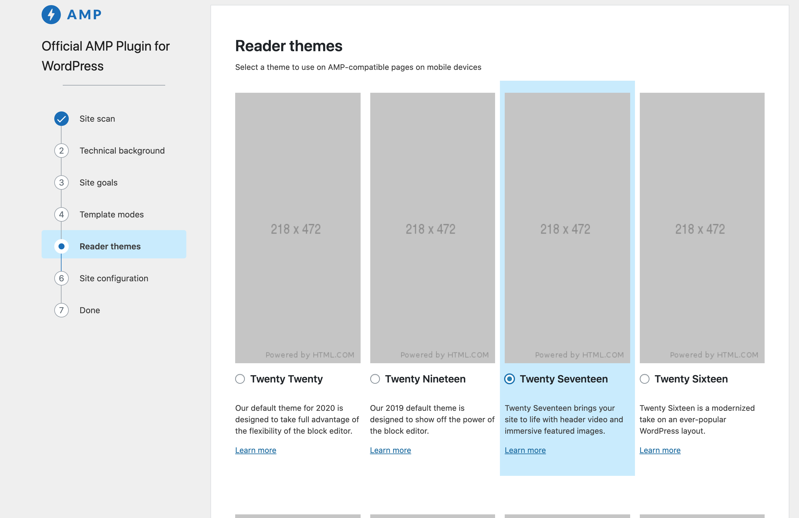
Currently the user can select any of the themes, and we're not showing some information that could be useful. With #4800, the theme data objects have the following fields that we can use:
- is_active: Whether the reader theme is the theme active on the site. Ideally a user wouldn't choose reader mode in this scenario, so we should either prevent accessing this screen or show a notice indicating their active theme is already AMP compatible and reader mode is not needed.
- can_install: Whether the theme can be installed on the current system. This will likely apply to all themes or none (though it's filterable). In this scenario the theme would be unselectable. What do we do if no themes can be installed?
- is_installed: Whether the theme already exists in the theme directory. This might not be useful to surface to the user, because themes that are not installed will be downloaded in the last wizard step.
- is_compatible_wp and is_compatible_php: If either of these fields is false, I think we'd make the theme unselectable and show a notice indicating why.
Are there other conditions I might be missing?
Acceptance criteria
- User can't select a theme if it can't be installed
- User has clear information about why a theme can't be installed
- User is directed back to previous screens if they attempt to choose a theme that is already active on their site
- If you approach the
Reader themespage, and are using a theme in your site that would have appeared on the list, hide that list. It's an unlikely scenario, but better to hide to avoid any issues. - Themes not in installed are for a specific scenario where the site is on a locked production environment - you can make file system changes, and write access cannot be made to install a theme from the plugin.
Implementation brief
- Themes that are installable will be grayed out in some way, and their radio inputs disabled
- The Notice component from core can be used to display different types of messages above or below themes listed on the screen
QA testing instructions
Demo
Changelog entry
 johnwatkins0
All 12 comments
@jwold @westonruter @amedina I created this as a follow-up to #4702. It will be small engineering-wise, but I wanted to get any opinions on the approach and maybe have our solution reflected in the comps.
johnwatkins0
on 30 May 2020
@westonruter Re: your comment on #4702:
For themes that are already installed, shouldn't there rather be an available field? For themes which are not installed but where a site allows them to be installed, then it could be true as well. Then there could be another field for installed. When installed and available are both false, then the theme would need to be disabled from being selected.
This is one status I might be missing so far. I'm not sure I've encountered a scenario where a theme is installed but not available. Can you elaborate on when this might occur? I'll need to work out the logic on the backend side, and then it does sound like we'd want these to be disabled.
johnwatkins0
on 30 May 2020
@johnwatkins0 By available I meant what you call, more precisely,can_install. I think I may have missed a “not” in that first sentence.
Something that comes to mind is that instead of is_installed and can_install perhaps we should combine these into a single non-boolean field called status (for example). It could have three values (for example):
installed: already installed, so we don't care ifcan_install.installable: not installed, but the system allows it to be installed.non-installable: not installed, and the system can't allow it to be installed (e.g. due to read-only filesystem).
This may be preferable to having two boolean fields, since we don't care if is_installed and ! can_install.
Come to think of it, this could also have the active value as well. Then there would be no need for is_active either. If a theme is active, then this entails installed.
 westonruter
on 1 Jun 2020
westonruter
on 1 Jun 2020
@jwold On the technical side, I'm going to make the update similar to how Weston suggested above. For the UI, I think the main thing we need is disabling the themes that are not installable. We may also want to handle the case where one of the reader themes is the active theme on the site.
johnwatkins0
on 1 Jun 2020
@johnwatkins0 here's the treatment I'm thinking, would love feedback:
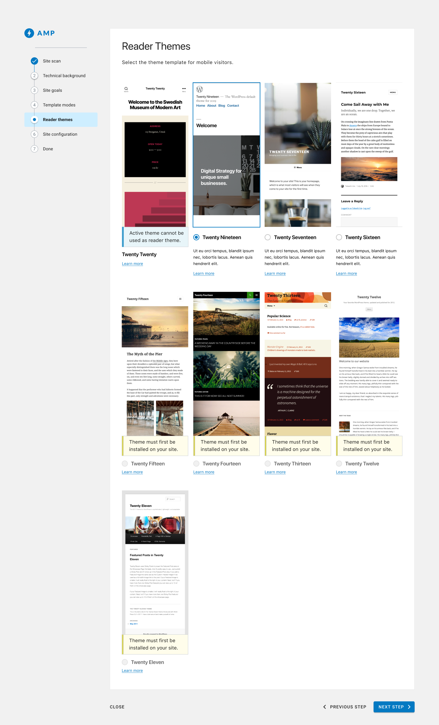
The active theme displays (if it's one on the list), but has a blue notice that it's the main theme, and has no radio button.
The selected state is a selected radio button and an outline an the image (I saw you've tested a treatment with a full blue background color, we could keep that for now, but would still welcome feedback on this treatment)
If a theme is available but not installed it will show a yellow notice, the headline and radio button will be grayed out, and the description will disappear (this is to help avoid unsightly rows if possible)
cc @amedina and @westonruter
 jwold
on 2 Jun 2020
jwold
on 2 Jun 2020
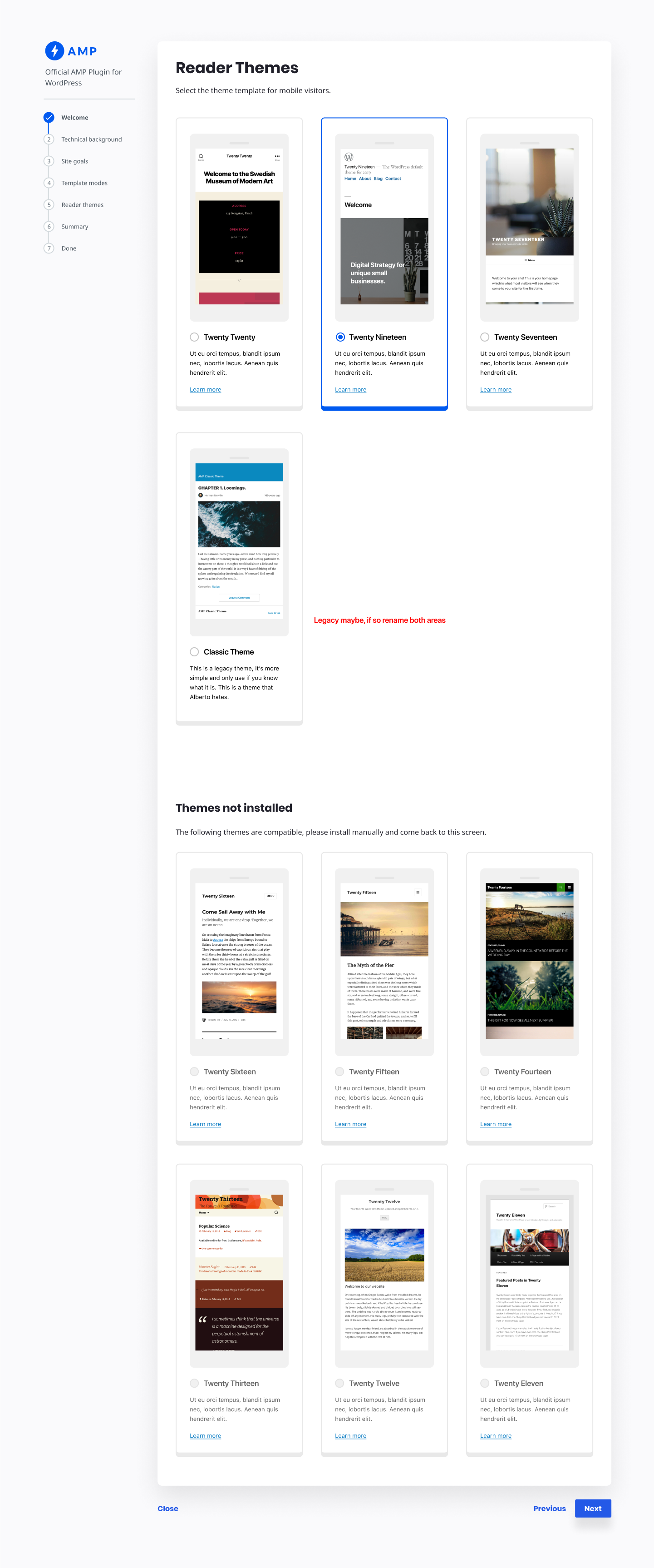
The theme cards somewhat lack visual separation. I think there should be borders around the entire theme card, with a blue color treatment for the selected theme. There may not even need to be a radio button displayed. In other words, each theme card can be considered a button. Although perhaps that would cause problems with the Learn More link.
If a theme is available but not installed it will show a yellow notice, the headline and radio button will be grayed out, and the description will disappear (this is to help avoid unsightly rows if possible)
As opposed to having the same warning message repeated multiple times, how about showing that warning once before the list of themes and then style those theme cards somehow with gray/disabled/opacity? The key here would be for all such non-installed themes to be sorted to the end of the list. Maybe it would make sense to even break the grid up into groups, where the list of disabled themes can be introduced by a heading saying “Unavailable” with an explanation why they cannot be installed.
The active theme displays (if it's one on the list), but has a blue notice that it's the main theme, and has no radio button.
The message should rather say something to the effect of, “Switch to Transitional mode or Standard more to use this theme.”
Alternatively, why not just omit it from the list?
westonruter
on 3 Jun 2020
Following up here in case I am missing something :) I liked the mobile
frame that Joshua showed today, and agree with Weston on the need of a
"card-like" layout of the theme components.
+1 to having the warning message abstracted out (e.g. a single message)
+1 on omitting the theme the desktop theme from the Reader mode theme list.
Once the user is here we have determined with certainty that Reader mode is
the appropriate mode for the user, given their answers and the plugin
intelligence gathering (e.g. site scan, etc). Therefore, we must optimize
for the Reader Mode scenario.
On Tue, Jun 2, 2020 at 3:14 PM Weston Ruter notifications@github.com
wrote:
The theme cards somewhat lack visual separation. I think there should be
borders around the entire theme card, with a blue color treatment for the
selected theme. There may not even need to be a radio button displayed. In
other words, each theme card can be considered a button. Although perhaps
that would cause problems with the Learn More link.If a theme is available but not installed it will show a yellow notice,
the headline and radio button will be grayed out, and the description will
disappear (this is to help avoid unsightly rows if possible)As opposed to having the same warning message repeated multiple times, how
about showing that warning once before the list of themes and then style
those theme cards somehow with gray/disabled/opacity? The key here would be
for all such non-installed themes to be sorted to the end of the list.
Maybe it would make sense to even break the grid up into groups, where the
list of disabled themes can be introduced by a heading saying
“Unavailable” with an explanation why they cannot be installed.The active theme displays (if it's one on the list), but has a blue notice
that it's the main theme, and has no radio button.The message should rather say something to the effect of, “Switch to
Transitional mode or Standard more to use this theme.”Alternatively, why not just omit it from the list?
—
You are receiving this because you were mentioned.
Reply to this email directly, view it on GitHub
https://github.com/ampproject/amp-wp/issues/4801#issuecomment-637835623,
or unsubscribe
https://github.com/notifications/unsubscribe-auth/AAD3R2M74LJ5SDZS4C4VV3LRUV2V3ANCNFSM4NOMZSEQ
.
 amedina
on 3 Jun 2020
amedina
on 3 Jun 2020
I think we've captured these suggestions. Thanks!
jwold
on 4 Jun 2020
@johnwatkins0 two AC that you probably captured, but I'll add to the description:
- If you approach the
Reader themespage, and are using a theme in your site that would have appeared on the list, hide that list. It's an unlikely scenario, but better to hide to avoid any issues. - Themes not in installed are for a specific scenario where the site is on a locked production environment - you can make file system changes, and write access cannot be made to install a theme from the plugin.
jwold
on 17 Jun 2020
jwold
on 23 Jun 2020
We will need to filter out the active theme from this screen. E.g., if the site is using Twenty Twenty as its main theme, we just won't show it here.
johnwatkins0
on 25 Jun 2020
- This passes QA for the common use cases
- Pending review of the problem identified regarding the deletion of the active theme and the
Congratulationsscreen message.
amedina
on 15 Jul 2020
Related issues
 swissspidy
·
5Comments
swissspidy
·
5Comments
 GitaStreet
·
4Comments
GitaStreet
·
4Comments
 miina
·
5Comments
miina
·
5Comments
swissspidy
·
4Comments
miina
·
5Comments
miina
·
5Comments
swissspidy
·
4Comments
Most helpful comment
@jwold @westonruter @amedina I created this as a follow-up to #4702. It will be small engineering-wise, but I wanted to get any opinions on the approach and maybe have our solution reflected in the comps.