Hi Jake and all,
Loving Altair and am trying to make a switch over to it from matplotlib when possible.
Is there a way that I can set things like the chart size and other features once at the beginning of an analysis instead of having to use, for example, ".properties(width=200, height=100)" after every chart? There ends up being a lot of duplication doing that as you could imagine.
I see here and here that this was addressed but wasn't able to find a clear example of how it can be done in Altair.
I can see here, that I can register a theme, but could I simply add to the default one since I'm mostly just looking to specify colors and size once?
Sincerely,
Al
 Alcampopiano
All 12 comments
The way to set defaults in a chart is to register a custom theme. For example:
import altair as alt

# do this once
def my_theme(*args, **kwargs):
    return {'width': 300, 'height': 300}
alt.themes.register('my-chart', my_theme)
alt.themes.enable('my-chart')

# now every chart will have that theme
from vega_datasets import data
cars = data.cars()

alt.Chart(cars).mark_point().encode(
    x='Horsepower',
    y='Miles_per_Gallon',
    color='Origin',
).interactive()

 jakevdp
on 16 Jul 2018
jakevdp
on 16 Jul 2018
Themes can be used to set defaults on any part of the chart specification
jakevdp
on 16 Jul 2018
This is so awesome. Thanks Jake. Altair is really a refreshing way to do visualization. Thanks for all your hard work.
Allan
Alcampopiano
on 16 Jul 2018
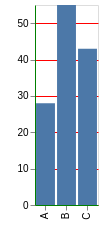
I've been working on setting global themes but hit a snag:
@jakevdp Can you think of any reason why I cannot globally set my axis titles? As you can see the plot respects some of the configurations, but not the axis title.
data = pd.DataFrame({
    'a': ['A', 'B', 'C'],
    'b': [28, 55, 43],
    'c': [33, 33, 43]
})

def my_theme(*args, **kwargs):
    return {'config': {'axis': {'domainColor': 'green', 'gridColor': 'red', 'title': 'GLOBAL_TITLE'}}}


alt.themes.register('my_theme', my_theme)
alt.themes.enable('my_theme')

alt.Chart(data).mark_bar().encode(y='b', x='a')
Alcampopiano
on 19 Jul 2018
Setting title via top-level chart configuration is not supported.
jakevdp
on 19 Jul 2018
There is no title property for config.axes. Configuration is about setting up the style of the chart than the content of the chart.
jakevdp
on 19 Jul 2018
You could do something like this if you want:
data = pd.DataFrame({
    'a': ['A', 'B', 'C'],
    'b': [28, 55, 43],
    'c': [33, 33, 43]
})

def my_theme(*args, **kwargs):
    return {'config': {'axis': {'domainColor': 'green', 'gridColor': 'red'}},
            'encoding': {'x': {'axis': {'title': 'my_x_title'}},
                         'y': {'axis': {'title': 'my_y_title'}}}
           }

alt.themes.register('my_theme', my_theme)
alt.themes.enable('my_theme')

alt.Chart(data).mark_bar().encode(y='b', x='a')
I'd probably avoid setting encoding properties as part of the theme, though. In particular, it will result in invalid chart specifications if you make a chart with no x or y encoding.
jakevdp
on 19 Jul 2018
This is exactly what I was after. I'm pretty sure I had tried something similar, but probably incorrectly set up the dictionary.
In my job I have to write very long analytic reports. They usually contain around 50 charts. Pretty well all charts have the same axis labels, color scheme, axis limits, ect. So for me it saves a lot of typing if I can specify a large number set of settings that the charts have in common at the top of the notebook.
Thank you very much Jake,
Al
Alcampopiano
on 19 Jul 2018
So, am I just thinking about this all wrong here? In my report, all bars charts should have the same bar width (size). In fact, all charts have many settings in common. I'm using:
def theme_1(*args, **kwargs):
    return {'width': 300, 'height': 300,
            'config': {'mark': {'size': 3}},
            'encoding': {'x': {'axis': {'title': 'options'}},
                         'y': {'axis': {'title': 'percentage of students'}}}}
But this does not change the bar size. When looking at the dictionary when size is used in the mark_bar() method, I see that we get:
...
'mark': {'type': 'bar', 'size': 30}
...
But adding the mark 'type' to the theme doesn't work and shouldn't since I'm pretty sure you cant render the chart without eventually using the mark_bar() method anyway.
Please let me know if I am just not using the tool correctly. In the past with matplotlib, I had a gigantic dictionary of settings that all charts had in common specified at the top of the notebook. This made the api calls smaller and easier to read. So, I'm looking for a similar sort of set up with Altair.
Thanks Jake,
Al
Alcampopiano
on 19 Jul 2018
Hi – yeah, I don't think this will work because it's not how themes were anticipated to be used.
Perhaps a better approach for you is not a theme, but a custom function you call on charts at the end; e.g.
def finalize_chart(chart):
    chart.x.axis = {'title': 'options'}
    chart.y.axis = {'title': 'percentage of students'}
    chart.mark = {'type': 'bar', 'size': 3)
    return chart
and then call that on every chart you create.
jakevdp
on 19 Jul 2018
Okay great. I will try that. Thanks Jake.
Alcampopiano
on 19 Jul 2018
Hi @jakevdp and all. After much digging and conversations with @domoritz, here is a theme that, at least in my line of work, gives access to many properties that charts will have in common for a given report: axis label font sizes, tick label font sizes, axis titles, legend symbol size, legend title font size, legend label font sizes, width, height, and bar padding (since padding is recommended instead of size; for other marks size may work).
in Altair
data = pd.DataFrame({
    'a': ['A', 'B', 'C'],
    'b': [28, 55, 43],
    'c': [33, 33, 43]
})

def theme_1(*args, **kwargs):
    return {'width': 400, 'height': 300,
            'config': {'style': {'bar': {'size': 20}},
                       'legend': {'symbolSize': 20, 'titleFontSize': 20, 'labelFontSize': 20},
                       'axis': {'titleFontSize': 20, 'labelFontSize': 20}},
            'encoding': {'x': {'axis': {'title': 'options'}, 'scale': {'paddingOuter': 0.5, 'paddingInner': 0.5}},
                         'y': {'axis': {'title': 'percentage of students'}}}}

alt.themes.register('theme_1', theme_1)
alt.themes.enable('theme_1');

alt.Chart(data).mark_bar().encode(y='b', x='a', color='a')
in vega-lite
{
  "$schema": "https://vega.github.io/schema/vega-lite/v2.4.3.json",
  "config": {
    "axis": {
      "labelFontSize": 20,
      "titleFontSize": 20
    },
    "legend": {
      "labelFontSize": 20,
      "symbolSize": 100,
      "titleFontSize": 20
    },
    "style": {
      "bar": {
        "size": 20
      }
    }
  },
  "data": {
    "values": [
      {
        "a": "A",
        "b": 28,
        "c": 33
      },
      {
        "a": "B",
        "b": 55,
        "c": 33
      },
      {
        "a": "C",
        "b": 43,
        "c": 43
      }
    ]
  },
  "encoding": {
    "color": {
      "field": "a",
      "type": "nominal"
    },
    "x": {
      "axis": {
        "title": "options"
      },
      "field": "a",
      "scale": {
        "paddingInner": 0.5,
        "paddingOuter": 0.5
      },
      "type": "nominal"
    },
    "y": {
      "axis": {
        "title": "percentage of students"
      },
      "field": "b",
      "type": "quantitative"
    }
  },
  "height": 300,
  "mark": "bar",
  "width": 400
}
Related issues
 LukeMathWalker
·
3Comments
LukeMathWalker
·
3Comments
 tonylee3399
·
3Comments
tonylee3399
·
3Comments
 nielsmde
·
4Comments
nielsmde
·
4Comments
 breadbaron
·
4Comments
breadbaron
·
4Comments
 HalukaMB
·
3Comments
HalukaMB
·
3Comments
Most helpful comment
This is so awesome. Thanks Jake. Altair is really a refreshing way to do visualization. Thanks for all your hard work.
Allan