Discuss!

 theZiz
All 26 comments
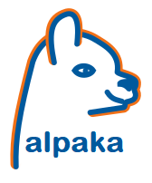
:) The idea is great! BUT, a thing which distracted me is the brown color and that the lines of the alpaka in the alpaka are a lil bit too sketchy. Maybe the smoothness & style factor can be increased to look more streamlined, while keeping the sweet look. Then I will really like it :)
 tdd11235813
on 25 Sep 2018
tdd11235813
on 25 Sep 2018
The colours are HZDR / picongpu / isaac related. I changed the brownish orange to a more orange hzdr orange.
It is quite hard to give the impression of a alpaca head, while making this it looked more like a hyena most of the time. I tried to smooth the neck a bit. I will try some other ideas tomorrow.

theZiz
on 25 Sep 2018
I see alpaka is not easy :) I am curious how a blue inner contour line will look like, so the head silhouette is complete and the orange bigger contour is the light coming from the back(-ends) ;)
tdd11235813
on 25 Sep 2018
Colors and logo are cool. Can you make the front of the face less wobbly?
I have the impression the orange line is too thick for the fine lines of blue... Maybe you can decrease the orange width or increase the blue-lines' width a little? Alternatively, maybe alternate the width of the orange line around the details, neck and/or ears?
(Is the font free?)
 ax3l
on 25 Sep 2018
ax3l
on 25 Sep 2018
Will this be a SVG?
In the png the ear is filled with white while the rest is transparent.
 BenjaminW3
on 26 Sep 2018
BenjaminW3
on 26 Sep 2018
Colors and logo are cool. Can you make the front of the face less wobbly?
Unfortunately no. Every try I gave to make the face less wobbly ended in a hyena or some my little pony character. :roll_eyes: I can of course give you the SVG to play around yourself :wink:
I have the impression the orange line is too thick for the fine lines of blue... Maybe you can decrease the orange width or increase the blue-lines' width a little? Alternatively, maybe alternate the width of the orange line around the details, neck and/or ears?
Hm, funny, I thought the orange line may be a bit too thin. I will try more variants after this post, maybe this solves this impression a bit. :smiley:
(Is the font free?)
The font is Latin Modern Sans Quotation. Of course I tried to to use a free font. The license is GUST Font License, which is legally the same as the LaTeX Project Public License.
Will this be a SVG?
It is already, but I can't upload SVGs in issues.
In the png the ear is filled with white while the rest is transparent.
You are right, this is not intended (for this design proposal). Can be fixed if we decide for that design. :wink:
I will upload some more variants I discussed with @tdd11235813 yesterday in the next hour.
theZiz
on 26 Sep 2018
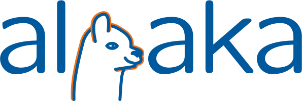
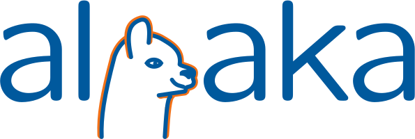
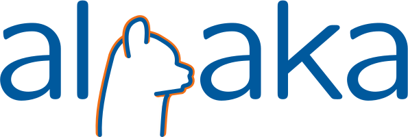
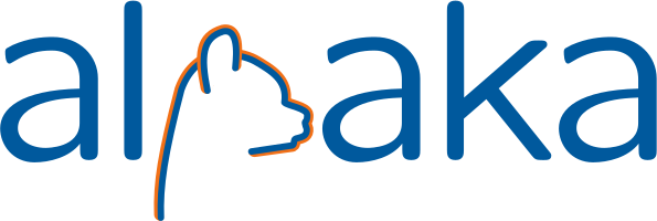
Okay, here more suggestions, I gave them version numbers, so we can talk about them better. :wink:
Version 3:
Version 4:
Version 5:
Version 6:
Version 7:
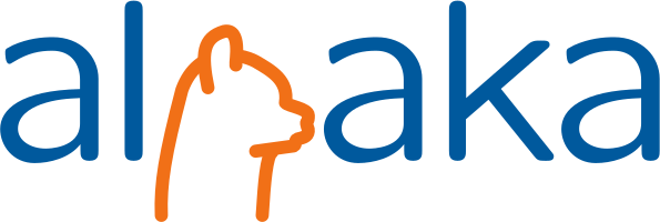
Version 8:
theZiz
on 26 Sep 2018
I like version 3 but I do not like the font.
 psychocoderHPC
on 26 Sep 2018
psychocoderHPC
on 26 Sep 2018
For me the the dystrophic middle horizontal stroke of a also looks weird.
Maybe it also makes sense to compare not only large pictures, but another realistic case of a small logo in a slide (e.g. to be put in a corner or in a list of used libraries, each with a small logo nearby).
 sbastrakov
on 26 Sep 2018
sbastrakov
on 26 Sep 2018
I like version 4. The font should be more similar to the alpaka so the head (without ears) should be as high as the "a" and the chin should be on the base line. The font should also be a bit more round and as @sbastrakov wrote, the lines (e.g. in the "a") should not be getting thicker/thinner because the alpaka lines are always equal width.
BenjaminW3
on 26 Sep 2018
I see your points and will give it another shot. However for this I would change the font. I chose this font because of two reasons:
- it had quite thin letters
- it is free
So, point me to a better font which fulfills these requirements and I will give it another try. If you want to play yourself, I put all versions in a zip file attached here: alpaka.zip
You need inkscape and probably the font Latin Modern Sans Quotation.
theZiz
on 26 Sep 2018
Maybe this font („Dosis“) fits better? I furthermore tried to fit the p-head better in the font lines.
(However I myself like the previous font more :disappointed: )
theZiz
on 26 Sep 2018
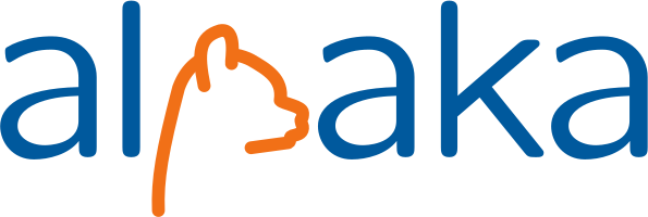
As suggested by @psychocoderHPC in an offline discussion, version 3 without the front-neck-line but with face:
It is interesting how much the shape of the neck defines an alpaca...
theZiz
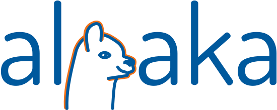
on 26 Sep 2018
Version 8 is my favourite up until now
 bussmann
on 26 Sep 2018
bussmann
on 26 Sep 2018
Version 8 is my favourite up until now
Yeah, the face-less versions are my favourites atm, too.
theZiz
on 26 Sep 2018
First of all: epic again, Alex!
Yes, I guess we have to go face-less. Reduce your browser (ctr -) to 30% and check which logo you can still recognize. The face details are too tiny, unfortunately.
+1 for v8
ax3l
on 26 Sep 2018
Depends on your display resolution. On my 4k and my 3.5k screen I still prefer the version with the face.
Should we have a small Icon only consisting of the alpaka head and small text for the cases where we do not have much place?
BenjaminW3
on 26 Sep 2018
Depends on your display resolution. On my 4k and my 3.5k screen I still prefer the version with the face.
Should we have a small Icon only consisting of the alpaka head and small text for the cases where we do not have much place?
Makes sense. I guess when we find a solution for the main banner like logo we can make an official small logo out of it like you suggested.
theZiz
on 26 Sep 2018
Ah and speaking about faces. I like the face, but the eye is awful. So if we stay with the face, please someone should improve the eye. :joy:
theZiz
on 26 Sep 2018
Sorry, have to disagree. One logo and only one to rule them all, good for all resolutions. If you want eyes, make a gif and make them blink, otherwise, no way.
bussmann
on 26 Sep 2018
If you want eyes, make a gif and make them blink, otherwise, no way.

theZiz
on 26 Sep 2018
I also like Benjamin's alternative logo. If I have to decide then I still would go with the version 8 to push simplicity, although the cute face will be missed. Blinking eye is too much realism for me :camel: :wink:
tdd11235813
on 26 Sep 2018
Honestely: I would go for version 6 or 8, too.
theZiz
on 26 Sep 2018
Furthermore I had a small talk with @bussmann right now and I thought about all the different logos we had to put on our posters or I had to deal with in talks. Most of them didn't have more than one version and came in all different shapes and sizes. So I would keep it simple and simply go for one logo.
(Using the blinking alpaca as favicon is still mandatory)
theZiz
on 26 Sep 2018
Agreed, problem with the inverse is also the letters and details get way too small next to floating text when scaled to fit.
Let's take 8 then?
Works on all resolutions (important), easy to grasp & remember, works in black & white and printed in bad quality, on 800x600 beamers with low resolution on hot summer days (important), and with CEOs with bad eyes.
ax3l
on 3 Oct 2018
I would suggest to create a PR with the Inkscape SVG, a generic SVG (font as path) and PNG next Monday if we agree on 8.
theZiz
on 5 Oct 2018
Related issues
ax3l
·
5Comments
 shefmarkh
·
4Comments
psychocoderHPC
·
5Comments
BenjaminW3
·
3Comments
BenjaminW3
·
5Comments
shefmarkh
·
4Comments
psychocoderHPC
·
5Comments
BenjaminW3
·
3Comments
BenjaminW3
·
5Comments
Most helpful comment
Agreed, problem with the inverse is also the letters and details get way too small next to floating text when scaled to fit.
Let's take 8 then?
Works on all resolutions (important), easy to grasp & remember, works in black & white and printed in bad quality, on 800x600 beamers with low resolution on hot summer days (important), and with CEOs with bad eyes.