Almanac.httparchive.org: Prototype an interactive data visualization for the 2020 CSS chapter
As a follow up to #896, I'll build a prototype of the kind of interactive data viz I have in mind for a select few chapters.
For context, I'm interested to supplement the images/charts used in the 2019 edition with a more engaging in-page "dashboard" of sorts, to let readers explore the data and find interesting insights on their own. For example, @bkardell built a Glitch app to supplement the Markup chapter and allow readers to see how any given element performs in the wild. This year I'd like to explore ways to bring that kind of interactive functionality into the chapters themselves.
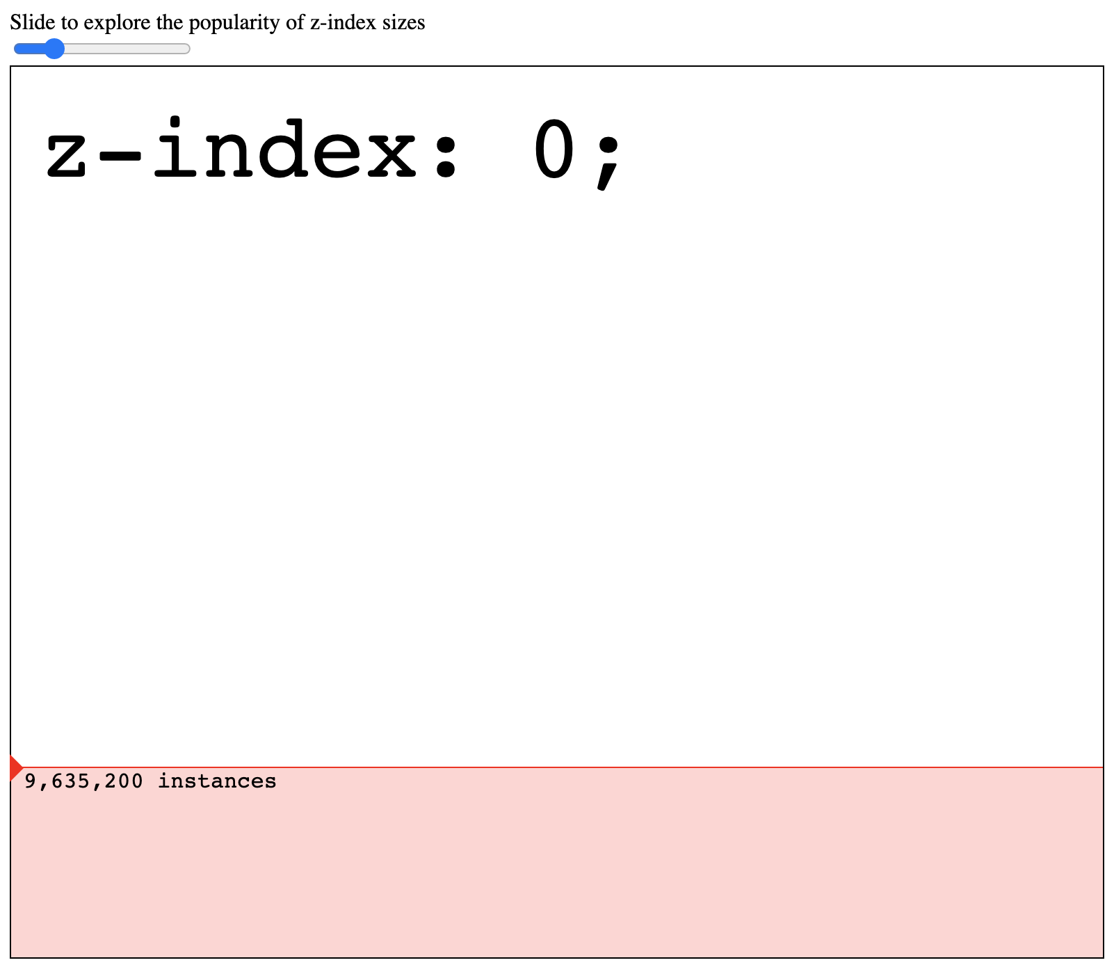
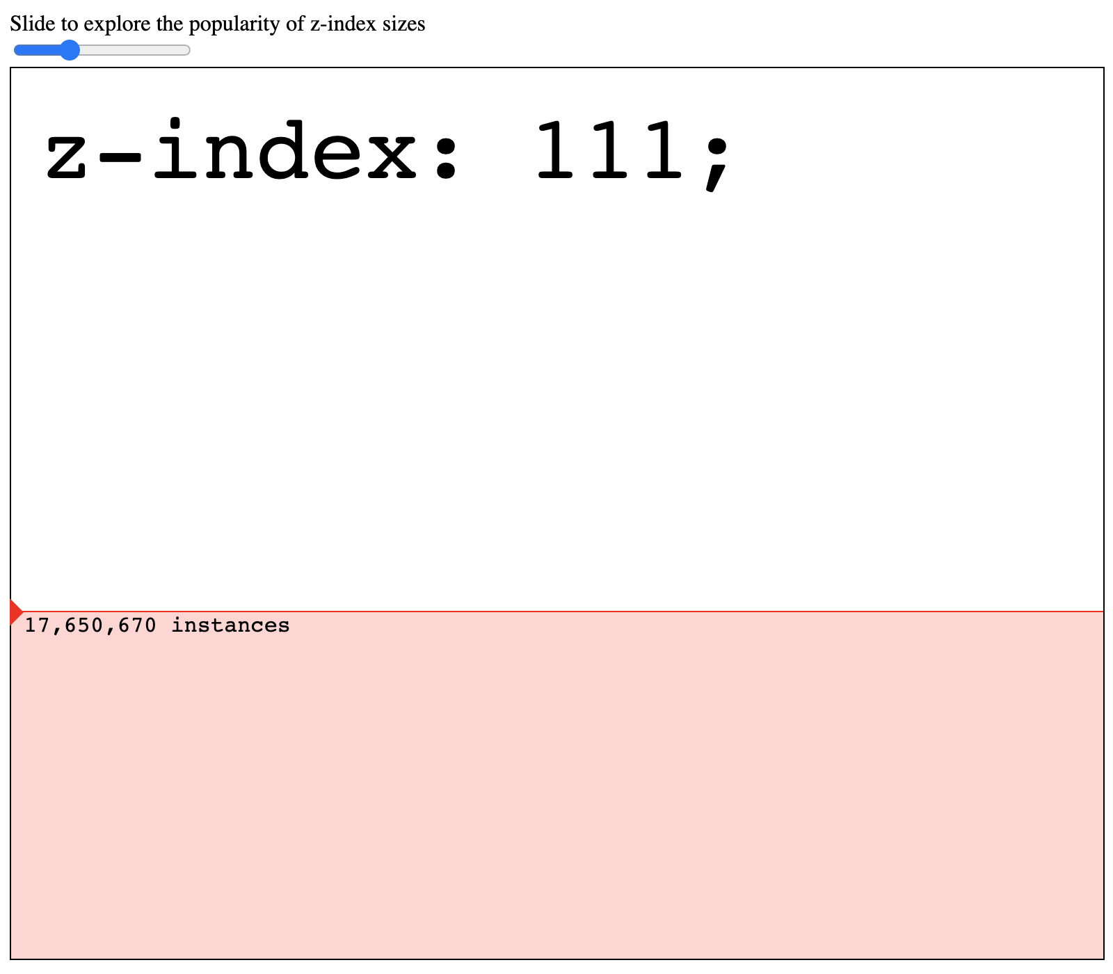
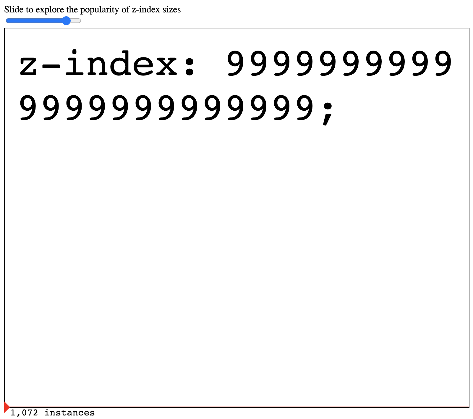
@LeaVerou I'd like to pick your brain for metrics/dimensions that could be good to visualize this way in the CSS chapter. On the low-tech end of the spectrum, for example, we could have a slider for the "largest z-index" data and as readers increase the slider, more and more 9s get added to the z-index CSS snippet on the page. We can do something more advanced and dynamic, like allowing readers to input a color (hex or color wheel) and see how often that color is used in CSS in the wild. Not the best examples, but that's where you come in! Let me know how you think we could make the CSS data more engaging.
 rviscomi
All 14 comments
Oh that's exciting! I especially like the color idea, though it would be more interesting to match close colors too, not exact ones (ideally with DeltaE, not Euclidean sRGB distance). But how would this be implemented? Surely it cannot run queries, so the data would need to be preloaded. Even for just your color example, there are 16.7 million colors in 8 bit sRGB alone. That's a lot of data for client-side querying.
 LeaVerou
on 18 Jul 2020
LeaVerou
on 18 Jul 2020
Even for just your color example, there are 16.7 million colors in 8 bit sRGB alone. That's a lot of data for client-side querying.
😱 you're right! Yeah for that example we'd need to have a +/- tolerance built in to group similar colors together. For simpler visualizations I imagined us preloading all options into the page, but for visualizations with more complex values we would lazy load or have some kind of click-to-load option to avoid incurring MB of JSON without permission.
Implementation details aside, are there any other areas of CSS you think would be nice to explore?
rviscomi
on 18 Jul 2020
The problem with pre-grouping colors is that you get a sharp transition across group boundaries. E.g., for the sake of argument, let's say we group all sRGB colors by flooring their coords to multiples of 15, e.g. rgb(0, 180, 255) becomes rgb(0, 180, 255), which gives us 17 ^ 3 = 4913 colors, which is doable.
rgb(0, 180, 255) is very close to rgb(0, 179, 254), but if someone queries the former, incidences of the latter are not counted.
LeaVerou
on 18 Jul 2020
Are you settled on the color idea? Anything else you wanted to explore?
rviscomi
on 20 Jul 2020
Potentially.
Let's flesh out which stats we're studying first, and then let's see which of those would be best represented by an interactive visualization.
And we need to make sure it's feasible too.
LeaVerou
on 20 Jul 2020
I would be really interested in prototyping this interactive visualization once the stats are fleshed out.
 SaptakS
on 29 Jul 2020
SaptakS
on 29 Jul 2020
Thanks @SaptakS! Would be great to have help with this.
@LeaVerou do you have a better idea now of what you'd like to focus the visualization on?
rviscomi
on 30 Jul 2020
I'll need to think about it :)
LeaVerou
on 31 Jul 2020
I think this is a great idea, and if feasible, it will be so powerful.
It would be amazing to have this functionality for the Markup #899 chapter too, wherein e.g. a user can query for an HTML element or/and attribute and see both the total number of appearances and frequency.
 catalinred
on 3 Aug 2020
catalinred
on 3 Aug 2020
Spent a couple of hours massaging the 2019 z-index data into something that can be manipulated and visualized in this codepen prototype. I don't love it but it's just something to demonstrate how one can engage with the data in a more hands-on way than just reading a graph. I'd definitely like to explore other metrics to visualize and more engaging ways to interact with the data.
rviscomi
on 8 Aug 2020
Had a play with this this morning. Sorry for the delay. An interesting little demo, and definitely makes it seem more achievable so addressing some of my concerns I raised in https://github.com/HTTPArchive/almanac.httparchive.org/issues/896#issuecomment-657121930
However, I do think we need to find the right use cases for this. I've a question as to whether the current demo (which I totally understand is a proof of concept) actually makes it easier to view and interrogate the data or if a simple graph would actually be better for this particular example?
Not sure what we should do to decide on these use cases. Is there anything we can consider and brainstorm now, or do we have to wait until we get the data and some of the writing to guide us here?
@HTTPArchive/2020-authors / @HTTPArchive/analysts have you any thoughts of good use cases for this?
 bazzadp
on 19 Aug 2020
bazzadp
on 19 Aug 2020
Aw why?
LeaVerou
on 30 Oct 2020
We can still explore building something interactive. This issue was scoped to a prototype, which we've built.
@bazzadp are there development resources to help with this?
rviscomi
on 30 Oct 2020
@SaptakS expressed interest above.
Do we have any clearer idea of what data or what visualisations we see this being used for? Was that PoC above a good use case to take further? Or do we have something else in mind now?
bazzadp
on 30 Oct 2020
Related issues
rviscomi
·
5Comments
rviscomi
·
6Comments
rviscomi
·
5Comments
rviscomi
·
5Comments
 obto
·
5Comments
obto
·
5Comments