Almanac.httparchive.org: Style dropdown lists
Related to #985, existing dropdown lists like the year and language pickers use select and option elements to represent list items. These are styled natively by the UA:
I'd like to see these better fit with the Almanac style by customizing the appearance of the dropdown lists.
@HTTPArchive/developers any ideas for how this could look or anyone interested to build it?
 rviscomi
All 7 comments
I would like to give this a shot, let me come up with a prototype with styles similar to dropdown in HTTP Archive. We can take a call based on that
 sudheendrachari
on 10 Jul 2020
sudheendrachari
on 10 Jul 2020
Thanks @sudheendrachari great to have you working on this! A prototype sounds like a great first step.
rviscomi
on 10 Jul 2020
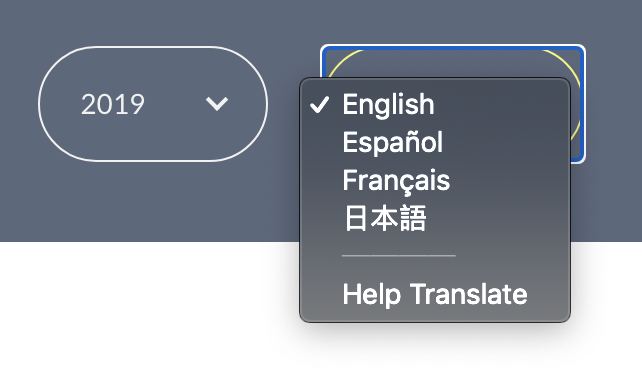
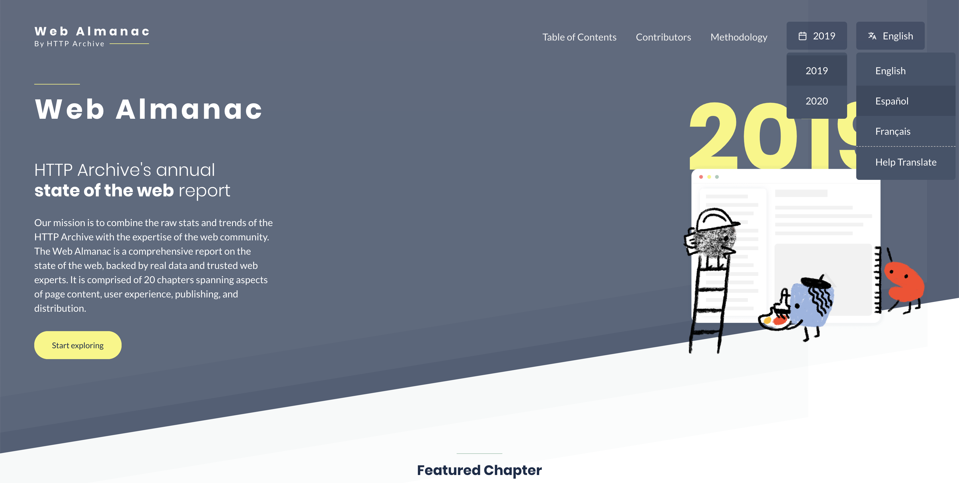
I am no designer 😁 but here is what i could imagine and style these two dropdowns into:
Major changes:
- Reduced the rounded corners to only 5px radius (Completely rounded corners doesn't seem to fit well into dropdown style layout)
- Instead of chevron added relevant icons for both
- Instead of border, used background color to differentiate from other items in menu
Version 1: (Trying to fit into the yellow color from the theme of home page)
Version 2: (trying to fit into gray background of the header and footer)
Note:
- List is supposed to be visible on click/hover
- _2019_ and _Español_ are in _hover_ state
@rviscomi @bazzadp What are your thoughts on these? Also please add anyone else into the thread, would love to get some design reviews on this attempt 😁
sudheendrachari
on 12 Jul 2020
Thanks for those mockups @sudheendrachari
My feedback:
- Agree with removing the rounded corners for the reason you give. Also solves #892
- Not sure I agree with replacing the chevron with icons. The lead to misunderstanding. The date icon makes me think it’s a date picker rather than a year picker and not sure what the language picker icon is? I think the chevron is simple and well understood.
- Not sure I like the yellow. To me these are secondary call to actions and think yellow should be for primary CTAs.
- Need to be very careful on click and hover. This needs to work on mobile and we’ve spent a lot of time on accessibility and keyboard support. Not sure if you’re just using those terms to mean
hover,focusand/oractivebut keep that in mind. - Need to consider keyboard support (up/down/esc and typing). There’s a lot you get with the native select, though ability to style it is unfortunately not one of them. This is a good article in this: https://www.smashingmagazine.com/2017/11/building-accessible-menu-systems/
- Will be interesting to see how this works on mobile.
- Should language menu be left-side aligned to stop it going off screen like it looks like it might?
These are minor tweaks and some are personal opinion that you or @rviscomi may disagree on. Looks good to me in general though and think it’s worth moving to developing so we can really see what it plays like.
Hope that’s helpful feedback and thanks again for working on this!
 bazzadp
on 12 Jul 2020
bazzadp
on 12 Jul 2020
On mobile could this be a problem as years (and hopefully languages!) grow? I quite like the native select for iOS for long lists. Not an Android user so dunno what it looks like there but maybe should consider keeping native select for mobile view?
bazzadp
on 12 Jul 2020
+1 thanks @sudheendrachari!
Agree with removing the rounded corners for the reason you give. Also solves #892
Other buttons on the site use these corners, so I think it's important to keep them consistent. I made a suggestion in #892 to address the outline issue. It also applies to .btn:focus styles.
Not sure I agree with replacing the chevron with icons. The lead to misunderstanding. The date icon makes me think it’s a date picker rather than a year picker and not sure what the language picker icon is? I think the chevron is simple and well understood.
+1
Not sure I like the yellow. To me these are secondary call to actions and think yellow should be for primary CTAs.
+1
So to sum up, I think the dropdown button itself is already well-designed overall, but the challenge in this issue is to develop a menu that fits within the existing UI patterns.
rviscomi
on 12 Jul 2020
How’s this going @sudheendrachari ? Anything we can help you on?
bazzadp
on 3 Aug 2020
Related issues
 AymenLoukil
·
4Comments
bazzadp
·
4Comments
bazzadp
·
4Comments
AymenLoukil
·
4Comments
bazzadp
·
4Comments
bazzadp
·
4Comments
 obto
·
5Comments
rviscomi
·
5Comments
obto
·
5Comments
rviscomi
·
5Comments
Most helpful comment
I would like to give this a shot, let me come up with a prototype with styles similar to dropdown in HTTP Archive. We can take a call based on that