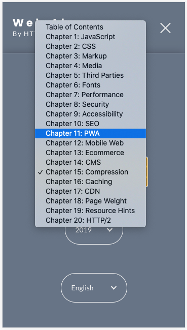
Almanac.httparchive.org: Table of Contents dropdown list
I often find myself wanting to jump to a specific chapter. There are a few ways to do this currently:
- navigate via direct URL
- navigate to the TOC page and click the link
- move sequentially previous/next from chapter to chapter
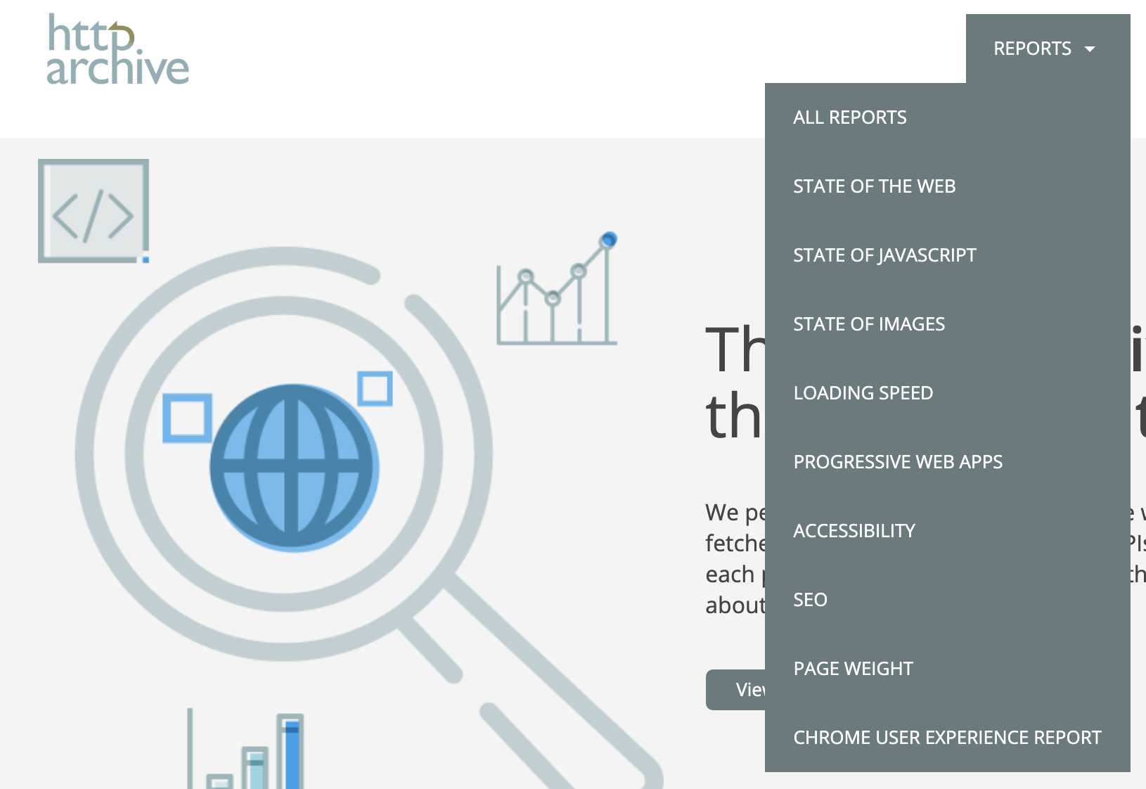
I'd like to propose a new UI that works from any page to navigate directly to any given chapter. The "Table of Contents" link in the header could reveal a dropdown list of chapters on hover/focus. See the "Reports" list on the HTTP Archive website, for example:
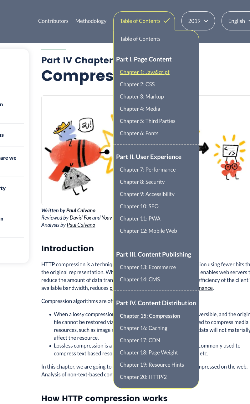
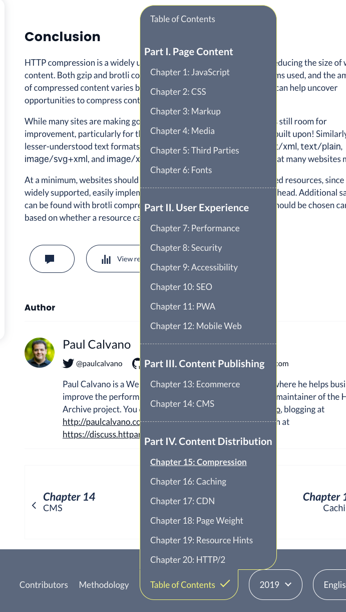
The contents of the list would be the chapters in order and grouped by section, as they appear on the TOC page. These chapters should be generated by the config and not hardcoded, to make it applicable for any year. It must also be fully accessible and follow best practices.
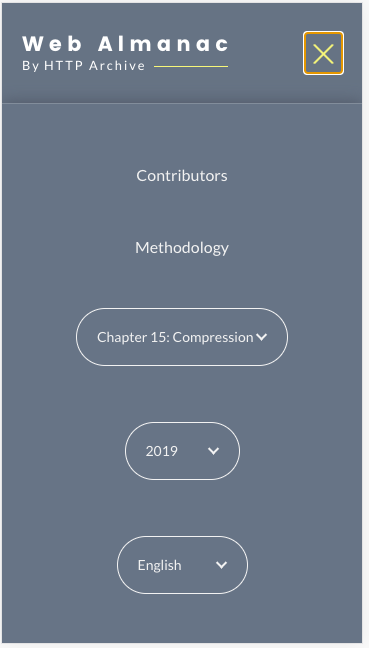
Some design work is needed. The list of chapters is long so we would need to design it with scrolling in mind. And we may want a mobile-specific design or, for example, rely on native UI for radio inputs.
Any @HTTPArchive/developers interested in building this?
 rviscomi
All 10 comments
I want to get to work on this.
I'll try to fix the table of contents to a dropdown list first.
 MSakamaki
on 29 Oct 2020
MSakamaki
on 29 Oct 2020
Great, thanks @MSakamaki! See #986 for the related style changes.
rviscomi
on 29 Oct 2020
@rviscomi
I implemented the dropdown as advised.
some refactoring and will submit a PR today.
PC Header
PC Footer
Mobile Header
Mobile Header (select)
Mobile Footer
MSakamaki
on 30 Oct 2020
Fixed in #1393
 bazzadp
on 12 Nov 2020
bazzadp
on 12 Nov 2020
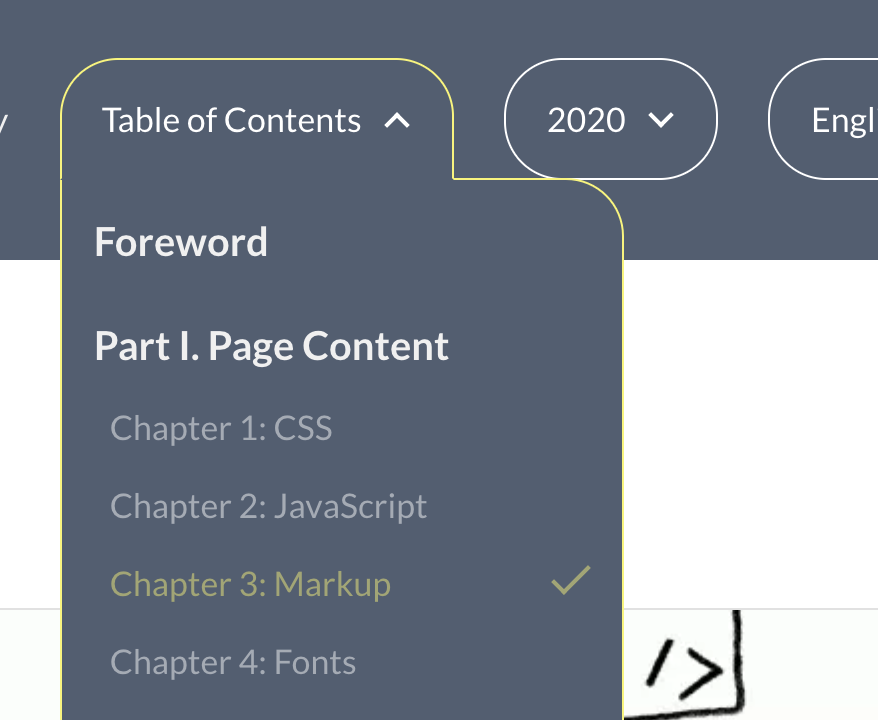
Thank you @MSakamaki I love this new dropdown! Reopening to track a couple of small nits I noticed while playing with the dropdown.
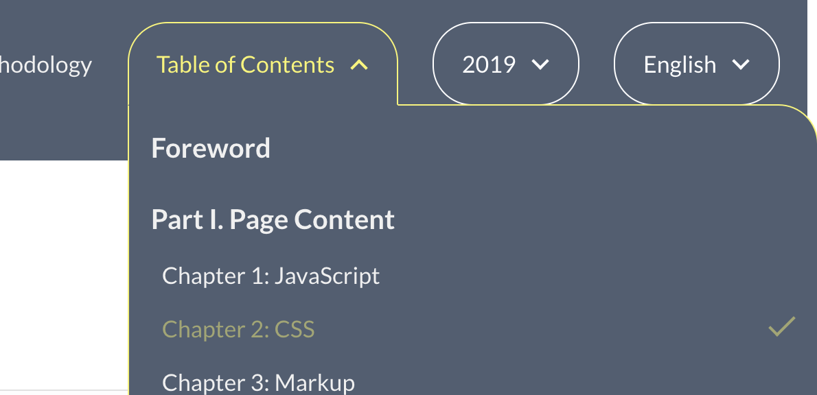
- Should the dropdown icon animate to a checkmark? This made sense for the year/lang pickers because it always reflected the current selection. But with the TOC dropdown, "Table of Contents" is always the button text, not the current selection. I see in an earlier comment that the button text took the value of the current chapter. Was that changed or is this a bug?

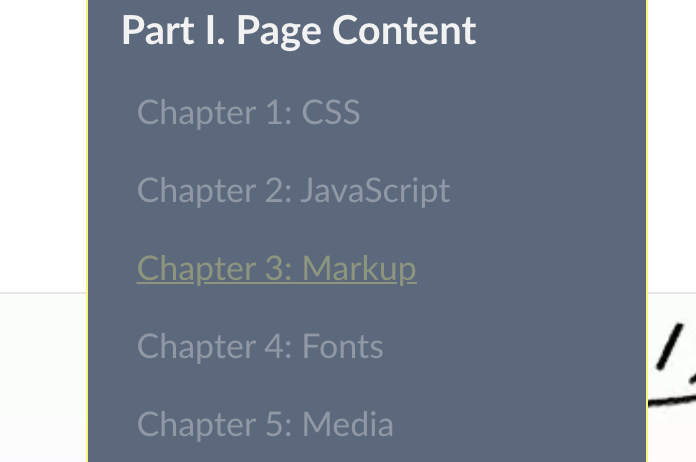
- Should the current chapter's style be more prominent? There may need to be better differentiation between a chapter that hasn't launched yet and is not clickable and the currently selected chapter, which is clickable. Not sure how good it would look but one idea is to make all clickable links underlined. Live chapters should all be white. So if I'm on the Markup page, it's white but not underlined or clickable. The Capabilities chapter would be both white and clickable. An unlaunched chapter like CSS would be muted and not underlined nor clickable.
rviscomi
on 14 Nov 2020
what about animate from down arrow to up arrow (^) instead of tick? I can include this in #1512
Not so sure about this. This is a very short term thing until other chapters are launched (hopefully next release but probably still some stragglers realistically) and I think the underlines are a bit ugly. Ultimately they are both not clickable.
bazzadp
on 14 Nov 2020
Could also add a tick next to the current chapter. That would be consistent with year and language, and what native select element shows on mobile.
bazzadp
on 14 Nov 2020
Could also add a tick next to the current chapter. That would be consistent with year and language, and what native select element shows on mobile.
Yeah I like that idea. Rather than the TOC text having the checkmark, denote the current chapter/page. Yellow + check?
Not so sure about this. This is a very short term thing until other chapters are launched (hopefully next release but probably still some stragglers realistically) and I think the underlines are a bit ugly. Ultimately they are both not clickable.
Current chapter is still clickable, but styled like ones that aren't, which is what threw me off. Clarified my previous comment to suggest that we should make the style more prominent for current chapters, which I think is also solved by your idea.
When viewing a page that isn't in the TOC (Home, Accessibility Statement) I guess there shouldn't be a checkmark at all?
rviscomi
on 14 Nov 2020
The current chapter shouldn’t be clickable at all. That’s a bug. We used to have this in place but looks like we lost it when @MSakamaki refactored code a little to stop having lists of lists (necessary to make up/down keys work). We should fix that.
Quick look at the code on my phone shows it works as intended for non-chapters but not for the chapters.
Agree with the rest. Will look to see what’s easy to add to #1512
bazzadp
on 14 Nov 2020
Have a play with the toc_dropdown_invalid_html branch.
Existing chapter 2019:
Existing chapter 2020:
bazzadp
on 14 Nov 2020
Related issues
rviscomi
·
3Comments
rviscomi
·
5Comments
rviscomi
·
5Comments
rviscomi
·
5Comments
bazzadp
·
3Comments
Most helpful comment
@rviscomi
I implemented the dropdown as advised.
some refactoring and will submit a PR today.
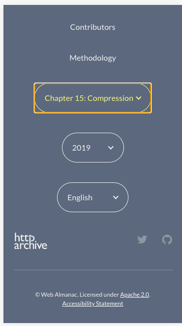
PC Header

PC Footer

Mobile Header

Mobile Header (select)

Mobile Footer
