Almanac.httparchive.org: Add Interest Form link to Contributors page
I really think we’re missing a trick not having an interest form link for next year on the Contributors page.
Either directly or linking to the appropriate part of the Methodology page.
It’s the first place I went looking for it when I was reminded I hadn’t gotten round to signing up for next year yet.
Thoughts?
 bazzadp
All 14 comments
I agree, I think the contributors page makes sense as a place to bring new people in. Not sure about the design aspect though, open to ideas.
 rviscomi
on 27 Nov 2019
rviscomi
on 27 Nov 2019
Usually, you'd want to add a form at the end of the contributors page, but considering the current page design and height, that wouldn't be easy to complete and submit from a UX perspective.
Maybe an idea would be to add a "Become a contributor" call to action near to the main h1 and link to the current Google Forms? This would be a good start IMO.
Alternatively, we could design/add an avatar/silhuette/+/join/etc... icon near to the existing /static/images/avatars/number.jpg ones and make it stand out from the rest - from a design perspective. Again, a link on it will go to the existing Google form.
 catalinred
on 27 Nov 2019
catalinred
on 27 Nov 2019
Are we not over thinking this? Wouldn’t an introductory paragraph with a link suffice? I think the page is a bit bare without this anyway.
I’m thinking something like this:
“The Web Almanac was built by a large team of contributors from analysts, authors...etc.
We are still continuing to develop the Web Almanac website including translating the chapters into other languages. We would invite people to comment on our GitHub Issues list if they want to get involved.
We hope to make this an annual publication and have an interest form for those who wish to be involved in 2020.”
bazzadp
on 27 Nov 2019
No strong opinions. I kind of like the idea @catalinred was exploring with a silhouette, almost like an index-0 placeholder contributor in the list, which is styled similar to the other contributor items. It doesn't need much text, maybe just a "Join the team" button that links to the interest form or a special CONTRIBUTORS.md file here in the repo.
@bazzadp does that work for you? If you prefer to go with the paragraph approach that's fine too.
rviscomi
on 27 Nov 2019
I’m happy as long as it works! 😀
Will admit I’m struggling to visualise it and see how exactly it’ll be as obvious to people as a simple intro paragraph.
Wanna do a mock up @catalinred ?
bazzadp
on 27 Nov 2019
how exactly it’ll be as obvious to people as a simple intro paragraph.
Pressure on :) but I'll give it a try, not so sure about the upcoming result as I'm not the original designer. I'll dig through the avatars images already designed and try to make a rough mockup.
Still, I too agree with you @bazzadp with the paragraph approach til we have a mockup or a better idea.
catalinred
on 28 Nov 2019
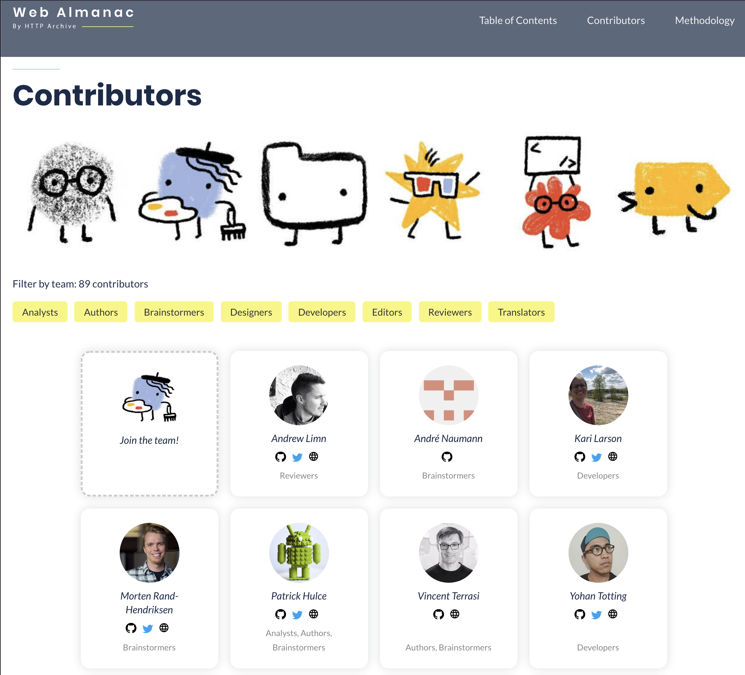
I managed to make a rough mockup, borrowing some(the whole conclusion) text from the /methodology page, this way we'll have some text content on this page as @bazzadp well suggested.
- Used an expressive (IMO) avatar from the existing avatars folder. That graphic would contain the same link as the interest form link.
- Joined the current "Filter by team:" and "86 contributors" texts for a better UI design balance.
What do you think? :)
catalinred
on 28 Nov 2019
Oh I like!!
Still think we should put a line in about GitHub for this year (on both this and the Methodology page).
So change this:
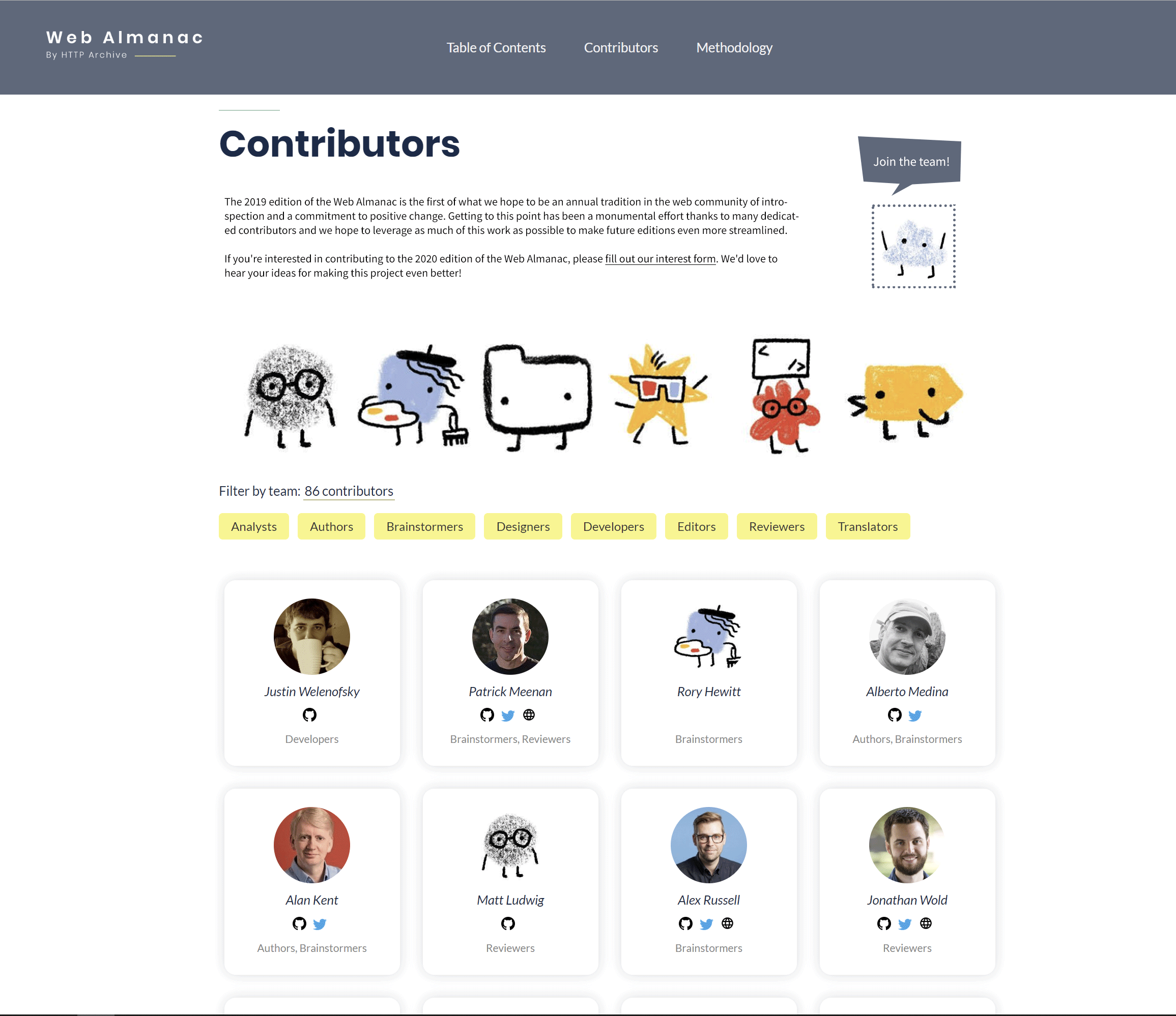
If you're interested in contributing to the 2020 edition of the Web Almanac, please fill out our interest form. We'd love to hear your ideas for making this project even better!
to something like this:
We're still continuing to work on the website and translations for the 2019 Web Almanac so head over to our GitHub home if interested in helping out.
If you're interested in contributing to the 2020 edition of the Web Almanac, please fill out our interest form. We'd love to hear your ideas for making this project even better!
bazzadp
on 28 Nov 2019
Oh I like!!
Still think we should put a line in about GitHub for this year (on both this and the Methodology page).
So change this:
If you're interested in contributing to the 2020 edition of the Web Almanac, please fill out our interest form. We'd love to hear your ideas for making this project even better!
to something like this:
We're still continuing to work on the website and translations for the 2019 Web Almanac so head over to our GitHub home if interested in helping out.
If you're interested in contributing to the 2020 edition of the Web Almanac, please fill out our interest form. We'd love to hear your ideas for making this project even better!
Glad you like it!
On the content, we should watch out for duplicate content (SEO) issues, so we should write a completely new copy for the contributors page not just partially, just in case we're not thinking about moving that "all-the-way-below-the-fold" text from the methodology page. :)
catalinred
on 28 Nov 2019
Bump! Any thoughts on that design after your recent tweet @rviscomi ?
Do you fancy implementing your design @catalinred ?
bazzadp
on 14 Jan 2020
Here's a mockup of what I had in mind
rviscomi
on 14 Jan 2020
Wow that’s very subtle. I was honestly just about to write back asking if you uploaded the wrong image! Seriously. Maybe it should have a different background colour to make it stand out?
Of the two I personally prefer @catalinred ’s design to be honest and do think this page could benefit from an introductory paragraph anyway.
bazzadp
on 14 Jan 2020
Do you fancy implementing your design @catalinred ?
@bazzadp Sure, if you guys both agree on my above mockup, I'm on it then!
But I do also like @rviscomi's mockup, we just need to make it stand out a bit more I think!
Also, comparing to my mockup this is easier to implement considering the media queries logic is already implemented for the contributor cards. For the text + icon design block, we'll need another extra CSS lines + MQ to stack them on mobile displays etc.
I'm saying that because currently we don't have a CSS grid system and for each design component, I've seen different ways to show, hide and stack elements. To summarize, we should think about building a custom minimal CSS grid system (w/ flexbox) or borrow an existing solution like https://getbootstrap.com/docs/4.4/layout/utilities-for-layout/. Thus, this might be too much (KB) for what we need at this point.
P.S.
Happy to finally see #573 live! 👏
catalinred
on 14 Jan 2020
I'd be against adding Bootstrap to the site to be honest - think it's overkill for the simplicity of the site and yet more KB to download and process as you say. Plus we need to start winding down 2019 and only closing little items like this one, before 2020 ramps up IMHO, rather than go for a full redesign.
I thought we used CSS Grid and Flexbox anyway? Might be showing my CSS ignorance here...
So with that in mind maybe we just go with @rviscomi 's suggestion then (possibly with some extra highlighting) - I agree it would be the simplest to implement (especially on mobile).
bazzadp
on 14 Jan 2020
Related issues
rviscomi
·
3Comments
 MSakamaki
·
4Comments
rviscomi
·
5Comments
bazzadp
·
4Comments
rviscomi
·
6Comments
MSakamaki
·
4Comments
rviscomi
·
5Comments
bazzadp
·
4Comments
rviscomi
·
6Comments