Almanac.httparchive.org: Home page text contrast issue on mobile when zoomed
Got this UX issue in a DM:

The user is on a mobile device with the page zoomed in.
cc #303
 rviscomi
All 8 comments
cc https://github.com/HTTPArchive/almanac.httparchive.org/issues/413#issuecomment-552175467 as well
Curious about how to reproduce the above zoomed in behavior.
 catalinred
on 11 Nov 2019
catalinred
on 11 Nov 2019
Yeah I wasn't able to reproduce this in Dev Tools.
rviscomi
on 11 Nov 2019
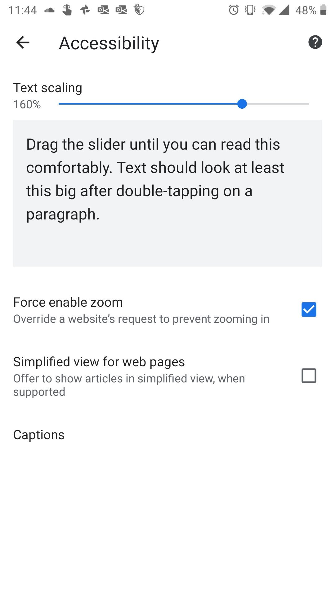
It seems the OS-level magnification settings need to be configured to 160% to trigger this bug.
rviscomi
on 14 Nov 2019
In case it helps, I did try text scaling on iOS and wasn't able to reproduce this behavior, the above screenshot looks like is taken on an Android phone.
Either way, IMO this issue is due to the fact that the main background image intro-background-fit.png is set on the body and not on the HTML element that wraps the above text and button, e.g. <section class="intro-container">. Related to #485
catalinred
on 14 Nov 2019
Yeah, I think one of the reasons for doing it this way is because it also needs to appear behind the <header>.
rviscomi
on 14 Nov 2019
They are definitely related, but even if it was set on the intro-container it would still cut off the text, wouldn't it? Because the header image is set to a fixed background-size.
 mikegeyser
on 14 Nov 2019
mikegeyser
on 14 Nov 2019
@rviscomi yes, technically the current header content and intro-container should be wrapped together in HTML to apply that background somehow, therefore to avoid zooming issues.
@mikegeyser those ‘background-size’ hardcoded px unit values are indeed part of the issue.
Will try to work on a solution tomorrow (I’m on EET timezone) and keep you updated.
catalinred
on 14 Nov 2019
Related #512
rviscomi
on 18 Nov 2019
Related issues
rviscomi
·
5Comments
 bazzadp
·
4Comments
rviscomi
·
5Comments
rviscomi
·
3Comments
bazzadp
·
4Comments
bazzadp
·
4Comments
rviscomi
·
5Comments
rviscomi
·
3Comments
bazzadp
·
4Comments