Alacritty: RFC: Font Configuration
I've been thinking about many of the current limitations of how Alacritty's font configuration and possible solutions. This is an RFC for a fully capable font configuration section.
Feedback is very much invited! I may have missed out on some important requirement, and I may have missed out on an obviously better solution. Please feel welcome to comment and suggest improvements or add to the list of use cases this should handle.
Font Configuration, today
Current font configuration is achieved through the following block of YAML. Most of the comments are preserved for clarity.
font:
  # The normal (roman) font face to use.
  normal:
    family: monospace
    style: Regular

  # The bold font face
  bold:
    family: monospace
    style: Bold

  # The italic font face
  italic:
    family: monospace
    style: Italic

  # Point size of the font
  size: 11.0

  # Offset is the extra space around each character. offset.y can be thought of
  # as modifying the linespacing, and offset.x as modifying the letter spacing.
  offset:
    x: 0.0
    y: 0.0

  # Glyph offset determines the locations of the glyphs within their cells with
  # the default being at the bottom. Increase the x offset to move the glyph to
  # the right, increase the y offset to move the glyph upward.
  glyph_offset:
    x: 0.0
    y: 0.0

  # OS X only: use thin stroke font rendering. Thin strokes are suitable
  # for retina displays, but for non-retina you probably want this set to
  # false.
  use_thin_strokes: true
Limitations in the current system
- Size is set globally. This is a problem because it may be desirable to have different sizes for latin text vs CJK or others.
- Glyph offsets are set globally. Setting this per face would be beneficial for things like powerline which often has alignment problems.
- There's no way to specify fallbacks. It may be desirable for users to provide their own fallback list.
- Several properties are not configurable because we don't yet offer them. These are things like subpixel AA, lcd filter, and antialiasing. In theory, these can all be configured per-font, so it might make sense to include them when thinking about a solution for size.
Other issues
The font.offset block is confusingly named. Its name sounds like it's doing what the glyph_offset config does, but in reality it is changing cell dimensions.
A better naming system for font.offset might be font.spacing and give it properties of line and letter to match convention.
Considerations for next system
In addition to solving the limitations outlined above, the next system should interact well with system level font settings such as fontconfig on Linux platforms.
Proposal
Common Font Options
Three out of the four issues are about providing settings per face. To keep things simple, this suggests there should be a common structure for setting size, glyph offsets, antialiasing, and etc. per font. Such a blob might look like this:
options:
  size: 12
  thin_strokes: true
  antialias: lcd # Can have values like lcd, lcdv, gray, and none
  hinting: true
  style: Regular
  offset:
    x: 0
    y: 0
This blob (henceforth referred to as _font options_) can exist in multiple places, such as on normal, italic, bold, and globally under font.
To keep subsequent examples succint, this shorthand will be used for _font options_:
options: { size: 12 }
Know that whenever this line is specified it is simply a shorthand, and all of the other properties are valid in the context despite not being present in the shorthand.
No properties of _font options_ are required.
Cascading and priority
Global _font options_ will be the default for each of normal, italic, and bold; they will also be used for non-configured fallback fonts.
Beyond the global cascade, this proposal specifies a priority order for applying settings. In the following list, items at the top are prioritized above items at the bottom.
- _font options_ attached to an individual font
- Gloabl _font options_
- System font configuration such as that from the _fontconfig_ library
- Alacritty provided defaults
Cascading will work at the property level. That is, a global _font options_ of options: { size: 12 } will become the default size for subsequent priority levels, but it won't provide any other defaults since they were not specified.
Specifying fallbacks
To support specifying fallbacks, each of normal, italic, and bold will now accept a list of _font specifications_. Currently, that looks like:
normal:
  family: monospace
  style: Italic
where the properties family and style are part of the specification. Note that, under the current propsal, style is actually moved into _font options_.
With the addition of _font options_, a specification looks like
normal:
  family: monospace
  options: { size: 12 }
And with the addition of fallback specifications, each section of font configuration will now look like
normal:
  - family: Source Code Pro
  - family: Powerline
    options: { size: 12 }
Complete Example
Taking all of this into account, the new config format will be
font:
  # These options tweak how each font is rasterized. Each section
  # Under font that accepts an `options` parameter can specify
  # any of the configuration listed here.
  #
  # Available options:
  # `size` - The font size in points
  # `thin_stokes` - macOS setting controlling stem thickness
  # `antialias` - antialiasing strategy, can be `lcd`, `gray`, or `mono`.
  # `hinting` - how glyphs are aligned to the pixel grid; can be
  #          `lcd`, `light`, or `none`.
  # `style` - style to use for a font - `Regular`, `Italic`, or `Bold`
  # `offset.x` - horizontal offset of glyphs within the cell
  # `offset.y` - vertical offset of glyphs within the cell
  options:
    size: 11

  # The normal (roman) font face to use.
  normal:
    - family: monospace
      # style: Regular will be the default in this section
      options: { style: Regular }
    - family: Powerline Symbols
      options: { offset: { x: 0, y: -1.0 } }

  # The bold font face
  bold:
    - family: monospace
      # style: Bold will be the default in this section
      options: { style: Bold }

  # The italic font face
  italic:
    family: monospace
    - family: monospace
      # style: Bold will be the default in this section
      options: { style: Italic }

  # Spacing is the extra space around each character.
  #
  # `spacing.line` is a delta to the height of cells
  # `spacing.letter` is a delta to the width of cells
  spacing:
    line: 0.0
    letter: 0.0
Alternatives
This config strategy is quite verbose, but it does allow full customization of font settings. Another much more succint version of this might be stealing fontconfig's pattern format; for example:
xft:DejaVu Sans Mono:size=10,xft:PowerlineSymbols:pixelsize=12,
This has the format of <family>[:<property>=<value>]*. Although this would keep the config file much more succint, the contents are quite terse.
Outstanding Questions
How do we communicate this in the (future) documentation or in config file comments, presently? The proposed format here is significantly more complex than the previous format.
 jwilm
jwilm
All 72 comments
This looks great, and would address all the issues I have. I personally prefer the more verbose approach.
As for documentation, I think some comments in the default .alacritty.yml would be sufficient, something like:
  # The normal (roman) font face to use.
  normal:
    - family: monospace
      # style: Regular will be the default in this section
      options: { style: Regular }
    # add items to his list to add to the fallbacks cascade
    #- family: Powerline Symbols
    #  options: { offset: { x: 0, y: -1.0 } }
Thanks @jwilm, looking forward to seeing this happen!
 sodiumjoe
on 23 Dec 2017
sodiumjoe
on 23 Dec 2017
I really don't like the fontconfig version and I think there is probably a good reason why a lot of modern systems prefer to use pango for this. (Fira Sans Mono Medium 12 style)
I think the current proposal looks good so far, but I have a question about the macos exclusive use_thin_strokes option. Is it really necessary to specify that on a per-font-basis? It sounds to me like you either want it for everything or you do not. But I guess even then the idea is to leave that to the user and allow freedom to specify it however you want.
 chrisduerr
on 23 Dec 2017
chrisduerr
on 23 Dec 2017
Thanks for the feedback so far!
@sodiumjoe
This looks great, and would address all the issues I have. I personally prefer the more verbose approach.
Glad to hear that. Regarding the verbose approach, it's totally up to you how you manage your config file. Both are valid. The default _alacritty.yml_ will probably choose a less verbose style to keep it approachable.
@chrisduerr
I really don't like the fontconfig version and I think there is probably a good reason why a lot of modern systems prefer to use pango for this. (Fira Sans Mono Medium 12 style)
This is a very valid criticism. One thing that the fontconfig style has going for it is that it allows specifying additional options like antialias, lcdfilter, etc. Is there an equivalent for pango?
question about the macos exclusive use_thin_strokes option. Is it really necessary to specify that on a per-font-basis?
It's certainly not necessary, but at the point we have a common config block, it may as well go there instead of adding a special case top-level item.
jwilm
on 23 Dec 2017
I don't think there's an option for advanced options with pango, at least I'm not aware of one. It just relies on the GTK font configuration settings.
This is the spec on how pango does it:
http://pygtk.org/pygtk2reference/class-pangofontdescription.html
I don't think using pango style (even partially) is good in our case. It's always kinda confusing with all the different font config options to understand which format will actually work and which one is broken. If we do it like proposed in this PR, it would solve these issues, because it clearly has one field for everything. There's not much you can do wrong when you have just a size field. So I like this approach a lot more than fontconfig/pango.
chrisduerr
on 23 Dec 2017
Agree, I'd also prefer the verbose style instead of fontconfig/pango approach, and I think the default config should be pretty verbose too - I'm not going to change it often, but when I do, I'd appreciate seeing the available options and intuitively understanding what they mean without referring to some extra documentation.
 maximbaz
on 23 Dec 2017
maximbaz
on 23 Dec 2017
In #965 I suggest that 'font styles' should be done away with and replaced by naming physical fonts or named 'flavors', i.e. virtual / composite fonts that are brought together by way of a hierarchical (cascaded) configuration that looks at codepoints. This is conceptually simple, demonstrably works, is very flexible, and avoids the inane complexities of fontconfig and font 'styles' (which in my opinion were never a thing, just a convenient-but-leaky abstraction that some vendors settled on to dumb down and better sell their stuff).
What you really want is not 'italic' or 'bold', what you want is a choice from multiple typefaces such that portions of text are nice to read and write a lot of stuff in, and other, small portions of text contrast with their surrounding so they stick out somewhat. What makes those portions stick out may be slant, or weight, but it may also be serifs or lack thereof, or size, or a combination thereof. Just my 2 cents.
 loveencounterflow
on 26 Dec 2017
loveencounterflow
on 26 Dec 2017
@loveencounterflow I love your ideas, thanks for introducing them. I feel like realistically in TUI-land we can apply it using bold, italic, and maybe underline or other "font styles" perhaps, and the idea of having CSS style code point resolution for these "font-buckets" would work so great.
I certainly don't do a whole lot of font customizing, so that given the availability of patched fonts (e.g. https://github.com/ryanoasis/nerd-fonts) and that the config does let me (now already, and in the OP here, as proposed) finely configure each of normal, italic, and bold, I'm already satisfied with good coverage of commonly used extra glyphs and being able to make them look good and line up.
In that context this would be quite a niche feature. But it would be so frickin nice for folks that are getting into customizing fonts!
 unphased
on 30 Dec 2017
unphased
on 30 Dec 2017
Not sure if you want a separate issue for this, but as mentioned on IRC, alacritty seems to ignore the aspect property in fontconfig. To reproduce, add something like the following to the appropriate <match> selector in fonts.conf:
          <edit name="aspect" mode="assign">
              <double>1.25</double>
          </edit>
This should make the font 25% wider but has no effect when I tried it. You can use fc-match -v to double check that fontconfig is picking up the aspect option
 jasom
on 31 Jan 2018
jasom
on 31 Jan 2018
Taking what @loveencounterflow said into consideration, I would propose something like this:
font:
  normal:
    - family: monospace
      # style: Regular will be the default in this section
      options:
        style: Regular
        range:
          start: 0
          end: 112
It should also be possible to spicify the start/end based on the characters themselves:
font:
  normal:
    - family: monospace
        options:
          range:
            start: 'a'
            end: 'z'
We could also just go without the range option. So we just have start and end.
Both start and end should be optional, so when a user wants that a font takes care of everything past a certain codepoint, he can just leave out the end.
This seems like a pretty cool improvement for font configuration and unicode support, so I'd love to get this started as quickly as possible. It seems like the current proposal goes in the right direction, so I'd offer taking a first stab at it unless someone has some completely different proposal! :)
Here's a summary of all available options if my proposal is accepted:
options:
  size: 12
  thin_strokes: true
  antialias: lcd # Can have values like lcd, lcdv, gray, and none
  hinting: true
  style: Regular
  range:
    start: 0
    end: 'Z'
  offset:
    x: 0
    y: 0
Thinking about it again, it might be nice to support multiple ranges for one font. So instead of having just one range it should be a Vector.
chrisduerr
on 9 Feb 2018
While playing around with this I've run into another problem.
Assuming the character which is looked up is not present in any of the fonts, the character still has to be rendered. Usually you'd go about this by selecting the character from the primary font, which will then display the "missing glyph" glyph.
If we use a configuration without ranges, it would be fair to assume the first font is always the primary font, however with a range the first font might override the actual primary font for a few glyphs.
Now we could just use the missing glyph glyph from Menlo/monospace, however that would probably lead to odd results.
Another alternative is to store the first glyph lookup, so we would walk the fonts once and remember the first font where the range contains the glyph. Then when we're through all fonts and the glyph has not been found, we'd fall back to the one we memorized. This is probably the best strategy, however it might lead to different "missing glyph" symbols which could look odd.
Alternatively we could ask the user to specify which font will be the primary font. This would be a flag just for falling back to a specific font once no glyph has been found.
Then we could also just always use the first/last font. This will always be consisnent, however the chance to get it wrong is pretty high when ranges are used.
chrisduerr
on 10 Feb 2018
I don't know if this is especially relevant but I thought'd I'd make a note of it.
As part of https://github.com/jwilm/alacritty/issues/28 I've added an additional font rendering back-end that works on all platforms.
I think adding a force_text_renderer flag would be a good way to allow switching between them.
It could look like:
# Force a specific text renderer.
# Uses freetype on linux, _ on osx, rusttype on windows.
# This will fallback to the default if the specified renderer is not supported on the current platform.
force_text_renderer: none
# force_text_renderer: rusttype
 zacps
on 8 Mar 2018
zacps
on 8 Mar 2018
I've used rusttype myself and there were some issues in my experience with some font types not being properly supported. It also doesn't help with font lookup or anything like that.
I don't really think this brings any improvement for macos/linux, or is there an advantage you know of @zacps? Is it faster?
chrisduerr
on 8 Mar 2018
I'm currently using rust-font-loader for loading fonts.
It currently only supports .ttf and some .otf files.
There's no particular reason I have at the moment but it might be useful in the future for working around any issues of a particular backend.
I was also thinking about it because I was thinking about implementing support for pathfinder once it becomes a bit more stable which has some more obvious benefits (speed).
zacps
on 8 Mar 2018
As far as I know, neither of these would help with stuff like ligatures, if this is something we would want to support in the future, it could be problematic.
chrisduerr
on 8 Mar 2018
Not all backends will support all the same features. On windows only DirectWrite (as far as I can tell) supports font ligatures, that doesn't mean that I wouldn't want to use something else (for quality or speed) if I didn't care about ligatures.
If you're just saying it makes it more complicated then, yeah it might. I don't know what implementing ligatures would look like from alacritty's perspective but for now all back-ends share the same Rasterizer API so I don't see a problem with allowing a runtime switch.
zacps
on 9 Mar 2018
A question, how would multiple fonts be handled? For example, I'd like to have SF Mono as my main display font, but I also would like to use the Powerline fonts (to get those cool triangles) in the bash. Not sure how I'd go about this with alacritty, currently it's just rendering some other unicode character instead of the triangle.
EDIT: Also, specifying "PowerlineSymbols" as the main font crashes alacritty.
 fschutt
on 12 Mar 2018
fschutt
on 12 Mar 2018
While there is a control sequence for alternative font selection, I don't
believe it's widely supported. That being said, alacritty does appear to use
the system font utilities for unicode fallback (so that may work if you
configure e.g. fontconfig correctly[1]), or you can just use a patched
powerline font.
1: http://powerline.readthedocs.io/en/master/installation/linux.html
On Mon, 12 Mar 2018 02:58:28 -0700, fschutt notifications@github.com wrote:
A question, how would multiple fonts be handled? For example, I'd like to have SF Mono as my main display font, but I also would like to use the Powerline fonts (to get those cool triangles) in the bash. Not sure how I'd go about this with alacritty, currently it's just rendering some other unicode character instead of the triangle.
--
You are receiving this because you commented.
Reply to this email directly or view it on GitHub:
https://github.com/jwilm/alacritty/issues/957#issuecomment-372253337Non-text part: text/html
jasom
on 12 Mar 2018
@fschutt I'm not sure, but it sounds like @chrisduerr's range proposal would address your issue: https://github.com/jwilm/alacritty/issues/957#issuecomment-362934573
That said, it seems like the range feature could come after an initial implementation of @jwilm's initial proposal, in order to avoid scope creep. I.e. if you consider the first font in a list to be the primary one, it seems like the overall architecture of the initial proposal could handle the addition of range without much trouble.
sodiumjoe
on 19 Mar 2018
Is there anyway we could put in the path to the actual font file instead of the font name? It always bothers me that we can't just use the font file and instead have to use the font name and hope the os is using the file we want. It can get really annoying if you are making your own fonts with ligatures etc.
 TaylorDennisLee
on 7 Apr 2018
TaylorDennisLee
on 7 Apr 2018
The relevant DirectWrite API for font fallbacks is here, this shows what you can specify about a font fallback (not everything in this proposal).
zacps
on 16 Dec 2018
Just a little feedback: When setting up a new machine (and shipping over an old config) I was rather surprised that specifying a missing font would crash Alacritty on boot.
$ cat /var/folders/zc/v3hv1k9j0sq63b86km4gtx65xlcf3c/T/Alacritty-1748.log
[2019-02-03 15:00] [ERROR] Alacritty encountered an unrecoverable error:
    Couldn't find a font with name IBM Plex Mono and style Medium
    Please check the font config in your alacritty.yml.
I installed Alacritty from brew, and launched from Spotlight.
 anxiousmodernman
on 3 Feb 2019
anxiousmodernman
on 3 Feb 2019
yeah at least runtime nonfatal errors are now being shown in-terminal now, e.g. can't parse config, which is wonderful. If it fails to launch, basic executable troubleshooting applies (run the program directly from another terminal to see its output) @anxiousmodernman i feel like your comment is a little off-topic though? hehe :)
unphased
on 4 Feb 2019
Can we have a bold-stroke or thicc-stroke or something to mimic macOS font rendering? Like what described here. Thanks!
 nvmnghia
on 18 Sep 2019
nvmnghia
on 18 Sep 2019
IDK if this has been mentioned, but since Alacritty is really only concerned with monospace fonts and fontconfig can't really differentiate non-monospace vs monospace fonts, I think I'd like a way to simply tell Alacritty to not use fontconfig at all. If we have a way to specify fallbacks (and other configs, as discussed here) I see no need for it.
 nixpulvis
on 5 Dec 2019
nixpulvis
on 5 Dec 2019
fontconfig does differentiate monospace fonts, try fc-list :mono. fontconfig is actually very feature-complete and the de-facto standard for font rendering on linux.
trying to reimplement it with custom configs instead of embracing and improving the ecosystem quickly leads to inconsistencies between programs, fragmentation of the ecosystem and frustration for the user who just wants one single place to configure his system font rendering in a consistent way.
Software inventing their own rendering is one of the reason why font-rendering is inconsistent in so many places.
 stev47
on 14 Dec 2019
stev47
on 14 Dec 2019
fontconfig does differentiate monospace fonts, try fc-list :mono. fontconfig is actually very feature-complete and the de-facto standard for font rendering on linux.
@stev47 fontconfig doesn't render or shape anything, it's just a thing to load your fonts and provide a fallback mechanism, the thing that renders is e.g. cairo or a combination of freetype (rasterization) + OpenGL. Yes it does differentiate fonts by spacing, however it's not accurate. fc-list :mono doesn't show my monospace font and also doesn't show Dejavu Sans Mono as monospace. The monospace is a common name either, so you can't rely on it being presented, I mean it's always presented, but you never know what thing users are running.
Yes, it is de facto standard for loading fonts and fallbacks on linux, but I feel like the thing @nixpulvis wants is not to delegate font fallbacks to fontconfig and just draw missing glyphs if we can't fint glyphs in what the user provided. fontconfig fallback is overly complex and strange tbh (just look on how fc-match works sometimes and you'll see the difference, even pango doesn't fully rely on it from what I see), and our experience in alacritty with it is not "good".
Software inventing their own rendering is one of the reason why font-rendering is inconsistent in so many places.
One more time, it's not a rendering, it a config. The thing you should tune for rendering is e.g. freetype.
 kchibisov
on 14 Dec 2019
kchibisov
on 14 Dec 2019
With respect to the "Cascading and priority" section, I think what I'm proposing here (no fontconfig fallback at all) could be an option. The advantage to this option however would be that alacritty's rendering would be consistent across platforms, reliably rendering the same set of glyphs in the same font.
I do think having fontconfig fallback enabled by default makes a lot of sense however. Thoughts?
nixpulvis
on 14 Dec 2019
I don’t like the idea of breaking default behavior on systems, however I like the idea of “adding option to disable system driven font fallback” if the user dont want to see any fonts besides the fonts they provided in alacritty.yml. I guess it makes sense to add this option on all systems(not only on Linux/BSD), since we’ll control fallback to some point anyway.
However this thing should’t be enabled by default, since we try to feel native, even
if we support different platforms and it could be hard sometimes.
kchibisov
on 14 Dec 2019
I feel like usually any glyph is better than nothing, right? I'm not sure what we gain by disabling fallback?
chrisduerr
on 14 Dec 2019
@kchibisov my bad and thank you for clearing up my mixup about fontconfig/freetype.
On my machine fc-list :mono does list DejaVu Sans Mono though. If some font categorization is wrong it should probably be fixed there instead of introducing workarounds in downstream software is what I'm trying to say.
stev47
on 14 Dec 2019
I feel like usually any glyph is better than nothing, right?
That's an interesting question. I'm not sure I agree. A broken font in the fallback could overlap with characters and make non-fallback glyphs illegible. I think most users will want the same fallbacks as the rest of their system (hence the default configuration), however I could see a user wanting to bypass this to ensure the terminal is maximally consistent across platforms, and system updates. For example, imagine a sysadmin updating the fonts on a workstation, resulting in changing the experience for a user of Alacritty in that environment.
In a perfect world my fontconfig would be properly setup, and no configuration would be needed by Alacritty at all (except maybe a font size), since monospace is the default (on Linux anyway), but this is just not realistic, let alone portable at the moment. Adding an option to simplify this stack seems like it might be helpful to some people.
EDIT: Cherry picking some SO posts related to this question:
nixpulvis
on 15 Dec 2019
I would argue that consistency within a platform is much more important than consistency across platforms. Everyone uses multiple applications on their platform of choice and wants things to not be "out of place" on it, but far fewer people use multiple platforms and mind less if applications seem "out of place" on some of them. Just as an example, for a long time Firefox was more in the "consistent across platforms" camp, which then led to a lot of complaints from people from essentially all platforms that it didn't feel "native". In the case of Alacritty it's pretty much guaranteed to lead to lots of people wondering why some font works in, say, Gnome Terminal, but not Alacritty.
Also for the record for me "DejaVu Sans Mono" does show up in the fc-list :mono output, so if it doesn't that sounds like a configuration issue.
 majutsushi
on 15 Dec 2019
majutsushi
on 15 Dec 2019
as non-english developer, I really hope it can config fallbacks fonts, now on win 7 it show blanks when the mono font missing the glyphs
 zhimoe
on 26 Dec 2019
zhimoe
on 26 Dec 2019
@cod3fn You probably want to watch for when #3127 is merged and released, which will give you some level of font fallback "automatically".
 davidhewitt
on 16 Jan 2020
davidhewitt
on 16 Jan 2020
Just curious: what's the current status of this RFC and why couldn't we at least follow the system fontconfig fallback fonts by default? Doing that alone doesn't sound like interfering with any existing semantics of the config. Please correct me if I'm wrong... I might be biased, but personally, as a Linux user, having some minimal working option is better than nothing, and it's been two years since the RFC. As a CJK user, this is the only deal breaker that prevents me from using Alacritty as my daily terminal. Sincerely, I really love this project and tried to contribute to some aspect of it (X11 input method). But I still can't use it because this.
In the meanwhile, I'm willing to take a stab at supporting the system fontconfig if @jwilm would like.
 Determinant
on 26 Jan 2020
Determinant
on 26 Jan 2020
@Determinant we support fontconfig fallback and full-width fonts. Just install your CJK font and you'll be good to go. The later discussion was about providing an option to opt-out from system fallback and use only alacritty one, since RFC allows you to define it. Font RFC is basically about more advanced font configuration, so the interest in it is quite low, since it doesn't solve any issue, just improves curtain things for curtain users.
kchibisov
on 26 Jan 2020
I'm confused. If alacritty already supports fontconfig fallback, why do emojis render for me in other applications, but not in alacritty?
fc-match seems to suggest that fontconfig is configured reasonably (I have Fira Code set as font.normal):
$ fc-match -s "Fira Code"
FiraCode-Regular.otf: "Fira Code" "Regular"
NotoColorEmoji.ttf: "Noto Color Emoji" "Regular"
DejaVuSans.ttf: "DejaVu Sans" "Book"
# etc etc
 sersorrel
on 26 Jan 2020
sersorrel
on 26 Jan 2020
Emojis on Linux/BSD supported only from v0.4.1
kchibisov
on 26 Jan 2020
$ alacritty --version
alacritty 0.4.1
Then they should render, I'll assume that some of them are just monochrome(from a different font) and some of them are colored. You can also try #3163
kchibisov
on 26 Jan 2020
Ah, right – I use a light-coloured background and that seems to break the coloured emoji rendering somehow, coloured emojis are being rendered (in some cases; that PR does help) but they're almost invisible for me :upside_down_face:
I'll open a new issue for that.
sersorrel
on 26 Jan 2020
@sersorrel There's already one for it https://github.com/alacritty/alacritty/issues/1864
kchibisov
on 26 Jan 2020
@Determinant we support fontconfig fallback and full-width fonts. Just install your CJK font and you'll be good to go. The later discussion was about providing an option to opt-out from system fallback and use only alacritty one, since RFC allows you to define it. Font RFC is basically about more advanced font configuration, so the interest in it is quite low, since it doesn't solve any issue, just improves curtain things for curtain users.
Thanks! But looks like it doesn't respect the font fallback because I have PowerlineSymbols in the fallback list in fontconfig, which works in other terminal emulators but not Alacritty.
Determinant
on 27 Jan 2020
@Determinant you can try the latest master and check it one again, since we just changed the entire implementation of it. There's no notion of respect font fallback. You can implement it differently like before and like we have now. Old fallback was also correct according to fontconfig, however it wasn't the one users were expecting. For more info you can read on 6b327b6f8f0f308ff8f46cdf551ce0d0f3eda60b commit message.
tl;dr now it should be the same as fc-match -s "FONT_NAME:pixelsize=X:style=Y"
kchibisov
on 27 Jan 2020
I see. (Also seems to be related to issue #2657) Thanks again for the quick response! :)
Determinant
on 27 Jan 2020
@kchibisov It looks like my fc-match -a does contain the desired order of fonts, but fc-match -s removes some fonts (like PowerlineSymbols) from the list. Not quite sure about the difference between -a and -s (what's "pruning" here?)...However, other emulators seem to use the list of fonts without pruning (might be -a instead of -s).
Determinant
on 27 Jan 2020
@Determinant -a doesn't prune fonts(I'd assume it doesn't trim the result). As I've said before you need to test latest master first here. And the right way is to prune, so -s is a correct way. Just use your font name in a match like fc-match -s "monospace:style=Regular"
kchibisov
on 27 Jan 2020
Yeah. I built from the latest master branch and my desired font doesn't show up by the given command, unless -s is replaced by -a. As you said -s is the right way, then is there any material on such "pruning" behavior? Because I'd like to prevent the font from being pruned from the list.
Determinant
on 27 Jan 2020
I believe the pruned list will likely exclude glyphs that do not provide any glyphs that haven't been provided by higher rated glyphs already. So these should be fonts that can never be actually used in correct fallback.
chrisduerr
on 27 Jan 2020
This is not entirely true, the list with -a lists all the fonts you have on a system, however -s prune by family/name you requested. Basically I'd recommend to check /etc/fonts/conf.avail and see for powerline and add a symlink to it to /etc/fonts/conf.d/.
You can also take a look here on how to change fontconfig fallback https://github.com/alacritty/alacritty/issues/2706#issuecomment-519703365 to fit your needs.
kchibisov
on 27 Jan 2020
@kchibisov I think -a still shows the "matching" fonts (if you try with different family/name, you'll get different results). The only difference is -s does additional "pruning" (see the man page). Other than that, everything should be the same.
       -a --all
              Displays sorted list of best matching fonts, but do not do any pruning on the list.

       -s --sort
              Displays sorted list of best matching fonts.
@Determinant depends, for me order is different here a bit, however I see that both requests respecting my $HOME/.config/fontconfig/fonts.conf and first entries are correct, since I've manually defined them, using query without pruning is not an option, since your font is already covered by something before, so you won't reach it anyway. The thing you can do is make your font to appear closer to the top of this list (and be in -s query actually), so it'll picked up. Just saying that using list identical to-a` won't change anything for you. The thing that could change is changing configuration.
kchibisov
on 27 Jan 2020
@kchibisov Thanks! I tried that already. Looks like the best way now is to patch my primary font with symbols. Because the primary font already "shadows" the PowerlineSymbol font.
Determinant
on 27 Jan 2020
@Determinant FWIW my distro ships a 10-powerline-symbols.conf in /etc/fonts/conf.avail. Without enabling it I also don't see powerline symbols in fc-match -s, however after enabling it sudo ln -s /etc/fonts/conf.avail/10-powerline-symbols.conf /etc/fonts/conf.d/ alacritty used it just fine and it was a 3d in my fc-match -s, right after my 2 fonts.
Just try to look into something similar in your /etc/fonts/conf.avail and link it.
If you don't have this file I can post it here and you can just update it right away.
kchibisov
on 27 Jan 2020
I tried that. It works with Inconsolata, but not with Fantasque Sans Mono. I also tried to modify the conf to support the latter. But it didn't work. Maybe Fantasque Sans Mono has something strange going on...
Determinant
on 27 Jan 2020
have you guys also thought about implementing a different font for powerline symbols and what not? (for example in kitty you can have specific fons per utf8 symbol range)
it is actually a configuration they already provide like so:
symbol_map U+E0A0-U+E0A2,U+E0B0-U+E0B3 FuraCode Nerd Font Mono Retina

#: Map the specified unicode codepoints to a particular font. Useful
#: if you need special rendering for some symbols, such as for
#: Powerline. Avoids the need for patched fonts. Each unicode code
#: point is specified in the form U+<code point in hexadecimal>. You
#: can specify multiple code points, separated by commas and ranges
#: separated by hyphens. symbol_map itself can be specified multiple
#: times.
not sure if this is the right place to ask as well but what about font ligatures?
is this also being thought of? (again kitty also has support for this)
 dagadbm
on 7 Feb 2020
dagadbm
on 7 Feb 2020
The ligature tracking issue is https://github.com/alacritty/alacritty/issues/50. I'll let one of the maintainers chime in on your other question.
 cole-h
on 7 Feb 2020
cole-h
on 7 Feb 2020
have you guys also thought about implementing a different font for powerline symbols and what not? (for example in kitty you can have specific fons per utf8 symbol range)
This is addressed in previous comments in this thread. So yes, we have thought about it.
chrisduerr
on 7 Feb 2020
The range option is great! Would be nice have all emojis rendered using a specific font, instead of mixed up. When using Jetbrains mono font, I'm getting a few black-and-white emojis and the rest colourful, from some fallbackfont right.
 quite
on 10 Feb 2020
quite
on 10 Feb 2020
How do you get this working right now?
I am using a patched jet brains font everything works on kitty term but on
alacritty i get nothing. No powerline symbols no git branch symbols,
nothing...
On Mon, Feb 10, 2020 at 7:29 PM Daniel Lublin notifications@github.com
wrote:
The range option is great! Would be nice have all emojis rendered using a
specific font, instead of mixed up. When using Jetbrains mono font, I'm
getting a few black-and-white emojis and the rest colourful, from some
fallbackfont right.—
You are receiving this because you commented.
Reply to this email directly, view it on GitHub
https://github.com/alacritty/alacritty/issues/957?email_source=notifications&email_token=AD7WGRZLAYAKQQQOB25ZBLLRCGTJ3A5CNFSM4EJOEVMKYY3PNVWWK3TUL52HS4DFVREXG43VMVBW63LNMVXHJKTDN5WW2ZLOORPWSZGOELJ5QII#issuecomment-584308769,
or unsubscribe
https://github.com/notifications/unsubscribe-auth/AD7WGR5QDYQWNDW76PQX6JLRCGTJ3ANCNFSM4EJOEVMA
.
dagadbm
on 10 Feb 2020
Worth a read over. Android seems the most complete atm. https://github.com/linebender/skribo/blob/master/docs/script_matching.md
nixpulvis
on 21 Feb 2020
As a good test case for some of this font configuration work, I'd expect this command (from the pastel tool) to produce better images: pastel color red. Currently, it looks like this for me:
EDIT: The fix for this being a range of characters using a separate font which is designed to work for this use case may be required. This should be documented in the Wiki to help users fix their box drawing characters. FWIW, here's kitty's hard coded character range: https://github.com/kovidgoyal/kitty/blob/60995ff04b7fbe8cf784da43473fb0a4628891ef/kitty/fonts.c#L595-L603
nixpulvis
on 13 Mar 2020
On a related note, to allow proper scaling of glyphs when offset is used, we may want to avoid px offsets, but instead use something like percentages.
nixpulvis
on 13 Mar 2020
we may want to avoid px offsets, but instead use something like percentages
We really don't. At that point the offsets just become a giant mess. Instead of having the ability to always make it work for your desired font, now suddenly you can never make it work because of weird rounding behavior and stuff. So you fumble around making minor changes to the percentage value until you find some random arbitrary value that bumps the pixel size by one, without any indication whatsoever that shows you how big the offset actually is.
chrisduerr
on 14 Mar 2020
Hi,
I just wanted to provide some more information about Opentype Features to both projects, kitty and alacritty, as there have been some very similar requests put forward by users. If the maintainers choose to not implement those requests, I can fully understand that, because this is a pretty complicated matter. During the conversations, there were some statements regarding user / system wide configurations, font wide configurations, local configuration or replacement of characters, where I wanted add a few comments.
Where to choose to use an Opentype feature:
- OT features are usually not set system wide. E.g. in macOS nothing lets you set any font feature to be used globally, not for the OS itself or for the applications. So it is always an application based use of those features or not.
- In an Application it is up to the application to decide if a feature would be used for every text render or if it is based on a configuration of a particular paragraph (e.g. a Text Box in InDesign or a div in html/css). So from my perspective it would actually make sense in a terminal emulator, it the user's preference to use a OT feature could be expressed per font face setting in the terminal emulators config. To implement additional escape sequences for rendering certain areas on screen differently than others based on the context (like it is today for colors or bold/italics) would be non-standard and a pretty high configuration effort as well.
Replacement of characters:
- kitty e.g. has the feature, that a character can on-the-fly be replaced by another character, even from another font.
- This feature could actually be used if there is the special need to replace one character with one other (or ranges of characters). The prerequisite for that is, that this glyph is actually present and accessible in the other font. To take an example: if someone wanted the standard Fira Code and use the old style numerals, then they would need to have another instance of FiraCode, where the old stlye figures can actually be accessed - the stylistic sets are not (at least to my knowledge). So you would need to put the stylistic variants into the place of the actual previous numbers, hence you would need a font editor (or patcher) and if you already have access to those, you can also patch the original font to your liking. So that will obviate any modification of terminal emulators, but defeats the idea of OT features in the first place.
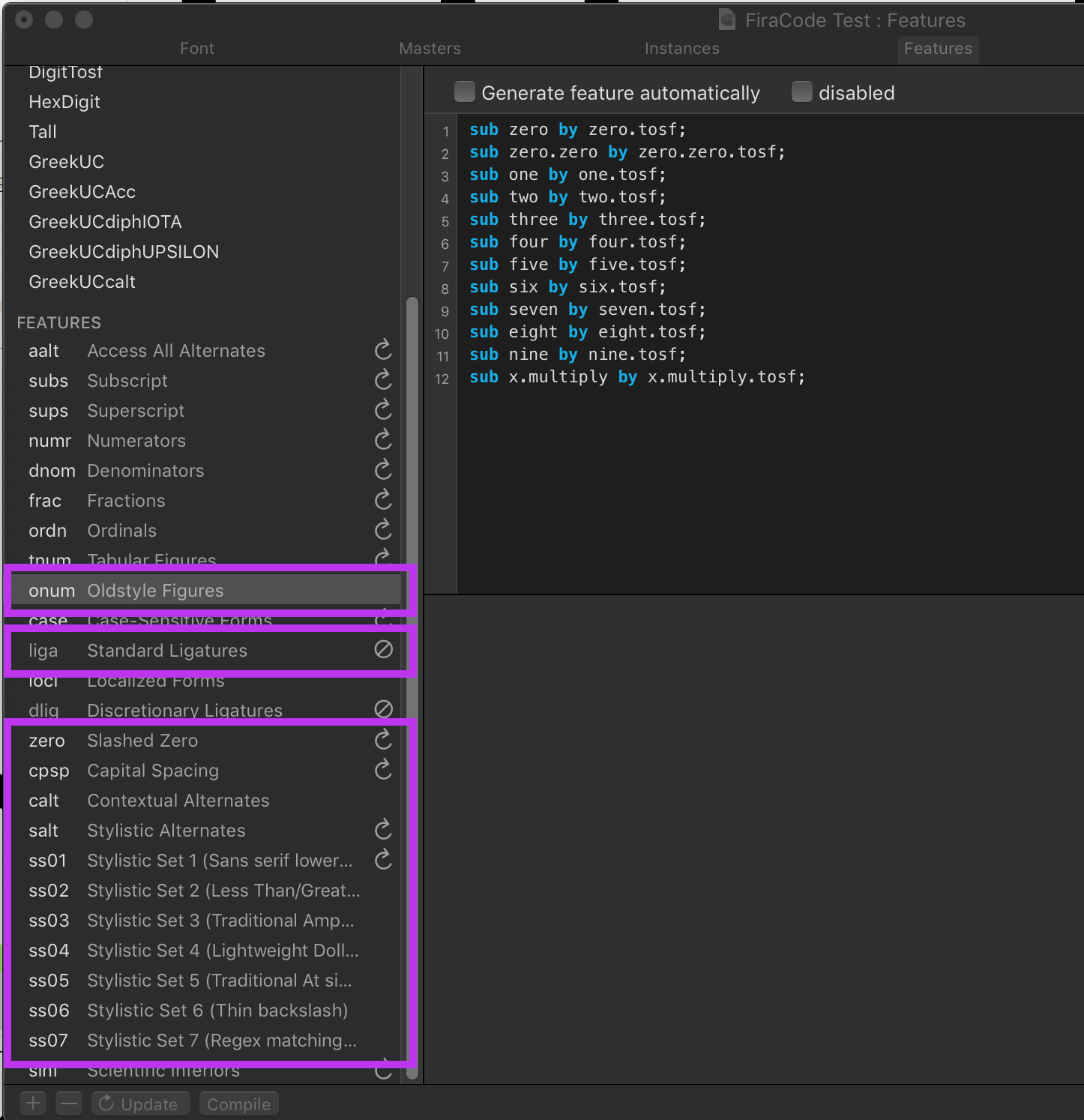
- You cannot access the ssxx glyphs via a replacement procedure, as they do not occupy any unicode code point in the font.
- Secondly, this approach would not work for replacing multiple characters, as is the case with ligatures and some ssets, e.g. ss07 of Fira Code "Regexp matching" which actually is some sort of additional ligature on-demand. (https://github.com/tonsky/FiraCode)

Difference of Stylistic Sets and other OT features:
- To me it seems interesting, that the importance of ligatures was high enough, that some terminal emulator maintainers chose to implement this feature (and for me it was the deciding factor, why I chose one over the other). Disclaimer: I have to admit, that I do not fully understand, how it works, because, when I type === the ligature appears, e.g. in kitty, but when I move the cursor back one position, the ligature disappears, even though the actual characters below are still the same, just with one block inverted. So somehow the inversion of the last character makes it different enough for the rendering engine, that the ligature is no longer recognized... Beats me, how that is done...
- So, if it is possible to enable ligatures (which is basically also only one OT feature, and it is enabled font-wide), then I would assume, that the same mechanism might be provided for the other types of OT features, e.g. stylistic sets.
I attach some screenshots from Glyphs, where you can see, that stylistic variant glyphs do not have a code point and how OT features generally look in a typeface editor.
I just hope that this brings additional information to the discussion. As I said, I completely understand if someone shies away from that matter.
Cheers and I thank both projects for their implementations! Great work!!
Michael.
 michaelrommel
on 26 Apr 2020
michaelrommel
on 26 Apr 2020
``
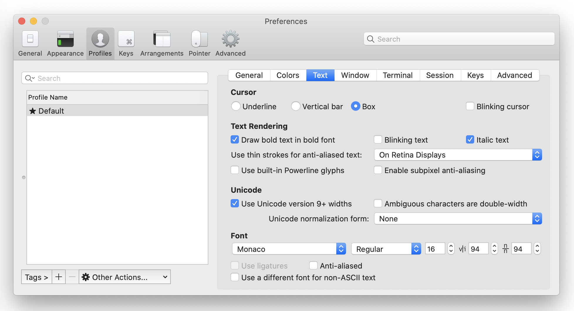
font: #antialias- antialiasing strategy, can belcd,gray, ormono`.
It would be great if we have ability to disable antialiasing.
Please include an additional value none to antialias option or maybe add the new option no_antialias to the font section.
Example from iTerm2 (macOS Catalina, retina display) below.
 bio
on 8 Jun 2020
bio
on 8 Jun 2020
Seems like at that point what you want is just a bitmap font.
chrisduerr
on 8 Jun 2020
Seems like at that point what you want is just a bitmap font.
@chrisduerr I'm not sure, it's hard to find great bitmap fonts for programming nowadays, they usually support only some specific (small) sizes.
bio
on 8 Jun 2020
Every other terminal except Alacritty respects my Xresources settings.
Xft.dpi:       93
Xft.antialias: false
Xft.hinting:   true
Xft.rgba:      none
Xft.autohint:  false
Xft.hintstyle: hintfull
Xft.lcdfilter: lcdnone
It seems like Alacritty just don't want to turn off antialias.
SOLVED:
Ok it seems Alacritty preffer to pay attention to '/etc/fonts/local.conf'. This solved it:
<!-- By default fontconfig get the DPI value from ~/.Xresources -->
<match target="font">
  <edit name="antialias" mode="assign">
     <bool>false</bool>
  </edit>
  <edit name="autohint" mode="assign">
    <bool>false</bool>
  </edit>
  <edit name="hinting" mode="assign">
    <bool>true</bool>
  </edit>
  <edit mode="assign" name="hintstyle">
    <const>hintfull</const>
  </edit>
  <edit mode="assign" name="lcdfilter">
   <const>none</const>
 </edit>
</match>
 Zeioth
on 11 Nov 2020
Zeioth
on 11 Nov 2020
Every other terminal except Alacritty respects my Xresources settings.
That's just a lie. Xresources is in no way a thing supported by every terminal. And Xft is something no sane terminal emulator should be using. You're just configuring things in a way specific to the terminal emulator you've used before and then getting surprised that a different terminal doesn't use the exact same thing, I'm not sure what you'd expect here. If you want to change this, change your fontconfig settings.
chrisduerr
on 11 Nov 2020
Related issues
davidhewitt
·
3Comments
 paupalou
·
3Comments
chrisduerr
·
3Comments
paupalou
·
3Comments
chrisduerr
·
3Comments
 dllud
·
3Comments
davidhewitt
·
3Comments
dllud
·
3Comments
davidhewitt
·
3Comments
Most helpful comment
Agree, I'd also prefer the verbose style instead of fontconfig/pango approach, and I think the default config should be pretty verbose too - I'm not going to change it often, but when I do, I'd appreciate seeing the available options and intuitively understanding what they mean without referring to some extra documentation.