Aegis: Keep field titles visible, even after filling
Could you please figure out a way to keep the labels on the fields even after they are filled. Thanks.
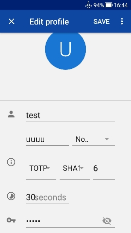
For instance, the field with "test" I put into it, should still have its title, which was Name, accessible.
And the one now with "uuuu ", should still say Insurer nearby, P.S., the trailing blank after uuuu should have been eaten.
That way at least we could still know what the names of the fields are without needing to open a new blank entry to find out.
Also we think that if we push the "i" "button" we will get some information.
We see the "30" and the "seconds" are too close together. Yes, some uses like larger font sizes in their Android settings.
Also the "No…" we swear means "number", even though of course it doesn't.
Of course "TOTP SHA1 6" we all know, but there should still be some names so the common man can discuss them.
Anyway there is surely enough white space above the uuuu etc. to squeeze a title.
 jidanni
All 3 comments
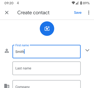
With respect, it's a bug. Not being able to see the name of a field with content is a serious UX issue. Look, for example, at the Google Contacts app. Field names appear in the field, but then move to the top border when content is entered, so you always know what's going on. Without field names you are flying blind.
 JNavas2
on 4 Jul 2020
JNavas2
on 4 Jul 2020
The author formulated this as a proposal and did not follow the bug report template. As such, I relabeled it to proposal. There are multiple things we have in mind for improving this view, and we'll certainly include this suggestion as well.
Look, for example, at the Google Contacts app
The entry editing view was actually inspired by the Google Contacts app, which did not have the field names appear above the text boxes until fairly recently.
 alexbakker
on 4 Jul 2020
alexbakker
on 4 Jul 2020
Material Design » Text Fields:
Label text should _always be visible_, moving from the middle of the text field to the top (if the field is selected).
[emphasis added]
JNavas2
on 4 Jul 2020
Related issues
 5a384507-18ce-417c-bb55-d4dfcc8883fe
·
7Comments
5a384507-18ce-417c-bb55-d4dfcc8883fe
·
7Comments
 devurandom
·
3Comments
devurandom
·
3Comments
 strawhatgami
·
6Comments
jidanni
·
5Comments
strawhatgami
·
6Comments
jidanni
·
5Comments
 victorbnl
·
6Comments
victorbnl
·
6Comments
Most helpful comment
Material Design » Text Fields: