Adguardforsafari: Revamp Big Sur style icon
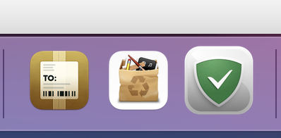
The new app icon for Big Sur is very ugly in my opinion. It is also slightly too big compared to other Apple system apps.
You can see that in the dock where the icon is next to other app icons:
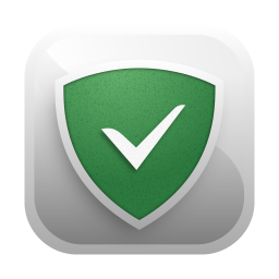
Here is an example of a clean, good looking, correctly sized icon:

The current icon for comparison:
 anonyme123
All 10 comments
On it, we are fixing the oversize icon in the next build
 vozersky
on 19 Nov 2020
vozersky
on 19 Nov 2020
Hello, I agree, it's too big but it's "old style" too.
We need something iOS-like, as anonyme123 suggested, but with some depth effects, as Safari icon:
https://cdn.arstechnica.net/wp-content/uploads/2020/11/Screen-Shot-2020-11-12-at-2.16.58-AM.jpg
 superlex
on 19 Nov 2020
superlex
on 19 Nov 2020
The system icons are 824/1024 px FYI. The current AdGuard icon is 954/1024 px and not even pixel perfect.
The current icon is also missing a 10/1024 px shadow under the icon comparing to the system icons.
 ddddxxx
on 20 Nov 2020
ddddxxx
on 20 Nov 2020
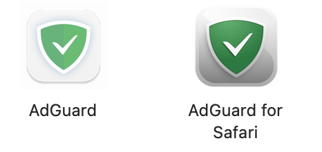
I will provide the fix while the app does not get updated. Just use the icon for the Adguard paid version. They prepared a beautiful and Big Sur compliant icon for it.
 tmonsores
on 20 Nov 2020
tmonsores
on 20 Nov 2020
I was so hoping this icon change was a mistake.
It used to be so clean and modern looking, and now is so old fashioned and ugly looking. 😢
 ciaw
on 21 Nov 2020
ciaw
on 21 Nov 2020
Worry not, we'll update it in the next update (soon)
 ameshkov
on 23 Nov 2020
superlex
on 24 Nov 2020
ameshkov
on 23 Nov 2020
superlex
on 24 Nov 2020
 Oleg-Chashko
on 24 Nov 2020
Oleg-Chashko
on 24 Nov 2020
Thank you so much. Now you have done beautifully!

https://github.com/AdguardTeam/AdGuardForSafari/commit/3132abd
Oleg-Chashko
on 25 Nov 2020
Very very nice, good job :)
superlex
on 26 Nov 2020
Related issues
ameshkov
·
11Comments
Oleg-Chashko
·
7Comments
ameshkov
·
5Comments
 kinoute
·
3Comments
ameshkov
·
3Comments
kinoute
·
3Comments
ameshkov
·
3Comments
Most helpful comment
Thank you so much. Now you have done beautifully!

https://github.com/AdguardTeam/AdGuardForSafari/commit/3132abd