Addons-server: Add a link to allow users to try the new frontend.
This should be a prominent notification on the header of the legacy frontend - this will allow users to checkout the new site more easily.
This should be waffled off so we can flip it on in production when we're ready.
It will need a paragraph containing a link, which will set the mamo cookie to the value "on" the same as the link in the footer.
We'll need editorial and UX for what this should look like. If it's prominent and/or shown on more than say the homepage we might want to make it something that can be dismissed.
/cc @jvillalobos for input on functionality.
 muffinresearch
All 22 comments
I'm in favor of showing the notification on all pages and making it easy to dismiss.
 jvillalobos
on 3 Oct 2017
jvillalobos
on 3 Oct 2017
Hey @devaneymoz, are you able to provide copy for this so I build this next week? 👍
 pwalm
on 9 Oct 2017
pwalm
on 9 Oct 2017
I'm guessing we want to keep this messaging strip pretty light and tight? If so how does this look...
AMO is getting a new look. Would you like to see it?
_[LINK] Visit the new AMO [LINK] [DISMISS BUTTON]_
 devaneymoz
on 9 Oct 2017
devaneymoz
on 9 Oct 2017
Love it! SHIP IT
Thanks @devaneymoz!
pwalm
on 9 Oct 2017
@pwalm do you have an ETA on the visuals for this? Would be nice if we could land this for next week's push so we can toggle it on as soon as soon as we're ready.
muffinresearch
on 10 Oct 2017
When is push? I was going to design it next week, but can try to bump it up.
pwalm
on 10 Oct 2017
@pwalm we need this ASAP, since our tag for the Thursday push is on Tuesday (tomorrow).
muffinresearch
on 16 Oct 2017
(removed my earlier comment since I've made some progress since then)
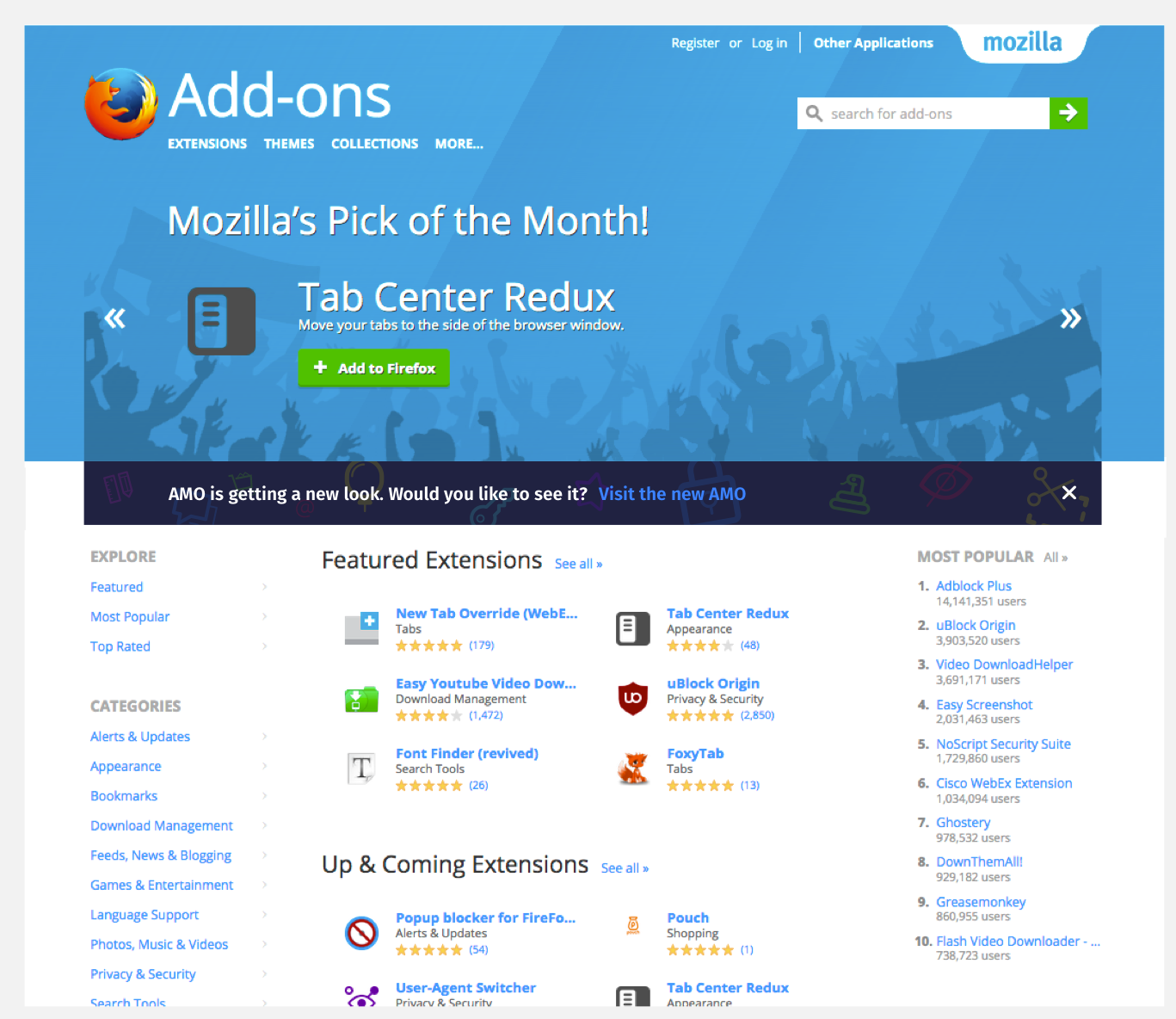
I've implemented this locally using the existing notification system, with some fixes to make it work on all legacy frontend pages. The notification is dismiss-able (never appears again once you have dismissed it). The result is this:
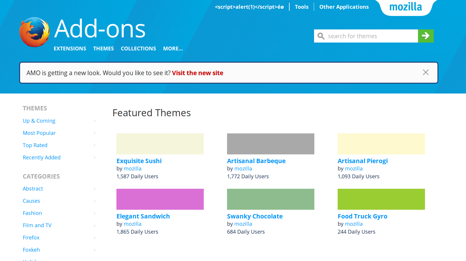
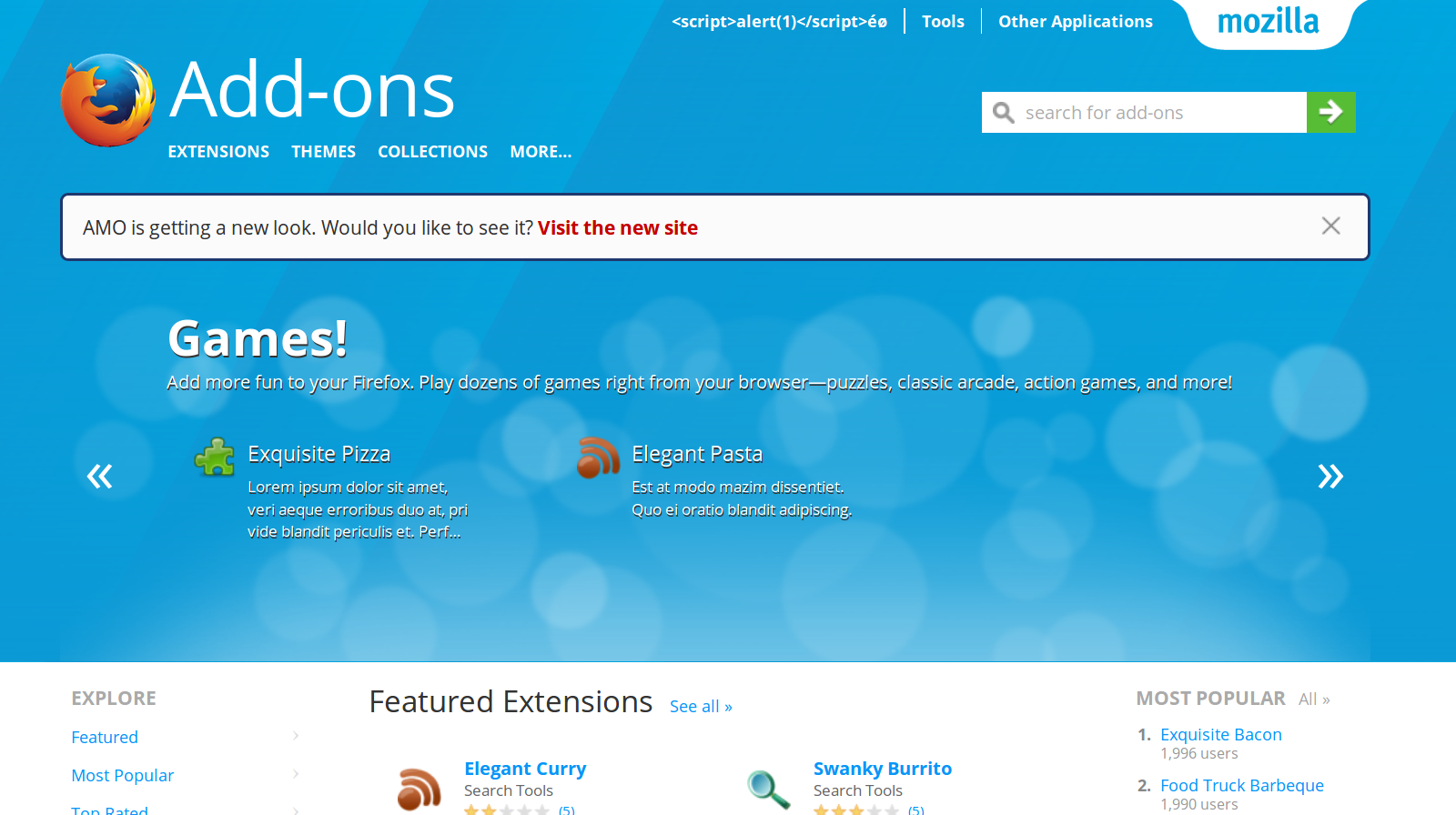
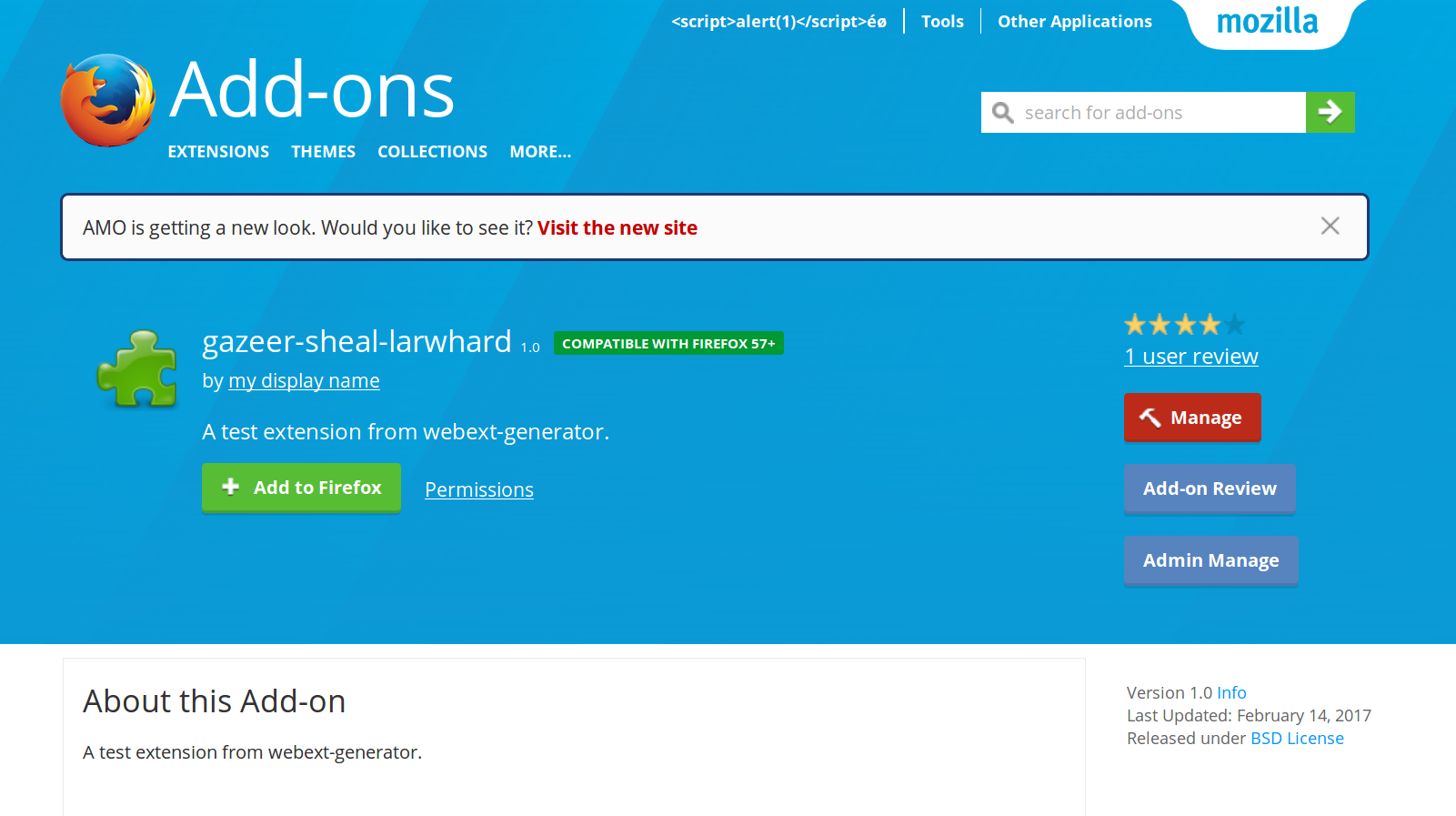
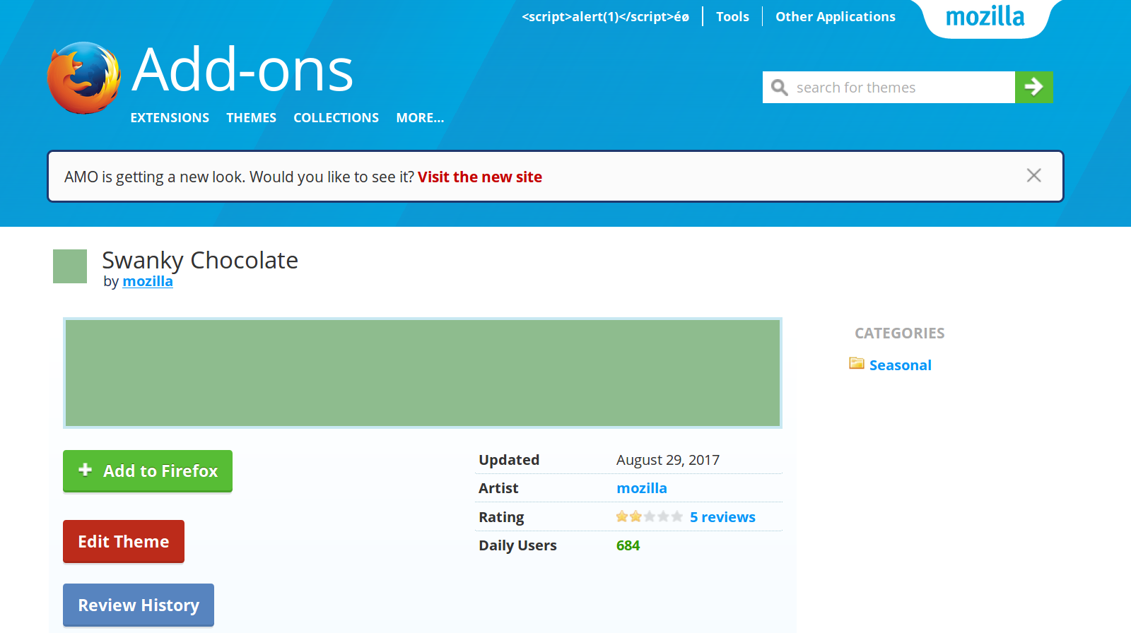
What do you think?
 diox
on 16 Oct 2017
diox
on 16 Oct 2017
In the pull request @EnTeQuAk suggest to tweak the copy slightly:
So… naming wise I'd suggest not using the word AMO but something more human like, "We are getting a new look", "This site is getting a new look" or something similar.
I agree, and this is why in my implementation I went with "Visit the new site" at the end ; but I had left the beginning of the text intact. @devaneymoz any ideas? Maybe just:
We're getting a new look! Would you like to see it? Visit the new site
?
diox
on 16 Oct 2017
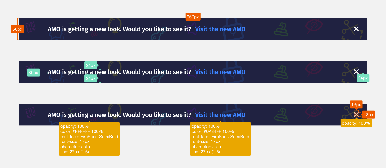 pwalm
on 16 Oct 2017
pwalm
on 16 Oct 2017
@pwalm do we want this only on the homepage? If not, on the other pages, where should the banner be? (In the add-on detail page, the main add-on details are included in the blue header, then continued below, it feels kinda weird to break this with the banner)
diox
on 17 Oct 2017
Also:
- Do we want Fira Sans in there? The legacy frontend does not have it, so that's an additional asset to download for clients.
- I can't find this close button in our assets. The legacy frontend have some dark grey close buttons, but not a white one like this one.
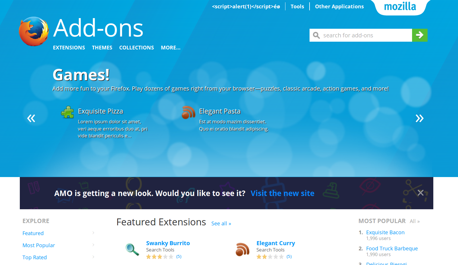
Edit; this is where I am right now without the Fira Sans and using the regular close button:
diox
on 17 Oct 2017
Closing to get QA to test this, we can tweak further if necessary. It's behind a "try-new-frontend" waffle, on every legacy frontend page (so no reviewer tools, no devhub, but pretty much everything else)
diox
on 18 Oct 2017
Verified this on AMO-dev FF56(Win 7).
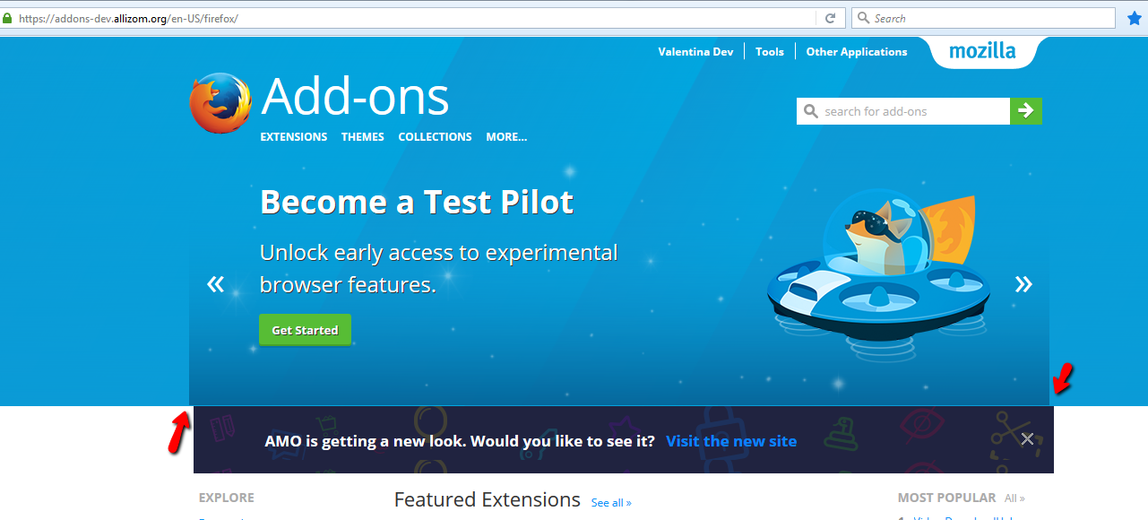
Banner is added but some dimensions don't correspond.
- Size of the banner:
Specs say: 960x60 px
We have: 960x75.2 px - Closing mark:
Specs say: 13x13 px
We have: 25x25 px
Also, looks a bit unaligned. Please see screenshot:
And, the background of the x mark is undetectable, intended?
Please see screenshot:

Please let me know if any of these are not expected and need separate tracking, and I'll comply.
Thanks!
 ValentinaPC
on 18 Oct 2017
ValentinaPC
on 18 Oct 2017
I'll adjust the height and position in a follow-up commit, but the closing mark is intended for now as I don't have any other image at my disposal for it.
diox
on 18 Oct 2017
- Yep, include Fira. It's part of our brand and the design system
- We only need this on the homepage (for now, we could expand it to other pages in the coming weeks)
- "x" svgs are in this zip, sorry about not including those before
pwalm
on 18 Oct 2017
Verified the banner position on AMO-dev FF56(Win 7).
Postfix screenshot:
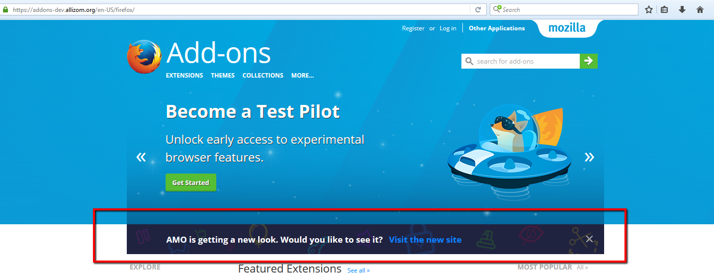
Is there anything else we fix here, or this can be marked as verified-fixed?
Thanks!
ValentinaPC
on 19 Oct 2017
I've got another round of design adjustments to implement following @pwalm last comment.
diox
on 19 Oct 2017
Latest version should:
- only be shown on homepage
- use Fira Sans Semi Bold as per spec
- use the correct close button image and position
diox
on 20 Oct 2017
Verified this on AMO-dev FF56(Win 7)
- the banner is only shown in homepage
- close mark is positioned as per mocks

Is the font family ok?

ValentinaPC
on 23 Oct 2017
@ValentinaPC : you are not looking at the right element to test the font (highlight the paragraphs or the link). Furthermore, it's better to use the "Fonts" tab of the inspector, which tells you directly which font is being used, regardless of what the css rule says. It should say Fira Sans SemiBold.
diox
on 23 Oct 2017
Oops...
Font is like expected:
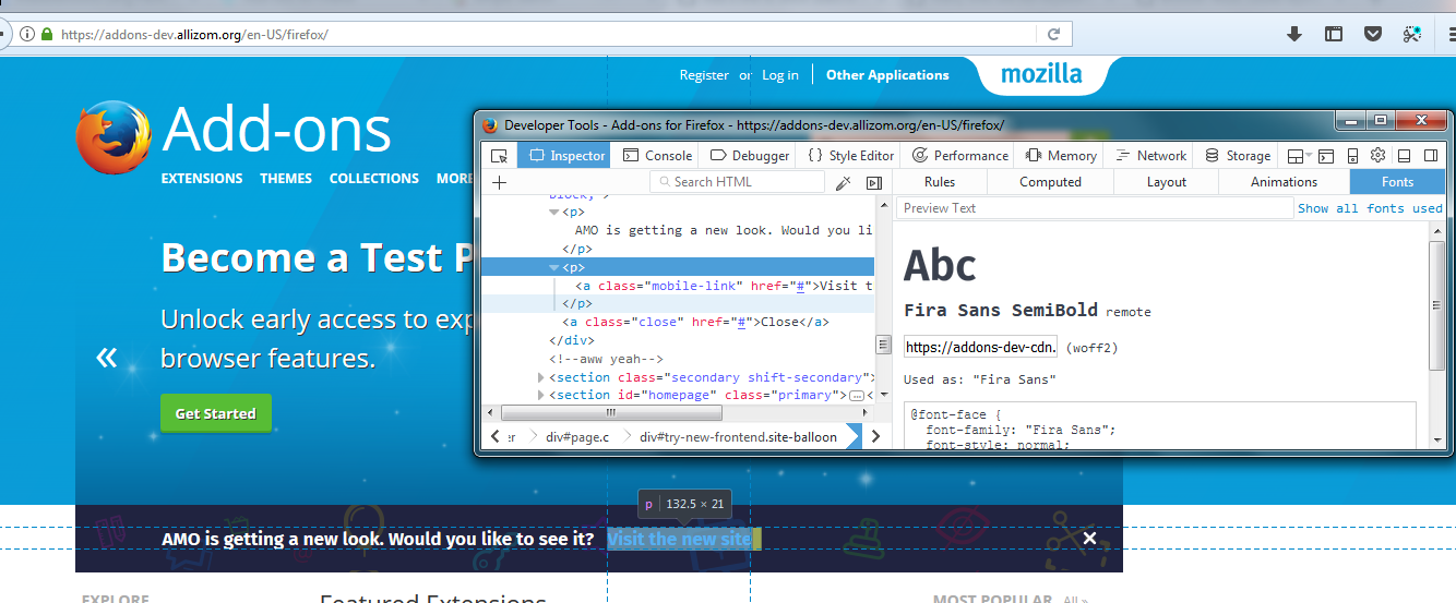
Marking this verified fixed.
ValentinaPC
on 23 Oct 2017
Related issues
 Sparsh-Bansal
·
4Comments
Sparsh-Bansal
·
4Comments
 hwine
·
7Comments
jvillalobos
·
7Comments
hwine
·
7Comments
jvillalobos
·
7Comments
 Juraj-Masiar
·
6Comments
Juraj-Masiar
·
6Comments
 mojorero
·
3Comments
mojorero
·
3Comments