A32nx: [BUG] PFD tapes background too bright
Mod Version
DEVELOPMENT
built: 2020-11-08T18:02:05+00:00
ref: refs/heads/master
sha: 9ecc85c0d81df306c5b66b2a29bc94aa9ab56ea1
actor: lukecologne
event_name: push
Describe the bug
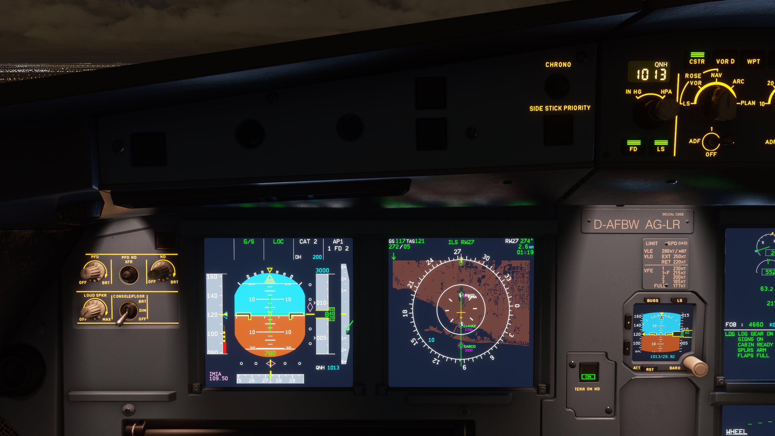
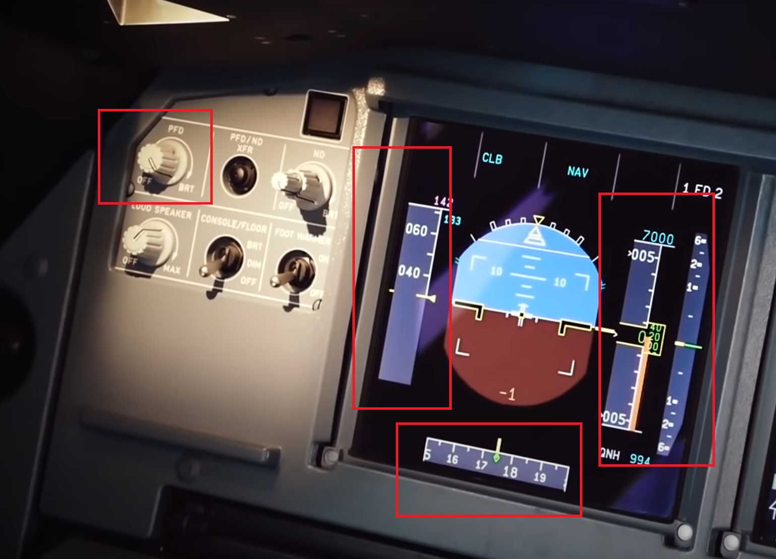
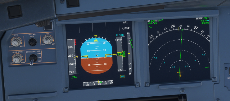
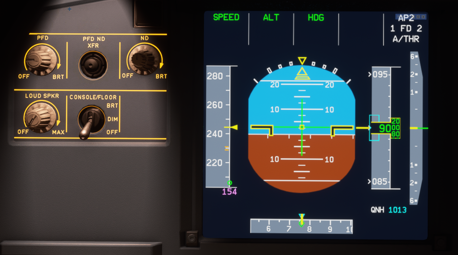
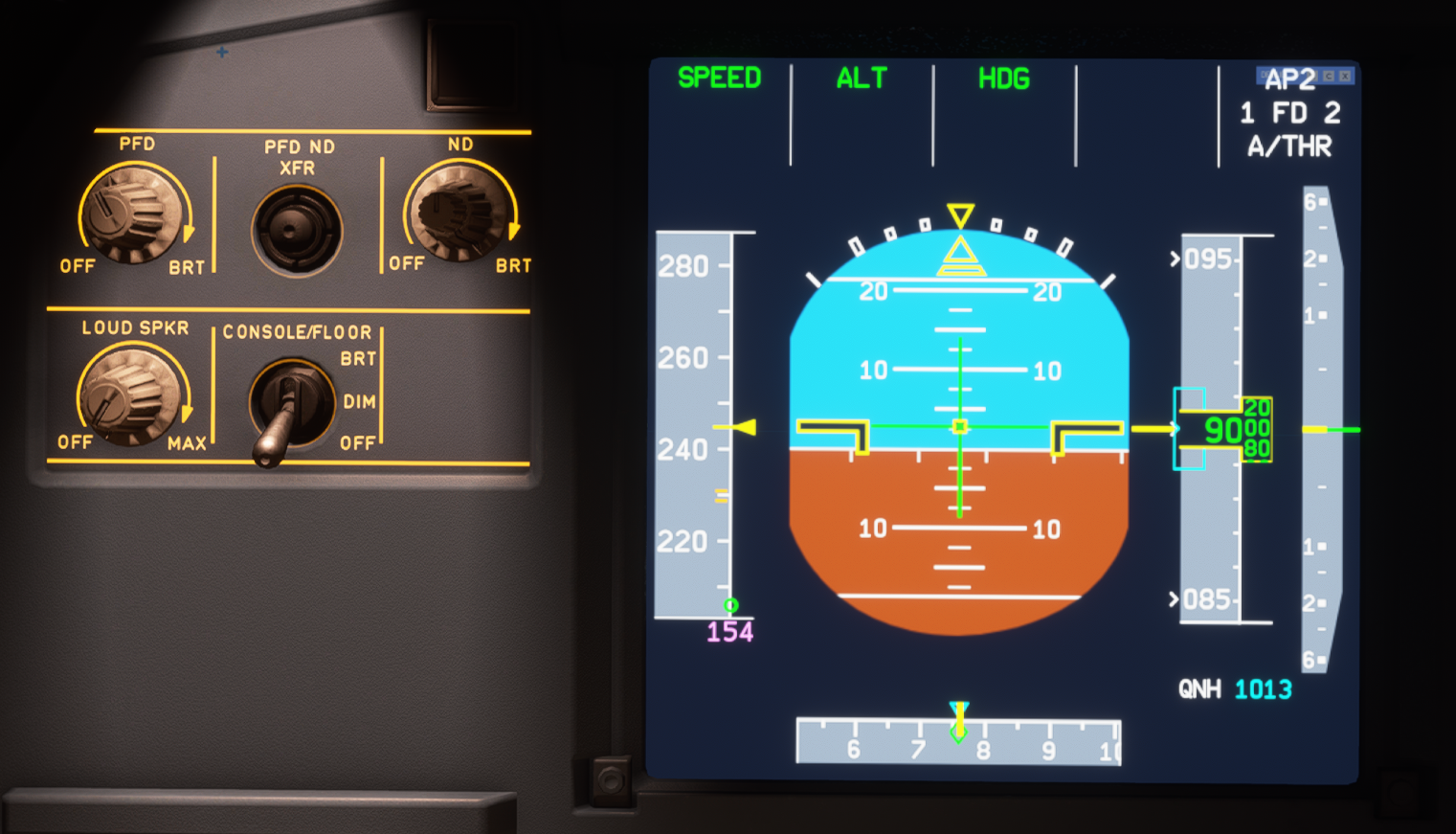
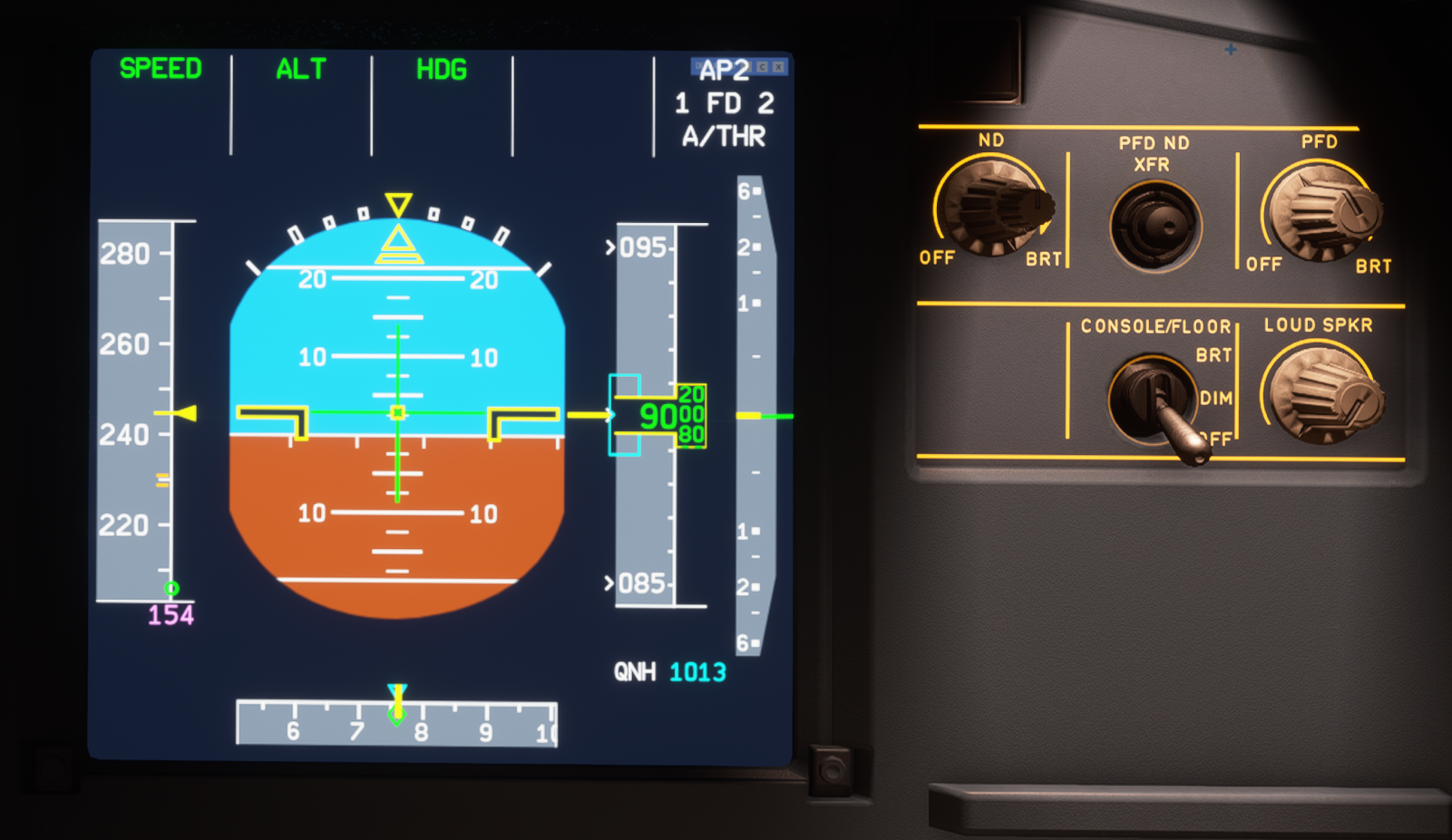
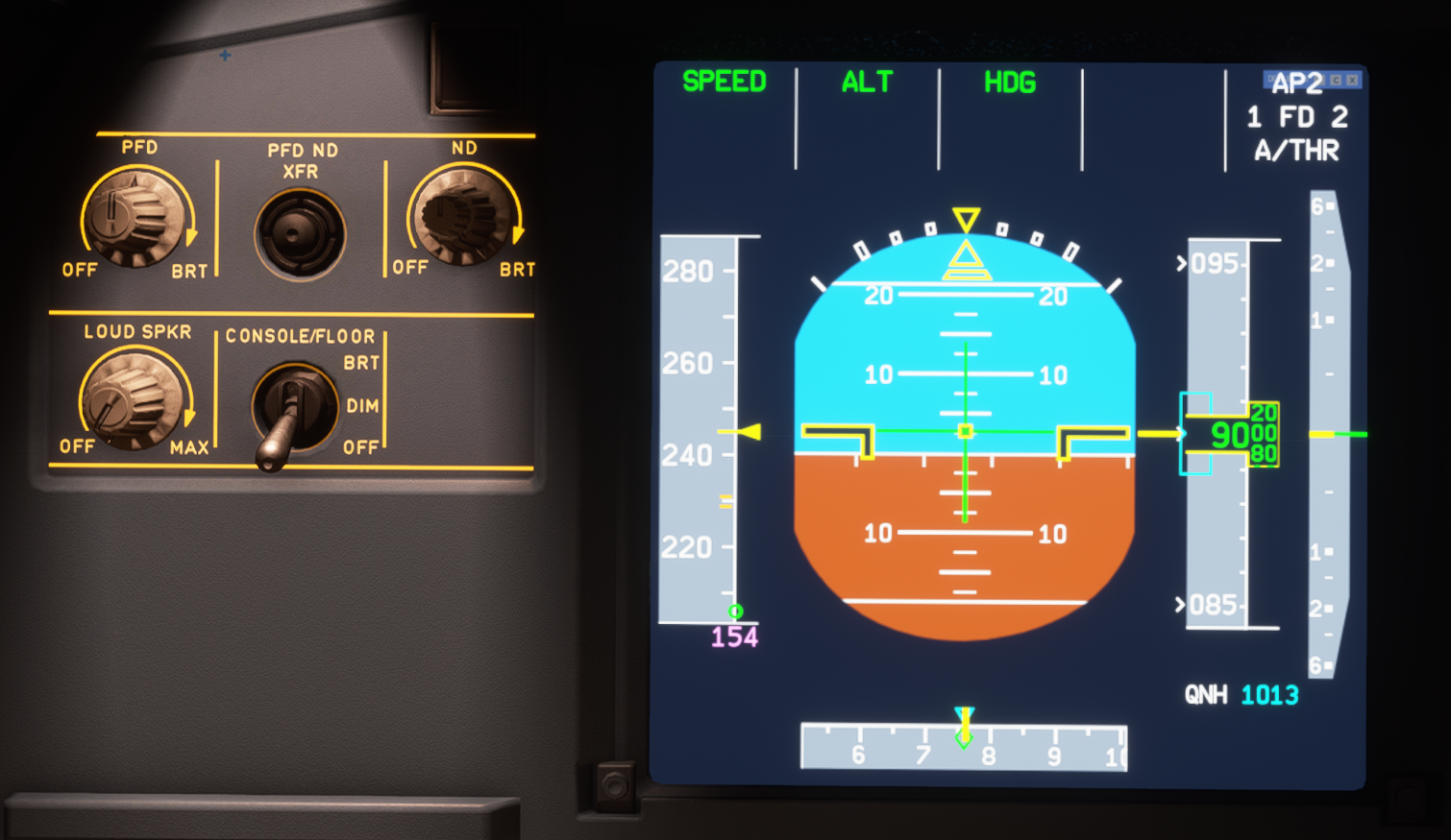
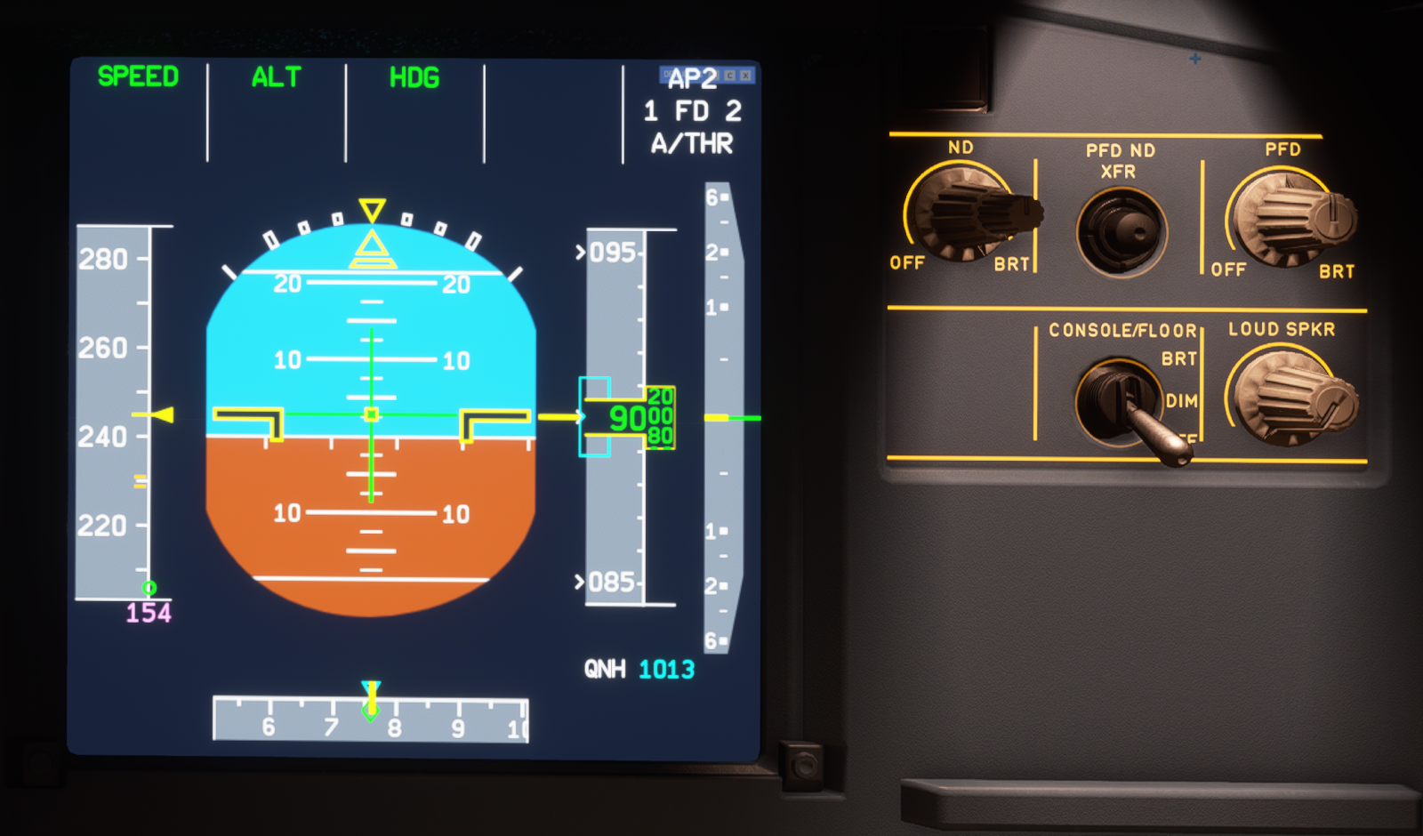
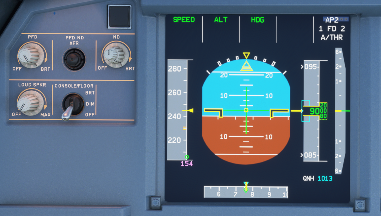
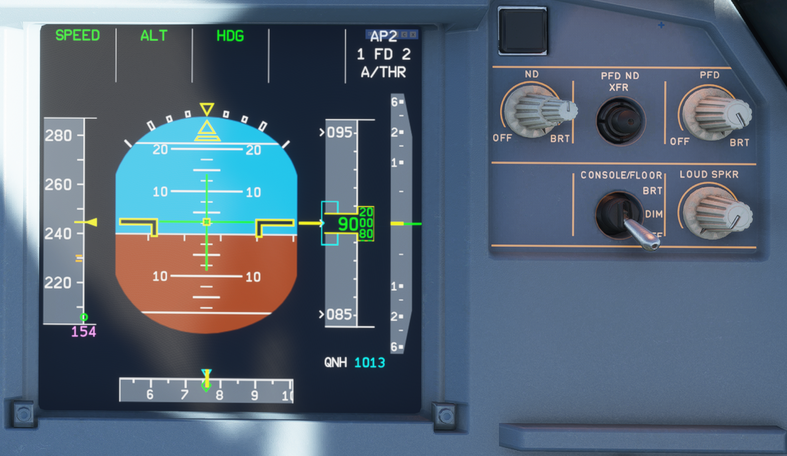
Background on PFD tapes (SPEED, ALTITUDE, V/S, HEADING) are too bright, causes information on it nearly unreadable.
To Reproduce
- Spawn at gate, ideally evening / night
- Power on the FPD. set brightness 50 - 100%
- Observe all tapes / notice effort needed to recognize numbers
Expected behavior
Contrast between text and background on tapes should be higher, backgroud should be much darker.
Actual behavior
To bright background of tapes on PFD.
References
Screenshot from A32nx
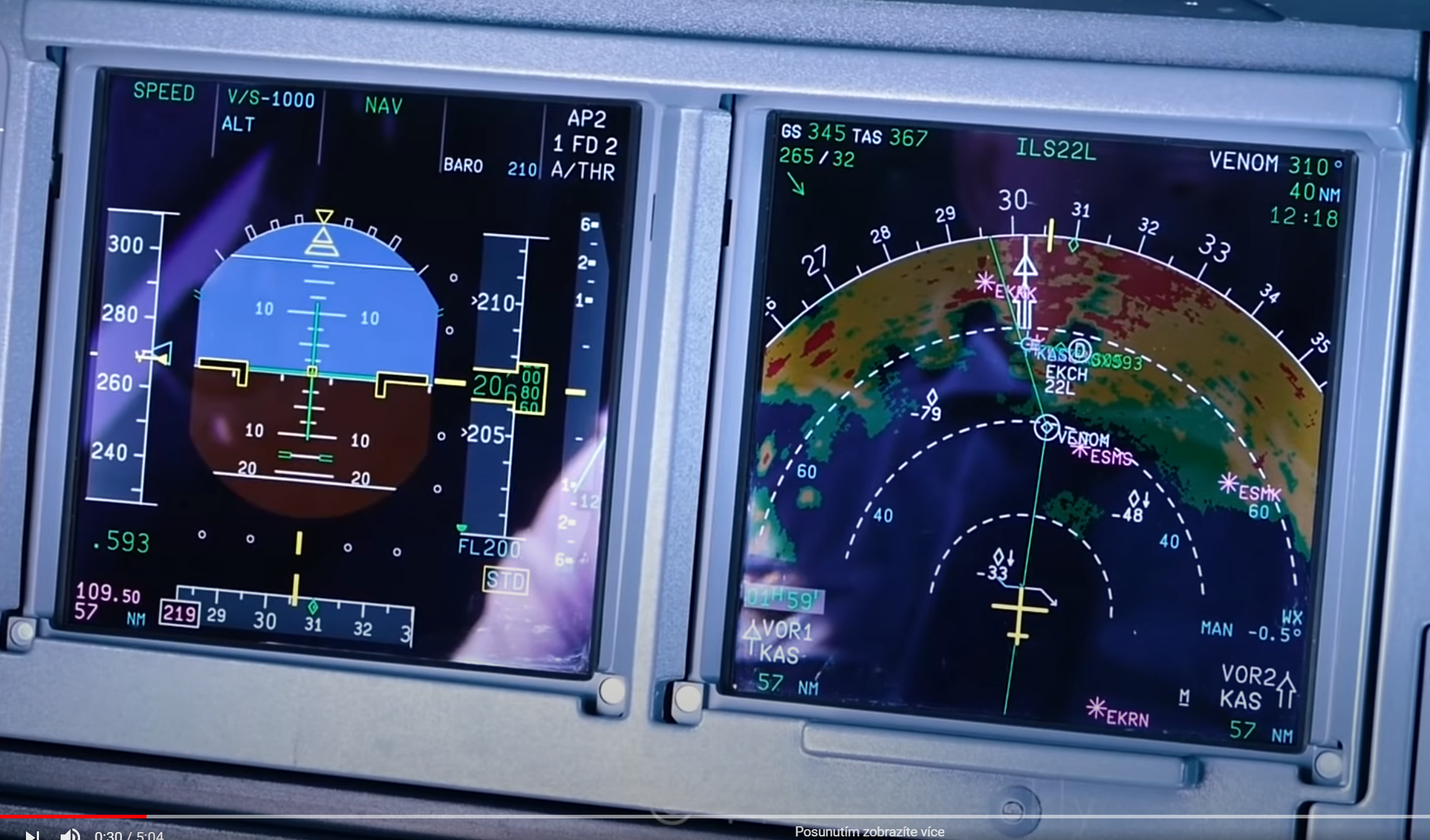
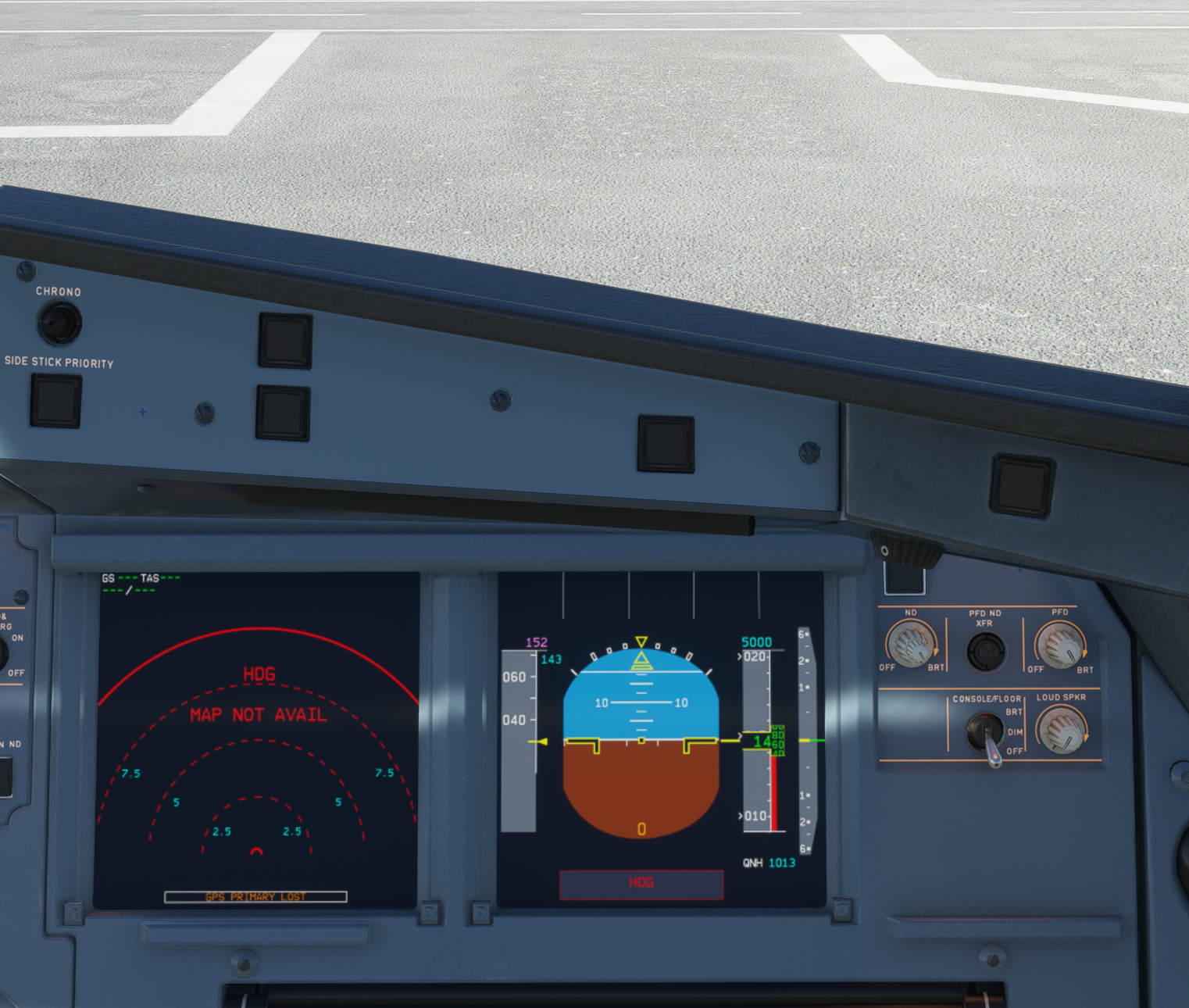
Snip from YT video of A320neo cockpit
Additional context
Was this working before/when did the issue start occurring?
Not sure.
Is this a problem in the vanilla unmodded game?
Not sure.
Discord username (if different from GitHub):
SteveX77 [Z+0!]#1407
 stevex77
All 17 comments
You should lower the brightness, try around 1/4 brightness
 lukecologne
on 8 Nov 2020
lukecologne
on 8 Nov 2020
@lukecologne with lower brightness set it's of course better. But I still believe that even thought brightness is set to max, all information should be clearly readable / contrast should be higher. The main reason is ergonomy / safety in the cockpit (important topic in Human performance & limitations).
See this IRL images for example (two different sources for objectivity):
Thanks for consideration.
stevex77
on 9 Nov 2020
Btw. I use the brand new calibrated EIZO display, so I should see nearly accurate colors here.
stevex77
on 9 Nov 2020
Agree with the OP. The problem is not brightness, the problem is contrast between font and background. It takes some effort to read, while it should be instantaneous.
 ntlgr
on 10 Nov 2020
ntlgr
on 10 Nov 2020
Try same settings with daylight!
The game manages the blur effect different than IRL
 MisterChocker
on 10 Nov 2020
MisterChocker
on 10 Nov 2020
MisterChocker
on 10 Nov 2020
OK, just tried in daylight and agree that it's better, so MSFS somehow adjusts cockpit brightness based on environmental lighting.
But in worse lighting conditions (like night), when instruments and visual recognition are generally more important, the contrast is still to low, making reading of these numbers harder. Especially for airspeed this is crucial. And I also want to fly in the night. :)
Will try how this behaves in vanilla A320 and let know. Also try to turn off the "eye adaptation" setting withing MSFS settings file.
stevex77
on 10 Nov 2020
so MSFS somehow adjusts cockpit brightness based on environmental lighting.
yup.
MisterChocker
on 10 Nov 2020
I confirm that in vanilla A320neo this issue is also present, but probably because of darker backlight of whole ND the contract is slightly better (compare with my original post). Turning off eye adaptation setting doesn't affect this (both vanilla A320 and A32NX).
So maybe making background of these tapes slightly darker or making the background of tapes like 50% transparent (with alpha channel, if possible) may help?
stevex77
on 10 Nov 2020
@stevex77, reduce brightness to 50% or lower...
I mean whats the point having PFD at 100% and ND at 10% brightness
MisterChocker
on 13 Nov 2020
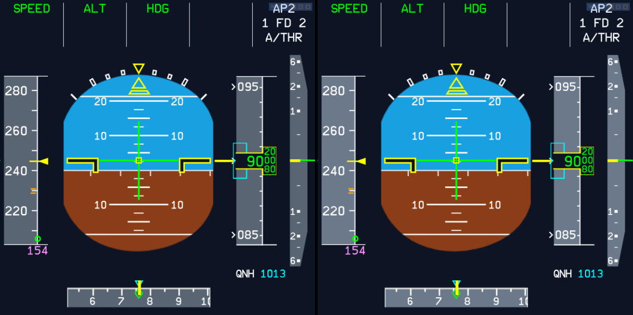
I noticed this with the awesome color changes added a while back, but was torn whether to make an issue of it or not. Now that someone else brought it up, I have to say I agree.
I very much understand that keeping the PFD brightness down helps (and I've been doing this), but I think the contrast between the gray background and white text is still too low overall. It is _legible_, but you really have to (actively) keep the display as dim as possible in order to comfortably read it.
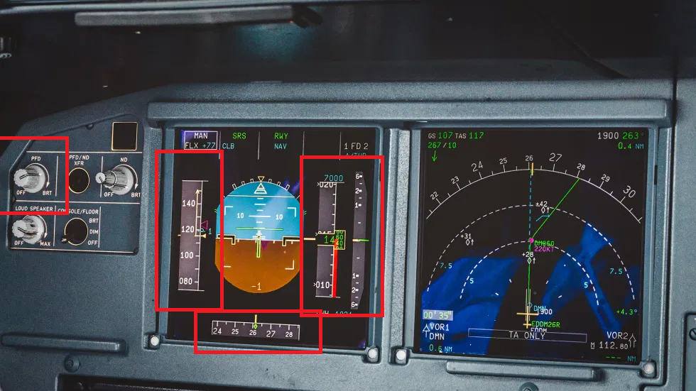
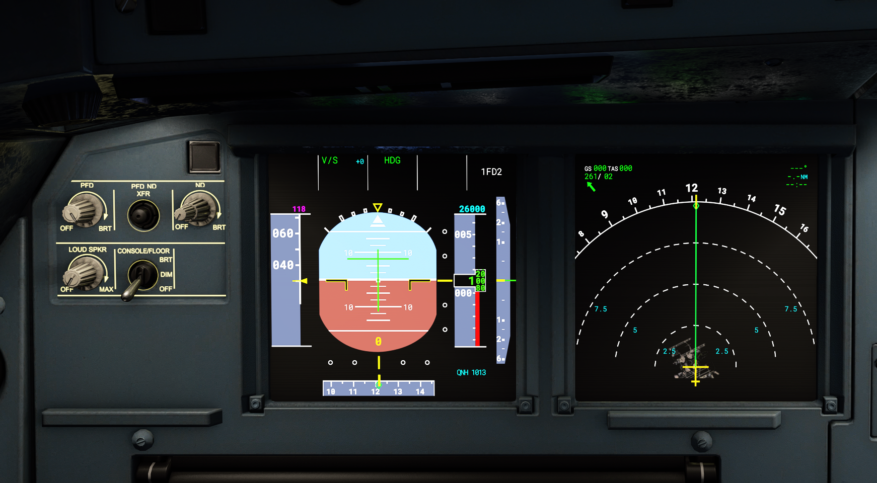
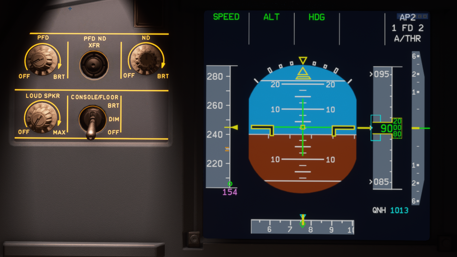
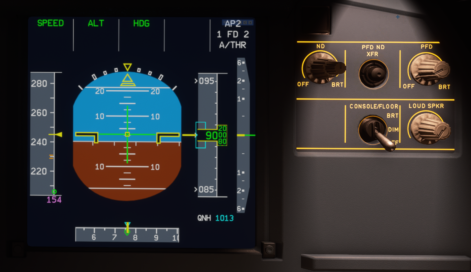
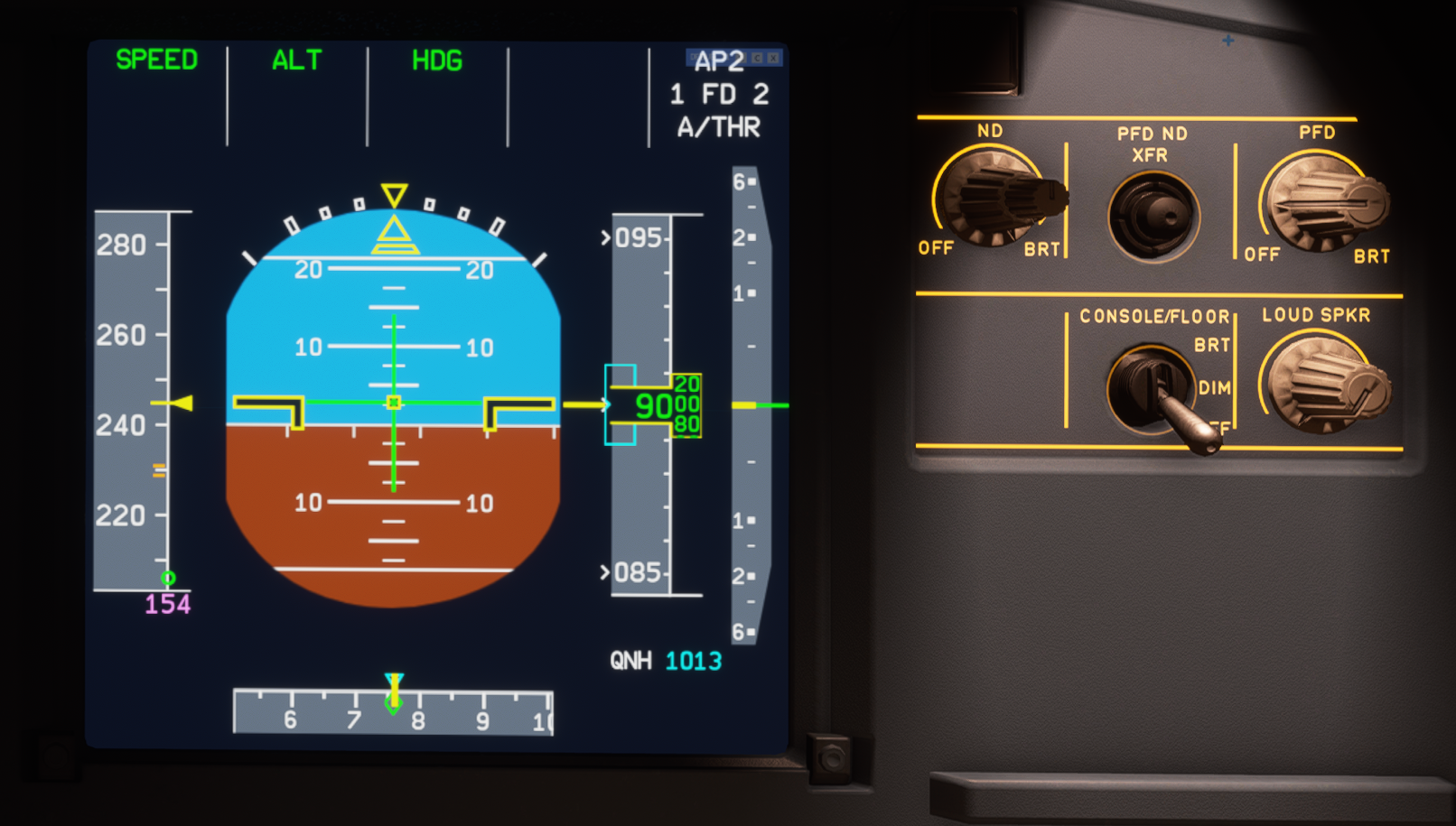
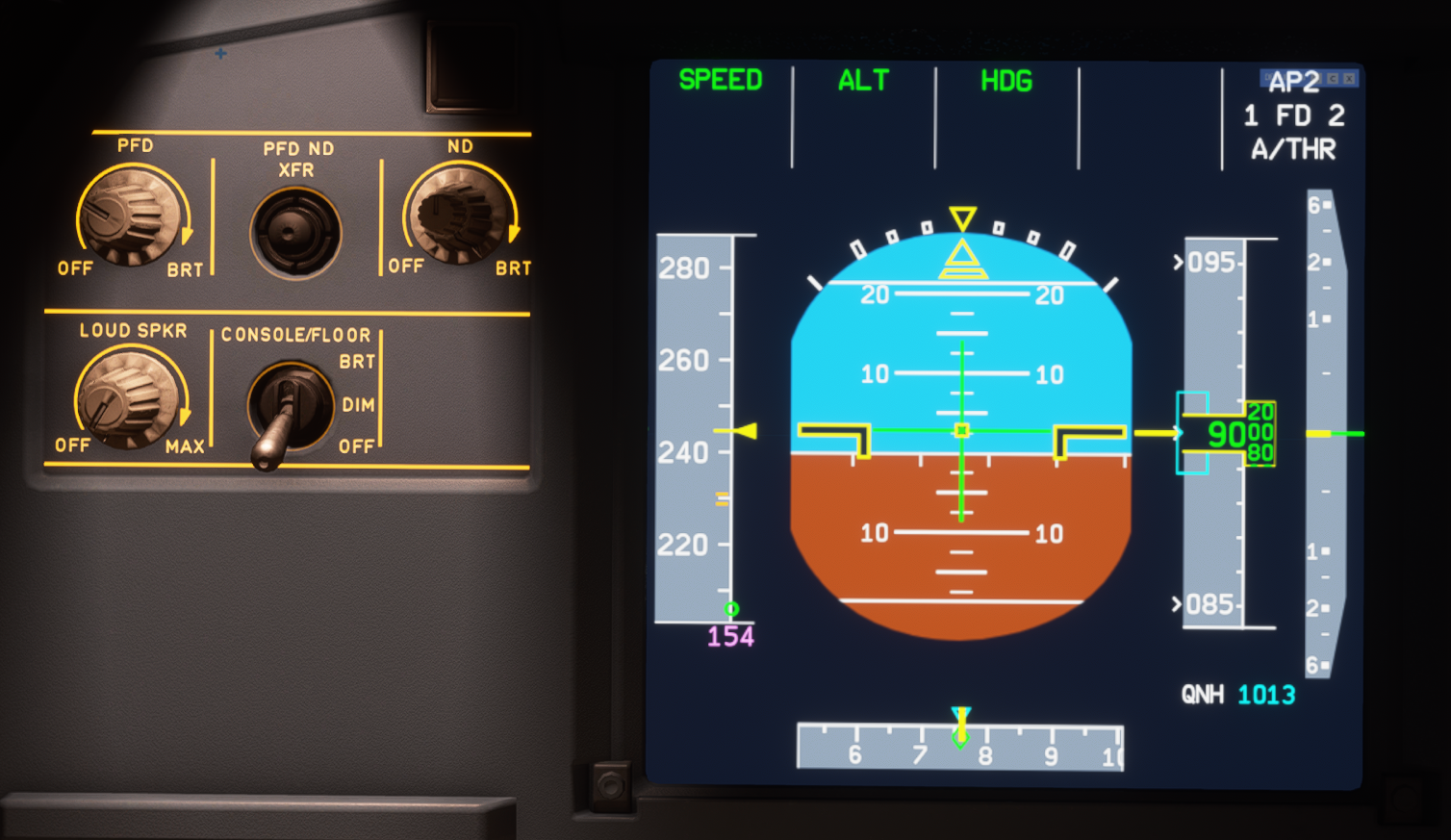
Compare the PFD to the ND and ECAMs in night lighting conditions:
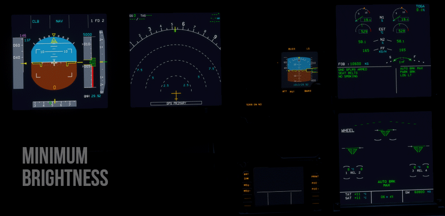
At minimum brightness, the PFD is easiest to see, while the ND and ECAMs are okay, but a little dim. At 30% brightness, the ND and ECAMs are very clear and easy to read. On the PFD, you must really begin concentrating to read anything over the gray.
At 50%, the ND and ECAMs are rather bright, but text remains quite readable, while on the PFD, it becomes physically uncomfortable to try and make out text over the gray. At max brightness, ND and ECAMs are still perfectly legible while the PFD's values are effectively washed out (contrast difference between the text and background is 5%).
Again, I have the utmost respect for the intent behind using this shade of gray and know a lot of effort went into it. Because the game does not play nicely with it, however, I sincerely think it would be better to make it darker out of consideration for the end-user's experience than perhaps a hardline devotion to realism (much like how a user can opt-out of the realistic IRS alignment time).
Edit:
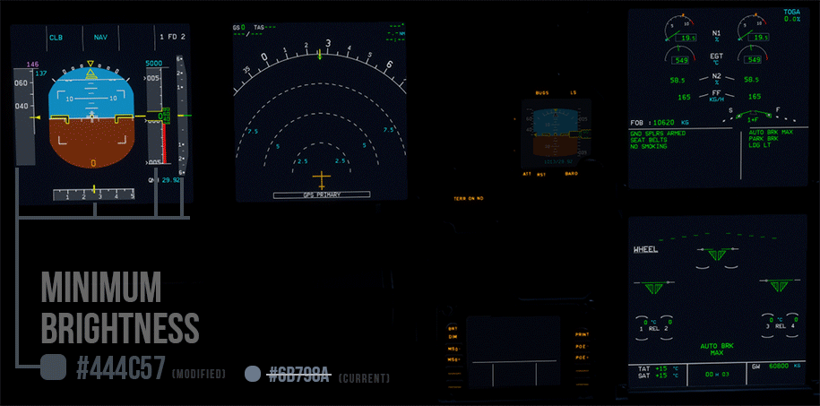
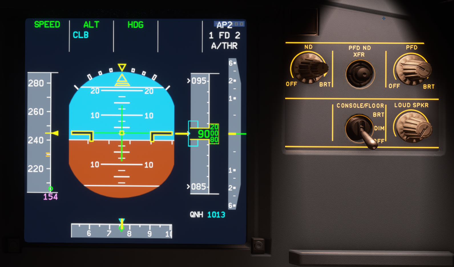
If anyone wants to experiment with the colors themselves, you can do a project-wide "find and replace" of #6B798A. That color is exclusively used for the the gray color in question and is on the PFD only (and it is not currently defined in a CSS file, as it is hard-coded in multiple JS files).
I made a quick test of using #444C57 instead (with no real-world basis) for my own personal use, and I am happy the contrast on all brightness levels:
(max brightness in early daylight)
 ischmal
on 13 Nov 2020
ischmal
on 13 Nov 2020
I sincerely think it would be better to make it darker out of consideration for the end-user's experience
Fully agree. Having to reduce brightness really highlights the fact _there is an issue_, and we're using a workaround. IMHO realism should not be towards selecting the exact Hex color value from the real bus; it should be in delivering a realistic PFD reading experience.
Since the effort was already made to improve the colors, instead of arguing about it, why not select a background color that is better readable night and day?
ntlgr
on 13 Nov 2020
@ischmal
(max brightness in early daylight)
Thanks for your response! Please show changes for same conditions as before. You need to compare apples with apples.
MisterChocker
on 13 Nov 2020
@stevex77, reduce brightness to 50% or lower...
I mean whats the point having PFD at 100% and ND at 10% brightness
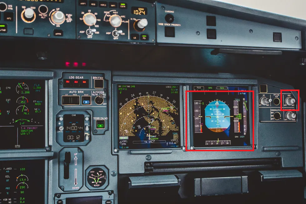
My latest screenshot was from VANILLA a320, both DUs, PFD and ND was se to 100%. In vanilla, outer ND knob sets overall ND brightness, inner knob is INOP. In A32NX inner knob sets overall brightness, outer knob sets terrain/WX brightness.
I did this vanilla screen to show that in vanilla Airbus it's slightly better, probably because there is no backlight bleeding simualted (whete in a32nx it is)...
All my screenshots were taken at night (in game :)).
stevex77
on 13 Nov 2020
@ischmal I really like result of your experiment! 👍 Will try myself with various light conditions (and on calibrated monitor).
stevex77
on 13 Nov 2020
@MisterChocker
Sorry, you are right. I should have done that to begin with. Here's an equal comparison:
I'm not necessarily standing by this color since I just chose a value roughly 50% darker than the current on the color picker. With reference images being all over the place, I can't say with any degree of confidence how bright it should be. I am also most definitely not qualified to assert how the plane should look or work.
ischmal
on 13 Nov 2020
Brightness should not affect colors, however it does.
I have done some changes to improve the visibility
| Captain PFD (before) | FOs PFD (after) |
| ----- | ----- |
| |
| |
|
| |
| |
|
| |
| |
|
| |
| |
|
| |
| |
|
| |
| |
|
This is a side by side comparison without any glare/bloom effect.
(Left after / right before)
MisterChocker
on 13 Nov 2020
Related issues
 AdenFlorian
·
3Comments
AdenFlorian
·
3Comments
 PANAM741
·
3Comments
PANAM741
·
3Comments
 javiiberia
·
3Comments
javiiberia
·
3Comments
 Curtis-VL
·
4Comments
Curtis-VL
·
4Comments
 Snapmatics
·
3Comments
Snapmatics
·
3Comments
Most helpful comment
Brightness should not affect colors, however it does.
I have done some changes to improve the visibility
| Captain PFD (before) | FOs PFD (after) | |
| |
| |
| |
| |
| |
| |
| |
| |
| |
| |
| |
|
| ----- | ----- |
|
|
|
|
|
|
This is a side by side comparison without any glare/bloom effect.

(Left after / right before)